Luke Posey, Product Manager
Jan 9, 2024

Machine learning in Quadratic feels like a native experience thanks to integrations like Pyodide for Python in the browser. In this tutorial we explore how to get started with your machine learning journey in Quadratic using Scikit-Learn.
You can follow along with this Machine Learning example file.
Step 1: Ingest and clean data
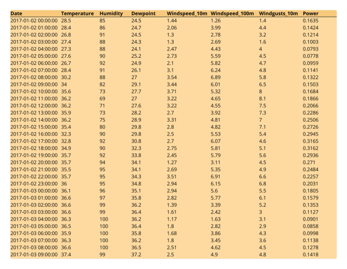
Step 1 for every tutorial is ingest your data. We’re using an example Kaggle dataset which comes in CSV form. In the case of analyzing a CSV we can simply drag and drop the file directly to the Quadratic grid.
We have a pretty clean dataset as-is, so our only data cleaning step in this case is to make the column headings a bit more readable - consistent casing, numerics, etc. We can also do some basic styling to our newly ingested data by aligning left and adding some background colors.
Step 2: Exploratory analysis - charting
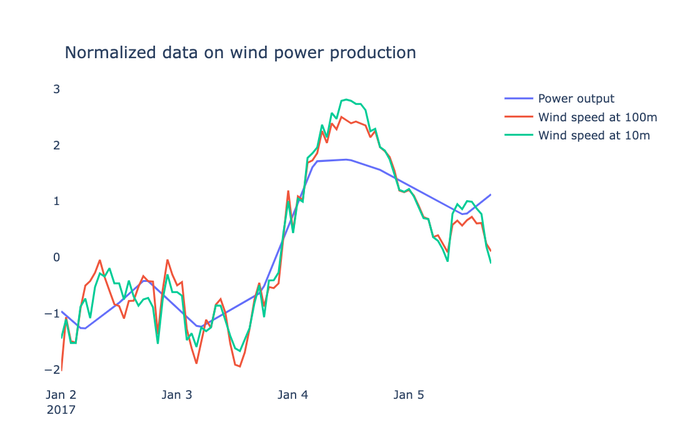
We first explore our data by creating a chart. This way we can see which features (input columns like Wind Speed, Temperature, Humidity) have the most obvious impact on our label (output column of Power). We do this with a Plotly line chart, styled for simplicity. We create a normalized version of our DataFrame so that the correlations are more discernable. We do this with the mean divided by the standard deviation.
# normalize dataframe values
normalized_df=(df-df.mean())/df.std()
normalized_df['Date'] = df['Date']

# select data to display
normalized_df = normalized_df.head(90)
Our chart displays that normalized data:
Step 3: Train and test our model
We start with importing scikit-learn and other necessary libraries. From there we do a train/test split. This means we’re splitting our dataset into a portion of data solely for training the model and then a portion for testing (90/10). In an attempt to avoid bias we add some randomness to how the data is sampled.
# train-test split
X_train, X_test, y_train, y_test = train_test_split(
    df[['Temperature','Humidity', 'Dewpoint', 'Windspeed_10m','Windspeed_100m']],
    df['Power'],
    test_size=0.1, random_state=13)
Now we fit our model, perform our predictions, and test the model. We use mean squared error (MSE) as our testing metric, and we also calculate the variance and range of our output to get a feel for how our mean squared error measures up against the dataset (e.g. a small MSE has more merit when variance is high, less merit when variance is low)
# fit model
regr = RandomForestRegressor()
regr.fit(X_train, y_train)

# test model
mse = mean_squared_error(y_test, regr.predict(X_test))
mape = mean_absolute_percentage_error(y_test, regr.predict(X_test))
From there, we set the sheet up so other users can input their own parameters to perform predictions. The model is then set up in another cell to call upon each of those cell values to perform the prediction.
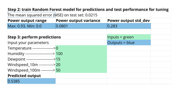
Further test and tune your own models as you see fit.
Step 4: Share our model
Part of the beauty of our model living in the spreadsheet is how easy it is to share and have others consume our work. Some options for sharing:
- Teams: let your colleagues and friends collaborate on the sheet with you.
- Presentation mode:
Ctrl + .(on Windows),⌘ Command + .(on Mac) - Copy-paste as PNG: select your data range, right click to open the menu, select 'copy as a PNG', a PNG of your data is copied to your clipboard and ready to paste in an email, document, etc.
- Embed: seamlessly embed the sheet into Notion, websites, or anywhere else by adding
?embedto the URL of your Quadratic sheet.
https://app.quadratichq.com/file/file_ID?embedGet started in Quadratic with this Machine Learning tutorial template.