


Explore Quadratic’s three pillars
AI
Understand any data set using natural language with a built-in AI assistant that will do things for you — analyze data, write code, and more.
Learn more
2Code
Learn how to leverage Python and JavaScript natively in your spreadsheet alongside traditional formulas.
Code 101
3Connections
Connect directly to databases, data warehouses, and APIs to execute queries, analyze results, and visualize insights.
See all connections
Start with a template
Explore what’s possible in a Quadratic spreadsheet without starting from scratch.
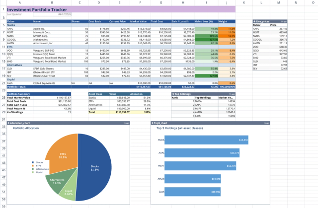
Investment Portfolio Template: Real-time Performance & Charts
Visualize and track your investment portfolio with live data.
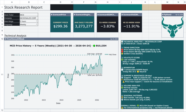
Stock Research Report Template: Live Stock Dashboard
Analyze a single stock's financial performance and risk.
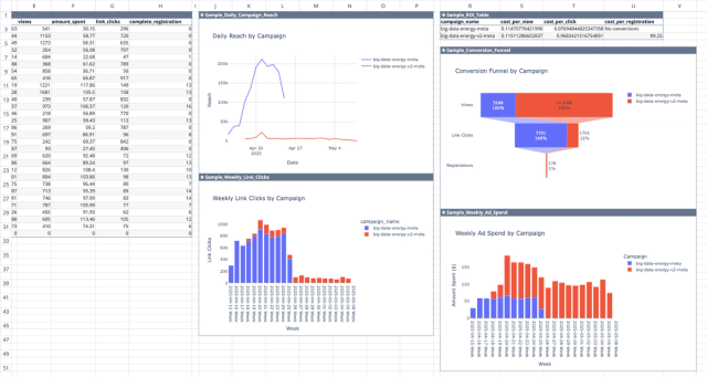
Meta Ads API Analytics Template
Get better insights from your Facebook ad campaigns with direct integration with the Meta Ads API.
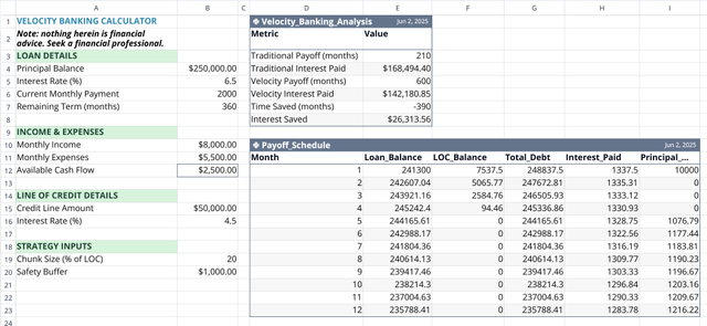
Velocity Banking Calculator
Accelerate your mortgage payoff by optimizing your line of credit usage.
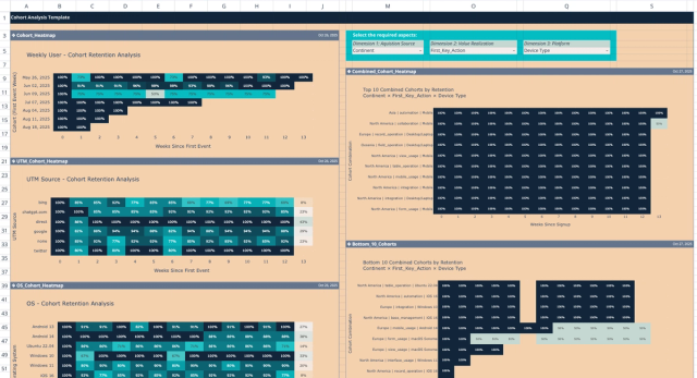
Cohort Analysis Template
Unlock deep user insights with multi-dimensional retention analytics.
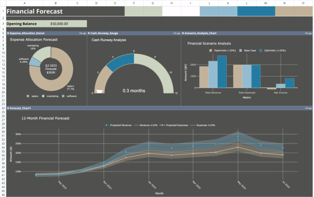
Financial Forecast Template: Projections & Scenarios
Project and visualize future financial performance and scenarios.