Amitesh Anand, Community Partner
Apr 30, 2025

Data visualization is simply the process of converting data into visual form, i.e., plots, charts, maps, or even graphs, so the human brain can easily comprehend and infer conclusions or insights from it.
In modern-day business settings, business data analysis and data-driven decision-making is essential, and among the key approaches is crafting insightful stories and visualizations that drive actions. With charts, maps, and other visual representations integrated into a broader data analytics strategy, data analysts can illustrate patterns, trends, and outliers that may go unnoticed in data. This raises the depth and quality of insights for data analysis for business intelligence, and more importantly, it improves communication between data and non-data professionals.
Python now dominates data visualization due to its versatility, ease of integration with data analysis workflows, and extensive libraries such as matplotlib, seaborn and plotly that allows user to create plots and interactive dashboards.
As the underlying Python libraries for data visualization improve, data visualization software like Quadratic are transforming the use of Python in everyday analysis. Quadratic is a next-generation spreadsheet platform that makes it easy to integrate Python into the spreadsheet environment, allowing easy data analysis and visualization without leaving the familiar grid interface. This combination of Python's analytical capabilities with spreadsheet simplicity represents a major advancement in the accessibility and usability of complex data visualization.
Why is Python a go-to language for data analysts?
Python is regarded as a go-to language because of its simplicity, flexibility, open-source nature, and strong community support. While its capabilities scale well for advanced users, its clean syntax makes it easily accessible even to users without strong programming knowledge. Analysts can easily process data and perform Python exploratory data analysis with libraries that allow for smooth pipelines.
Programming libraries make customization easy, from basic plots to interactive dashboards. Let’s explore the best Python libraries for data visualization like Plotly, Matplotlib, and Seaborn.
Plotly: The interactive visualization powerhouse
Plotly is the most popular Python data visualization library. It is open-source, versatile for data storytelling and data exploration, and interestingly helpful in creating quality and interactive visualizations.
Plotly supports a variety of different chart types, such as bar, line, box, scatter, and 3D plots.
Key features of Plotly
Below are some of the key features of Plotly:
- Integration with data science libraries: Plotly works perfectly with pandas, numpy and other Python libraries. This makes it easy to visualize dataframes or arrays beautifully.
- Numerous chat types: Plotly supports a wide range of chart types, from simple and fundamental charts like pie, bar, and line to advanced visuals like fully interactive 3D maps. This makes it accessible to users for storytelling and other analytical tasks.
- Full customization: Plotly allows users to tweak chart features, from fonts to colors, to axes, and even layouts. This gives users full control of their visualizations.
- Interactivity: Users can zoom to details and hover on visuals without extra coding, which shows that Plotly is user-friendly and dynamic.
- Open source: Plotly is freely available to individuals and teams that see flexibility as importance without license limitations. This gives room for wide-ranging accessibility and community-driven improvement.
Use cases
- Data exploration: Plotly has interactive features that make it efficient and easy to explore datasets, whether minimal or large, visually.
- Dashboards: Plotly allows you to create interactive, real-time dashboards in Python that track and monitor KPIs (Key Performance Indicators) for decision-making.
- Web applications: With Plotly, users can build interactive and sleek web applications integrated with Dash.
- Scientific research and education: Plotly is suitable for displaying statistical models, simulations, and experimental data, especially in cases where interaction and clarity are needed for sharing and interpretation of complex results.
Matplotlib
Matplotlib (MATLAB, plot, and library) is a Python foundational plotting library that forms the basis for most data visualization libraries. It gives direct low-level access to all plot elements, meaning it is an analyst's friend for creating particular, publication-quality visuals. Matplotlib is a widely used data visualization tool with the advantage of being free and open-source.
Strengths
- Matplotlib is well integrated with Numpy and pandas for a smooth workflow
- Users can enjoy the benefit of extensive documentation and a large base of contributors, as Matplotlib is one of the first data visualization libraries in Python.
- Matplotlib works well for creating comprehensive visualizations and publication-quality figures in scientific journals and technical reports.
- Matplotlib offers users control over labels, axes, font size, grid lines, and other visual elements.
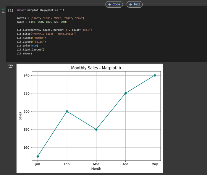
Check out these functions in the image below:
Seaborn
Seaborn is a Python data visualization library built on Matplotlib. It's built-in themes give plots a professional look.
It simplifies creating statistically relevant, good-looking graphics and features built-in themes, color palettes, and visualization tools for working with complex data sets. Seaborn is known for accepting Pandas DataFrames directly and using their labels.
Strengths
- Seaborn has functions that are designed to handle statistical data.
- It is ideal for data analysis workflows because it accepts Pandas DataFrames as inputs and uses their labels, much like advanced Google Sheets pandas integrations.
- It widely supports charts such as scatterplots, line charts, violin plots, bar plots, pair plots, etc.
- Seaborn makes it easy to visualize statistical plots by handling DataFrame structures and providing advanced statistical plots with simple function calls.
- Users can easily style charts with a few lines of code, reducing the need for extensive customization.
Visualizing data using Quadratic
Quadratic transforms how data analysts interact with spreadsheets by integrating Python coding and running it directly within spreadsheet cells. This makes data visualization simpler and more flexible, as it eliminates the gap between spreadsheet and coding environments. Quadratic enables the creation of interactive charts in Python from within spreadsheet cells, even allowing you to generate charts with native AI.
With integration and support for Plotly, one of the best Python visualization libraries, Quadratic offers seamless running of advanced data analysis and visualization dashboards, and interactive data exploration without leaving the spreadsheet.
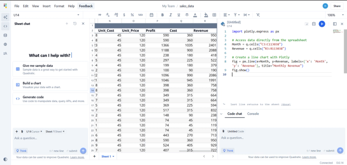
Referencing spreadsheet Data
Working with data in Quadratic is easy. Referring to a range of spreadsheet cells directly within Python code is possible. This means that structured data can be fed into Plotly charts seamlessly, creating charts in Python that update automatically with any change to the cell data.
For example,
x = q.cells(”A1:A5”)
y = q.cells(”B1:B5”)
Chart example
The image below shows how you can easily generate a plotly chart by referencing cells in Quadratic.
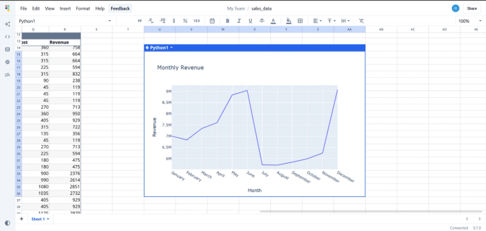
With just a few lines of code, you can use Python to turn basic cell data into interactive visualizations.
Here’s the result:
Benefits of Quadratic for data analysts
- Increased efficiency: Python scripts can be handled on one centralized platform without the need for switching between tools. Users can run Python code and make visualizations directly within the spreadsheet environment without hurdles between cleaning, analysis, and visualization.
- Enhanced data exploration and communication: Users can create visually appealing, interactive charts that improve how results are communicated to stakeholders.
- Interactive and real-time insights: With quadratic, users can easily develop interactive and real-time plots that assist to find trends, patterns, and anomalies in data seamlessly.
Conclusion
Data visualization continues to be an indispensable component in translating complex data into actionable insights, and Python has cemented its role as a dominant tool in this space due to its powerful, user-friendly libraries like Plotly, Matplotlib, and Seaborn. These libraries empower data analysts to craft detailed, customizable, and interactive visualizations suitable for diverse applications ranging from business intelligence and scientific research to education.
Furthermore, platforms like Quadratic represent a significant evolution as a Python alternative to Excel by merging Python's robust analytical capabilities with the intuitive familiarity of spreadsheets. Quadratic's coding spreadsheet eliminates barriers between coding and data analysis, making sophisticated visualizations accessible and manageable directly within a spreadsheet environment. This powerful combination not only enhances productivity but also fosters greater collaboration and clearer communication among both technical and non-technical stakeholders.
As data visualization practices evolve, the continued integration of Python data visualization libraries within user-friendly interfaces like Quadratic will undoubtedly shape the future of data analysis, making complex insights simpler, faster, and more impactful for everyone.