John Walter, Community Partner
Jul 2, 2025

Table of contents
- Why product usage analytics matters in SaaS
- Challenges with traditional product analytics tools
- Quadratic: A new way to analyze product usage
- How to build a SaaS product usage dashboard in Quadratic
- Use case: Real-time iteration based on user behavior
- Why Quadratic is ideal for SaaS product teams
- Turn product usage data into a strategic advantage
Product usage analytics are often one of the most underrated contributors to the success of software-as-a-service (SaaS) enterprise companies. Whether you are building in the business-to-business (B2B) or business-to-consumer (B2C) software models, product SaaS analytics help you understand your users. This, in turn, continuously enhances their experience by closely shaping the product roadmap, among other meaningful iterations.
You'd be surprised by looking at the best product analytics software shortlists. Most will feature SaaS analytics from a wide range of categories, including heatmaps, user experience issue identifiers, mobile-focused web analytics, user actions, user behavior, privacy compliance, and basic reporting. However, a particular domain is left out despite having proven to provide real-time value. One such example is spreadsheet-native tools, such as Quadratic.
In this guide, we'll demonstrate how modern SaaS teams can leverage the power of AI-driven tools like Quadratic to track product usage and make more informed product decisions. By the end, you will be able to create an automated pipeline in Quadratic to visualize real-time usage metrics, which you can use to help your team iterate faster and build better digital product experiences. But before, let's build momentum by answering a few questions before delving into the how.
Why product usage analytics matters in SaaS
In practice, SaaS analytics primarily focuses on optimizing user experience by analyzing users' actions and preferences, such as their interactions with the platform. The goal is to take a data-driven approach to extract product usage analytics and use them to make informed decisions, inspire customer satisfaction, and ultimately stay competitive in the market. Two teams benefit from SaaS product usage metrics.
As the first, product teams utilize key metrics such as daily active users (DAU) and monthly active users (MAU), feature adoption, session lengths, and navigation patterns to examine and understand user sentiment regarding their product. Consequently, they can identify blockers in the user's journey and prioritize them for improvement. Additionally, this approach guides the development of new features based on actual needs and preferences, leading to successful digital products.
The second is marketing teams, which utilize product usage analytics to identify the most effective channels for reaching target audiences and ensure their messages resonate with them. User interactions with marketing campaigns, be it landing pages or advertisements, once extracted as SaaS analytics, help optimize go-to-market strategies, increase and retain conversion rates, and improve the overall return on investment (ROI). Moreover, insights serve as a compass for creating personalized experiences that drive long-term customer satisfaction and engagement.
Challenges with traditional product analytics tools
While the best product analytics software solutions have been valuable for years, they struggle to keep up with the ever-growing volumes, complexity, and speed of modern data. Some modern data architectures will have their landscape, sources, and key performance indicators spread across different platforms, making insights discovery not only difficult but also time-consuming.
At enterprise levels, data integration is difficult and time-consuming. There is a scarcity of skills and resources to analyze big data, as the process involves technically advanced statistical procedures. Traditional product analytics tools offer a historical log of static data models for analyzing trends over time. However, in a fast-paced and competitive environment, marketers and developers need real-time feedback about product sentiment from a customer's perspective.
Traditional observability has been too focused on systems’ performance, with little or no concern for customer issues. Because it cannot quantify customer impacts, it cannot prioritize the changes that need to be addressed or optimizations that could benefit customer experiences. Existing solutions excel at visualizations. That's support for independent analysis. It requires adapting to the context and a deep understanding of the data to get actionable insights from graphs and raw data.
In a setup such as the one above, only manual efforts from product professionals lead to decisions, partly due to a probable partial understanding of it. Put another way, there are too many dashboards but insufficient valuable insights to drive action. The idea behind product professional roles is to remain focused on a mission and goals. Approaching products as an ongoing work in progress, you focus on the things that matter, but the problem with most analytic software is that they weren't built to support this technique at work.
In a digital product, different users engage with features in unique ways depending on understanding, user journey, and persona. Rather than personalization, most analytic products are based on the correlation of success to user behavior. Often, they are error-prone, if not biased.
If you’re facing the above challenges (or even more) and can’t contribute to work at best, you won’t love your experience. This is where AI-powered tools fill in the gap and adapt to scale, perform, handle complexity, give better functionality, and offer interoperability. Quadratic is exactly that tool.
Quadratic: A new way to analyze product usage
“Quadratic is reimagining the spreadsheet with a focus on data.” — Kyle Wiggers, TechCrunch Editor.
Quadratic, as a modern SaaS analytics tool, blends the best of spreadsheets, artificial intelligence, and programming ability to ease the analysis of large data sets, all from a collaborative browser application.
Built-in AI and native support for coding languages like Python and SQL in Quadratic make it easy to build dynamic dashboards, track feature adoption, and monitor SaaS usage trends—all without leaving the spreadsheet. The ability to communicate across analysts, developers, and an entire organization through a tool most folks are already familiar with provides a powerful way to access product usage analytics and make faster, more informed technical tradeoffs and roadmap decisions.
Unlike traditional dashboards and complex analytics suites, Quadratic offers a native approach to both no-code and code, enabling direct work with real-time product usage data for managers, designers, and marketers in a spreadsheet. If you or your team comes from a non-technical background, you do not need to rely on engineers to do technical product analysis. Instead, you can directly connect Quadratic to a live database or application programming interface (API) and manipulate the data visually. Let’s see how with a step-by-step guide.
How to build a SaaS product usage dashboard in Quadratic
Building a product user metrics dashboard is straightforward in Quadratic. Let's walk through the process step by step.
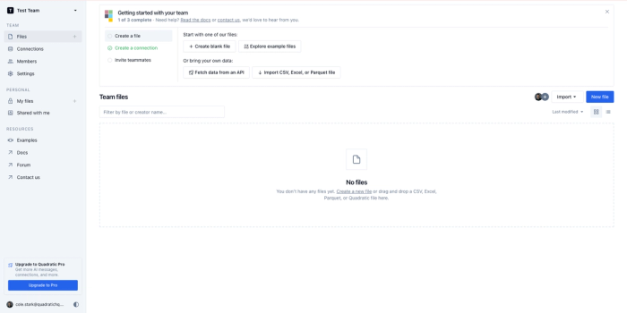
If you are new to product usage analytics tools, head over to Quadratic’s app and create a free account. Next, you should be redirected to a page that resembles the one below, which serves as the starting point.
1. Import your product usage data
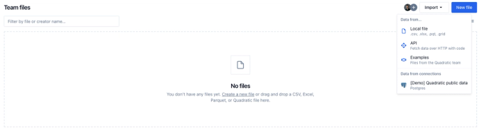
While on the above application page, click on "import" to pull in your product data from its respective source. A dropdown menu with four options should appear. The first two are a local file (which can be in any traditional format, such as CSV, Parquet, or Excel files) or an API. The remaining two allow you to start by picking an existing example template or using the Quadratic public data (a PostgreSQL database). This is how it looks on the UI.
If you’d like to connect to company database like Postgres, MySQL, or Snowflake, you’ll click “Connections” on the left sidebar of the dashboard and fill out the proper credentials for your database.
Only after you have connected Quadratic with your product usage analytics database or an API like Mixpanel will you be able to monitor SaaS usage in real-time.
Once your database is connected, simply type “/” to start a code cell. Here, you can select your database, then view the associated tables and schema, and interact with the AI code chat.
2. Bring in and structure raw usage data
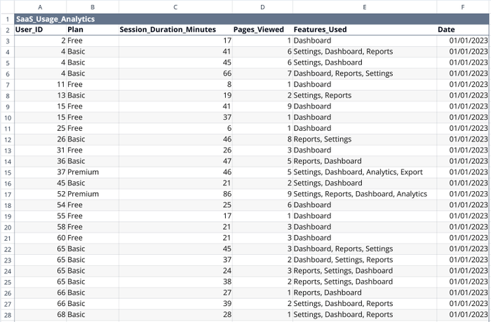
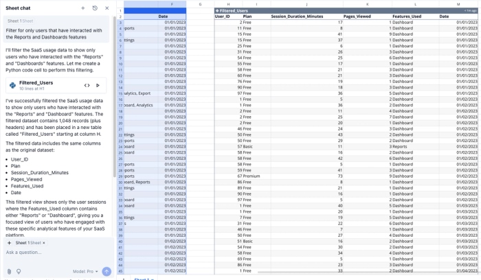
For this tutorial, we’ll be using sample data generated by AI. See an example of the data here:
Much like this sample data, raw data from a database or API might need to be cleaned, formatted, or structured to enable easier analysis. For example, perhaps we’re only interested in users who have interacted with our Reports and Dashboards features. Instead of converting the “Features_Used” column into multiple columns for each feature used, dealing with null values, and manually filtering, we’ll simply ask the AI, “Filter for only users that have interacted with the Reports and Dashboards features”.
In a few seconds, we have a new dataset on our sheet that we can further analyze.
3. Use AI + Python for insights
Up until now, we have cleaned up our data (or at least shown you how to do so). Let’s extract insights from it. To create value from product usage metrics, we’ll perform three common SaaS analytic operations.
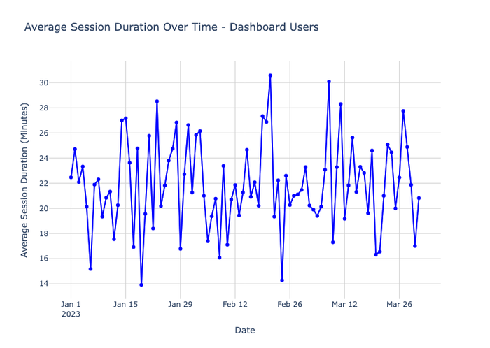
a) Track feature engagement over time
We can use Quadratic’s AI to understand the patterns of feature adoption. Achieve this in a single AI prompt: "Show how session duration changes over time for Dashboard users". The AI writes Python code that powers a data visualization with Plotly.
The output is a line chart with the date on the x-axis and average session duration on the y-axis, revealing the trends in engagement over time. A good use case would be to evaluate the impact of UI changes on user engagement.
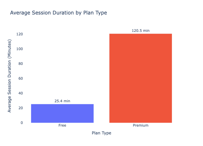
b) Compare user cohorts
While the above dataset does not contain cohorts yet, you can simulate this by adding another column, “User plan”, if you like, to indicate which product tier a user is entitled to. The flow for this scenario would be:
- Add a new column called User Plan, filling it with sample data such as “Free” and “Premium”. (In practice, you’ll call this kind of data from an API, or append a new cohort to your database data).
- Then with a single prompt: “Compare average session duration between Free and Premium users”.
As you'd expect, the output is a bar chart showing the average engagement for each cohort. A useful application of this technique is to measure the extent to which premium users engage and identify areas where they fall short.
c) Detect churn signals
To proactively identify churn risks, look for days when engagement drops significantly. The steps would be:
- Prompt: “Analyze churn risks based on users that had abrupt drops in session duration.”
The following is an example of output from the AI:
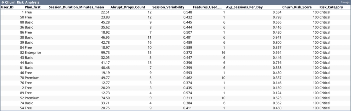
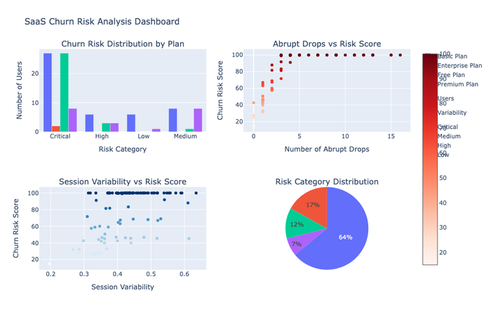
Such data would be more valuable when evaluated in tandem with other product factors, such as reported bugs or feature update deployments on the specific days where the dip was witnessed.
It is worth noting that there are many capabilities and functionalities that you can leverage using Quadratic, but that’s out of the scope of this article. Keep exploring to learn more about what you can do with Quadratic.
4. Share and collaborate in real-time
Quadratic has been designed for collaboration. Once the SaaS product analysis is ready, it's time to collaborate with others. One of the easiest ways to share your working spreadsheet with others is to copy and paste the page’s URL (available in the browser address bar) for them to use.
Alternatively, follow these steps:
- Click “Share” in the top-right
- Set permission levels (Viewer, Editor)
- Share to the person’s email address directly, or send them the link
This functionality makes it easy to collaborate with others as you won’t have to wait for dashboard export from other teammates to make valuable contributions — you can all work in the same space.
Use case: Real-time iteration based on user behavior
Product research challenges make it difficult to keep up with ever-evolving customer needs; however, monitoring SaaS usage is a key door to developing better products. What’s more valuable in product development is when SaaS analytics inspires its direction.
As a manager involved in B2C or B2B SaaS analytics feedback loops for product development, you will often want insights that cater to all stages of your journey, from discovery to launch and enhancements. Technically, this translates to using analytics in problem identification, idea validation, usability testing, flagging user behavior patterns, measuring product success and progress, informing future decisions, and presenting data.
In practice, you’ll use a tool like Quadratic to track product posture and generate SaaS usage reports by automating data collection and analysis, performing sentiment analysis and customer insights, utilizing predictive analytics for market trends, leveraging AI-driven analysis, and facilitating personalized product development. For example, you can have a card system for ads in your product that performs better after some technical optimizations and UI/UX updates. Similarly, the implementations could be carried out in other areas (of the same software system) to improve the overall product experience across different microservices.
Why Quadratic is ideal for SaaS product teams
Quadratic, as a spreadsheet, will come more naturally to users than advanced data science notebooks or complex BI tools. Here are a few reasons why you should use Quadratic for product usage analytics:
What makes Quadratic the best product usage analytics software
- AI-powered data analysis — Quadratic uses the latest LLMs that excel at writing and refactoring code, a powerful feature to generate insights or analyze both numbers and text. Use it to create revenue reports or summarize customer feedback through chat-based prompts.
- Real-time collaboration and multiplayer editing — You’ve likely had a good experience collaborating with Google Docs and Workspace. Quadratic provides similar functionality in spreadsheets, allowing multiple people to edit and analyze the same file simultaneously. Use Quadratic to invite collaborations and inputs in real-time, especially for fast-paced projects.
- API integrations and live data connections — Connect Quadratic with your database or a third-party source, such as an API. In this case, a live connection ensures that you always work with the most up-to-date data and can run SQL queries for data analysis directly within the spreadsheet.
- Browser support for Python, SQL, and JavaScript — At some point, you may need complex logic for analysis in large datasets. Quadratic supports native code in SQL, Python, and JavaScript, whether you take the custom approach or decide to use AI in your queries and analysis.
Real-world product analytics use cases with Quadratic
- Seamless import and data clean up — Automate your data processing with Quadratic's AI by cleaning up messy data, filling in missing values, and ultimately suggesting better ways to organize it. To get started, drag and drop a CSV file on Quadratic, connect to a database, or link to an API, and just ask the AI.
- AI-generated visuals: charts and dashboards — When visualizing your product usage analytics, ask Quadratic to create charts, bars, graphs, histograms, or any other model you choose. Through AI, it will do the heavy lifting, providing actionable visuals in seconds.
- AI Insights and report automation — Turn SaaS data analytics into a report using Quadratic’s AI. If you need detailed reports, a highlight of key trends, a sales trajectory overview, or a breakdown of sentiment, Quadratic supports procedural (step-by-step) analysis, accessible through prompts.
Turn product usage data into a strategic advantage
As a product manager, designer, or marketer, there are steps you can take to streamline product usage analytics in your company. Half the journey is choosing the best product usage analytics tools. You want to pair yourself with an adaptive tool that leverages the latest technologies, such as AI, to provide a better analytical experience. The other half involves making good use of the tool, which requires solid exposure and understanding of it unless it has built-in support for assistive technology. With Quadratic, you get the best of both worlds that are needed to generate valuable SaaS analytics.
Product usage analytics has helped many teams improve the overall customer experience. In contrast to usage surveys, which reveal overall perceptions, analytics provide insight into how customers engage with your digital products. When product usage analysis processes are paired with AI-assistive technology, you can expect to gain visibility into feature adoption over time, understand user journeys by persona and role, identify user pain points, and track user activity across a suite of applications.
Now that you have learned a new way to approach SaaS product analytics, it is worth mentioning that the techniques highlighted in this post are no substitute for expertise. You’ll need to maintain a balanced perspective where data is essential but not a substitute for product developers (managers, designers, engineers, and specialists). The implementation of analytics will also vary depending on the complexity of your products, as well as the variance in usage behavior. The best managers combine product usage analytics with customer feedback to make meaningful iterations.