
MJ Lindeman, PhD, Community Partner
Jul 7, 2025

Table of contents
- Understanding what is sensitivity analysis
- Types of sensitivity analysis methods
- Sensitivity analysis across industries
- Sensitivity analysis vs scenario analysis
- How to do a sensitivity analysis
- Building sensitivity analysis examples
- Excel sensitivity analysis and modern alternatives
- Sensitivity analysis formula and calculations
- Advanced techniques and sensitivity analysis software
- Implementation and best practices
- Conclusion
Sensitivity analysis helps you understand how changes in inputs to a model affect its outputs. Unlike single-point estimates that assume everything goes according to plan, this technique reveals (1) which variables drive the most variation in your results and (2) where you should focus your risk management efforts. This systematic testing helps distinguish between assumptions that significantly affect your results and those that have minimal impact on final outcomes.
Consider a financial model projecting revenue growth over three years. Sensitivity analysis would test how changes in market growth rates, pricing strategies, and customer acquisition costs affect your final projections. You might discover that a 10% change in unit price impacts profitability far more than a 20% change in marketing spend. This would be an actionable insight for strategic planning.
Understanding what is sensitivity analysis
What is sensitivity analysis fundamentally? It's a technique that examines how uncertainty in the outputs of a model relates to uncertainty in its inputs. The process involves systematically varying input parameters within reasonable ranges while keeping other variables constant then observing how these changes impact results.
This approach identifies which variables have the most significant influence on outcomes. In project management, you might evaluate a product launch with variables including development costs, marketing spend, unit price, and expected sales volume. Sensitivity analysis reveals which factors deserve the most attention and monitoring.
Types of sensitivity analysis methods
There are five types of sensitivity analyses discussed in this post:
- Local sensitivity analysis
- Global sensitivity analysis
- One-way sensitivity analysis
- Two-way sensitivity analysis
- Probabilistic Sensitivity Analysis (Monte Carlo)
They often use different types of charts to illustrate the results. Sensitivity analysis graph visualization makes complex analysis accessible to decision-makers.
In modern tools such as Quadratic, instead of manually creating charts, you can generate professional visualizations with simple AI commands. This is particularly valuable when testing multiple variables or creating stakeholder presentations. You can adjust input ranges and immediately see updated results, and this facilitates a deeper exploration of model behavior and assumptions.
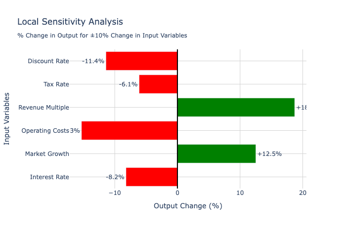
Local sensitivity analysis
Local sensitivity analysis examines how small changes around a base case affect outputs. This approach works well for understanding the immediate impact of minor variations in assumptions and provides insights into model behavior near expected values.
Best visualizations:
Local analysis focuses on small changes, so you need visualizations that clearly show relative sensitivity magnitudes and directions around a central point.
- Gradient/Slope Charts - Show the rate of change (derivative) around the base case
- Spider/Radar Charts - Multiple variables radiating from the center, showing sensitivity magnitude
- Bar Charts - Horizontal bars showing percentage change in output for ±X% change in each input
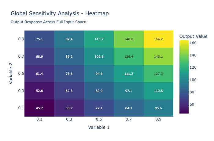
Global sensitivity analysis
Global sensitivity analysis explores how outputs vary across the entire range of possible input values. This method proves valuable when dealing with highly uncertain variables or when you need to understand model behavior under extreme conditions.
Best visualizations:
Global analysis covers wide ranges, so you need visualizations that can display behavior across entire input spaces and reveal non-linear relationships.
- Heatmaps - Show output values across the full range of input combinations
- 3D Surface Plots - For continuous variables, showing output landscape
- Contour Plots - 2D representation of 3D surfaces with level curves
- Parallel Coordinates - Show how outputs change across multiple input dimensions
One-way sensitivity analysis
One-way sensitivity analysis changes a single variable while holding others constant. Results are often displayed as tornado diagrams, where horizontal bars show the range of outcomes for each variable, arranged from most to least impactful.
Best visualizations:
Tornado diagrams are the gold standard because they instantly show which variables have the biggest impact and allow easy ranking by importance.
- Tornado Diagrams ⭐ (Most Popular) - Horizontal bars showing the output range for each variable
- Waterfall Charts - Show the cumulative impact of each variable change
- Line Plots - Output vs. single input variable (multiple lines for different variables)
Each bar in a tornado diagram shows the range of possible outcomes for your final result (in this case, Project NPV) based on the uncertainty of a single input variable. NPV is the acronym for Net Present Value.

Each full bar (red + green) gives you a quick visual summary of the total risk or opportunity associated with that single variable. The longer the total bar, the more that variable's uncertainty "swings" the outcome.
- The Center Line (at zero): This represents your base case or expected outcome, where all your input variables are at their most likely values. This is the break-even point of Net Present Value (NPV).
- The Negative Bar (in red): This shows the "unfavorable" impact. It answers the question, "How much worse will my NPV be if this specific variable changes to its worst-case scenario?" For example, if Variable Cost goes up, your NPV goes down.
- The Positive Bar (in green): This shows the "favorable" impact. It answers the question, "How much better will my NPV be if this variable changes to its best-case scenario?" For example, if Sales Volume is higher than expected, your NPV goes up.
Two-way sensitivity analysis
Two-way sensitivity analysis examines how simultaneous changes in two variables affect outcomes. This method uncovers interactions between variables that might not be apparent when changing them individually.
Best visualizations:
Two-way analysis needs to show interactions, so 2D grids (heatmaps) or 3D representations work best to reveal patterns and interactions.
- Heatmaps ⭐ (Most Effective) - Color intensity shows output values for Variable A × Variable B combinations
- Contour Plots - Lines of equal output values on X-Y grid
- 3D Surface Plots - Z-axis shows output, X-Y axes show the two input variables
- Bubble Charts - Size/color represents output, position shows two input variables

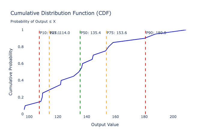
Probabilistic sensitivity analysis (Monte Carlo)
Probabilistic sensitivity analysis incorporates probability distributions for input variables rather than testing discrete values. This approach, often called a Monte Carlo simulation, runs thousands of iterations with randomly sampled input values to create probability distributions for outputs.
Best Visualizations:
Probabilistic analysis generates distributions, so you need visualizations that effectively communicate uncertainty, probability, and statistical relationships.
- Histograms/Probability Distributions ⭐ - Show output probability distribution
- Box Plots - Compare distributions across different scenarios
- Cumulative Distribution Functions (CDFs) - Show the probability of outcomes below any value
- Scatter Plot Matrices - Show correlations between inputs and outputs
- Sensitivity Indices Charts - Sobol indices showing first-order and total-order effects
Sensitivity analysis across industries
Finance professionals use sensitivity analysis finance applications for investment evaluation and risk assessment. When building discounted cash flow models, analysts test how changes in growth rates, discount rates, and profit margins affect valuations. This analysis helps investment committees understand the range of possible outcomes.
In capital budgeting, sensitivity analysis reveals which projects remain attractive under various economic scenarios. A manufacturing company considering a new facility might test how changes in raw material costs, labor rates, and demand levels affect the project's net present value.
Marketing teams optimize campaign performance using sensitivity analysis. By testing how changes in conversion rates, customer lifetime value, and acquisition costs affect return on investment, marketers identify critical success factors. E-commerce companies examine how different price points affect sales volume, revenue, and profit margins with Point of Sale (PoS) dashboards.
Supply chain managers employ sensitivity analysis to evaluate vendor relationships, inventory tracking policies, and logistics strategies. Understanding how disruptions affect overall costs and service levels helps companies build more resilient operations.
Sensitivity analysis vs scenario analysis
Sensitivity analysis vs scenario analysis represents a common analytical choice. Sensitivity analysis typically changes one or two variables at a time while keeping others constant, helping isolate individual variable impact and identify which factors drive the most variation.
Scenario analysis changes multiple variables simultaneously to create coherent, realistic scenarios. Instead of asking "what if demand increases by 15%," scenario analysis asks "what if we enter a recession," then adjusts multiple variables, including demand, pricing, costs, and financing availability.
The methods work best together. Sensitivity analysis helps identify critical variables for inclusion in scenario analysis, while scenario analysis provides a realistic context for interpreting sensitivity results.
How to do a sensitivity analysis
How to do a sensitivity analysis effectively requires a systematic approach and careful attention to variable selection. Start by identifying key input variables that are both uncertain and potentially impactful. Focus on variables where you have genuine uncertainty about future values and where changes could significantly affect decisions.
Define realistic ranges for testing based on historical data, expert judgment, and AI market research. Many analysts use ranges representing the 10th to 90th percentiles of expected values, though appropriate ranges depend on your specific context and risk tolerance.
Consider correlations between variables when designing an analysis. Economic downturns often bring simultaneous decreases in demand, increases in customer price sensitivity, and tighter credit markets. Ignoring these correlations can lead to unrealistic scenarios.
Document assumptions clearly and update them regularly as new information becomes available. Sensitivity analysis models require ongoing maintenance to remain relevant and accurate.
Building sensitivity analysis examples
A practical sensitivity analysis example might involve evaluating a new product launch. Key variables include development costs ($500,000 ± 20%), unit price ($50 ± $10), annual sales volume (10,000 ± 30%), and variable costs per unit ($20 ± $3).
Testing these ranges reveals that unit price and sales volume drive most of the variation in profitability, while development cost variations have a relatively minor impact on overall returns. This insight focuses management attention on pricing strategy and demand forecasting rather than cost control.
Another sensitivity analysis example from real estate investment might test how changes in rental rates, vacancy rates, maintenance costs, and interest rates affect property returns. The analysis might show that rental rate assumptions drive 60% of the variation in returns, while maintenance cost assumptions contribute only 10%.
Excel sensitivity analysis and modern alternatives
Sensitivity analysis in Excel has long served as the foundation for this type of analysis. Excel sensitivity-analysis capabilities include data tables, scenario manager, and goal seek functions that enable systematic testing of variable changes.
However, Excel sensitivity analysis faces limitations with large datasets and complex calculations. Modern Excel alternatives offer significant advantages in performance, visualization, and analytical capabilities.
Advanced spreadsheet environments such as Quadratic AI spreadsheet integrate programming languages like Python and SQL, can handle larger datasets and more complex calculations while maintaining familiar interfaces. These platforms excel at the computational demands of Monte Carlo simulation sensitivity analysis and other advanced techniques.
Sensitivity analysis formula and calculations
The basic sensitivity analysis formula calculates the percentage change in output divided by the percentage change in input:
Sensitivity = (% Change in Output) / (% Change in Input)
For elasticity analysis, the sensitivity analysis formula becomes:
Elasticity = (ΔY/Y) / (ΔX/X)
Where Y represents the output variable and X represents the input variable.
Monte Carlo simulation sensitivity analysis uses more complex formulas involving probability distributions and random sampling. Each iteration samples values from specified distributions and calculates resulting outputs, building probability distributions for results.
Advanced techniques and sensitivity analysis software
Modern sensitivity analysis software incorporates machine learning approaches like feature importance analysis and SHAP values to understand how different inputs contribute to model predictions. These methods work particularly well with complex, non-linear models.
SHAP stands for SHapley Additive exPlanations, a popular Python library and a powerful method for explaining machine-learning model predictions based on cooperative game theory. SHAP values explain how much each feature contributes to a specific prediction by treating features as "players" in a cooperative game. SHAP values show how each feature affects each final prediction, the significance of each feature compared to others, and the model's reliance on the interaction between features.
Key Properties:
- Additive: SHAP values of all the input features will always sum up to the difference between the baseline (expected) model output and the current model output for the prediction being explained.
- Fair Attribution: Each feature gets credit for its contribution across all possible combinations of other features.
- Model-Agnostic: SHAP values remain model-agnostic, making them universally applicable to various machine learning and deep learning models.
Implementation and best practices
Modern analytical platforms transform sensitivity analysis through AI-powered capabilities. Quadratic's AI image and PDF import features can pull data from various sources, reducing the manual work required for analysis setup. When testing how changes in market data, competitor pricing, or economic indicators affect your model, AI-powered data retrieval ensures current information.
Automated charting tools make it effortless to visualize sensitivity analysis results. Instead of manually creating tornado diagrams or sensitivity charts, you can generate professional visualizations in Quadratic with natural language commands.
Successful sensitivity analysis requires a systematic approach balancing thoroughness with practical constraints. Begin with a clear understanding of what decisions your analysis needs to support. Different decisions require different levels of detail and precision.
Establish regular schedules for updating sensitivity analysis as new data becomes available. Many organizations conduct comprehensive updates quarterly while monitoring key variables monthly.
Validate results against historical performance when possible. If your model suggests that a 15% increase in marketing spend should drive a 25% increase in customer acquisition, check whether similar relationships held true in past campaigns.
Focus on translating technical findings into business implications and actionable insights. The ultimate value lies not in technical execution but in how you interpret and apply insights to improve decision-making.
Conclusion
Sensitivity analysis represents one of the most practical tools for understanding and managing uncertainty in business decision-making. Whether evaluating investments with a cost benefit analysis template, developing pricing strategies, or planning operations, it helps you understand potential risks and opportunities.
Modern platforms make sophisticated sensitivity analysis more accessible than ever. AI-powered data import reduces time spent gathering data, while automated charting tools ease results communication. These advances democratize access to advanced analytical techniques.
The key to successful implementation lies in combining rigorous analytical techniques with practical business judgment. Focus on building models detailed enough to provide meaningful insights while remaining simple enough to understand and act upon. Start with simple models addressing your most pressing decisions, then gradually build more sophisticated capabilities as experience and needs grow.