
Table of contents
- Why standard tools struggle with weekly analysis
- Setting up your data for analysis
- Step 1: Cleaning and formatting timestamps with Python
- Step 2: Extracting week numbers (The core logic)
- Step 3: Aggregating metrics for the dashboard
- Visualizing the results
- Conclusion
- Use Quadratic to do weekly feedback analysis
Effective feedback analysis isn't just about understanding sentiment; it is about understanding velocity. Knowing that customers are unhappy about a specific feature is useful, but knowing that complaints spiked specifically on Tuesday following a software update is actionable, highlighting the importance of time series analysis. For data analysts and operations managers, the challenge often lies in connecting the "what" to the "when."
Most analysts struggle to track these trends over time because standard spreadsheet date functions are notoriously rigid. Trying to convert text-based timestamps into ISO week numbers using traditional formulas often results in errors or brittle reports that break when new data is pasted in. On the other hand, dedicated external customer feedback analysis tools often lock this data away in pre-set dashboards that don't allow for custom granular reporting.
The solution lies in meeting in the middle: using Python directly within your spreadsheet to clean timestamps, extract week numbers, and pipe aggregated data into a live report. By using Quadratic, you can build a dynamic dashboard that automates the weekly reporting grunt work, allowing you to focus on the insights rather than the data preparation.
Why standard tools struggle with weekly analysis
If you have ever tried to build a custom time-series report in a standard platform, you have likely encountered significant friction. While platforms like monday.com customer feedback analysis dashboards are excellent for tracking individual ticket status, they often lack the flexibility required for complex temporal grouping, reflecting common limitations of traditional BI tools. You might want to group reviews by "ISO Week," "Fiscal Month," or a custom rolling period, but standard tools usually force you into their predefined date buckets.
In traditional spreadsheets, the pain point is often the date conversion itself. Raw data exports often arrive with timestamps formatted as text strings. Converting these to usable date objects and then extracting a week number typically requires a chain of complex formulas. If the date format changes slightly in the next export, your formulas break.
This is where a customer feedback analysis tool that allows for custom Python scripting offers a distinct advantage. Python’s libraries are designed to handle messy time-series data efficiently, with Pandas' extensive capabilities for working with time series data being a prime example. By bringing that capability inside the spreadsheet grid, you gain the power of a data science workflow with the familiarity of a spreadsheet interface.
Setting up your data for analysis
To illustrate this workflow and help you get started with Python in Quadratic, let's look at a practical scenario. Imagine you are performing hotel feedback analysis or looking for tools for travel companies automate review feedback analysis machine learning. You have a CSV export containing thousands of guest reviews.
The raw dataset typically includes columns for the guest name, the timestamp of the review, the text of the feedback, and a numerical rating. In a standard workflow, you might import this CSV into a sheet and immediately start struggling with the timestamp column, which might look like "2023-10-25 14:30:00 UTC."
In Quadratic, you can ingest this data directly via a CSV upload or a connection to a database. Once the data is in the grid, it acts as your raw source. You won't need to touch this raw data manually again; instead, you will write a Python script in a separate cell to reference, clean, and aggregate it automatically.
Step 1: Cleaning and formatting timestamps with Python
The first step in any robust analysis pipeline is data hygiene. In many enterprise scenarios, analysts look for customer feedback analysis tools with taxonomy management to help organize categories, but before you can categorize, you must ensure your timeline is accurate.
In Quadratic, you can use Python to reference your raw data cells and clean them instantly. Instead of writing a formula for every row, you write one script that handles the entire column. Using the pandas library, you can convert string columns into proper datetime objects in a single line of code.
For example, you can create a dataframe from your raw cells and tell Python to interpret the "Date" column as actual dates. This is superior to spreadsheet formulas because Python is exceptionally good at inferring date formats, handling different separators, and managing timezone offsets without requiring complex syntax adjustments.
Step 2: Extracting week numbers (The core logic)
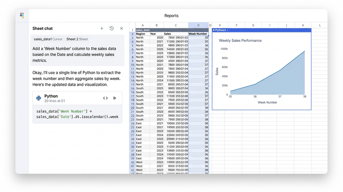
Once your dates are recognized as time objects, the next step is grouping them. This addresses the specific use case of dynamic week number extraction, which is often the hardest part of building a weekly tracker in Excel.
In Python, extracting a week number is a standardized operation. You can create a new column in your dataframe specifically for the week number using a command like df['week_num'] = df['date'].dt.isocalendar().week, which leverages the official dt.isocalendar() method.
This single line of code replaces what would otherwise be a messy nested IF or ISOWEEKNUM formula copied down thousands of rows. The critical differentiator here is that this Python script runs directly in the sheet. If you paste new feedback data into your raw source columns next week, the script automatically re-runs, extracts the new week numbers, and updates your dataset instantly. You are not just analyzing data; you are building a reusable data pipeline.
Step 3: Aggregating metrics for the dashboard
With your data cleaned and week numbers assigned, you can now move from raw rows to a summary view. The goal is to output a clean table that shows the count of reviews and the average rating for each week.
Using a groupby operation in Python, you can split your data by the "week_num" column you just created and calculate your metrics. You might count the number of reviews to measure volume and average the "Rating" column to measure sentiment.
If you are looking to learn Python for data analysis, this is where modern customer feedback analysis tools with AI copilot features become incredibly valuable. In Quadratic, you can ask the integrated AI to "group this data by week and calculate the average rating," and it will generate the necessary aggregation code for you.
Finally, you can output this aggregated dataframe to a specific range in your "Report Sheet." This creates a clean, summarized table that updates automatically whenever the raw data changes.
Visualizing the results
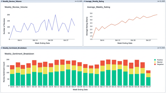
The loop is closed when you visualize the data. Your Python script has transformed thousands of messy rows into a neat summary table organized by week. You can now use this output to power a dashboard.
Because the data is living in the spreadsheet grid, you can easily link it to a line chart to visualize trends in review volume or use conditional formatting to highlight weeks where the average rating dipped below a certain threshold.
This approach differs significantly from standard data science program reviews or tutorials that teach you to analyze data in a Jupyter notebook. In those environments, the data is trapped in the developer's tool. In Quadratic, the analysis lives in a spreadsheet that can be shared with stakeholders, operations managers, and non-technical team members who need to see the results immediately, not the code behind them.
Summary of the workflow
1. Ingest raw feedback: Import your CSV or database query containing timestamps and reviews.
2. Python script cleans dates: Use Pandas to convert text strings into datetime objects.
3. Extract and aggregate: Calculate week numbers and group data to find counts and averages.
4. Dashboard updates: The summarized data populates charts and tables that refresh automatically when new data is added.
Conclusion
By moving your feedback analysis into a Python-enabled spreadsheet, you transition from static, manual reporting to a dynamic, automated workflow. You no longer need to fight with brittle date formulas or export data to third-party tools just to see a weekly trend line.
Effective customer feedback analysis requires the right tools—ones that are flexible enough to handle the nuances of real-world data. If you are tired of manually updating weekly reports, try building this tracker in Quadratic to experience the power of a coding spreadsheet with Python running directly inside.
Use Quadratic to do weekly feedback analysis
- Automate weekly feedback reports: Automatically process new feedback data, clean timestamps, and refresh your weekly analysis without manual updates.
- Effortlessly clean and standardize timestamps: Use Python to convert messy text-based timestamps into usable date objects and extract ISO week numbers with robust, error-free code.
- Create dynamic, custom feedback dashboards: Aggregate review counts and average ratings by specific weekly periods directly in your spreadsheet grid, bypassing rigid predefined dashboards.
- Connect feedback to precise time trends: Quickly identify spikes in complaints or changes in sentiment by linking feedback to exact weekly occurrences, enabling timely, data-driven actions.
- Leverage Python for powerful, in-spreadsheet data processing: Utilize Pandas to efficiently clean, transform, and aggregate large feedback datasets, streamlining complex analytical tasks.
Stop fighting with manual updates and start getting insights faster. Try Quadratic.