
Cole Stark, Head of Growth
Feb 12, 2026

Table of contents
- What you’ll build
- Before you start
- Step 1: Discover your top events
- Step 2: Find which properties you can segment by
- Step 3: Pick your funnel events (and a breakdown property), then auto-build the dashboard
- Step 4: If the dashboard didn’t get created automatically (fallback)
- Step 5: Time-to-activate, segmented correctly
- Step 6: Retention curve (12 weeks)
- Step 7: Retention heatmap by your signup breakdown property
- Step 8: “What changed?” weekly exec summary
- Step 9: Anomaly detection (simple, useful, fast)
- Prompt 10: Add a date range selector + clean dashboard layout into a grid
- Troubleshooting (quick fixes)
- Conclusion
If you’ve ever tried to turn Mixpanel data into a clean weekly report, or found yourself debating Mixpanel vs Google Analytics for your tech stack, you know the routine: export → clean → pivot → rebuild charts → repeat. Or, you just try to make due with built-in dashboards in Mixpanel that don’t give you the full details of your user base.
This post shows a faster workflow: connect Mixpanel to Quadratic, then use a small set of prompts to generate a complete Mixpanel funnel report dashboard (funnel metrics + trends + charts) in minutes. This workflow builds off your event schema so that it works right away without template customization.
What you’ll build
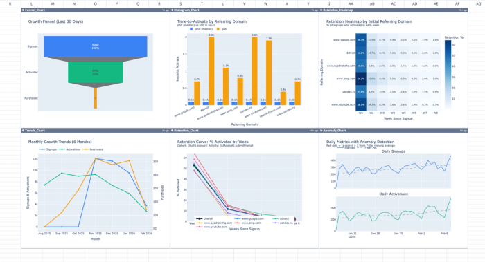
By the end, you’ll have a shareable Mixpanel dashboard built on your live data that includes:
- A full-funnel view (Signup → Activation → Conversion) with counts and conversion rates at every step
- A drop-off visualization so you can instantly see where users fall out
- 6-month trend charts for signups, activations, and conversions to spot momentum (or regression) over time
- Time-to-activate analysis (p50/p75/p90 + histogram) to diagnose onboarding friction
- Retention reporting (12-week curve + segmented heatmap) to understand quality, not just volume
- A ready-to-send summary (key takeaways + winners/losers) you can paste into Slack for weekly updates
Before you start
- You’ll need access to your Mixpanel project
- You’ll need to connect your Mixpanel project to Quadratic
- Start a new file, and select your Mixpanel connection in the AI chat
- Keep everything in one Quadratic chat thread so the AI assistant remembers your chosen events
Step 1: Discover your top events
What this prompt does: Pulls your top Mixpanel events so we can pick funnel steps from real data (no guessing).
Why it matters: Every Mixpanel project names events differently. This step prevents the dashboard from being built on the wrong events.
What you’ll get:
- Top events table (unique users + volume)
- Top 10 bar chart
Paste this prompt into Quadratic (or click here):
Using my Mixpanel connection, pull the top 30 events in the last 30 days.
Return a table with: event name, total event count, unique users, and % of total events.
Sort by unique users descending.
Then create a bar chart of the top 10 events by unique users.
Step 2: Find which properties you can segment by
What this prompt does: Scans your Mixpanel data to surface the most common event/user properties you can use for breakdowns (UTMs, referrer, device, plan, country, etc.).
Why it matters: A funnel is only actionable when you can segment it. This step tells you what “levers” you actually have available for attribution and quality analysis.
What you’ll get:
- A table of candidate breakdown properties
- Example values for each property (so you can recognize what’s useful)
- (Optional) Whether each property is event-level or user-level
Paste this prompt:
For the top 10 events from the previous table, list the most common event properties and user properties available for breakdown (e.g., utm_source, initial_referrer, campaign, referring_domain, device, country, plan).
Output a short table: property name, property type (event/user if available), and example values.
If property types aren’t available, just list the property names and 3 sample values.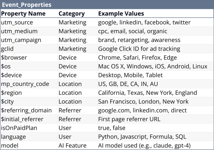
Step 3: Pick your funnel events (and a breakdown property), then auto-build the dashboard
What this prompt does: Helps you choose the right Signup/Activation/Conversion events and ensures your chosen breakdown property is actually present on the Signup event. Then auto-creates the full Growth Dashboard.
Why it matters: The most common Mixpanel mistake is choosing a Signup event that doesn’t carry the acquisition properties you want (UTMs/referrer/device). This step prevents dead-end segmentation before you commit.
What you’ll get:
- Recommended event options for each funnel step (A/B/C)
- Compatibility check for breakdown properties on Signup events (with distinct value counts)
- A fully built “Growth Dashboard” sheet (funnel table + chart + 6-month trends + takeaways)
Paste this prompt:
Using my Mixpanel connection, I want to build a standard growth dashboard.

Step 1: Pull the top 30 events in the last 30 days with unique users.

Step 2: Propose 3 candidate events for each funnel step and label them A/B/C:
- Signup (account created)
- Activation (first key value action)
- Conversion (purchase/upgrade/lead) — include “None” if not applicable
For each candidate, show last-30-day unique users.

Step 3: For each Signup candidate (A/B/C), list which of the breakdown properties are present on that event and show distinct value counts.

Step 4: Ask me to reply in exactly this format and WAIT (do not proceed until I respond):
- Signup: A
- Activation: B
- Conversion: C (or None)
- Breakdown property (must exist on the Signup event): <property_name>

Step 5: After I reply, validate the breakdown property exists on the selected Signup event and has at least 3 meaningful values.
If it fails, recommend the best alternative breakdown property for that Signup event and ask me to confirm.

Then automatically create a new sheet called “Growth Dashboard” that includes:
- Funnel metrics table (counts + conversion rates)
- Funnel chart
- Monthly trends table for the last 6 months (signups/activations/conversions)
- Trends line chart
- 5 bullet takeaways (biggest drop-off, biggest trend, and what to investigate)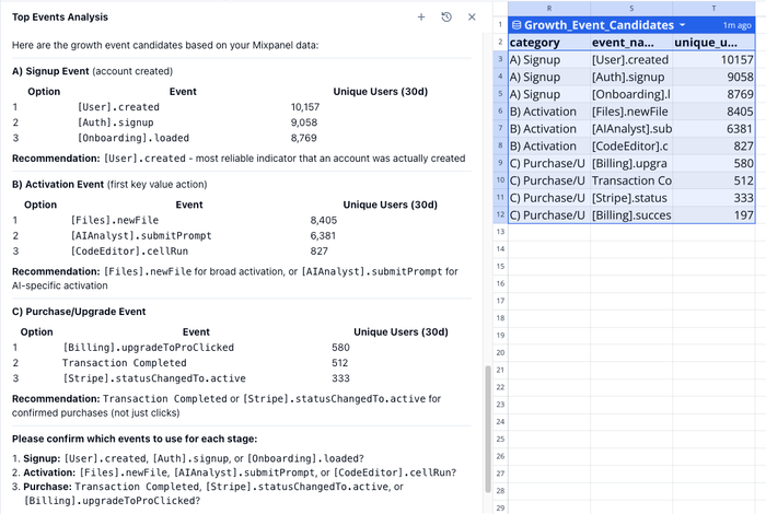
Step 4: If the dashboard didn’t get created automatically (fallback)
What this prompt does: Forces creation of the Mixpanel dashboard using the events you already selected in this chat.
Why it matters: Sometimes the assistant stops after confirming your choices; this ensures you still end up with the finished dashboard without redoing event selection.
What you’ll get:
- A “Growth Dashboard” sheet with funnel metrics + funnel chart
- 6-month trends table + line chart
- Bullet takeaways (or the exact outputs you requested)
Paste this prompt:
Use the previously selected Signup / Activation / Conversion events from this chat.
Create a new sheet called “Growth Dashboard” with:
- Funnel metrics table for the last 30 days (counts + step conversion rates)
- Funnel chart
- Monthly trends table for the last 6 months (signups/activations/conversions)
- Line chart of those trends
- 5 bullet takeaways

If the Conversion event was set to None, build the dashboard with just Signup → Activation.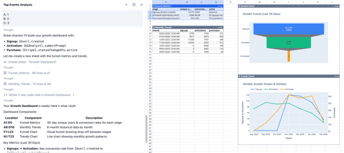
Step 5: Time-to-activate, segmented correctly
What this prompt does: Measures how long it takes users to go from Signup → Activation (p50/p75/p90 + histogram), and segments results using a property tied to the Signup event.
Why it matters: Time-to-activate is one of the best “onboarding health” signals—but segmentation only works if the breakdown property exists at the moment users enter the funnel (Signup).
What you’ll get:
- Time-to-activate percentiles (p50/p75/p90) overall
- Histogram of time-to-activate
- Segment-level time-to-activate for the top signup segments
- Automatic fallback suggestions if the breakdown property is missing/sparse on Signup
Paste this prompt:
Using the same Mixpanel connection and the previously selected funnel events:
Build a time-to-activate analysis (Signup → Activation) for the last 30 days.

Important: Any breakdown must be based on a property that exists on the Signup event (not the Activation event).

First, confirm the chosen breakdown property exists on the Signup event by showing:
- distinct value count
- top 8 values by signup count
- share of signups for each value

If the breakdown property is missing or has fewer than 3 meaningful values on the Signup event, automatically fall back (and tell me) to the best available Signup-event property, and provide other Signup events that have valuable breakdown properties I can choose from.

Then compute and chart:
- p50/p75/p90 time-to-activate overall
- the same percentiles for the top 8 signup segments
- histogram of time-to-activate overall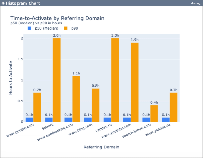
Step 6: Retention curve (12 weeks)
What this prompt does: Builds a 12-week retention view using Signup as the cohort definition and Activation (or “any event”) as the return behavior.
Why it matters: Funnels tell you conversion; retention tells you whether you’re attracting users who stick. This is the backbone of weekly product reporting.
What you’ll get:
- Cohort size by signup week
- Retention rates for W1/W2/W4/W8/W12
- A retention curve line chart
- Bullet takeaways summarizing the retention trend
Paste this prompt:
Create a weekly retention report for the last 12 weeks.
Cohort = users who performed the selected Signup event.
Returning activity = the selected Activation event (if too strict, ask whether to use “any event” instead).

Output:
- cohort size by signup week
- retention rates for week 1, 2, 4, 8, 12
- a line chart of retention by week number
- 3 bullet takeaways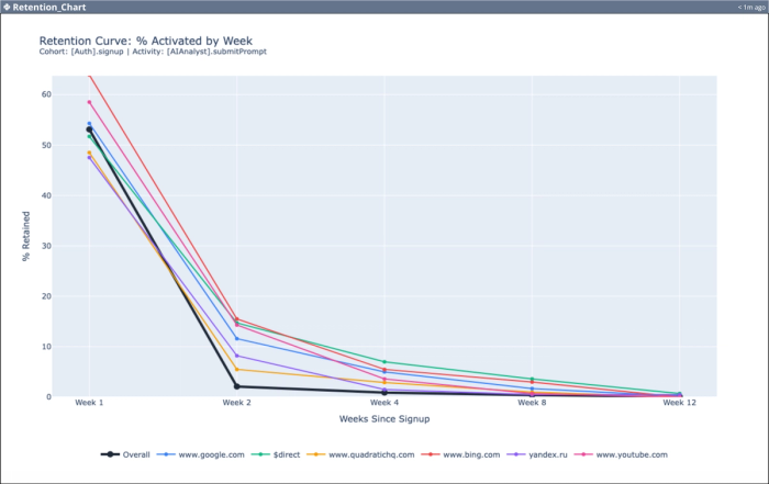
Step 7: Retention heatmap by your signup breakdown property
What this prompt does: Creates a retention heatmap segmented by your selected breakdown property (e.g., utm_medium, referrer, device), using cohorts defined by Signup.
Why it matters: Overall retention hides channel quality, making it difficult to analyze quality vs quantity traffic. This step answers “which acquisition sources or segments retain best?”
What you’ll get:
- Retention heatmap (top segments × weeks)
- Ranked segment table with cohort size, W1 retention, W4 retention
- A quick “best vs worst segment” comparison you can act on
Paste this prompt:
Build a retention heatmap for the last 12 weeks segmented by the breakdown property we selected earlier (tied to the Signup event):
- rows = top 10 segment values by cohort size
- columns = week number (1–8)
- cells = retention %

Also output a ranked table showing cohort size, W1 retention, and W4 retention.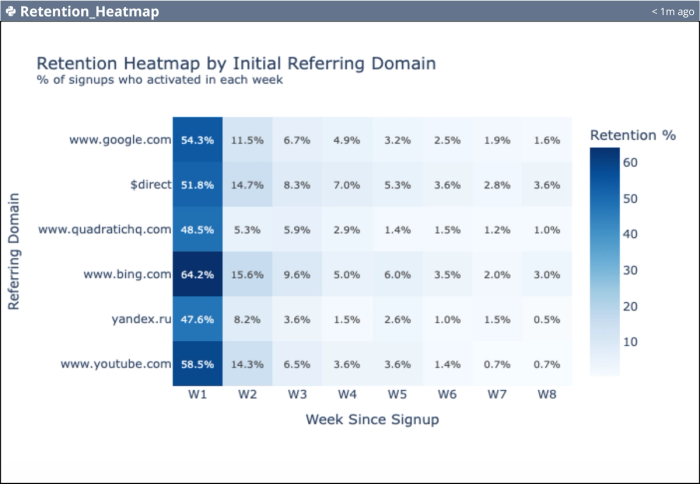
Step 8: “What changed?” weekly exec summary
What this prompt does: Produces a week-over-week comparison for signups, activations, activation rate, and conversions (if available), both overall and broken down by your signup-level property.
Why it matters: This is the fastest way to answer the weekly question: “What moved, and why?” without digging through charts manually.
What you’ll get:
- Overall and segmented delta tables (absolute + % change)
- Winners/losers list (top gainers/decliners)
- Plain-English bullet takeaways for reporting
Paste this prompt:
Compare last 7 days vs previous 7 days for:
- Signups (unique users)
- Activations (unique users)
- Activation rate (activations/signups)
- Conversions if Conversion event exists; otherwise skip

Break down by the selected breakdown property (tied to Signup event) for the top 8 values.
Compute absolute change and % change.

Output:
- an overall summary table + segmented summary table
- top 3 gainers and decliners by activation rate and signups
- 5 bullet takeaways written in plain English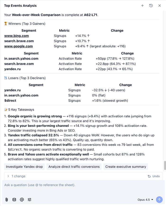
Step 9: Anomaly detection (simple, useful, fast)
What this prompt does: Flags unusually high/low days for Signups and Activations using a rolling baseline, and attributes spikes/drops to the most likely segment driver when possible.
Why it matters: Instead of noticing problems days later (or blaming the wrong thing), you can catch tracking issues, bot spikes, campaign effects, or onboarding breaks immediately.
What you’ll get:
- Time series chart with anomaly days highlighted
- Table of flagged dates (expected vs actual + likely driver segment)
- Short takeaways describing what changed and where to investigate
Paste this prompt:
Detect anomalies in daily Signups and Activations over the last 30 days.
Use a 7-day moving average baseline and flag days where the metric deviates significantly.

If possible, attribute flagged days to the segment values of the breakdown property (tied to Signup event), showing which segment contributed most.

Output:
- time series chart with anomalies highlighted
- a table listing flagged dates, metric, expected vs actual, and likely driver segment
- 3 bullet takeaways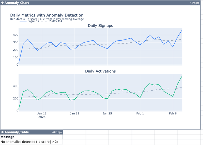
Prompt 10: Add a date range selector + clean dashboard layout into a grid
What this prompt does: Adds dashboard controls (Last 7/30/90 + custom dates) and repositions tables/charts into a clean, aligned layout.
Why it matters: It turns your dashboard from a one-off into something you can reuse weekly—change the dates and everything updates.
What you’ll get:
- A “Controls” area with presets + start/end dates
- All tables/charts filtered to the selected range
- A tidy, shareable dashboard grid (no overlaps)
Paste this prompt:
Finalize this Growth Dashboard so it’s clean, readable, and reusable.

1) Add a date range selector at the top of the dashboard:
- Include preset options: Last 7 Days, Last 30 Days, Last 90 Days, and Custom.
- For Custom, add Start Date and End Date inputs.
- Store the chosen Start Date and End Date in clearly labeled cells in a "Controls" area.

2) Update the existing Mixpanel queries / tables / Python calculations used in this dashboard so they all respect the selected Start Date and End Date.
- If any table/query is currently hardcoded to “last 30 days,” replace it with the selected date range.
- If something cannot be parameterized, tell me exactly which table/chart and propose the closest workaround.

3) Clean up the dashboard layout into a simple grid:
- Move tables and charts so nothing overlaps and spacing is consistent.
- Align everything to cell boundaries and standardize chart sizes.
- Use a layout like:
  - Row 1: Controls
  - Row 2: Funnel table + Funnel chart
  - Row 3: Trends table + Trends chart
  - Row 4: Retention chart + Retention heatmap (if present)

4) Final polish:
- Add clear chart titles and axis labels.
- If any table has too many rows, limit to top N (e.g., top 10 segments) and group the rest into “Other.”
- When finished, give me a short checklist of what you changed (controls added, which queries updated, and layout adjustments).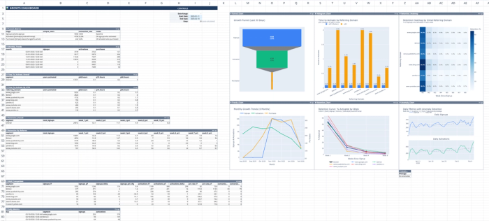
Troubleshooting (quick fixes)
My breakdown property isn’t available on Signup → Re-run Step 3 and choose a different Signup event that carries UTMs/referrer/device, or pick a different breakdown property that exists on that Signup event.
Only one breakdown value shows up → Use the automatic fallback in Step 5 (it will switch to a better property like utm_medium or referrer if needed).
Retention is empty → Your Activation event may be too strict. Use “any event” as the return condition and compare both.
Conclusion
At this point you’ve got something most teams never quite achieve with Mixpanel: a repeatable reporting workflow instead of a one-off Mixpanel dashboard.
You started by discovering your event schema, picked funnel steps that actually support segmentation, and then used those same choices to generate a Growth Dashboard with funnel performance, trends, activation speed, retention, and “what changed” insights. The best part is that none of this depends on exporting CSVs or rebuilding charts from scratch. Once the connection is in place, you can rerun the same flow any week (or change the date range) and get a fresh readout in minutes.
If you want to take it further, here are three easy extensions:
- Add your North Star event as the conversion step (or a second activation milestone)
- Segment by a different signup-level property (utm_medium, device, plan) to identify quality cohorts
- Turn the weekly comparison + anomaly steps into a lightweight monitoring routine
If you build a dashboard you’re proud of, share a screenshot on socials and tag us. We’d love to see what you create and we’ll feature the best ones.