James Amoo, Community Partner
Nov 24, 2025

Imagine it’s the year 2010. You and your team are deep in a data analysis project. Collaboration appears very different, as every analyst works on their own copy of an Excel file, sending and receiving numerous versions via email or shared drives. Filenames like “Final_v3_Updated_Last.xlsx” fill your folders, and you spend more time merging spreadsheets than generating insights.
While this approach got the job done, it came with challenges such as version confusion, data inconsistencies, a lack of real-time collaboration, and long turnaround times before any meaningful insights could be delivered. Each update meant another round of emails, another round of manual consolidation, and another delay in decision-making.
Fast forward to 2025, and the landscape has changed significantly. Teams no longer have to juggle multiple Excel versions or wait days for updated reports. The rise of collaborative analytics platforms has revolutionized how analysts work together. These platforms make it easier to analyze, visualize, and collaborate on data from any location.
In this blog post, we’ll explore the best platforms for collaborative analytics. We’ll highlight their unique features and ideal use cases, helping you determine which one best fits your team’s workflow.
1. Quadratic AI: The AI Spreadsheet
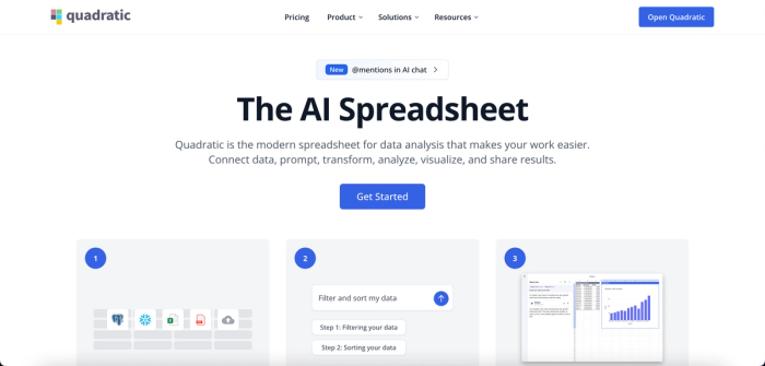
Quadratic is an AI-powered collaborative analytics platform built to simplify how teams analyze, visualize, and share data. Designed for the modern data-driven workplace, Quadratic enables users to collaborate on data in real time, connect directly to live databases, and generate insights instantly.
Quadratic allows multiple users to edit datasets, build visualizations, or refine analyses simultaneously, eliminating the version control issues that often plague traditional workflows. Its intuitive interface makes it accessible to non-technical users, technical users, and citizen developers. New team members can easily jump into existing workbooks and generate insights without facing steep learning curves or complex onboarding processes.
Unlike many analytics tools that require switching between multiple tools for data access, analysis, and visualization, Quadratic offers a comprehensive, all-in-one environment. Users can analyze, visualize, and share insights from their data, all without leaving the platform. By promoting data democratization and self-service analytics, Quadratic ensures that every member of the organization can participate meaningfully in the data conversation.
Let’s explore some of the key features of Quadratic:
Features of Quadratic
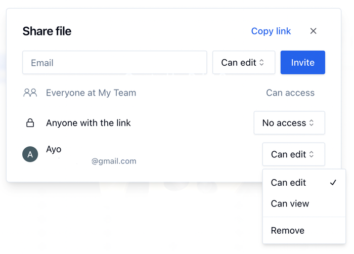
- Collaboration: Quadratic offers a collaborative environment where teams can work together on data projects in real time. Users can easily invite teammates for collaborative analysis on existing datasets. It also offers flexibility in controlling access levels, choosing whether collaborators can simply view the data or also make edits. Here:
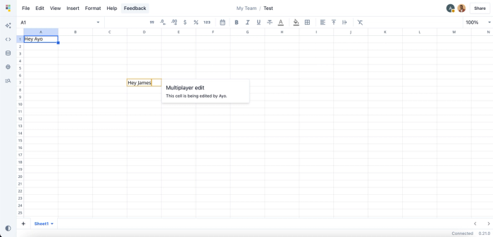
When collaborators are added, they can immediately begin to explore the data and generate insights. Here’s an example of Quadratic’s real-time collaboration feature:
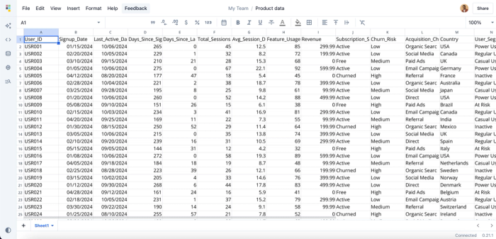
- AI assistance: Being an AI tool for data analysis, Quadratic allows users to generate insights by simply asking questions. Instead of writing complex queries or formulas, users can ask questions in natural language. For example, “Which region had the highest revenue growth last quarter?” Quadratic’s AI interprets the request, runs the appropriate analysis instantly. Let’s see how this works. First, I load a sample product data into Quadratic:
From this data, I can get insights into active and inactive users. So I ask Quadratic AI to “Identify users with low or no recent activity”. Here’s the result:
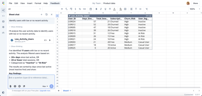
Quadratic AI instantly filters out users with low activity, just like we asked. No need for figuring out the logic or writing long lines of code, Quadratic does all the hard work. You can generate several insights from your data by using simple text prompts.
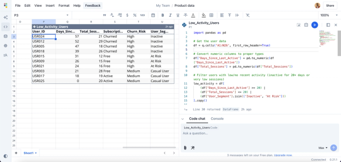
- Native support for modern programming languages: Quadratic also stands out as an IDE for data analysis, providing a coding spreadsheet environment where users can write and execute their code. It offers native support for Python, SQL, and traditional formulas. Here’s the code equivalent of the AI-assisted analysis we conducted earlier:
- Data visualization: Sometimes, filtered tables and raw numbers aren’t enough to clearly communicate insights to stakeholders. That’s where data visualization software tools become essential. With Quadratic, you can instantly transform your spreadsheet data into interactive visualizations using simple text prompts. This makes it easier to highlight trends and tell compelling data stories. Let’s generate a visualization of the analysis we conducted earlier:
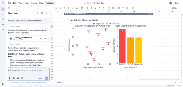
Here, I ask Quadratic to generate a visualization of our data for better communication. It instantly creates a scatter plot (left side) showing the relationship between user activity and user sessions and a bar chart (right side) that represents the user segment. You can generate many visualizations based on your data.
- Templates: Quadratic offers a range of customizable templates designed to help you and your team generate insights faster. Simply select a template, add your data, and invite your teammates to collaborate. Within minutes, you can begin exploring trends and making data-driven decisions together, all in one shared workspace.
- Multiple data sources: Quadratic connects directly to multiple databases, APIs, and raw data. Simply import your data, and you and your teammates can start analyzing it instantly.
2. Power BI
Developed by Microsoft, Power BI is a collaborative data analytics and business intelligence platform that enables users to easily analyze, visualize, and share data. With its extensive library of pre-built connectors, Power BI integrates seamlessly with tools in the Microsoft ecosystem, such as Excel, SQL Server, Azure services, and many others.
While Power BI is powerful and feature-rich, its advanced capabilities can sometimes create a steep learning curve for teammates who don’t have technical expertise, slowing down collaboration for less experienced users.
Features of Power BI
- AI assistance: Users can use Copilot to identify trends, generate summaries, and automatically get insights on their data.
- Multiple data sources: Power BI connects to various data sources, including databases, spreadsheets, and cloud services. This allows users to easily access their data.
- Data visualization: Power BI provides a drag-and-drop interface that allows users to easily create interactive visualizations and reports. Users can also customize the appearance of the charts created to suit their preferences.
- Power Query Editor: It comes with a Power Query Editor that allows users to perform several data preparation techniques, including cleaning, shaping, and transformation.
3. Tableau
Tableau is a leading data visualization and collaborative data analysis tool that helps to turn raw data into interactive visualizations and dashboards. Tableau enables collaboration with team members on a shared virtual dashboard. This dashboard then allows users to create reports, comment on analyses, and generate insights together.
Features of Tableau
- Collaboration: Users can collaborate seamlessly via Tableau Server, Tableau Online, or Tableau Public.
- AI insights: With Tableau’s AI features, such as Ask Data and Explain Data, users can generate summaries and insights from their data using natural language queries.
- Interactive dashboards: Tableau streamlines the creation of interactive dashboards, aiding seamless data exploration. It supports different chart types, including bar charts, graphs, and maps.
- Ease of use: Compared to Power BI, Tableau has a friendlier interface, enabling users of all skill sets to achieve their desired results easily.
4. Looker Studio
Looker Studio (formerly Google Data Studio) is a user-friendly collaborative tool that helps teams create shareable dashboards seamlessly. It provides features that ease data exploration, analysis, and visualizations. Looker Studio’s intuitive interface allows technical and non-technical users to create and share interactive visualizations with ease.
Features of Looker Studio
- Collaboration: Users can share dashboards, reports, and visualizations with other members in a shared organization workspace. Looker is also cloud-based, which means teams can access their dashboards from anywhere.
- Native integration with Google Products: Looker natively integrates with Google products such as Google Analytics, Google Sheets, and BigQuery.
- Customizable dashboards: Looker offers a drag-and-drop interface for creating and customizing dashboards.
- Extensive visualizations: Looker provides a wide variety of visualization options, including charts, pivot tables, and heatmaps.
5. Qlik Sense
Qlik Sense is a collaborative analytics and business intelligence tool that offers a platform for data exploration, analysis, and visualization.
Powered by its unique associative engine, it helps users easily uncover hidden patterns and relationships that other tools often overlook. Instead of relying on fixed drill paths or predefined filters, Qlik Sense lets users explore data dynamically. It also supports real-time collaboration, enabling teams to share dashboards, export reports, and work together to generate insights.
Features of Qlik Sense
- Associative model: Its associative engine automatically identifies relationships across all data sources. This allows users to explore data without predefined drill paths or hierarchical structures.
- Multiple data sources: Qlik Sense connects to multiple databases, spreadsheets, and web services.
- Collaboration: Qlik Sense provides a shared dashboard that allows users to share apps and insights in real time.
- Data visualization: Qlik Sense offers a drag-and-drop tool that allows users to create a wide range of visualizations and chart types.
Conclusion
If you and your team can’t collaborate seamlessly on files or share insights instantly, you’re unintentionally slowing down your organization. Collaborative analytics platforms create the foundation for a truly data-driven culture, one where everyone stays aligned and manual work is significantly reduced.
In this blog post, we explored the top five collaborative analytics tools for teams, highlighting their unique features and how each one empowers teams to generate insights efficiently and share them effortlessly.