
MJ Lindeman, PhD, Community Partner
Nov 12, 2025

Your company keeps related data in different systems. You have users identified in the product database, revenue transactions in Stripe, and campaign performance in the marketing platform. Each system tells part of the business story, but understanding customer lifetime value, campaign ROI, or which features drive conversions requires seeing all three together. That's where data blending comes in. It connects data from separate sources that were not designed to work together.
What data blending is and why you need it
Data blending uses shared identifiers such as user IDs or email addresses to relate datasets from different sources. You can then analyze the data as one dataset because blending combines the data without physically merging the datasets. This differs from joins that create a single merged table or unions that stack rows vertically. When you blend data, each source stays independent while you analyze them as one dataset.
Your CRM holds customer information. Your product analytics platform tracks feature usage. Your payment processor stores transactions. Your marketing automation captures campaign performance. Each system optimizes for its purpose, creating boundaries that make cross-system analysis difficult.
These boundaries make it difficult to answer questions that span multiple systems. For example, which marketing campaigns generate customers that yield the largest ROI? Answering this question requires connecting campaign data with product usage and revenue. Or which product features correlate with subscription renewals? You need user behavior blended with payment status. Single-source analysis cannot answer these types of questions.
Traditional approaches involve exporting data from each source and manually combining data in spreadsheets. The process breaks when the underlying data changes, and you must start over for each question. Sophisticated teams build data warehouses, but that requires engineering resources. It also creates delays between when events occur and when they become available for analysis.
Why traditional BI tools make data blending rigid
Traditional business intelligence (BI) platforms like Tableau attempt to solve cross-source analysis through data blending features. However, they impose rigid constraints that limit what questions you can answer.
According to Tableau's documentation, data blending in Tableau "brings in additional information from a secondary data source and displays it with data from the primary data source." The first field you drag to a worksheet determines the primary data source, and all other sources become secondary. This matters because Tableau only supports left-join semantics. Consequently, all rows from the primary source appear, but only matching rows from secondary sources are included.
What if you want to see all rows from both sources? You cannot access row-level detail from secondary data because data blending in Tableau cannot do full outer joins. The documentation acknowledges you must "rebuild the view" by starting your analysis over with different sources designated as primary. All fields from secondary sources must be aggregated. If your product data is primary, then you only get aggregated transaction totals.
Tableau handles this by displaying an asterisk when "there are multiple values in the secondary data source for this mark in the view." The asterisk indicates that the actual values are aggregated. The suggested fix is adding fields with higher granularity or rebuilding with sources swapped. Unfortunately, either option forces you to rethink your analytical approach to fit the tool's constraints rather than addressing your actual question.
Because each worksheet defines its own blend relationships, you must reconfigure how sources connect when you move between analytical views. There's no global relationship definition, which requires you to repeat the same blend setup multiple times and manually maintain consistency.
How Quadratic solves data blending with AI
In contrast, Quadratic eliminates these constraints through natural language prompts to the embedded AI. You just describe what you want with conversational BI instead of configuring relationships through dialog boxes. The AI interprets your intent, generates the code, and executes the analysis. The code appears in your spreadsheet as visible and editable code that you do not have to write.
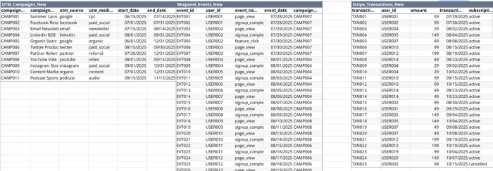
Quadratic blends the data by bringing in each dataset as a separate table on the same sheet (Figure 1). The data can be loaded by direct connection to their sources. This example blends the three types of very different data sources shown in Figure 1: UTM marketing data, Mixpanel events, and Stripe transactions.
There is no primary-secondary designation for the sources. No rule that the first field determines the structure. No rebuilding when your question changes. Quadratic AI understands and adjusts how the fields in the different sources are blended to match your request. Combine data using inner join semantics one moment and left join the next.
Quadratic makes data blending easy to do. Rather than learning whether you need a left join, right join, or inner join, you tell the AI the outcome you want. "Show me all customers with their purchase history, including customers who haven't purchased yet" automatically becomes the correct join. Your request to "Show me every transaction, even if the customer record is missing" automatically becomes a different join. The AI handles implementation, while you focus on defining what you want.
Quadratic natively integrates Python, SQL, and JavaScript alongside spreadsheet formulas. When you combine data from a database and an API, Quadratic AI might generate a SQL query for the database, a JavaScript fetch for the API, and Python code to merge results. All of this can happen automatically, with code visible in different cells and data flowing between them.
Connections to databases and data warehouses like PostgreSQL, MySQL, and Snowflake are native, meaning Quadratic queries millions of rows directly without exports. The architecture built on Rust, WebAssembly, and WebGL provides performance that handles large datasets smoothly in the browser.
Getting started with data blending in Quadratic
To start data blending in Quadratic, connect to your data sources first. Quadratic supports direct database connections plus CSV/Parquet/Excel/PDF uploads and API integrations. Use Quadratic’s live connections to your database sources and never have to export and paste from those databases again.
After they are connected, your data can be analyzed using natural language. If you ask the Quadratic AI to choose the analysis that gives you what you want, it can define and generate the analysis automatically. If you already know the analysis you want done, just specify that in the prompt.
This example demonstrates how to connect three separate data sources to understand which marketing channels drive the most valuable customers. By joining UTM campaign data, user behavior events, and transaction records, we can answer critical questions about marketing effectiveness. This type of multi-source analysis enables data-driven decisions about where to allocate marketing budget for maximum profitability.
What this analysis shows:
The four tables in the Source Medium Analysis sheet (Figure 2) break down marketing performance by both traffic source (Twitter, LinkedIn, Partner, etc.) and medium (paid_social, referral, video, etc.), revealing:
- Revenue & Conversion Metrics: Which source/medium combinations drive the most revenue, and which have the highest signup-to-customer conversion rates
- Paid vs Organic Performance: A comparison showing that while paid channels drive higher volume (17 signups, $1,970 revenue), organic referral traffic converts at a higher rate (66.7% vs 47.1%)
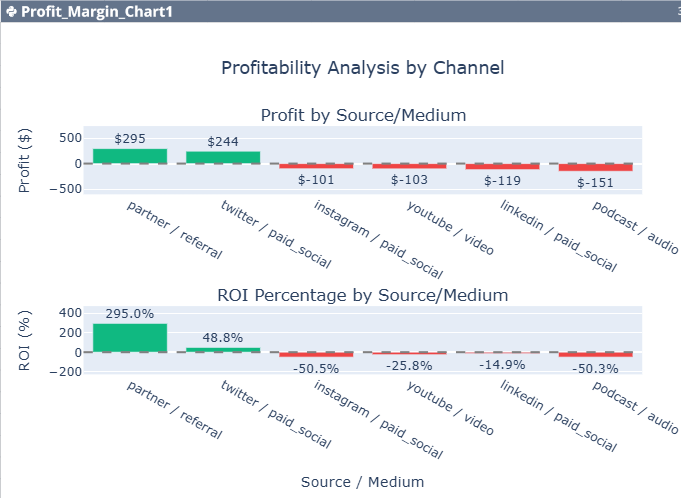
- ROI & Profitability: Marketing spend data combined with revenue shows that not all channels are profitable - Partner referrals deliver 295% ROI, while some paid channels like LinkedIn show negative ROI despite high conversion rates
- Channel recommendations: This table provides strategic insights by categorizing channels into four action tiers. Notably, the two channels with 100% conversion rates (Podcast and Instagram) are recommended for cutting due to extremely high acquisition costs, demonstrating that conversion rate alone is not a sufficient metric for marketing success.
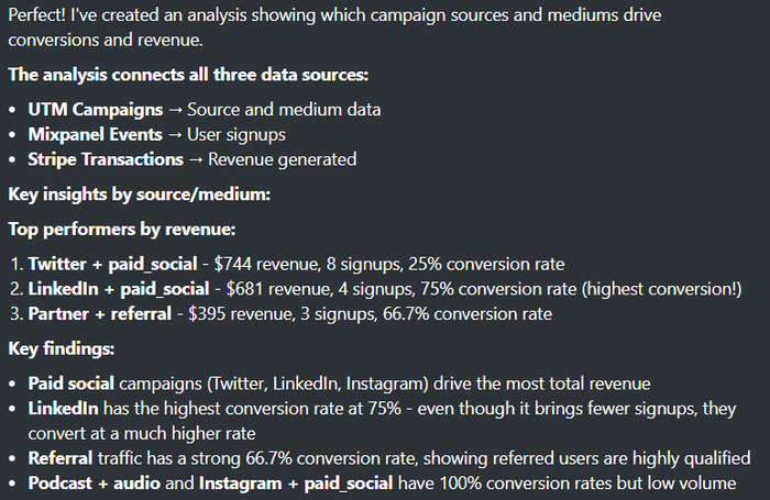
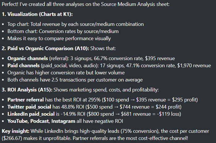
The screenshots in Figures 3 and 4 show the AI’s textual description of what it did and the results that were produced. While revenue and conversion metrics tell part of the story, true marketing success is measured in profitability. The second analysis layer adds marketing spend data to calculate profit margins and ROI for each channel with recommendations for actions that will maximize profit.
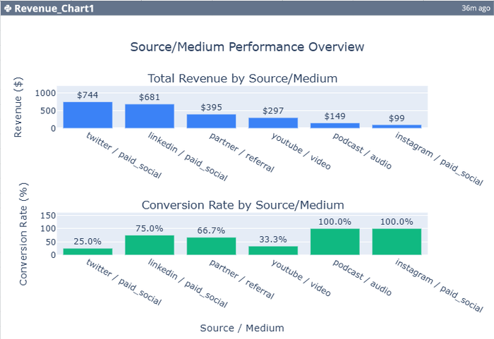
The visualizations (Figures 5 and 6) make it immediately clear that Twitter's paid social campaigns generate the most total revenue ($744), but LinkedIn converts at the highest rate (75%). However, the ROI analysis reveals that LinkedIn's high cost per customer ($266.67) makes it unprofitable, while the Partner referral program costs just $50 per customer and delivers the best return on investment.
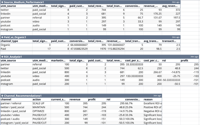
- Table 1: Source_Medium_Performance Performance metrics by marketing source and medium, showing total signups, conversion rates, revenue, and customer value.
- Table 2: Paid_vs_Organic Comparison of paid versus organic marketing channels.
- Table 3: ROI_Analysis Caption: Return on investment analysis including marketing spend, costs per acquisition, and profitability by channel.
- Table 4: Channel_Recommendations Caption: Data-driven action items for each marketing channel based on ROI, conversion rates, and profitability.
Figures 3 and 4 are screenshots of the AI’s text response that describes what it did and summarizes the results. Completing this entire data blending example from beginning to end took less than 10 minutes.
Whenever the AI completes an analysis, it suggests three next actions for the user to select. In this example, the second prompt was simply “Do all three you suggest on this same sheet.”
Two of the analyses suggested by the AI were the charts shown in Figures 5 and 6. The two panels in Figure 5 show the total revenue by source/medium and the conversion rate by source/medium. Although this information is useful, it is not the information needed to make decisions about the use of the channels. That is shown in the two panels in Figure 6, which provides the profit and ROI percentage by source/medium.
What this analysis shows:
The most important results of this analysis are its recommendations for action. The Profit Margin Chart uses color coding to instantly distinguish profitable channels (green) from money-losing ones (red), making it immediately clear which channels deserve more investment and which need to be reconsidered. The AI’s channel recommendations are also in Table 4 on the Analysis Sheet in Figure 2.
Based on the complete picture that includes revenue, conversion rates, costs, and profitability, we can generate actionable recommendations for each marketing channel:
- SCALE UP (Partner / Referral): With 295% ROI, this channel returns nearly $4 for every dollar spent. This is where to invest additional budget.
- MAINTAIN (Twitter / Paid Social): Positive 48.8% ROI shows this is working, but there's room to optimize and improve returns.
- OPTIMIZE (LinkedIn / Paid Social): Despite the highest conversion rate (75%), high costs create negative ROI. Better targeting or lower CPCs could make this profitable.
- PAUSE/CUT (YouTube, Podcast, Instagram): All showing ROI between -25% and -50%, these channels are destroying value and should be paused or significantly restructured.
This type of automated recommendation system turns raw data into strategic action items, helping teams make confident decisions about budget allocation.
Conclusion
Data blending traditionally required choosing between rigid BI tool configurations or complex manual coding. Data blending tools like Quadratic eliminate this tradeoff by embedding a natural language AI that generates the right analysis for your request. No primary-secondary designations, no forced aggregations, no rebuilding views when your needs change.
The examples here demonstrate practical data blending that connects product analytics, revenue transactions, and marketing attribution to answer real business questions. Start with simple requests, review the generated code to build understanding, then progress to complex multi-source analyses. Share insights with your team through real-time collaboration where both technical and non-technical members contribute meaningfully.
Create a free Quadratic account and load the demo database by clicking on the database icon on the left. Then experiment to experience how using natural language with AI transforms disparate data sources into actionable insights for a better BI strategy.