Kickstart data visualization with this Python Chart Code Generator template for Quadratic. Designed for beginners and power users alike, it helps you create a chart in Python from spreadsheet data in minutes, no heavy scripting required. Use it to prototype visuals, explore insights, and export ready-to-run Plotly code. Ideal for anyone who wants charts in Python that are interactive, reproducible, and easy to share.
What you can do
- Quickly build Python interactive charts from your own data using a guided workflow.
- Experiment with styles (colors, fonts, sizes) and see instant results inside the sheet.
- Export the generated Python code to reuse in scripts, notebooks, or apps.
- Move from spreadsheet exploration to production by swapping “Your data call here” with real data sources.
How it works
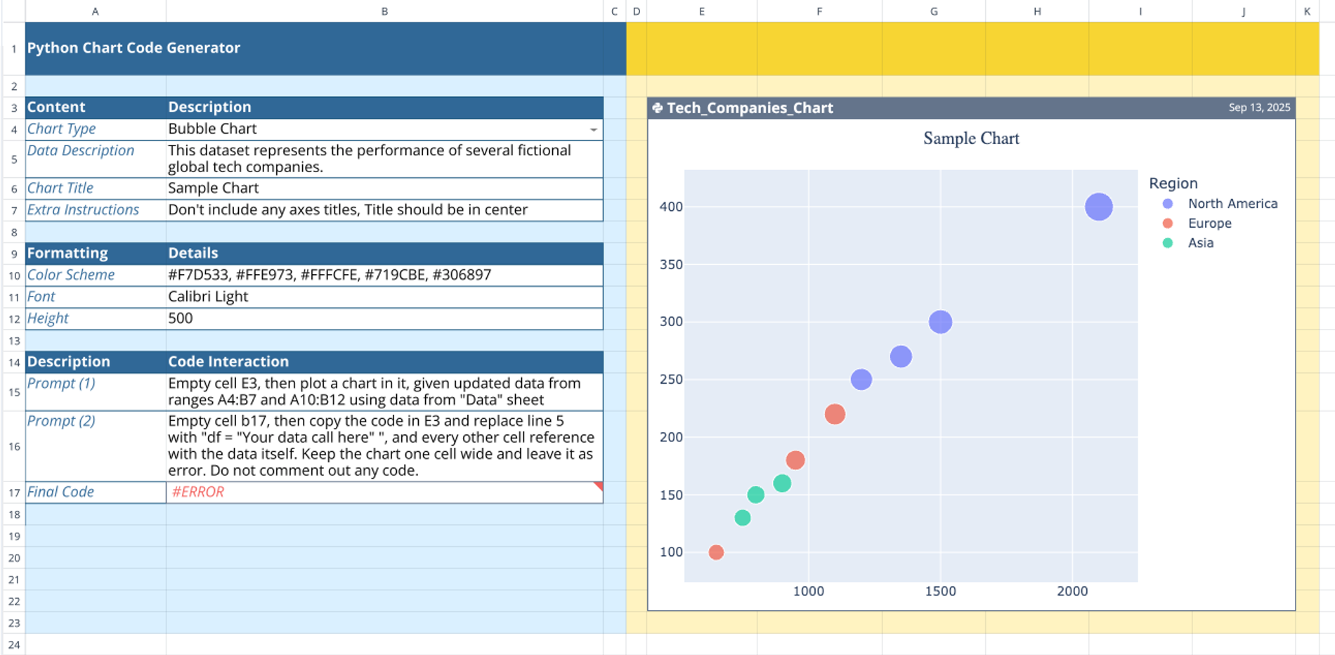
- Import data: Paste or type sample rows on the Data sheet (include clear headers and avoid blanks).
- Define chart details: Fill in the chart type, title, and formatting on the Input sheet.
- Generate and preview: Run the prompt to render a live chart in the grid—perfect for quick iteration.
- Finalize code: Copy the code from the sheet, replace the placeholder data call, and run locally to Python generate chart outputs with Plotly.
Tips and best practices
- Keep columns clean and typed (numbers as numbers, dates as dates).
- Start with a small sample; scale after the structure looks right.
- Use consistent naming for headers to avoid confusion in the code.
- Leverage provided color schemes and fonts for a coherent look.
- If coming from Excel, this is a smooth path to generate charts in Excel using Python while retaining a familiar grid interface.
Who it’s for
- Analysts, PMs, marketers, educators, founders, and data-curious teams.
- Startups and SMBs building quick dashboards, internal reports, or investor visuals.
- Classrooms and workshops demonstrating how to Python generate chart code from real data.
Real-life use cases
- Sales pipeline bubble charts by region.
- Marketing campaign performance timelines.
- R&D spend vs. revenue comparisons.
- Executive snapshots you can refresh and export.
Why this template
- Streamlined Python chart generator flow: from sheet to Plotly code in one place.
- Interactive preview inside the spreadsheet—iterate fast.
- Clean handoff: export code to reuse anywhere.
- Works great for users seeking to build Python interactive charts or automate data visualization.
Try the template now to turn your data into clear, compelling visuals—and keep the generated Python code for your analytics toolkit.