
Table of contents
- Why standard spreadsheets fail video reviews
- Organizing your test data
- Building the workflow: from raw temps to visuals
- Styling for legibility and "dark mode"
- Automating the "new product" cycle
- Analyzing the result: a data-driven story
- The new standard for tech reviewers
- Use Quadratic to Create Professional CPU Cooler Benchmark Charts for Video
Hardware reviews are a battle of precision, where data accuracy is paramount. Whether you are analyzing the thermal density of a new flagship processor or stress-testing a budget build, the data you collect is the backbone of your content. However, for technical content creators and video producers, gathering the data is only half the battle. The real challenge lies in presenting that data meaningfully. When viewers search for cpu cooler benchmarks, they aren't just looking for a spreadsheet full of numbers; they are looking for a story told through clear, legible, and accurate visualizations, adhering to established data visualization best practices.
Achieving that level of clarity usually requires a tedious workflow involving spreadsheets, manual data entry, and slow graphic design software like Adobe Illustrator or After Effects. Quadratic, the Python spreadsheet, changes this dynamic. By combining the calculation power of Python and SQL with a design-first infinite canvas, Quadratic allows reviewers to build broadcast-ready charts directly from their test data, bridging the gap between raw thermal metrics and the polished visuals your audience expects.
Why standard spreadsheets fail video reviews
The traditional spreadsheet was designed for accountants, not video producers. When you try to use standard tools for video production, you run into immediate visual limitations, highlighting the inherent limitations of traditional spreadsheets for complex visual tasks. The default white grids, small fonts, and low-contrast colors look terrible on a YouTube timeline, especially when viewed on mobile devices. To make them presentable, creators often have to export data to a separate design tool, breaking the link between the numbers and the visuals.
Data rigidity is another major hurdle. In a comprehensive review, you might need to compare disparate hardware categories without breaking your chart's formatting. For example, plotting a low profile cpu cooler benchmark against a massive 360mm liquid cooler requires a flexible axis and intelligent labeling to ensure the comparison remains fair and readable. Standard spreadsheets struggle with this level of customization, often forcing you into rigid templates that hide the nuance of your testing.
Quadratic solves this by offering an infinite canvas. You are not confined to a grid. You can place your raw data tables on one side and your Python-generated visualizations on the other, allowing you to tweak code and see the visual results instantly. This environment supports the dark mode aesthetics and custom typography required for professional video production.
Organizing your test data
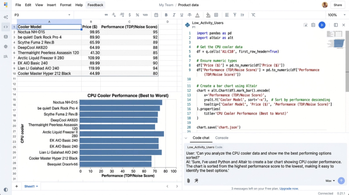
The foundation of any great chart is clean data. In Quadratic, you can ingest your raw testing logs—temperatures, noise levels, fan RPMs—directly via CSV or by connecting to a database. Using Python or SQL directly within the cells of this SQL spreadsheet, you can tag and filter your data types efficiently. This is crucial when you are managing a massive dataset that includes years of testing history. You might have a single master dataset that contains everything from entry-level heatsinks to high-end custom loops. By writing a simple SQL query or Python script, you can filter this master list to display only the relevant cpu water cooler benchmarks for one video, and then toggle to show cpu aio cooler benchmarks for a different comparison.
This method keeps your data centralized. You don't need fifty different spreadsheet files for fifty different videos. You have one master source of truth, and you use code to slice that data into the specific cpu air cooler benchmarks you need for your current project.
Building the workflow: from raw temps to visuals
Once your data is organized, the next step is transforming raw numbers into meaningful metrics. In the world of thermal testing, raw temperature means very little without context, which is why a standardized CPU thermal testing methodology is crucial to account for room temperature fluctuations and other variables.
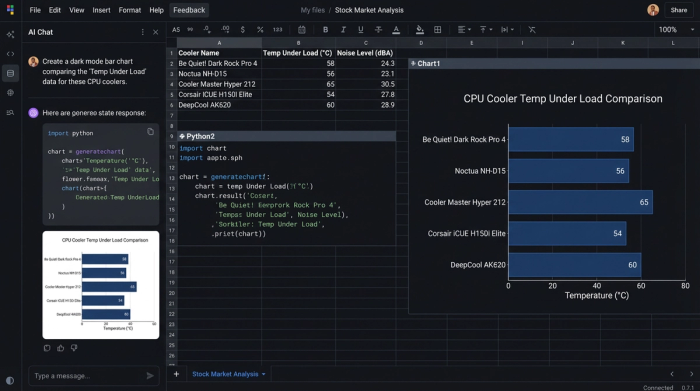
In a standard tool, this involves dragging formulas down endless columns and hoping you didn't miss a cell. In Quadratic, you can use Python to perform this calculation programmatically across the entire dataset. The visualization step is where the 'reviewer’s bottleneck' usually occurs. Instead of fighting with a chart wizard, you can use Python libraries for data visualization like Altair or Matplotlib directly in the canvas. This gives you granular control over how the data is rendered. A key advantage here is sorting. When presenting the best cpu cooler benchmark data, you typically want the chart sorted from best performance to worst performance automatically. With Python, you can write a sort function that instantly reorders the bars based on thermal performance or noise-normalized results, saving you from manually rearranging rows every time you add a new product.
Styling for legibility and "dark mode"
For a chart to look good on video, it needs high contrast and large, clear text. This is often called "dark mode" styling, where the background is dark gray or black, and the text and data bars are bright and punchy. Quadratic allows you to define these aesthetic parameters directly in your code.
You can set the background of your chart to match your video's color palette (hex codes included), increase the font size of the axis labels for mobile legibility, and assign specific colors to different data series. For instance, you might want all AIOs to appear in blue and all air coolers to appear in orange. This level of customization ensures that when you render the chart, it is already consistent with your channel's branding. You are essentially creating a reusable template that turns raw data into the best cpu cooler benchmark graphic possible, with no post-production work required in Photoshop.
Automating the "new product" cycle
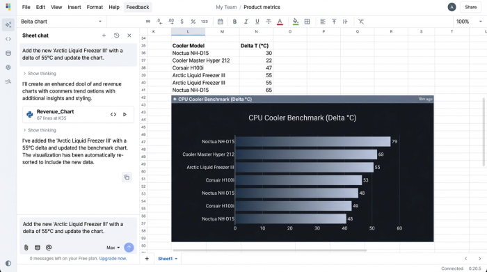
The biggest pain point for hardware reviewers is the new product launch cycle. Every time a manufacturer releases a contender for the best cpu air cooler benchmark, reviewers have to re-run tests, open their old spreadsheets, add the new data, and then manually redesign the charts.
Quadratic automates this cycle. Because your visualization is powered by code linked to your data range, adding a new product is as simple as adding a new row to your dataset. As soon as you input the new cooler's name and thermal data, the Python script re-runs, the sorting algorithm places the new cooler in its correct position relative to the competition, and the chart updates immediately. You can then export the updated visual as a high-resolution PNG or SVG and drop it directly into your video editor.
Analyzing the result: a data-driven story
The final result is more than just a graph; it is a clear visual narrative. By using Quadratic, you can produce a chart that tells the story of the hardware. For example, a well-constructed chart can instantly show viewers the diminishing returns of high-end cooling.
Imagine looking at a chart comparing a budget low profile cpu cooler benchmark against a flagship liquid cooler. With the precision labeling and clear axis scaling you built in Quadratic, the viewer can visually grasp the "thermal throttling point"—the moment where the cooler simply cannot handle the heat load, causing the CPU to slow down to prevent damage. This allows you to provide deeper analysis, pointing out exactly where a specific cooler falls short or where a budget option punches above its weight class. The ability to annotate these findings directly on the canvas alongside the cpu cooler benchmark chart adds a layer of depth that standard spreadsheets cannot provide.
The new standard for tech reviewers
Content creators no longer have to choose between the speed of a spreadsheet and the beauty of a design tool. Quadratic offers a unified workspace where data analysis and visual design happen simultaneously. By leveraging the power of Python and an infinite canvas, you can build a robust, automated workflow that scales with your channel. The next time you sit down to compile a cpu cooler benchmarks dataset, try loading it into Quadratic. You will find that the tool doesn't just manage your numbers—it helps you tell the story behind them.
Use Quadratic to Create Professional CPU Cooler Benchmark Charts for Video
- Generate broadcast-ready charts directly from test data: Transform raw
cpu cooler benchmarkdata into polished, video-optimized visuals without external design software. - Effortlessly manage and filter extensive datasets: Ingest all your thermal and performance logs, then use Python or SQL to instantly slice and dice for specific
cpu water cooler,AIO, orair cooler benchmarkcomparisons. - Automate complex calculations and sorting: Programmatically transform raw temperatures into meaningful metrics and automatically sort
cpu cooler benchmarkresults by performance, saving hours of manual adjustments. - Design charts for optimal video legibility: Customize dark mode aesthetics, high contrast colors, and large fonts directly via code, ensuring your
cpu cooler benchmarkgraphics are clear and impactful on any screen. - Streamline new product reviews: Add new
cpu cooler benchmarkdata, and your charts automatically update and re-sort, ready for immediate export without tedious redesigns. - Craft compelling visual narratives: Precisely illustrate performance nuances, thermal throttling points, and value propositions, transforming raw numbers into an engaging story for your audience.
Ready to create professional, data-driven video content more efficiently? Try Quadratic.