
Every Monday morning, support operations analysts face a familiar disconnect. On one screen, there is a raw CSV export from a help desk platform like Zendesk, Help Scout, or Intercom. On the other screen is a blank presentation deck waiting for executive insights. The gap between these two is often filled with hours of manual spreadsheet formatting, fragile formulas, and anxiety over whether the data is actually accurate, a challenge that robust data automation software can help overcome.
Most guides on support metrics focus on the final number—the Key Performance Indicator (KPI). For a broader understanding of relevant metrics, explore this executive guide to customer service KPIs for executives. They rarely discuss the messy reality of the analyst's workflow: inconsistent date formats, blank values that skew averages, and the difficulty of merging ticket volume with satisfaction scores. However, the integrity of your reporting relies entirely on a sophisticated processing layer, which is often powered by automated data processing. Understanding the core principles of data integrity is crucial for reliable analytics.
Effective CSAT analytics requires moving beyond simple averages. For a comprehensive overview, you can refer to guides on calculating a CSAT score. It demands a workflow that incorporates rigorous data cleaning and weighted logic to enable data-driven transformation by turning raw feedback into strategic decisions regarding staffing, cost optimization, and platform investment.
Why standard CSAT reporting fails executive needs
Executives rarely need just a score. A static "4.2 out of 5" tells leadership very little about the health of the customer base or the efficiency of the support team. To drive business strategy, leadership needs to understand why the score changed, how it correlates with ticket volume, and what it costs the company to maintain that service level.
The "average trap" is a common pitfall in standard reporting. In high-volume support environments, a simple average can mask critical failures. For example, if your team handles 5,000 "password reset" tickets with a 5/5 score, but 500 "billing error" tickets with a 1/5 score, a simple average might look healthy. However, the business risk lies entirely in those 500 billing errors.
Furthermore, the traditional static report—often a PDF or a screenshot of a dashboard—fails during live meetings. When a VP asks, "What happened in Week 34 with Enterprise customers?" the analyst often has to say, "I'll pull that data and get back to you." True strategic partnership requires the ability to perform ad-hoc analysis instantly, drilling down into specific weeks or form types without breaking the underlying data model.

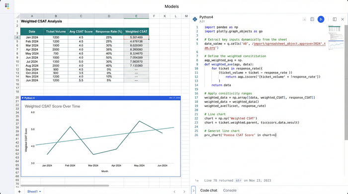
Step 1: Cleaning the "dirty data" (The processing layer)
The foundation of reliable CSAT analytics is the data preparation phase. Raw exports are notoriously "dirty." They often contain blanks where a customer didn't leave a score, timestamps that don't align with reporting periods, and inconsistent categorization.
One of the most critical decisions an analyst makes is how to handle non-responses. In many standard spreadsheets, a blank cell might be ignored by an AVERAGE formula. To learn more about this, you can explore various methods on how to handle missing values in data cleaning. However, in specific analytical contexts, you may need to treat blanks as null values to exclude them from the denominator, or in rare weighted scenarios, treat them as a neutral zero. The logic you apply here fundamentally changes the integrity of the data.
Date normalization is another hurdle. Transactional data comes with precise timestamps (e.g., "2023-10-27 14:32:01"), but executive reporting requires weekly or monthly buckets. Converting these timestamps into clean reporting periods is essential for accurate trend analysis. Similarly, categorizing data by "Ticket Form" or "Issue Type" allows for the granular breakdowns necessary to isolate problems.
In tools like Quadratic, considered among the best data science tools, this processing layer becomes transparent and repeatable. This ensures that the cleaning logic is documented and consistent every time new data is imported.
Step 2: Implementing weighted CSAT logic
Once the data is clean, the next step is establishing analytical authority by moving past simple arithmetic means. This is where weighted CSAT logic becomes essential, and you can learn more about applying weighted scores in survey analysis.
A weighted approach acknowledges that not all tickets carry the same significance. A high satisfaction score on a low-complexity interaction should not necessarily carry the same weight as a score on a critical churn-risk ticket. Additionally, periods with low response rates should be contextualized differently than periods with high engagement.
To implement this, analysts combine ticket volume with satisfaction scores. By factoring in the response rate, you ensure that a 100% CSAT score based on two responses doesn't overshadow a 90% CSAT score based on two thousand responses. This method provides a more accurate reflection of customer sentiment and agent performance.
Using CSAT analytics in this way transforms the metric from a vanity number into a weighted index of customer health. It allows operations leads to defend their numbers with mathematical rigor when challenged by stakeholders.
Step 3: Analyzing trends for strategic decisions
With clean, weighted data, the focus shifts to identifying trends over time. Executive reporting relies heavily on Month-Over-Month (MoM) and Week-Over-Week (WoW) comparisons to gauge the trajectory of the support organization.
The most powerful insights often come from visualizing volume fluctuations alongside CSAT scores. For instance, if ticket volume spikes by 20% due to a new feature launch, it is expected that response times might slow down, potentially lowering CSAT. However, if volume remains flat and CSAT drops, it indicates a process or product failure.
This granular analysis also helps identify top and bottom performers. By breaking down the data, analysts can pinpoint specific "Form Types" (e.g., Bugs vs. Feature Requests) that are dragging down the overall score.
Using a tool like Quadratic allows for rapid recalculation of these trends. Because the logic is built with code and formulas in a single workspace, updating the report for a new week doesn't require rebuilding the entire model. You simply refresh the data, and the MoM and WoW calculations update instantly, allowing you to focus on interpreting the results rather than crunching the numbers.
From grid to boardroom: Presenting the data
The final deliverable of this workflow is the executive report. The goal is to move from the spreadsheet grid to a concise, visually supported story that drives action.
Visualizing the relationship between volume and satisfaction is key, and tools that help create a dashboard in Python can be instrumental here. A combination chart—using bars for Ticket Volume and a line for CSAT—is an effective way to show correlation at a glance. This visual immediately answers the question: "Is our workload impacting our quality?"
The data should lead directly to actionable recommendations:
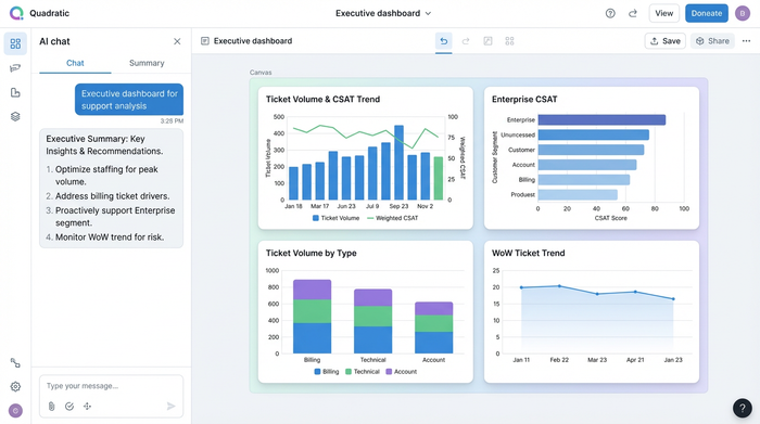
- Staffing: "Volume is trending up 15% WoW with a corresponding dip in CSAT; we need to increase headcount for the weekend shift to stabilize quality."
- Cost optimization: "High volume on 'Billing' forms suggests a need for better self-serve documentation. Investing in a help center update could reduce support costs by 10%."
- Risk management: "CSAT dropped significantly in the 'Enterprise' segment this month. Immediate intervention by the Success team is required to prevent churn."
Conclusion
CSAT analytics is more than just a calculation; it is a comprehensive workflow. It begins with the unglamorous work of cleaning dirty data, moves through the application of sophisticated weighted logic, and culminates in the visualization of strategic trends.
By mastering the processing layer of your data, you transform your role from a number-cruncher into a strategic advisor. You provide the insights that leadership needs to navigate risk and optimize operations.
For analysts looking to bridge the gap between raw exports and boardroom-ready insights, Quadratic offers a powerful environment to handle complex data cleaning and weighted logic that breaks standard spreadsheets, often through advanced AI spreadsheet analysis.
Try Quadratic, the AI spreadsheet that does your work for you.
Use Quadratic to do CSAT analytics
- Cleanse raw help desk data and normalize timestamps automatically for accurate CSAT reporting.
- Apply sophisticated weighted CSAT logic to move beyond misleading averages and truly reflect customer sentiment.
- Uncover critical trends by combining ticket volume and satisfaction scores for mathematically rigorous insights.
- Perform instant ad-hoc analysis and drill-downs during live meetings without rebuilding underlying data models.
- Automate weekly or monthly report updates, instantly recalculating trends and MoM/WoW comparisons.
- Develop actionable recommendations for staffing, cost optimization, and risk management from comprehensive CSAT analytics.
Ready to transform your CSAT analytics workflow? Try Quadratic.