
Collecting data is rarely the problem for modern logistics teams. Telematics systems, fuel cards, and TMS platforms generate endless streams of numbers every day. The real challenge lies in making that data actionable. A raw spreadsheet full of trip logs doesn't immediately tell you who your top performers are or where you are bleeding margin. It requires transformation.
To truly understand operational efficiency, you need to look beyond simple averages and dive into segmented fleet performance metrics. While knowing what to track is the first step, this article focuses on how to analyze it effectively.
Standard spreadsheets often make this difficult. Creating performance tiers usually involves brittle, nested formulas that break easily. In this guide, we will walk through a modern workflow using Quadratic—an AI-powered spreadsheet that integrates Python—to calculate Revenue Per Mile (RPM), "bin" drivers into clear performance tiers, and visualize the results with precision.
Defining the core metric: Revenue Per Mile (RPM)
Before diving into the technical workflow, it is important to establish the baseline metric. For many carriers, Revenue Per Mile (RPM) is the north star of economic efficiency. It is a simple calculation: Total Revenue divided by Total Miles.
While there are dozens of fleet management performance metrics available—ranging from fuel economy and idle time to safety scores—RPM combines asset utilization and pricing power into a single number. If a truck is moving but not generating sufficient revenue per mile, it is hurting the fleet's profitability regardless of how fuel-efficient the engine is.
This logic applies across various asset classes. Whether you are analyzing long-haul trucking data to optimize route pricing or reviewing forklift fleet performance metrics in a warehouse to determine pick-efficiency per hour, the analytical goal remains the same. You need to identify which assets are exceeding expectations and which are underperforming.
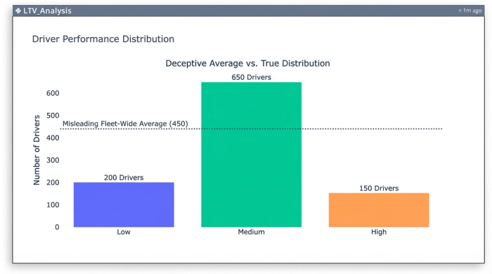
The challenge: why averages hide the truth
The most common mistake analysts make is relying on an "Average Fleet RPM." If your fleet average is $2.25/mile, that sounds healthy. However, averages hide distribution. You might have half your fleet performing at an exceptional $3.00/mile and the other half dragging the bottom at $1.50/mile.
To optimize the fleet, you need to see this distribution. You need to segment drivers or assets into tiers, such as:
- Tier 1 (High): > $2.50/mile
- Tier 2 (Medium): $2.00 – $2.50/mile
- Tier 3 (Low): < $2.00/mile
In a traditional spreadsheet, creating these segments usually involves messy nested logical statements. You end up writing complex formulas that look like IF(A2>2.5, "High", IF(A2>2.0, "Medium", "Low")). These are difficult to read, hard to audit, and prone to breaking if you sort the data incorrectly. Furthermore, when you try to chart this data, standard tools often randomize the legend order or sort by the size of the slice rather than the logical progression of the tiers.
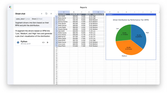
Tutorial: segmenting driver data in Quadratic
Quadratic solves this by allowing you to use Python directly within the spreadsheet grid. This enables you to perform complex data segmentation using clean, readable code while keeping the interface familiar.
Step 1: Ingesting and calculating RPM
The first step is bringing your data into Quadratic. You can copy and paste your CSV data or connect directly to a database like PostgreSQL or Snowflake.
Once the data is in the sheet, you can calculate the RPM for every driver using standard spreadsheet formulas. If column B contains "Total Revenue" and column C contains "Total Miles," you simply divide the two. This gives you a raw efficiency score for every driver in the fleet.
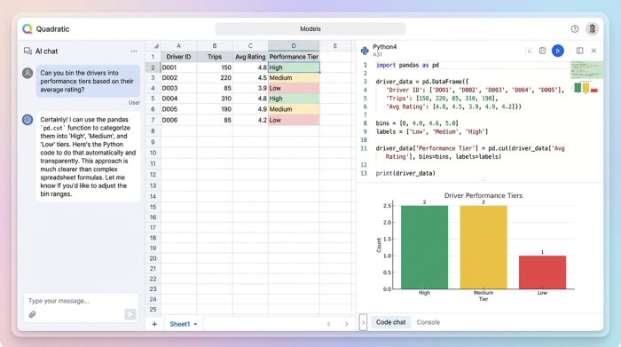
Step 2: Binning performance with Python
This is where the workflow shifts from manual formulas to automated logic. Instead of writing a fragile nested formula to categorize drivers, you can use a Python code cell.
Using the Pandas library, which is native to Quadratic, you can "bin" the data instantly. The pd.cut function allows you to define specific numerical edges for your bins and assign labels to them.
For example, you can tell Python to look at the RPM column and categorize values between 0 and 2.00 as "Low," 2.00 to 2.50 as "Medium," and anything above 2.50 as "High."
The result is a new dataset that includes a clean, text-based "Performance Tier" column for every driver. The benefit here is transparency. Anyone reading the code can see exactly where the cut-off points are. If you decide next month that the threshold for "High" performance should be raised to $2.75, you simply change one number in the script, and the entire dataset updates instantly.
Step 3: Visualizing tiers in ascending order
Visualizing segmented data is often frustrating in standard tools because of how they handle sorting. If you create a pie chart of your driver tiers, a standard spreadsheet will often order the legend based on the count—putting the biggest slice first—or alphabetically. This ruins the narrative flow. You want the legend to read naturally: Low, Medium, High.
In Quadratic, because your data is structured via Python, you have total control over the output. You can explicitly define the sort order of your categories. When you generate your chart—whether it is a pie chart, donut chart, or bar graph—the legend will respect the logical order you defined.
This results in a visualization that matches the analyst's mental model. When a stakeholder looks at the report, they see the progression from low performers to high performers without having to mentally rearrange the legend.
Why code-based metrics are better for fleets
Moving your fleet performance metrics into a Python-enabled environment offers advantages that go beyond just making better charts.
<a href="https://research.gatech.edu/python-vs-r-choosing-right-tool-supply-chain-analytics-and-business-intelligence">Scalability</a> is a major factor. Standard spreadsheet formulas can become sluggish when applied to thousands of rows of data. Python scripts run efficiently whether you are analyzing 50 drivers or 5,000.
Reproducibility is another key benefit. This workflow turns your analysis into a reusable template. Next month, when new trip logs come in, you can simply paste the raw data into the sheet. The Python script will automatically detect the new rows, recalculate the RPM, re-bin the drivers into tiers, and update the visualizations.
Precision ensures that your business logic is sound. By defining bin edges in code, you eliminate the risk of "gaps" in your logic where a specific value might not trigger a nested formula correctly.
Conclusion
Operational efficiency relies on the ability to turn raw data into clear, segmented insights. By calculating Revenue Per Mile and then using Python to "bin" drivers into performance tiers, you move away from deceptive averages and gain a true view of your fleet's distribution.
This workflow transforms fleet performance metrics from a monthly reporting chore into a strategic tool. Instead of fighting with brittle formulas and disordered charts, analysts can focus on the story the data tells—identifying which drivers need coaching and which deserve recognition.
If you are ready to stop managing nested formulas and start analyzing your fleet with precision, try this segmentation workflow in Quadratic.
Use Quadratic to segment and visualize fleet performance metrics
- Segment drivers into clear performance tiers (high, medium, low RPM) using robust Python code, replacing brittle nested formulas.
- Visualize driver tiers with precision, ensuring charts display in logical order (e.g., low to high) rather than random or alphabetical.
- Automate monthly fleet performance reporting with reusable Python scripts that instantly update calculations, tiers, and visualizations.
- Analyze large datasets of trip logs and telematics data efficiently, scaling your analysis beyond traditional spreadsheet limitations.
- Ensure precision and transparency in your business logic by defining bin edges and rules directly in auditable Python code.
Ready to elevate your fleet analysis? Try Quadratic.