
Modern materials research is rarely about testing a single sample in isolation. It is an iterative, high-volume process involving the comparison of dozens of novel composite formulations, each with varying additives, against a strict control group. For researchers, the challenge isn't just generating the data; it is synthesizing it into a clear narrative. Whether you are measuring conductivity, dielectric response, or mechanical strength, effective material composition analysis depends on your ability to normalize massive datasets and visualize the incremental impact of every constituent.
The problem many labs face is that traditional spreadsheets are not built for this level of scientific rigor, a common issue among the challenges in data-driven materials science. Calculating "response ratios"—normalizing experimental data against a baseline, often referred to as response-ratio analysis in scientific literature—often requires cumbersome manual formulas that are prone to breakage. Furthermore, creating multi-panel plots to compare these metrics side-by-side usually involves exporting data to external software or struggling with limited charting tools.
Quadratic bridges this gap. By combining the familiarity of a spreadsheet with the computational power of Python, it functions as a data science spreadsheet, allowing researchers to streamline the analysis of composite materials. You can import raw data, normalize it algorithmically, and generate publication-quality visualizations without ever leaving the grid.
The data landscape: from simulation to spreadsheet
Before analysis begins, data must be aggregated. In a typical R&D environment, researchers juggle outputs from a variety of high-precision sources. You might have chemical data from an emission spectrometer material composition analysis, mechanical stress data from a universal testing machine, or predictive data from simulation software.
Whether the source is physical hardware or a digital simulation—such as a finite element analysis of composite materials—the output is almost always a tabular dataset, such as a CSV or Excel file. Tools like Ansys are incredible for generating data via composite material analysis in Ansys, and Abaqus is the standard for the analysis of composite materials with Abaqus, but these tools are not designed for the post-processing stage where experimental results are compared against simulations.
This is where the workflow often bottlenecks. Researchers find themselves pasting CSVs into standard spreadsheets, losing the connection to the original data source, and struggling to align rows for comparison. Quadratic acts as the staging ground, allowing you to pull in these disparate datasets and prepare them for rigorous analysis.
Workflow step 1: normalizing experimental data with Python
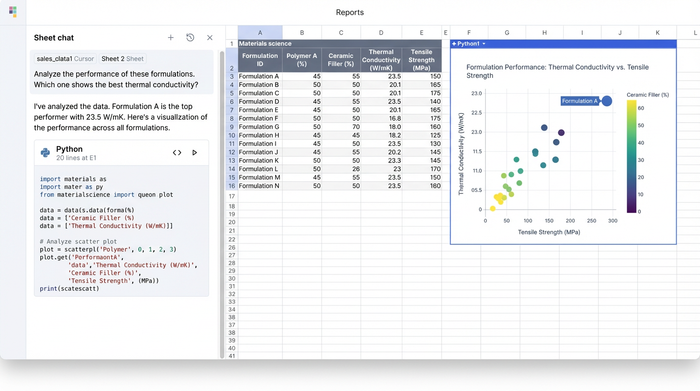
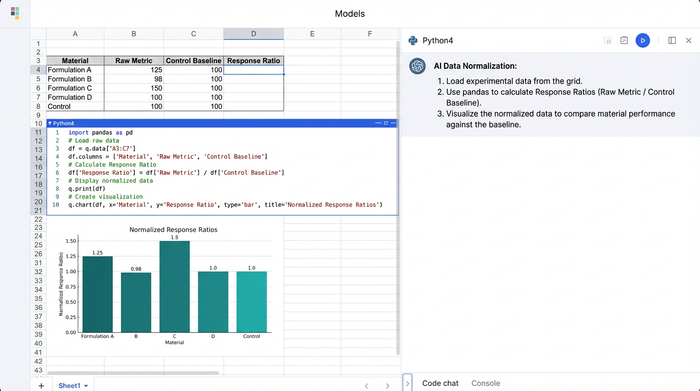
Once your data is in the grid—perhaps a dataset containing conductivity and dielectric response metrics for twenty different formulations—the first step is usually normalization. To understand the true impact of an additive, you need to see how a formulation performs relative to a control sample.
In a standard spreadsheet, this involves writing a formula to divide an experimental cell by a control cell, then dragging that formula down thousands of rows. If the sort order changes, the references break.
In Quadratic, you can handle this using Python directly in the spreadsheet cells, functioning as a powerful python data analysis ide. By loading your data into a pandas DataFrame, you can write a short script that identifies the "Baseline" row and automatically divides every other row’s performance metrics by that baseline’s values, a key step in automated data processing. This creates a "Response Ratio" column instantly. If the baseline conductivity is 100 S/m and a new formulation is 150 S/m, the ratio is 1.5. This allows for immediate, quantifiable insight: the new additive improved performance by 50%.
This approach brings a level of scrutiny similar to how engineers perform a software composition analysis bill of materials review. Just as software developers analyze their code "ingredients" for vulnerabilities, materials scientists can now programmatically analyze their physical "bill of materials" (the ingredient list) to pinpoint exactly which constituent drives performance or instability.
Handling failure and fatigue metrics
This normalization workflow extends beyond electrical properties. It is equally vital for the failure analysis of composite materials. When testing for durability, you can normalize stress-strain curves to identify exactly when a new composite begins to deviate from the expected performance of the control group.
Similarly, in the fatigue analysis of composite materials, where samples are subjected to cyclic loading, Python can help you calculate the degradation rate relative to the baseline. Instead of staring at raw cycle numbers, you get a clear percentage that indicates whether a formulation is degrading faster or slower than the standard.
Workflow step 2: visualizing trends with multi-panel plots
The most common pain point in reporting material analysis is visualization. Comparing multiple metrics—like Conductivity vs. Dielectric Response—usually requires creating separate charts and manually aligning them in a presentation slide.
Quadratic solves this by allowing you to use Python graphing libraries, such as Matplotlib or Seaborn, directly within the spreadsheet. You can generate a multi-panel figure (subplots) that displays conductivity in one panel and dielectric response in another, sharing the same x-axis (the formulation name), adhering to principles of effective data visualization.
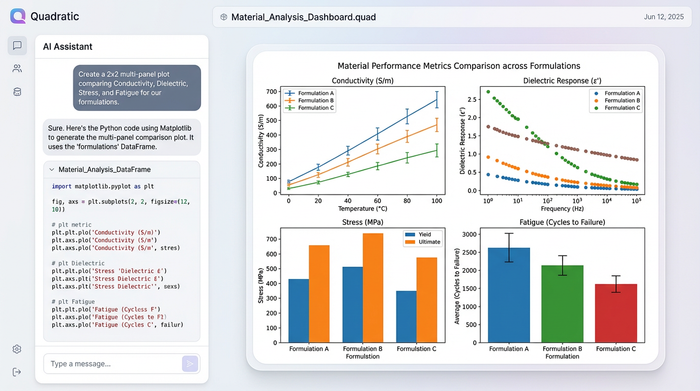
Because you are using code, you can also programmatically add reference lines. For example, adding a horizontal line at y=1.0 across your response ratio plots provides an instant visual anchor. Any bar extending above the line represents an improvement over the baseline; any bar below represents a deficit. This results in a clean, publication-quality visual that updates dynamically. If you add five new formulations to your dataset, the Python script automatically includes them in the chart without any manual reformatting.
Non-destructive analysis and iteration
One of the biggest fears in scientific data management is accidental data loss. In traditional spreadsheets, cleaning data often means overwriting the original cells. If you make a mistake, the raw experimental data is gone.
Quadratic supports a non-destructive workflow. You can import your raw CSVs into one sheet and perform all your cleaning, normalization, and visualization in a separate area using Python. The raw data remains pristine. This is particularly useful when validating simulations. You can import results from a finite element analysis composite materials simulation and place them side-by-side with physical lab results. You can then run scripts to calculate the percent error between the simulation and reality, all while ensuring the source data for both remains untouched. This capability is critical for maintaining data integrity and ensuring scientific reproducibility.
Conclusion: a better way to quantify impact
The transition from raw data to actionable insight should not be the hardest part of materials science. by using Quadratic, researchers can move beyond the limitations of standard spreadsheets. You can import complex datasets from hardware or simulations, normalize them using robust Python logic to calculate accurate response ratios, and visualize the results with professional multi-panel plots.
This workflow empowers you to quantify the impact of your formulations precisely and efficiently. It bridges the gap between rigid simulation tools and flexible data analysis software, allowing you to focus on the science rather than the spreadsheet maintenance. If you are ready to stop wrestling with cell formulas and start telling clear stories with your data, try loading your next experimental dataset into Quadratic.
Use Quadratic for material composition analysis
- Consolidate diverse material data: Seamlessly import and aggregate raw data from spectrometers, testing machines, and simulation software (Ansys, Abaqus) into one workspace for comprehensive analysis.
- Automate response ratio calculations: Leverage Python directly in cells to programmatically normalize experimental data against control groups, ensuring accurate and robust response ratio analysis without manual formula errors.
- Create dynamic, multi-panel visualizations: Generate publication-quality multi-panel plots using Python charting libraries within the spreadsheet to compare conductivity, dielectric response, and fatigue metrics side-by-side.
- Ensure non-destructive data workflows: Perform all data cleaning, normalization, and visualization without altering your original raw data, critical for scientific reproducibility and validating simulations.
- Quantify additive impact precisely: Use code-based analysis to accurately measure the incremental impact of each material constituent, identify degradation rates, and compare physical results against simulated outcomes.
Ready to move beyond spreadsheet limitations and precisely quantify the impact of your material formulations? Try Quadratic.