
For the modern data analyst, the workflow often feels fractured. You have your data sitting in a spreadsheet, which is the most intuitive place to view, sort, and organize it. However, when the questions get harder and you need to perform rigorous predictive modeling and analytics, the spreadsheet hits a ceiling. You are often forced to export your CSVs, switch to a code editor or a Jupyter Notebook to run Python scripts, and then paste static charts back into your sheet for presentation.
This disconnect is more than just an annoyance; it creates a barrier between your data and the insights you need. Traditional spreadsheets struggle with advanced diagnostics. If you need to check for multicollinearity using Variance Inflation Factor (VIF) or run complex regressions on multivariate datasets, standard formulas usually fall short.
By integrating Python directly into the spreadsheet grid, it allows analysts to perform advanced statistical work without leaving the interface they know. This article explores how a real-world analyst utilizes this workflow to manage diverse datasets—from automotive engineering metrics to educational statistics—and build robust predictive models in a single, infinite workspace.
Bridging data analytics and predictive modeling
To understand the value of this workflow, it is helpful to clarify the difference between standard reporting and true predictive work. While general reporting looks at what happened in the past, data analytics and predictive modeling are about understanding the relationships between variables to forecast future outcomes. In a research context, this means moving beyond simple trendlines and into statistical rigor.
The "spreadsheet ceiling" is a common frustration here. Most spreadsheet tools are excellent for arithmetic and basic logic but lack native functions for the modeling techniques in predictive analytics with Python and R that researchers rely on. For example, calculating a regression model is possible in legacy spreadsheets, but validating that model with diagnostic checks often requires cumbersome workarounds or paid add-ons.
Quadratic bridges this gap by allowing you to write code directly in the cell. This enables a workflow where predictive analytics and modeling are not separate tasks performed in a different piece of software but are an integral part of the spreadsheet itself. You get the reproducibility and power of code combined with the visual immediacy of the grid.
The setup: organizing diverse datasets
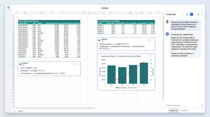
In our specific use case, a data analyst in the educational sector faced a complex challenge. They were not analyzing a single, clean table. Instead, their research required juggling multiple, distinct datasets simultaneously. This included automotive engineering performance metrics, market pricing data, and institutional financial indicators.
In a traditional spreadsheet, these datasets would be hidden away in separate tabs or buried in different files, making cross-reference difficult. Quadratic offers an infinite canvas, allowing these distinct tables to sit side-by-side. The analyst can ingest data via CSV, JSON, or direct database connections (like PostgreSQL or Snowflake) and place them anywhere on the grid.
This spatial organization is crucial for complex analysis. The analyst can view the automotive performance metrics on the left and the market pricing data on the right, ensuring that the raw inputs for their models are always visible and accessible. This setup eliminates the cognitive load of switching tabs and helps maintain context across disjointed data sources.
Executing advanced regression and VIF analysis
Once the data is organized, the workflow shifts to execution. In Quadratic, the analyst does not need to open a terminal. They simply click a cell and start writing Python. This allows them to leverage powerful libraries like pandas for data manipulation and statsmodels or scikit-learn for regression.
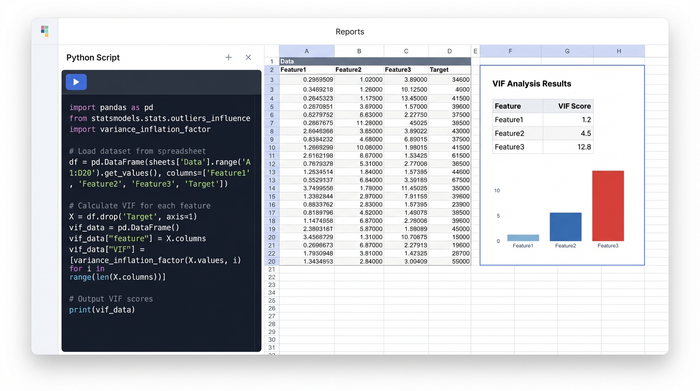
The primary goal for this user was to generate accurate predictive models, but accuracy requires validation. A critical step in their process was VIF analysis. VIF, or Variance Inflation Factor, helps identify multicollinearity—a phenomenon where independent variables in a regression model are highly correlated, which can skew results.
In a standard spreadsheet, calculating VIF is incredibly difficult. In Quadratic, the analyst writes a short Python script referencing the cells containing their automotive and financial data. The code cleans the data, runs the regression, and calculates the VIF score for each variable, outputting the results directly into the spreadsheet cells. This brings sophisticated modeling techniques in predictive analytics with Python and R into a familiar environment, making advanced diagnostics accessible and repeatable.
Visualizing the output: from residuals to forecasts
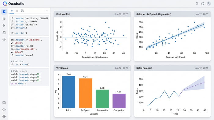
Numbers tell only half the story. To truly understand the behavior of a predictive model, you need to visualize the results. Standard spreadsheet charts are often limited to basic bar and line graphs, which are insufficient for statistical diagnostics.
Using Python libraries like Matplotlib or Seaborn directly within the Quadratic grid, the analyst generates high-fidelity visualizations that go far beyond the scatter plot. For this workflow, they created residual plots to check for homoscedasticity (ensuring the variance of errors is constant) and advanced scatter plots overlaying regression lines on educational program statistics.
The most powerful aspect of this workflow is the live link between data and visual. Because the charts are generated by code referencing the spreadsheet cells, any change to the input data—such as an update to the institutional financial indicators—automatically triggers the Python script to re-run. The VIF scores update, the regression model recalibrates, and the charts regenerate instantly. This creates a dynamic dashboard where the analysis is always live and up-to-date.
Applications across industries
While this specific example highlights a workflow involving educational and automotive data, the implications extend to every industry that relies on data-driven decision-making. The ability to combine data storage, code execution, and visualization in one view is a universal advantage.
For instance, a medical researcher might use this same workflow to generate healthcare data analytics and predictive modeling HD images for a publication, ensuring that their visual output is directly tied to their raw patient data. Similarly, a financial analyst could use it to forecast institutional indicators, documenting their methodology in Python so that the model is transparent and auditable by their team.
This approach is particularly valuable for researchers who need to share their work. Instead of sending a static PDF or a folder of scripts, they can share a Quadratic sheet. The recipient sees the data, the code that processed it, and the final visualization in one place.
Conclusion: breaking the spreadsheet ceiling
The era of choosing between the ease of a spreadsheet and the power of a programming language is over. Predictive modeling and analytics require a tool that respects the complexity of the math while retaining the simplicity of the grid.
By bringing Python into the cell, Quadratic allowed this analyst to perform rigorous statistical work—from VIF analysis to complex regressions—without fragmenting their workflow. They could organize diverse datasets, run advanced diagnostics, and generate professional visualizations on a single infinite canvas.
If you are ready to stop fighting with limited formulas and disjointed tools, try running your next regression model in Quadratic. It is time to experience a spreadsheet that works as hard as you do.
Use Quadratic to do predictive modeling and analytics
- Perform rigorous predictive modeling and advanced analytics directly within your spreadsheet, eliminating the need to export data or switch tools.
- Integrate Python and powerful libraries like pandas, statsmodels, and scikit-learn for complex regressions and diagnostic checks such as VIF analysis, all within your cells.
- Organize and analyze diverse datasets side-by-side on an infinite canvas, keeping all your raw inputs visible and accessible.
- Generate high-fidelity, dynamic visualizations—from residual plots to advanced scatter plots—that automatically update with any changes to your source data.
- Combine the reproducibility and power of code with the visual immediacy of a spreadsheet for transparent and auditable models.
Ready to enhance your predictive modeling? Try Quadratic