Tyler Von Harz, Community Partner
Aug 20, 2025

Numbers don’t lie. But only if you know how to read them. Quantitative data analysis is how we make sense of those numbers. Testing what holds up, spotting patterns that matter, and building models that can actually predict what’s next.
Customer data analysis, testing product performance, or forecasting revenue are all critical activities for a successful company, and quantitative analytics is how raw figures become real insight. This post will break down the core methods behind the madness and show you how modern tools like Quadratic can make that analysis faster, clearer, and easier to act on.
What is quantitative data analysis?
Quantitative data analysis is the systematic examination of numerical information using mathematical and statistical techniques to identify patterns, test hypotheses, and make predictions. In practice, you are transforming raw figures into actionable insights by uncovering associations between variables and forecasting future outcomes through methods such as regression or time-series modeling.
The quantitative approach differs fundamentally from data analysis for qualitative data, which relies on non‑numerical observations such as text, images, or interview transcripts to explore meaning and context. Quantitative data analysis methods focus purely on measurable variables, whereas qualitative methods aim to interpret subjective experiences.
For example, with data analysis techniques in quantitative research like surveys, data often comes from rating scales, multiple‑choice responses, or frequency counts. Analysts compute averages, percentages, cross‑tabulations, and correlations to test hypotheses or segment populations. For instance, they might compare satisfaction ratings across demographic groups or use cohort analysis to test whether a net promoter score differs significantly between cohorts. Closed‑ended survey formats allow straightforward statistical testing and estimation, making survey data analysis efficient and scalable.
In financial reporting, data analysis of quantitative data is central to understanding financial health and forecasting performance. Analysts apply financial data analytics techniques like ratio analysis, horizontal and vertical trend analysis, and predictive modeling to financial statements, extracting insights about liquidity, profitability, leverage, and future projections. Constructing ratios and time‑series models, means you can estimate future revenue or assess credit risk quantitatively based on past trends and assumptions.
With everything from marketing analytics to operational dashboards, quantitative data analysis plays multiple roles. Descriptive statistics summarize behavior (this could be things like average session duration, conversion rates), inferential statistics test hypotheses (using an A/B testing calculator for significance), and predictive modeling forecasts outcomes (churn prediction or revenue trends). It involves data cleaning, exploration, modeling, and visualization. The end goal is to improve data-driven decision-making across domains like e-commerce, healthcare, and IT.
Key methods in successful quantitative data analysis
So how do you do quantitative analysis? Once you know what it’s for, you need the right quantitative data analysis tools to make that happen. Below are the core techniques that drive most quantitative workflows, from basic summaries to more advanced statistical modeling.
Descriptive statistics
Descriptive statistics serve as the foundational toolset for summarizing and organizing numerical datasets. These methods include central tendency measures (mean, median, and mode) as well as dispersion metrics such as range, variance, and standard deviation. The mean represents the arithmetic average and is sensitive to extreme values, the median reflects the middle of an ordered dataset, and the mode indicates the most frequent value.
Variability is characterized by the range (difference between maximum and minimum values), variance (average squared deviation around the mean), and standard deviation (the square root of variance), capturing the typical spread of observations
For example, when performing customer loyalty analysis on transaction data, descriptive statistics quickly reveal the average purchase amount, the most common price, and how varied spending behavior is across users. In Quadratic, you could embed inline formulas or Python code to compute these statistics directly in cells and render them in a clean summary table.
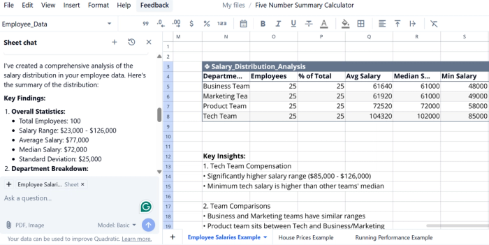
Quadratic offers a Five Number Summary Calculator template that instantly computes and visualizes min, Q1, median, Q3, and max using your dataset. The generated box plots and summary table highlight distribution shape, spread, and potential outliers. Perfect for contextualizing metrics like mean or standard deviation when analyzing customer transaction behavior.
Asking the AI “Summarize the salary distribution in your employee data” triggers automatic calculation of mean, median, standard deviation, and a chart to deliver an instant statistical overview.
Hypothesis testing
Hypothesis testing is the formal process of evaluating a claim about a population parameter by comparing sample evidence to what would be expected under a null hypothesis (H₀). The analyst formulates H₀ (e.g. “mean conversion rate equals X”) and an alternative hypothesis (H₁) that expresses a contrasting claim.
Test statistics like t-scores in t-tests or z-scores in z‑tests, are calculated based on sample means, standard errors, and sample size. A p-value quantifies the probability of observing results at least as extreme as those observed, assuming H₀ is true.
There are multiple testing procedures depending on the data and design. A t-test is appropriate for comparing sample means when the population variance is unknown or the sample size is relatively small; a z-test is used when the population variance is known and sample size is large.
A chi-square test evaluates relationships between categorical variables, checking whether observed frequencies differ significantly from expected distributions. For categorical comparisons like chi-square tests, you can write simple Python code or use Quadratic’s AI assistant to conduct the analysis inline.
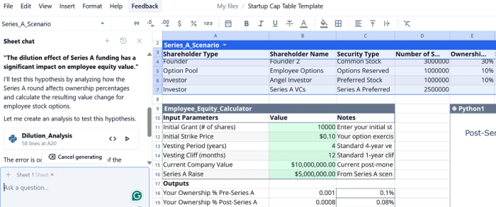
For example, I wanted to test the hypothesis:
"The dilution effect of Series A funding has a significant impact on employee equity value."
Using Quadratic, I analyzed how the Series A round affected ownership percentages and calculated the resulting change in value for employee stock options. The spreadsheet let me define the hypothesis, set up the model, and compute the outcome all in one place.
ANOVA
ANOVA encompasses a family of statistical methods designed to test whether the means of two or more groups are significantly different by comparing variance between groups versus within groups using an F‑statistic. In a one‑way ANOVA, you examine the impact of a single categorical independent variable on a continuous outcome variable. For instance, testing whether the average customer rating differs across three product tiers.
By contrast, two‑way ANOVA introduces a second independent variable, and evaluates not only the main effects of each factor but also whether the factors interact—meaning the effect of one variable depends on the level of the other. For example, testing whether product performance differs across both regions and marketing channels, and whether there’s an interaction between them.
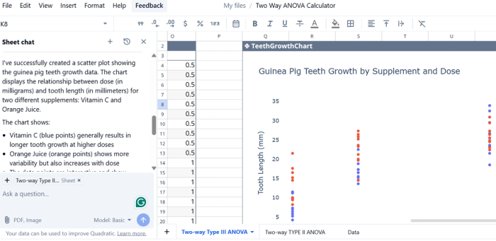
The two‑way design partitions total sums of squares into variance due to the first factor, the second factor, their interaction, and residual error. Quadratic offers a template for running a two-way ANOVA calculator, so you can save valuable setup time and get straight to analyzing.
Regression analysis
Regression analysis is a broad class of statistical methods used to estimate relationships among one dependent variable and one or more independent variables. Linear regression fits a line through the data that minimizes the sum of squared residuals, using ordinary least squares. The slope and intercept parameters describe how changes in an independent variable relate to changes in the dependent variable.
In real-world use, regression is a go-to method for forecasting and business planning. Companies often use it to predict revenue based on things like marketing spend, seasonal trends, or pricing changes.
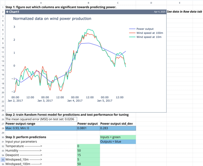
To see this in action, Quadratic’s Machine Learning Tutorial Template walks through the full regression workflow inside a spreadsheet. You define your target, select your input features, and run a predictive model using Python right in the sheet. It's an efficient way to explore regression analysis without needing a separate Jupyter notebook or IDE.
Why use Quadratic for your quantitative analysis software?
Quadratic brings the familiarity of a spreadsheet interface together with the power of code execution, making it a powerful Python alternative to Excel uniquely suited for your company’s quantitative data analysis software. You can write Python, SQL, and JavaScript directly inside cells to work with complex calculations, database queries, and dynamic transformations without leaving the sheet.
The hybrid model makes it easy to perform hypothesis testing, regression modeling, and ANOVA without needing to jump between platforms. Importing raw data, running a two-way ANOVA, or building a regression forecast, you can write, test, and document the entire process within the same interface.
What makes this particularly valuable is reproducibility. Quadratic keeps the code, data, and visual output in the same collaborative space. That means every chart is tied to its logic, every formula is traceable, and every stakeholder can inspect how the results were produced.