Table of contents
- The challenge with manual stock vs index comparison
- Step 1: Consolidating historical data
- Step 2: Calculating returns (total & average)
- Step 3: Formatting precision for the summary table
- Step 4: Visualizing the stock index comparison chart
- Final output: A reusable benchmark template
- Conclusion
- Use Quadratic to do stock index comparison
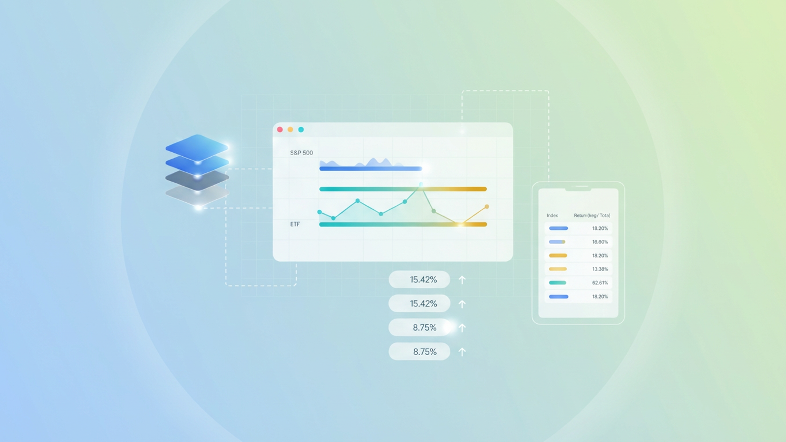
Every financial analyst, at some point in their weekly or monthly workflow, has to perform a stock index comparison. Whether you are benchmarking a specific portfolio against the S&P 500 or analyzing the relative performance of emerging market indices against the Nasdaq, the goal is always the same: accuracy and clarity.
However, the process of building these comparisons in traditional spreadsheets is often fraught with friction. You likely spend hours aligning dates across disparate CSV files, dragging formulas down thousands of rows, and battling formatting inconsistencies that make your summary tables look unprofessional.
This article explores a more reliable workflow using Quadratic. We will walk through a specific use case where a financial analyst consolidates market indices to generate a clean summary table with precise accumulated and average returns. By moving this stock market index comparison into a modern environment, you can eliminate manual errors and leverage automated data processing for a presentation-ready result.
The challenge with manual stock vs index comparison
Before diving into the solution, it is worth identifying why this workflow is so fragile in standard tools like Excel or Google Sheets. A robust stock vs index comparison requires handling time-series data that often spans years or decades.
The first hurdle is data alignment. Different indices may have different holidays or missing data points. Aligning these dates manually often involves complex VLOOKUP or INDEX-MATCH formulas that are prone to breaking if a single row is shifted.
The second issue is what we call "drag-down fatigue." To calculate daily returns for five years of history, you have to write a formula in the top cell and drag it down nearly 2,000 rows. If you add new data next month, you must remember to drag that formula down again. If you forget, your analysis is incomplete.
Finally, there is the issue of formatting inconsistency. In standard spreadsheets, clicking the "decrease decimal" button only changes what you see, not the underlying value. This often leads to rounding errors in summary tables where the visible numbers do not sum up correctly, causing confusion during stakeholder presentations.
Step 1: Consolidating historical data
The first step in a better workflow is centralized data ingestion. In a typical manual workflow, an analyst might download three different CSV files—one for the S&P 500, one for the Dow Jones, and one for a custom sector ETF—and copy-paste them into separate tabs.
In Quadratic, you can streamline this by pulling data directly into the canvas. Because Quadratic integrates Python and SQL natively within the python spreadsheet grid, you can connect directly to a database or use an API connector to fetch historical price data.
This ensures that your raw dataset is clean and ready for manipulation. You are not worrying about whether you pasted the data into the correct column; you are simply querying the source. This creates a solid foundation for your stock index comparison, ensuring that the starting inputs are always accurate, which is key for effective financial data analysis.
Step 2: Calculating returns (total & average)
Once the data is in the grid, the next step is calculating the performance metrics. For a standard stock market index comparison, you generally need two key metrics:
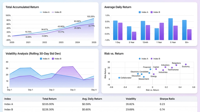
- Total Accumulated Return: The percentage growth from the start of the period to the end. The formula is generally (Ending Value - Beginning Value) / Beginning Value.
- Average Return: The mean of the daily or monthly percentage changes over the selected period.
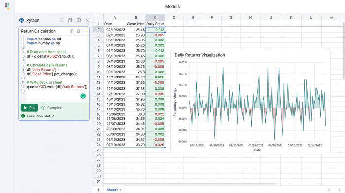
In a traditional spreadsheet, you would calculate the daily change in a helper column and then average that column. In Quadratic, you can handle this programmatically using Python, and a Python Intro Template can help you get started.
Instead of writing a cell-by-cell formula, you can write a short Python script using the Pandas library to calculate the returns for the entire column instantly. For example, you can calculate the percentage change for the entire dataset in a single line of code. This eliminates the risk of the "drag-down" error. The calculation automatically applies to the full length of the data, regardless of whether you are analyzing one year or twenty years of history.
Step 3: Formatting precision for the summary table
This step is often overlooked but was critical for the user workflow we are highlighting. When presenting a summary table to investment committees or clients, the numbers must be precise.
A common issue in financial analysis is floating-point math. If a return is calculated as 5.459382%, a standard spreadsheet might display it as 5.46%. However, if you use that cell in a subsequent calculation, the spreadsheet uses the full 5.459382%. This can result in summary tables where the individual line items do not seemingly add up to the total.
In Quadratic, you can control this precision at the calculation level. Rather than just masking the decimals visually, you can use Python to round the values to exactly two decimal places within the data itself.
This ensures that the value displayed is the exact value used in the final sum. By handling this formatting programmatically, you guarantee that your summary table is mathematically consistent and presentation-ready immediately.
Step 4: Visualizing the stock index comparison chart
No analysis is complete without visualizing the trend. A summary table tells you the start and end points, but a stock index comparison chart reveals the volatility and the journey between those two points.
In Quadratic, generating this visual is dynamic. You can create a line chart that references your consolidated data. Because the data manipulation is handled by Python or formulas that automatically adjust to the dataset size, the chart updates instantly.
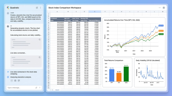
If you decide to change the time horizon—perhaps comparing the last 3 years instead of 5—you do not need to right-click the chart and manually re-select the data range. The underlying logic updates the dataset, and the stock market index comparison chart reflects those changes immediately. This allows for rapid iteration during analysis meetings.
Final output: A reusable benchmark template
The ultimate result of this workflow is more than just a one-off report. It is a reusable asset. You have created a summary table that displays the winners and losers of the stock index comparison with perfect formatting precision.
Because the logic is built using structured data connections and scripts rather than fragile cell references, this sheet becomes a template. Next month, or next quarter, you do not need to rebuild the file. You simply refresh the data, and the calculations, rounding logic, and charts update automatically.
Conclusion
Moving your financial analysis from a manual spreadsheet to a structured workflow in Quadratic transforms a tedious task into a reliable process. By automating data ingestion, calculating returns programmatically, and strictly controlling decimal precision, you ensure that your stock index comparison is both accurate and easy to maintain.
If you are tired of fixing broken formulas and explaining rounding errors to stakeholders, try Quadratic for your next analysis. It allows you to focus on actionable financial insights rather than the mechanics of the spreadsheet.
Use Quadratic to do stock index comparison
- Streamline data ingestion: Easily pull historical index data directly from databases or APIs into a single canvas, eliminating manual CSV consolidation and date alignment issues.
- Automate return calculations: Use Python to instantly calculate total accumulated and average returns across entire datasets, avoiding manual formula dragging and ensuring accuracy for any time horizon.
- Ensure formatting precision: Programmatically round values to exact decimal places, guaranteeing that your summary tables are mathematically consistent and presentation-ready without hidden rounding errors.
- Create dynamic visualizations: Generate stock index comparison charts that update automatically with changes to your data or timeframes, allowing for rapid, iterative analysis.
- Build reusable analysis templates: Transform your comparison workflow into a robust template that automatically refreshes calculations and charts with new data, saving hours on recurring reports.
Ready to simplify your financial analysis? Try Quadratic.