
MJ Lindeman, PhD, Community Partner
Oct 13, 2025

Table of contents
- Why cohort retention curves matter more than aggregate retention
- Forming cohorts: signup versus behavior
- Measuring retention: classic versus N-day windows
- Reading cohort curves: parallel, diverging, and converging patterns
- Rolling versus fixed time windows: measuring lifecycle versus seasonality
- Connecting retention to revenue: what actually builds a business
- Building cohort analysis into regular product rhythm
- Getting started: from basic cohorts to advanced segmentation
- From insight to action: using cohorts to drive decisions
Aggregate metrics such as overall retention rate collapse time and mix user segments. Consequently, they hide the patterns that matter most for product decisions. What is cohort analysis? It organizes users into groups (“cohorts”) based on when they joined or took specific actions, then tracks how each cohort behaves over time. This reveals whether your product is actually improving, whether new features retain users, and whether the customers you acquired last quarter are more valuable than those from six months ago.
Why cohort retention curves matter more than aggregate retention
The overall retention rate metric includes all users in your system, ranging from those who joined on your first day of business several years ago to those who made their first purchase yesterday. However, different cohorts of customers experienced different onboarding, features, and bugs. When you track cohorts separately, you can identify improvements or deterioration that aggregate numbers mask. For example, your overall retention might hold steady at 40% while your newest cohorts retain at 55% and older cohorts at 25%, indicating substantial product improvement that the aggregate metric hides completely.
Thus, cohort retention analysis shows patterns that single numbers cannot. Retention curves reveal whether users find sustained value (curve flattens into a plateau), experience a gradual decline (steady downward slope), or hit specific friction points (sharp drops at particular days). For example, you might discover through your cohort analysis chart that cohorts completing a certain volume of core actions retain at dramatically higher rates than cohorts below that threshold. Consequently, you could shape your entire activation strategy around getting cohorts to reach that activity level.
Revenue cohorts extend beyond engagement into business outcomes. For example, you might observe strong day-30 user retention across cohorts, which looks healthy until revenue analysis shows your highest-paying subscribers are churning while free users remain. This would indicate the product solves a casual need well enough for free usage, but it does not deliver value worth paying for. A customer cohort analysis that includes revenue would catch this disconnect immediately.
Forming cohorts: signup versus behavior
It is easy to default to measuring signup cohorts without considering whether this actually isolates what you need to measure. Signup cohorts work when measuring how product changes affect the new user experience. If you shipped a redesigned onboarding in March, comparing April signups to February signups shows the impact. But signup cohorts fail when you need to understand feature adoption among existing users or behavior patterns that predict retention.
Behavioral cohort analysis groups users by when they first performed specific actions, regardless of signup date. These cohorts prove essential for feature analysis. For example, when introducing a major personalized feature, you could compare signup cohorts before and after launch, but that would mix users who tried the feature with those who ignored it. Instead, you might group users by when they first engaged with the personalized feature. This could reveal that users who tried it within their first week retained at significantly higher rates than users who tried it later, and both cohorts far exceeded users who never engaged with the feature. The insight wouldn't just be that the feature worked. It would show that early exposure mattered enormously.
The distinction matters for product decisions. Consider launching collaborative features in a project management tool. A signup cohort analysis example would compare July signups (post-launch) to June signups (pre-launch), measuring whether the feature attracted different user types. A behavior cohort tracking when users first invited teammates isolates the feature's retention impact regardless of signup timing. This often reveals that features with mediocre adoption show excellent retention among users who actually try them. This identifies that there is an adoption problem, not a retention problem.
Measuring retention: classic versus N-day windows
Retention calculation seems straightforward until you realize that subtle methodological choices dramatically affect conclusions. Classic retention measures whether users return on specific days, such as day one, day seven, and day thirty. This provides clean comparisons and highlights the exact drop-off points. A meditation app might show strong day-one retention, moderate day-seven retention, and weak day-thirty retention, with the sharp day-seven drop suggesting users struggle to build weekly habits.
N-day retention measures whether users return within a window rather than on a specific day. Seven-day retention counts any user returning during their first week, whether on day two, day five, or day seven. For products without daily-use expectations, this provides more realistic engagement measurement. Project management tools might show terrible classic day-seven retention simply because teams don't schedule meetings exactly seven days after signup, while seven-day N-day retention would accurately capture first-week engagement.
The methodology choice depends on product usage patterns. Email, messaging, and social apps need classic retention because success requires daily habits. For these products, strong day-one retention, solid day-seven retention, and healthy day-thirty retention typically indicate product-market fit. Products with weekly or monthly usage patterns need N-day windows that respect natural cadences. B2B analytics tools might show weak day-seven classic retention but strong seven-day N-day retention, accurately reflecting weekly usage cycles.
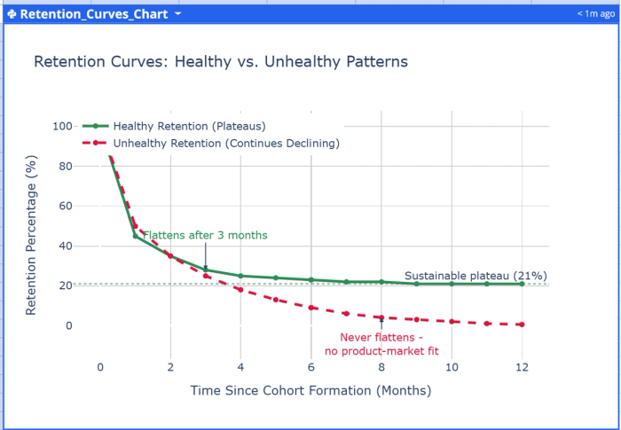
Retention curves visualize these measurements by plotting retention percentage against time since cohort formation. Healthy curves show a sharp initial drop as poor-fit users self-select out, then flatten into a sustainable plateau representing core engaged users. A curve that never flattens and continues to decline, even after months, indicates the product hasn't found product-market fit. For example, you might observe your retention curves showing new cohorts flattening after three months into a stable plateau, demonstrating long-term engagement.
Reading cohort curves: parallel, diverging, and converging patterns
When you plot multiple cohort retention analysis curves on the same chart, the relationship between curves reveals product health better than any individual metric. Each curve represents one cohort's journey, and the pattern they form tells whether you're improving, stagnating, or declining.
Parallel curves maintaining consistent spacing mean retention patterns remain constant across cohorts. If curves run parallel at strong retention levels, you have stable, healthy retention. If they parallel at weak retention levels, you have consistent but concerning retention. The insight is that recent product changes are not affecting retention either way. For example, you might observe parallel curves at solid month-six retention over a two-year period, indicating stable product-market fit but no improvements from new features during that time.
Diverging curves where recent cohorts retain worse than earlier ones signal serious problems. This pattern often indicates deteriorating acquisition quality, bugs from recent changes, or increasing competition. For example, you might discover curves showing each new cohort retaining progressively worse than previous ones, which could predict revenue decline before it appears in financial statements. Diverging curves demand immediate investigation.
Converging curves where newer cohorts retain better represent the ideal scenario. For example, you might observe retention curves showing each quarterly cohort over an 18-month period converging upward, with later cohorts retaining substantially better than earlier ones. This would demonstrate that product improvements and ecosystem effects are compounding. When analyzing converging curves, identify which cohort first improved and connect that timing to product changes.
The velocity of convergence matters as much as direction. Slowly converging curves suggest incremental improvements compounding over time. Rapidly converging curves indicate major breakthroughs. For example, you might observe curves converging rapidly after launching a significant collaborative feature, showing that this single capability transformed retention across all user segments.
Rolling versus fixed time windows: measuring lifecycle versus seasonality
Rolling window cohorts measure retention based on time elapsed since the cohort event, regardless of calendar dates. A user signing up on January 15 who returns on February 15 counts as retained at day 31, identical to someone signing up on March 1 and returning on April 1. This isolates user lifecycle stages and makes cohorts comparable regardless of formation timing. Rolling windows work best for understanding how product changes affect retention patterns or for measuring curves extending beyond a few months.
Fixed window cohorts organize retention by calendar periods, usually weeks or months. A user signing up anytime in January who returns in February counts as retained in February. This reveals seasonality, competitive changes, and external events affecting all users simultaneously. Tax software naturally shows different retention patterns in April than in July. Fixed windows prove essential for products with seasonal patterns or when aligning retention analysis with business reporting.
The distinction becomes critical for B2B products with seasonal usage. For example, educational software shows apparent churn around day 90 in rolling window analysis because schools close for summer break. Fixed window analysis correctly shows that all cohorts have lower engagement in June-August, revealing seasonality rather than lifecycle problems. E-commerce platforms show rolling window retention declines around day 60 due to post-holiday returns, while fixed window analysis clarifies this as January-specific behavior.
Using both approaches together provides a complete understanding. Start with rolling windows to understand fundamental lifecycle patterns and identify retention curve shape. Layer in fixed window analysis to spot seasonal effects or external events. When rolling and fixed window analyses tell different stories, you've discovered important interactions between lifecycle and calendar-based factors. When using Quadratic for retention rate analyses, ask the AI in your cohort analysis spreadsheet to generate both views. For example: "Show me rolling 30-day retention by signup cohort, then show me fixed monthly retention by calendar month."
Connecting retention to revenue: what actually builds a business
User retention predicts business outcomes, but the connection is not automatic. Excellent user retention might accompany terrible revenue retention if engaged users stay on free plans. Mediocre user retention might drive strong revenue if high-value customers stick around while low-value users churn. SaaS cohort analysis that includes revenue reveals whether retention efforts build sustainable businesses.
Revenue retention measures what percentage of a cohort's initial revenue remains in subsequent periods. A cohort starting with an initial monthly recurring revenue that maintains significantly higher revenue six months later shows strong revenue retention. There is successful expansion despite possible user count declines. This pattern indicates strong product-market fit among paying customers, even with activation or conversion challenges. For example, you might discover net revenue retention above 100%, meaning existing customer cohorts expanded revenue through upsells and usage growth.
Net revenue retention breaks into gross revenue retention and expansion revenue. Gross revenue retention measures how much original cohort revenue you keep without counting upsells. This isolates churn prevention ability. Expansion revenue captures upsells, cross-sells, and usage-based growth among retained customers. Products with net revenue retention above 100% expand existing cohort revenue faster than they lose it to churn, enabling profitable growth even without new acquisition.
The relationship between user and revenue retention reveals critical insights. When user retention significantly exceeds revenue retention, the highest-value customers churn while lower-value users remain. This indicates solving a nice-to-have problem for casual users while failing to deliver enough value to justify payment for power users. When revenue retention exceeds user retention, you are growing revenue from retained customers faster than losing it to churned users, typically through usage-based pricing or successful upsells.
This is another example when it is useful to calculate both metrics by requesting from the AI: "Show me monthly revenue retention by payment cohort, breaking out gross retention and expansion separately." For user-to-revenue comparison: "Compare user retention and revenue retention for customers who paid in Q1 2024, showing both curves on the same chart."
Building cohort analysis into regular product rhythm
Companies treating cohort analysis as an occasional investigation miss opportunities to catch problems early and validate improvements quickly. Effective product organizations review cohort curves as regularly as daily active users or monthly recurring revenue. The difference between occasional and systematic cohort analysis is the difference between knowing there might be a problem and catching retention changes as they happen. This is why a cohort analysis dashboard can be extremely helpful.
Weekly cohort reviews focus on short-term retention, such as day-one through day-seven for recent cohorts. This catches onboarding problems before thousands of users experience broken flows. Compare the current week's early retention to the previous four to six weeks. A single week showing worse retention might be noise, but three consecutive weeks of declining day-one retention demand an investigation. For example, you might review day-one retention every Monday, catching activation issues within days rather than months.
Monthly reviews examine longer windows, such as month-one through month-six retention. This reveals whether product changes improve retention for users who are beyond initial onboarding. Compare recent cohort curves to those from three and six months ago to see improvement or decline. These reviews connect retention patterns to specific product changes, marketing campaigns, or competitive events. These are easy to do in Quadratic by asking the AI: "Show me month-three retention for the last six monthly cohorts, highlighting any cohorts that differ by more than 5 percentage points from the average."
The practical implementation depends on making analyses easy. While some companies start with cohort analysis Excel templates, these require constant manual updates and become unwieldy as data grows. Modern cohort analysis spreadsheet environments, such as Quadratic, support Python or SQL and directly connect to databases for analytics. This eliminates data analyst bottlenecks and promotes self-service analytics. For example, you can ask the AI: "Calculate rolling 30-day retention for weekly signup cohorts from the past six months, and show me a line chart with one line per cohort." The analysis can update automatically as new data arrives.
Getting started: from basic cohorts to advanced segmentation
Starting with cohort analysis feels overwhelming if you try implementing everything simultaneously. Begin with basic signup cohorts measuring simple retention, then progressively add behavior cohorts, revenue analysis, and segmentation. Understanding how to do cohort analysis starts with a simple cohort report providing more insight than aggregate metrics.
Your first implementation should measure day-one, day-seven, and day-thirty retention for signup cohorts from the past six months. You do not need specialized cohort analysis software or cohort analysis tools because spreadsheet environments such as Quadratic provide everything needed.
Products with strong product-market fit typically show high day-one retention, solid day-seven retention, and stable day-thirty retention, with variations by product type and usage frequency. Your numbers may differ significantly. What matters is whether newer cohorts retain better than older ones. If September signups show stronger day-one retention while April signups showed weaker retention, you are improving. If the pattern reverses, investigate immediately.
Once you have baseline signup cohorts, add behavior cohorts for important activation events. If your product has clear activation metrics, measure them with funnel analysis. Examples include completing a project, inviting teammates, and integrating with other analytics. You create cohorts based on when users first complete these actions. For example, you can ask the AI: "Compare 30-day retention between users who invited a teammate in their first week versus users who never invited anyone, for cohorts from the past three months." This quantifies how much activation matters.
Advanced cohort analysis incorporates segmentation by user type, acquisition channel, or usage pattern. Create separate curves for users from different sources, company sizes, or regions. These segmented cohorts often reveal that aggregate retention masks dramatic segment differences. One SaaS company discovered organic search users retained at significantly higher rates than paid social users, indicating they were paying to acquire users who did not value the product. After dropping in your user data, ask Quadratic AI: "Show me month-three retention by acquisition channel for Q3 signup cohorts, with separate curves for organic, paid search, paid social, and referral."
A data infrastructure that supports automated analysis eliminates the friction that prevents regular reviews. Build templates that automatically generate cohort curves when new data arrives, making weekly or monthly retention checks trivial. Set up alerts when retention for recent cohorts drops below historical patterns, enabling immediate investigation rather than discovering problems months later. A well-designed cohort analysis report should integrate into your standard cohort analysis product management workflow, reviewed alongside other key metrics.
From insight to action: using cohorts to drive decisions
Cohort analytics generates insights, but insights matter only when they change decisions. Teams getting the most value from cohort analysis have clear processes for translating retention patterns into product priorities, experimentation roadmaps, and go-to-market strategies.
When cohort analysis reveals deteriorating retention, the instinct is to fix retention for new users. This makes intuitive sense, but often misses bigger opportunities. If you have ten existing cohorts showing poor retention and improve retention for the newest cohort, you've improved 5% of your user base. Consider instead whether you can resurrect engagement for existing cohorts through re-engagement campaigns, features adding value for current users, or improvements helping churned users return. For example, major retention gains might come from features improving value for existing users rather than optimizing new user onboarding.
Cohort analysis should drive feature prioritization by revealing which user segments and product usage patterns predict retention. When behavior cohorts show users completing specific actions retain at dramatically higher rates, these actions become optimization candidates. You might improve onboarding to encourage more users reaching these milestones, create product improvements making actions easier, or build marketing content explaining why actions matter. For example, you might discover that users uploading files to multiple devices retain at significantly higher rates than single-device users, leading you to optimize cross-device setup during onboarding.
Revenue cohort analysis informs pricing and packaging decisions. When cohorts show strong revenue retention but weak user retention, free tiers might be too valuable relative to paid plans, making it easy to extract value without paying. When revenue retention significantly exceeds user retention, you have pricing power. Then consider value-based pricing increases or usage-based models, capturing more value from growing customers. For example, you might move to usage-based pricing after revenue cohort analysis shows your largest customers have substantial willingness to pay as their usage scales.
Ask your AI-powered cohort analysis tools questions that connect retention to specific actions: "Which features correlate most strongly with 90-day retention for users who signed up in Q2?" or "Compare revenue retention between customers using one product versus multiple products in their first quarter." These queries reveal the specific behaviors and patterns that predict long-term success, guiding where to focus improvement efforts.
Cohort analysis transforms from an occasional investigation to a core product practice when you make it as routine as checking daily active users or monthly recurring revenue. Exploring the patterns in cohort retention curves tells whether your product improves at creating value, whether recent changes work, and whether you're building a sustainable business.
These insights remain invisible in aggregate metrics that mix users from different cohorts and collapse the time dimension. Start with simple signup cohorts, add behavior cohorts as you identify critical activation events, incorporate revenue retention to connect engagement to business outcomes, and build the analysis into a regular product rhythm.