
Table of contents
- The landscape: Top tools for general adoption tracking
- The "messy middle" of adoption analysis
- Workflow: Tracking product migration & retention in Quadratic
- Strategic insights: Turning data into product decisions
- Summary: Choosing the right tool for your data
- Use Quadratic to track product migration & retention
Modern product management is rarely about static numbers. It is not enough to simply count how many users logged in yesterday; the real challenge lies in understanding movement. You need to know how users are flowing between features, how they are migrating from legacy versions to new releases, and exactly where they are dropping off. When looking for the best product analytics tools for adoption tracking, you often find tools that are either too simple or too complex.
The market is saturated with dashboards that offer beautiful, pre-calculated charts, but these often fail when you hit the "messy middle" of data analysis. This is the stage where you have raw transactional logs and complex user histories, and you need to clean that data to isolate valid customer segments without crashing a spreadsheet. While this article reviews the broader landscape of analytics solutions, it focuses specifically on how to handle complex migration and adoption workflows using Quadratic, a tool designed to bridge the gap between rigid dashboards and raw code.
The landscape: Top tools for general adoption tracking
Before diving into complex, raw-data workflows, it is important to acknowledge the standard market leaders. If your goal is to track high-level event data—such as button clicks, page views, or general session duration—and understand key product adoption metrics, tools like Amplitude and Mixpanel are excellent choices. They are purpose-built for event-based tracking and offer robust visualization libraries that allow non-technical teams to see general trends quickly.
However, these platforms often operate as "black boxes," relying on data being sent in a specific, clean format, and often presenting limitations in dashboard customization for truly custom analysis. If you need to define a "valid customer" based on complex historical logic—for example, excluding users who were on a beta plan three years ago but re-subscribed last month—standard SaaS dashboards often hit a wall. You cannot easily inject custom scripts to clean historical data retroactively, nor can you blend raw billing logs with usage data without significant engineering effort. This limitation forces many product managers back into spreadsheets, where they face a different set of problems.
The "messy middle" of adoption analysis
Most content regarding product analytics assumes your data is already perfect. The reality for data analysts and product managers is usually quite different. You likely have a massive CSV export of sales data from Stripe, a separate log of usage data from your application database, and a list of internal test accounts that need to be filtered out, highlighting the inherent challenges of working with raw data.
Attempting to merge and analyze this data in standard spreadsheets leads to the "Excel ceiling." Row limits cut off your datasets, VLOOKUP functions cause the application to freeze, and complex filtering logic becomes a nightmare of nested formulas that are impossible to audit. Conversely, moving entirely to SQL-based BI tools can feel like working in the dark; you can query the data, but you cannot easily "see" the shape of it or manipulate it tactically as you explore.
This is where Quadratic fits into the stack. It is designed for this specific messy middle—where the data is too large and complex for a standard spreadsheet, but the analysis requires the visual flexibility that pure code editors lack.
Workflow: Tracking product migration & retention in Quadratic
To understand how this works in practice, consider a common scenario for a technical product manager: you have launched "Version 2.0" of your product and need to track how existing customers are migrating from "Version 1.0." This isn't just about adoption; it is about analyzing transactional data to understand user behavior during a transition. Here is how you can execute this workflow in Quadratic.
Step 1: Ingesting raw transactional data
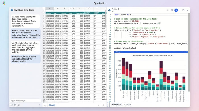
The first step is bringing your data into a workspace where it can breathe. In Quadratic, you can connect directly to your database (Postgres, MySQL, Snowflake, etc.) or drag and drop massive CSV files containing your raw billing logs and usage history. Because Quadratic supports an infinite canvas and handles large datasets efficiently, you are not restricted by standard row limits. You can see your raw sales data side-by-side with your product usage logs on the same grid.
Step 2: Filtering for "valid" segments
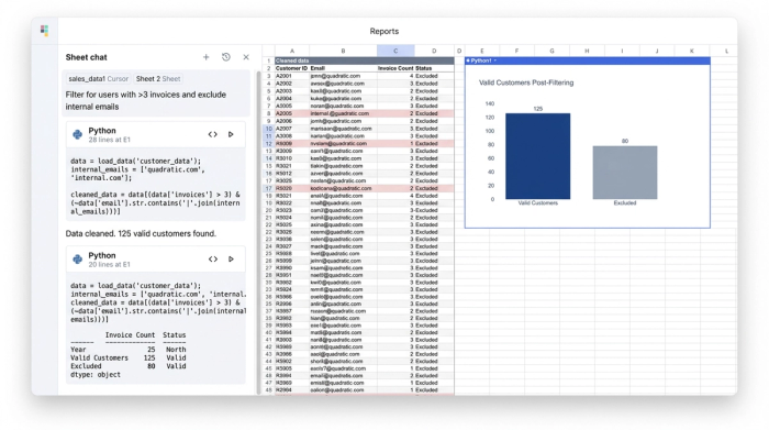
This is the critical differentiator. In a standard tool, filtering out "noise" (internal testers, free trials, comped accounts) is often limited to basic "include/exclude" checkboxes, underscoring the need for robust data cleaning best practices. In Quadratic, you can use Python or SQL directly in the cell to write precise logic.
For example, you might write a Python script that filters your dataset to include only users who have paid at least three invoices in the last six months and excludes any email domain matching your company’s internal address. This ensures that your subsequent analysis is based on true, high-value customers. Unlike a spreadsheet filter that hides rows, this code generates a clean, new dataset that is fully reproducible and auditable.
Step 3: Mapping the migration
Once you have a clean list of valid customers, you can map their movement. You can write a SQL query within the sheet to join your billing data with your version usage logs. This allows you to categorize users into distinct buckets: those who stayed on Version 1.0, those who successfully migrated to Version 2.0, and those who canceled during the transition period.
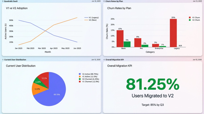
This level of granularity is essential for accurate customer churn analysis. Instead of a generic "churn rate," you can see exactly which cohort of users is dropping off. perhaps users on the "Pro" plan are migrating successfully, while "Starter" plan users are churning because the new version lacks a specific feature they relied on.
Step 4: Visualizing the story
Finally, you need to communicate these findings. In Quadratic, you do not need to export your clean data to a third-party visualization tool. You can generate charts using Python libraries or the built-in charting interface right next to your analysis. This allows you to create a visual adoption curve that shows the migration from Version A to Version B over time, backed by the transparent code that generated it.
Strategic insights: Turning data into product decisions
The value of using a code-enabled spreadsheet for this workflow extends beyond just getting the numbers. It provides a layer of trust and reliability that is often missing from black-box dashboards. Because you wrote (or audited) the Python and SQL logic that filtered the data, you know exactly how "churn" and "adoption" are defined. There is no ambiguity about whether internal test accounts were skewing the results.
This clarity leads to actionable outcomes. If your analysis reveals that product migration is stalling among a specific user segment, you can confidently make strategic decisions—such as delaying the sunset of the old version or launching a targeted education campaign for that specific cohort. This is the difference between guessing based on trends and deciding based on evidence.
Summary: Choosing the right tool for your data
While platforms like Amplitude and Mixpanel serve a vital role for general event tracking, they often fall short when the questions become complex and the data becomes messy. For technical product managers and data analysts, the best product analytics tools for adoption tracking are the ones that give you total control over your logic.
Quadratic offers a unique solution by combining the familiarity of a spreadsheet with the power of Python and SQL. This hybrid approach allows you to ingest raw logs, define your own valid customer segments, and visualize complex migration patterns without hitting the performance limits of traditional software. If you are ready to move beyond rigid dashboards and fragile spreadsheets, try Quadratic for your next deep-dive analysis.
Use Quadratic to track product migration & retention
- Ingest and combine raw transactional data from massive CSVs or databases like Postgres and Snowflake, viewing it all on an infinite canvas.
- Precisely define and filter "valid" customer segments using Python or SQL directly in cells, ensuring reproducible and auditable data for analysis.
- Map complex user migration paths by joining billing and usage data with SQL, categorizing users by their adoption status (e.g., stayed on V1, migrated to V2, churned).
- Visualize adoption curves and migration trends directly within your workspace using built-in charting or Python libraries, with transparent code backing every insight.
- Conduct deep, custom analysis of product adoption and churn, moving beyond rigid dashboards to confidently make strategic product decisions.
Ready to get granular with your product adoption data? Try Quadratic.