
Table of contents
- Beyond headcounts: what your attendance data should be telling you
- The workflow: how to build a custom attendance dashboard in Quadratic
- The "data smasher": combining attendance with financials
- The final output: a printable, board-ready summary
- Making your software work for you
- Use Quadratic to build custom church attendance dashboards
Most church administrators live in two worlds. In one world, you have excellent church attendance tracking software—platforms like Realm, Planning Center, or Tithe.ly—that captures every check-in, registration, and headcount perfectly. In the other world, you have a board of elders or an executive pastor asking complex questions about growth trends that those platforms simply cannot answer.
This is the rigidity gap in church management software reporting. Your database is designed for input, not flexible output. You can easily see who attended last Sunday, but trying to visualize a three-year period-over-period comparison of youth group engagement against total giving usually results in frustration. You end up exporting CSVs, wrestling with rigid spreadsheet templates, and pasting charts into Word documents.
There is a better way to handle your church metrics. By moving your raw data out of a rigid system and into a flexible analysis layer like Quadratic, you can build the exact, board-ready dashboard your leadership team needs without changing your core database.
Beyond headcounts: what your attendance data should be telling you
Modern church management is about stewardship, and that applies to data as much as it does to finances. Tracking "butts in seats" is no longer enough. To understand the health of your congregation, you need attendance analysis that reveals the story behind the numbers.
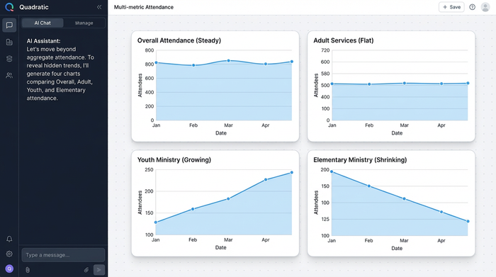
Standard reports often fail to account for context. A drop in attendance in July might look like a crisis on a standard line graph, but a period-over-period analysis would show that it is a normal seasonal trend. Furthermore, total attendance numbers can hide critical shifts in demographics. Your main service might be growing while your elementary ministry is shrinking, a trend that requires immediate strategic attention but is easily missed in aggregate reports.
Your board members do not need raw spreadsheets. They need high-level insights that answer specific questions about the health of the organization. They need to know if the new service time is cannibalizing the old one or if the fall launch campaign actually retained visitors past the first month.
The workflow: how to build a custom attendance dashboard in Quadratic
The solution to rigid reporting is not to buy new software but to change where you analyze your data, thereby optimizing your data analytics strategy. Quadratic serves as an infinite canvas where you can bring in data from multiple sources and visualize it exactly how you want. Here is how you can turn a raw export into a dynamic dashboard.
Centralizing your data
The first step is getting the data out of your church attendance tracking software. almost every major platform allows you to export your attendance logs as a CSV file. In a standard spreadsheet, this raw data is messy and hard to read.
In Quadratic, you can import this CSV directly onto the canvas. Because Quadratic is built for data, it handles large datasets easily. You can place your raw data in one section of the infinite grid, keeping it separate from your calculations and visualizations. This ensures that your source of truth remains intact while you build your analysis around it.
Analyzing trends (period-over-period)
Once your data is in Quadratic, you can start asking real questions. Instead of looking at a flat list of dates, you can use built-in formulas or Python to filter the data.
For a true period-over-period growth analysis, you might want to compare this October’s average attendance against last October’s average. This isolates seasonal variables and gives you a true picture of growth. You can further refine this by categorizing the data by event type. You can set up a filter to isolate "Wednesday Youth" numbers from "Sunday Morning" numbers, allowing you to track specific ministry health individually.
Visualizing the story
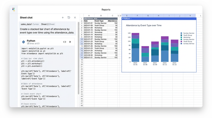
Rows and columns rarely inspire action. To make your point, you need church data visualization. In Quadratic, you can create visual bar charts that live directly on the canvas next to your data.
You might create a stacked bar chart that shows total attendance for the last six months, color-coded by event type. This allows leadership to see at a glance that while overall numbers are steady, the composition of the audience is changing. These charts are not static images pasted from another tool; they are connected to your data. When you update the export next month, your charts update automatically.
The "data smasher": combining attendance with financials
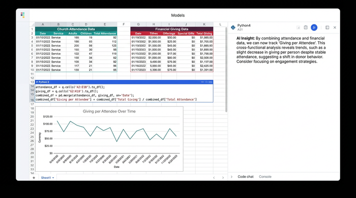
One of the biggest limitations of standard church attendance tracking software is that it usually keeps people data separate from financial data. Your attendance lives in one system, and your budget lives in QuickBooks or Excel. This separation makes it impossible to see the correlation between engagement and generosity.
Quadratic acts as a "data smasher." You can pull your attendance CSV into one part of the canvas and your budget CSV into another. Because they are in the same workspace, you can perform cross-functional analysis.
You can calculate complex ratios that most software cannot handle, such as "Cost per Attendee" or "Giving per Family Unit." This answers the financial and operational questions that executive pastors care about most. It moves the conversation from "we feel like giving is down" to "giving per attendee has remained stable, but total attendance has dropped by 5%." This distinction changes the strategy from a financial appeal to an engagement campaign.
The final output: a printable, board-ready summary
The goal of this analysis is a clear, actionable report for nonprofit leadership. Once you have built your charts, tables, and comparison metrics, you can organize them on the Quadratic canvas.
You can arrange your dashboard so that the "messy" raw data is off to the side or hidden, leaving only the clean summary visible. This might include a headline metric for the month, a custom church reporting table showing year-over-year changes, and your visual charts.
From there, you can format this view for a PDF export. This allows you to walk into your board meeting with a professional, single-page document that summarizes the entire month’s activity. Instead of saying, "I think we are growing," you can hand out a report that says, "The data shows a 12% increase in youth attendance year-over-year, despite a flat trend in adult services."
Making your software work for you
Your church attendance tracking software is a vital tool for data entry, but it should not limit your decision-making. You do not have to settle for generic reports that fail to capture the nuance of your ministry.
By using Quadratic as your analysis layer, you can bridge the gap between raw data and actionable insight. You can respect the complexity of your church’s data while presenting it with clarity and simplicity. Stop fighting with built-in reporting tools that were not designed for you. Export your data, bring it into Quadratic, and build the dashboard your ministry needs today.
Use Quadratic to build custom church attendance dashboards
- Generate flexible, board-ready reports that go beyond basic headcounts to reveal true growth trends and demographic shifts over time.
- Combine attendance data with financial records on one canvas to calculate insightful metrics like "giving per attendee" and "cost per family unit."
- Build dynamic dashboards with charts and tables that automatically update, turning raw CSV exports into actionable, period-over-period insights.
- Export professional, single-page PDF summaries for your leadership team, clearly communicating ministry health and strategic opportunities.
Ready to build the custom attendance dashboard your ministry needs? Try Quadratic.