
Table of contents
- Introduction: The Executive’s Dilemma
- What makes an effective executive dashboard?
- The data strategy: moving beyond rigid templates
- Step-by-step: building the visualization layer
- Leveraging the infinite canvas for the "whole picture"
- Final polish: an executive dashboard checklist
- Conclusion
- Use Quadratic to build accessible executive dashboards
Introduction: The Executive’s Dilemma
Presenting data to the C-suite is a high-stakes exercise in brevity. Executives have limited time and even less patience for ambiguity. When a chart is cluttered, the labels are overlapping, or the colors are indistinguishable, the insight is lost before the meeting even begins. The reality is that most executive dashboards fail not because the data is wrong, but because the presentation is rigid.
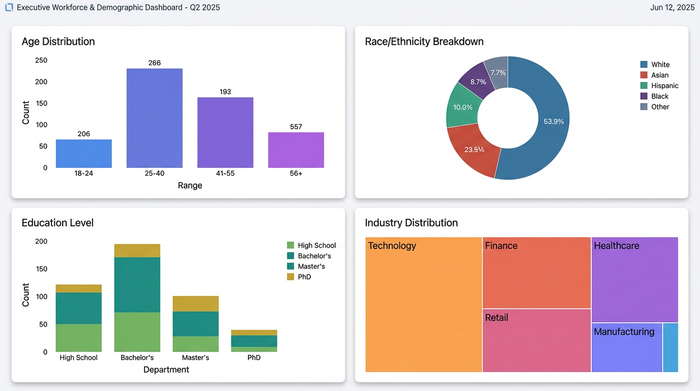
Standard spreadsheet tools and BI platforms often force visualizations into cramped grids or pre-set widgets. This leads to messy layouts where long category names get cut off and important trends are buried in visual noise. To solve this, analysts are turning to tools like Quadratic, which offers an infinite canvas and Python-enabled cells. This approach allows for the creation of "Board-Ready" dashboards that are spatially organized, strictly accessible, and visually precise. In this guide, we will walk through building a high-level Workforce & Demographic Overview—covering Age, Race, and Education distributions—to demonstrate how to build a dashboard that actually drives decisions.
What makes an effective executive dashboard?
Before diving into the build, it is essential to define what success looks like. Research into cognitive load and data visualization best practices suggests that clarity must always supersede complexity. An effective dashboard isn't about fitting the most charts onto a screen; it is about reducing the time it takes to understand the data.
First, accessibility is paramount. Decision-makers need to scan data instantly. If a dashboard relies on subtle color nuances that a colorblind executive cannot distinguish, the dashboard has failed; understanding essential accessibility design principles is crucial. High-contrast, accessible palettes are a requirement, not a stylistic choice.
Second, context requires space. A traditional executive project dashboard is often squeezed onto a printable A4 sheet or a fixed-width monitor view, forcing charts to compete for attention. A modern dashboard should breathe. By using an infinite canvas, related metrics can sit side-by-side without being compressed, allowing the viewer to follow the narrative flow naturally.
Finally, the dashboard must tell a story. It should not be a dump of raw numbers. Whether you are building an executive KPI dashboard for finance or a demographic overview for HR, the goal is to weave disparate data points into a cohesive narrative about the health and direction of the organization.
The data strategy: moving beyond rigid templates
The workflow usually begins with raw, somewhat messy data—percentage distributions for various categories like Age, Race, and Industry. A common mistake is downloading a generic executive dashboard template and trying to force this specific data into it.
Templates in traditional spreadsheets are brittle. If your category labels are long (e.g., "Manufacturing and Logistics" vs. "Tech"), the template breaks. Text overlaps, columns stretch awkwardly, and the visual balance is destroyed. This forces the analyst to spend hours fighting the tool rather than analyzing the data.
In Quadratic, the strategy changes. You bring your data into the grid, but you don't rely on the grid's physical cells to constrain your visualization. Because code and spreadsheet data live together, you can clean your data using Python or SQL directly in the sheet and then project it onto the infinite canvas. This decouples the data layer from the presentation layer, giving you total control over the final output.
Step-by-step: building the visualization layer
The core of this workflow is moving from raw data to a polished visual. Here is how a real user leveraged Quadratic to build a workforce demographic dashboard that solved common formatting headaches.
Choosing the right chart for percentage distributions
When dealing with demographic data, the first instinct is often a pie chart. However, when comparing multiple segments—such as workforce composition by Age or Education—pie charts become difficult to compare side-by-side.
For this use case, the user opted for Stacked Bar Charts or 100% Stacked Bars. These allow executives to instantly compare the weight of different segments across different departments or years. By reviewing various executive dashboard examples, it becomes clear why linear comparisons (bars) are far easier for the human eye to measure than angular comparisons (pies), especially when precision is required.
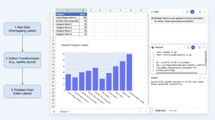
Solving the "label overlap" problem with Python
One of the most frustrating aspects of standard charting tools is label management. If a data category is named "Education: Master’s Degree or Higher," a standard chart will often cut the text off or overlap it with the next label, rendering it unreadable.
In Quadratic, the user utilized Python within the grid to solve this programmatically. Using libraries like Plotly or Matplotlib directly in a cell, they could write a script to rotate labels 45 degrees or, more effectively, create a custom legend that sits outside the chart area. This ensures that the text remains perfectly legible without encroaching on the visual data. The result is a clean, professional look where the insight is the hero, not the formatting struggle.
Enforcing color consistency for accessibility
In drag-and-drop BI tools, color consistency is a frequent pain point. You might set "Age 18-24" to blue in one chart, but the next chart auto-assigns it to orange. This confuses the reader and breaks the visual narrative.
The user in this case solved this by defining a color dictionary in a Python cell. For example, they wrote a simple mapping: colors = {'18-24': '#1f77b4', '25-34': '#ff7f0e'}. By referencing this dictionary in the code for every chart, they guaranteed that the visual language remained identical across all executive dashboard samples. Furthermore, this allowed them to use specific hex codes verified for colorblind accessibility, ensuring that every stakeholder could read the data without ambiguity.
Leveraging the infinite canvas for the "whole picture"
Once the charts were generated, the layout phase began. In a traditional spreadsheet, you might have to hide charts in different tabs or force the user to scroll vertically through a long report.
Using Quadratic’s infinite canvas, the user arranged the charts spatially. They placed the Age, Race, and Industry charts side-by-side. This panoramic view offers a strategic advantage: an executive can look at the "Entry Level" age bracket on the left and immediately glance to the right to see the diversity breakdown for that same group, without flipping pages or losing context.
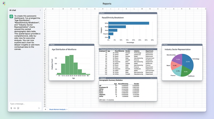
This level of flexibility is often missing in enterprise software. When leaders evaluate the AI-native ERP company Sage on board-ready executive dashboards, they often find that while the data is robust, the visualization lacks the spatial flexibility needed for complex storytelling. Custom dashboards built on an infinite canvas bridge this gap, offering the rigor of enterprise data with the design freedom of a whiteboarding tool.
Final polish: an executive dashboard checklist
Before sharing the dashboard with leadership, it is critical to run a final quality check using a comprehensive checklist. The difference between a good analysis and a great presentation often lies in the details.
1. Consistent Legends: Check that categories are colored identically across all charts. If "Engineering" is green in the headcount chart, it must be green in the attrition chart.
2. Breathing Room: Ensure there is ample white space between the Education and Income charts. Crowded data looks like messy data.
3. Clear Labeling: Are percentages readable without hovering? An executive reviewing a PDF or a screenshot cannot "hover" to see the number.
By following these best practices, your executive dashboards will move from being simple status updates to powerful tools for strategic discussion. Reviewing high-quality executive dashboard samples can help keep your standards high and your layouts fresh.
Conclusion
True executive insight comes from clarity, not complexity. The goal of any analyst is to remove the friction between the data and the decision by applying a comprehensive framework for data storytelling. By using Quadratic, you move from fighting the limitations of rigid spreadsheet grids to crafting a deliberate data narrative. The combination of Python for precision and an infinite canvas for context allows you to build reports that respect your leadership team's time and intelligence.
If you are ready to stop wrestling with templates and start building your next executive dashboard in Quadratic.
Use Quadratic to build accessible executive dashboards
- Solve label overlap and clutter: Use Python directly in cells to programmatically rotate labels or create custom legends, ensuring every detail is legible without visual noise.
- Guarantee visual consistency and accessibility: Define color palettes in Python to ensure identical, colorblind-accessible visuals across all charts, eliminating confusion and enhancing comprehension.
- Build flexible, spatially organized layouts: Leverage the infinite canvas to arrange related charts side-by-side, providing executives with a panoramic view and immediate context without endless scrolling.
- Decouple data from presentation: Clean and transform raw data using Python or SQL directly in the grid, then project it onto the canvas for complete control over the final dashboard design.
- Generate precise, impactful visualizations: Utilize powerful Python libraries like Plotly to create chart types (e.g., stacked bar charts) that accurately convey proportions and facilitate easy comparisons for decision-makers.
Ready to build clear, impactful dashboards? Try Quadratic.