Financial analysts tracking digital assets often find themselves trapped between two extremes. On one side, you have the raw chaos of live API feeds and massive datasets that break standard spreadsheets. On the other, you have rigid business intelligence tools that force your data into pre-set templates, stripping away the nuance required for high-fidelity reporting.
For researchers and analysts, the goal is not just to track price action. It is to communicate complex trends—like real-world asset (RWA) tokenization growth or cross-chain liquidity flows—without overwhelming stakeholders. Achieving actionable financial insights requires more than just a chart; it requires a narrative, or more broadly, the ability to tell compelling financial stories.
This is where the concept of a programmable canvas comes into play. By combining the data-fetching power of Python with a flexible, infinite design space, Quadratic, the python spreadsheet, allows analysts to master crypto visualization. It bridges the gap between the code required to get the data and the design required to explain it, enabling you to build bespoke financial stories that are as accurate as they are aesthetically clear.
Why standard crypto charting tools fall short
If you are analyzing tokenomics or derivatives, you likely rely on a stack of disconnected tools. Terminal-style apps like TradingView are excellent for technical analysis and price action, but they struggle when you need to visualize custom metrics, such as a protocol’s revenue relative to its governance token emissions. Conversely, standard BI dashboards often lack the flexibility to handle the velocity of web3 data.
The limitations become obvious when you try to blend on-chain data with off-chain financial metrics. A standard crypto visualizer might let you see a token's price history, but it rarely lets you plot that price against a custom risk model you built in a spreadsheet.
Furthermore, there is an aesthetic gap. For the analyst who values meticulous visual style, the default output of most charting libraries is cluttered and unpolished. "Chart junk"—unnecessary gridlines, heavy borders, and redundant legends—obscures the signal. High-stakes financial decision-making requires a cleaner approach, where the design supports the data rather than distracting from it, aligning with core effective data visualization principles.
The analyst’s workflow: from raw data to visual crypto insights
In a standard workflow, an analyst might download a CSV from Dune Analytics, clean it in Excel, and then attempt to paste it into a presentation tool. In Quadratic, this entire pipeline happens in one workspace, allowing you to use a crypto spreadsheet tracker to move from raw numbers to a polished crypto visual without switching context.
Step 1: Ingesting complex data
The first step in sophisticated crypto analysis transaction visualization is getting the data. Because Quadratic runs Python natively in the grid, you can make API requests from spreadsheets to pull live data directly from APIs like CoinGecko, Dune, or proprietary institutional feeds.
Instead of manually importing files, you write a short Python script to fetch the exact dataset you need. Whether you are tracking wallet movements or analyzing liquidity pool depths, the data lands directly in your spreadsheet grid, ready for processing. This allows for a level of depth that pre-packaged tools simply cannot match.
Step 2: Modeling and calculations
Once the data is in the grid, the financial data analytics begins. This is where you apply your financial models, which are part of a broader financial analysis. You might calculate volatility indices, project staking yields, or assess risk-adjusted returns.
For example, if you are building a custom crypto derivatives visual screener, you can use the spreadsheet grid to process the raw options data, applying Black-Scholes models or custom logic to identify mispriced premiums. You are not limited to the calculations a software vendor thought you might need; you are building the logic yourself, directly alongside the data.
Step 3: Rendering on the canvas
With the data modeled, you move to the presentation layer. Using Python graphing libraries like Plotly or Matplotlib, you can render charts that appear directly on the infinite canvas. This is distinct from standard spreadsheet charts because you have code-level control over every pixel. You can adjust opacity, layer multiple datasets, and ensure the visualization perfectly matches your thesis.
Design principles for effective crypto market visualization
The difference between a confusing dashboard and a clear insight often comes down to design. When you have full control over your plotting libraries, you can adhere to design principles that elevate your analysis.
Clarity over complexity
The most effective crypto market visualization strips away the non-essential. By using Python to define your charts, you can remove default borders, soften gridlines, and ensure that the data series itself is the boldest element on the screen. This minimalism helps stakeholders focus immediately on the trend, not the axis labels, embodying Clarity, as a key principle of data visualization.
Consistent color palettes
When presenting a comprehensive market overview, color consistency is vital. If you are distinguishing between Layer 1 blockchains and DeFi tokens, you can define specific hex codes in your Python script to ensure that "Ethereum" is always the same shade of blue across every chart in your report. This visual continuity reduces cognitive load for the viewer, aligning with best practices for consistent color palettes in financial dashboards.
Interactive elements
Static images often fail to capture the depth of crypto markets. A strong crypto market cap visualization should be interactive. By using libraries like Plotly within Quadratic, you can enable tooltips and zoom functions. This allows a stakeholder to see the high-level trend of the entire market but also hover over a specific data point to see the exact market cap of a specific asset at a specific moment in time.
Use case examples: what you can build
When you control both the data and the pixel-perfect output, you can build visualizations that tell specific financial stories.
Tokenization growth projections
The real-world asset (RWA) tokenization market is a complex narrative involving off-chain value moving on-chain. You can build a clean line chart that plots historical growth while projecting future trajectories with confidence intervals. By annotating key regulatory milestones directly on the chart, you provide context that raw numbers lack.
Asset class performance heatmaps
Instead of a simple list, you can create a crypto portfolio visualizer that functions as a heatmap. This view can compare emerging sectors—like gaming or decentralized identity—against traditional crypto assets. By scaling the size of the blocks by liquidity and the color by performance, you create an instant visual summary of where the market heat is flowing.
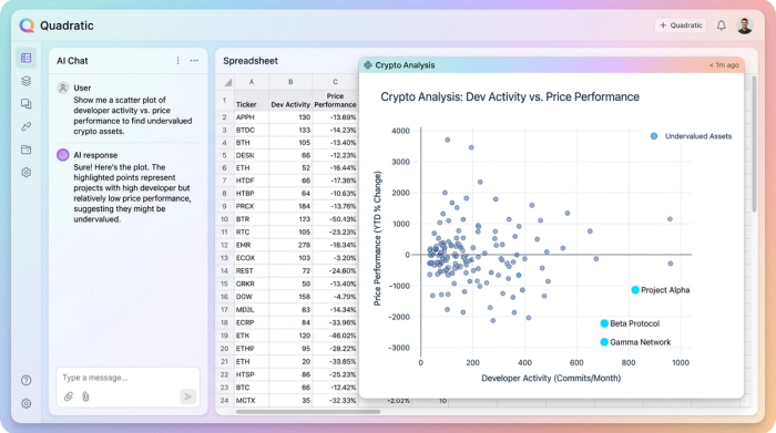
Investment opportunity distribution
For identifying outliers, a scatter plot is often the best tool. You can design a chart that plots assets based on developer activity versus price performance. This helps isolate undervalued projects that have high activity but low market attention. By keeping the design uncluttered, the "opportunities" stand out clearly against the noise of the broader market.
The future of crypto visual analytics
As financial markets continue to merge with digital assets, the tools analysts use must evolve. We are moving past the era of static spreadsheets and rigid dashboards. The future of crypto visual analytics belongs to those who can curate their own data and design their own narratives.
Analysts no longer have to choose between the power of code and the clarity of design. By working in a programmable canvas, you can build the exact tools you need to decipher the market, and even learn Python for data analysis. Stop fighting with templates that do not fit your needs, and start to create a dashboard in python in Quadratic today.
Use Quadratic to do crypto visualization
- Pull live crypto data directly from APIs like CoinGecko or Dune into your spreadsheet grid using native Python.
- Model custom crypto metrics and apply complex financial calculations (e.g., risk models, staking yields) directly alongside your data.
- Render pixel-perfect crypto charts and interactive dashboards with Python libraries like Plotly or Matplotlib on an infinite canvas.
- Design clear, compelling visualizations that strip away "chart junk" and use consistent palettes for high-fidelity crypto reporting.
- Build bespoke visual stories for tokenization growth, asset performance heatmaps, or investment opportunity analysis in one workspace.
Start building your custom crypto visualizations today. Try Quadratic.