
Table of contents
Empirical economic modeling is rarely a linear process. It involves wrangling multi-dimensional datasets where entities—such as firms, countries, or individuals—are observed over time. For researchers analyzing the intersection of financial performance and environmental metrics, the complexity doubles. You are not just looking at a snapshot; you are tracking the evolution of variables across distinct cross-sections.
Panel data econometrics stands as the gold standard for this type of analysis. By combining cross-sectional and time-series data, researchers can control for individual heterogeneity that would otherwise bias results. However, while foundational texts like Wooldridge’s econometric analysis of cross section and panel data provide the theoretical rigor required for these models, the practical execution often forces a painful compromise. Researchers typically fracture their workflow, storing data in spreadsheets while running complex regressions in isolated environments like R or Stata.
This separation creates a "black box" problem. Data cleaning happens in one place, analysis in another, and visualization in a third, making the audit trail difficult to follow. This article explores a real-world use case where a financial researcher utilized Quadratic to unify this workflow. By investigating the "profitability paradox" of technological adoption, we demonstrate how to execute rigorous panel data analysis without losing the transparency of a spreadsheet.
Structuring the dataset for econometric analysis
The first hurdle in any empirical study is data organization. In this specific use case, the researcher needed to merge comprehensive firm financials with environmental performance metrics and corporate governance variables. In a standard spreadsheet, managing this creates a sprawling, fragile web of lookups and tabs. Panel data requires a specific structure—usually a "long" format where each row represents a unique unit-time observation—which is often counter-intuitive to the "wide" format used in financial reporting.
Before running a single regression, the data must be rigorously cleaned and reshaped, often requiring significant data exploration. In Quadratic, the researcher imported raw CSVs and SQL data directly into the grid. Instead of manual copy-pasting, they utilized Python code cells to programmatically reshape the data. This allowed them to pivot wide financial reports into the long format necessary for regression analysis without breaking the visual link to the source data.
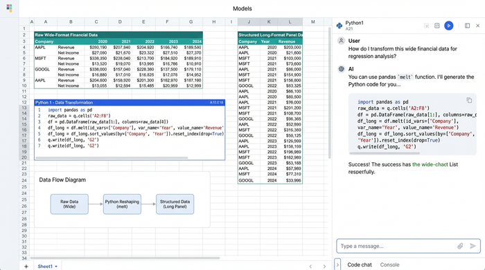
This approach aligns with the best practices outlined in Baltagi’s econometric analysis of panel data regarding data structure. By keeping the transformation logic visible in Python cells right next to the data, the researcher ensured that every step—from handling missing values to normalizing environmental metrics—was documented and reproducible.
The base model: fixed effects and interaction effects
Once the data is structured, the modeling phase begins. The researcher’s primary objective was to define the equation for the impact of technology adoption on firm value. A major challenge in this analysis is unobserved heterogeneity—factors like corporate culture or management quality that do not change over time but significantly impact profitability.
To address this, the researcher chose a Fixed Effects (FE) model. Theoretically, FE models control for these time-invariant characteristics, ensuring that the estimated coefficients reflect the actual impact of the variables in question rather than unobserved noise. The researcher also sought to test the "profitability paradox" via interaction effects, examining whether the return on tech investment was conditional on specific governance structures.
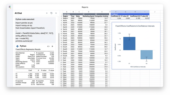
In a traditional workflow, this is where the researcher would export data to a statistical package. In Quadratic, they simply opened a code cell and used Python libraries like linearmodels or statsmodels to run the regression directly on the dataset in the sheet.
The immediate benefit was visibility. The regression output table—complete with coefficients, standard errors, and p-values—rendered directly in the grid. This allowed for an immediate comparison between the model outputs and the raw data. This proximity is vital when navigating the nuances of econometric analysis of cross section and panel data, particularly when deciding between fixed and random effects based on the Hausman test, which could also be scripted and displayed in the same view.
Addressing endogeneity and the "black box" problem
A critical critique in empirical economics is endogeneity. In this case, the researcher had to ask: Is technology adoption driving firm value, or are high-value firms simply more likely to adopt new technology? Failing to address this simultaneity bias renders the results invalid.
To solve this, the researcher employed advanced data analytics techniques, including Instrumental Variable (IV) approaches and Mediation Analysis. They needed to isolate the exogenous variation in tech adoption to establish causality.
This level of complexity often breaks standard spreadsheet tools, forcing users to rely on opaque, clunky add-ins that function as black boxes, making the choice of software for data analysis critical. Because Quadratic runs native Python, the researcher could implement rigorous IV regressions and mediation models using the same transparent syntax found in academic literature.
For those familiar with Arellano panel data econometrics, specifically regarding dynamic panel bias or Generalized Method of Moments (GMM), the ability to script these estimators manually or call specialized libraries within the spreadsheet offers a significant advantage. It ensures that the sophisticated statistical corrections required to handle endogeneity are not just theoretical concepts, but visible, executable parts of the analysis.
Visualizing results and ensuring reproducibility
The final step for the researcher was producing academic deliverables. The requirements were strict: detailed methodology sections with clear equations, reproducible charts, and a discussion section interpreting the complex statistical results.
Visualization in empirical papers must be precise. The researcher used Quadratic to generate high-quality plots using Matplotlib and Plotly. They created visualizations of the interaction effects, plotting the marginal effect of tech adoption on firm value at different levels of governance quality, complete with confidence intervals.
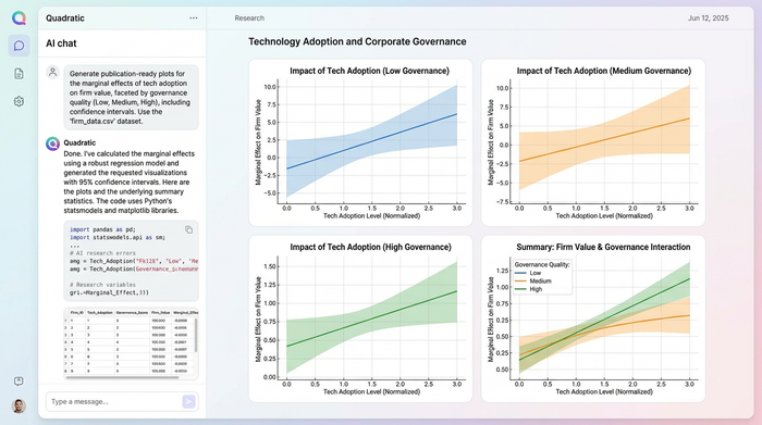
Because these charts were generated via code referencing the data in the grid, they were inherently reproducible. If the underlying dataset changed—perhaps due to an update in the financial quarter—the charts updated automatically. Furthermore, the "audit trail" was built-in. A peer reviewer or colleague could click on any cell, chart, or regression table and see the underlying Python code. This transparency satisfies the rigorous documentation standards that panel data in econometrics demands, moving beyond the "trust me" nature of static spreadsheet exports.
Implications for empirical economic modeling
The implications of this workflow extend beyond convenience. By unifying data, code, and visualization, the researcher was able to synthesize complex findings effectively. They concluded that while tech adoption generally drives value, there was a significant moderating effect of governance—meaning the ROI of technology is heavily dependent on how well a firm is managed.
Tools like Quadratic act as a digital companion to econometric analysis of panel data. They bridge the gap between the theoretical density of textbooks and the practical reality of research. They allow economists and data scientists to move faster from hypothesis to publication, ensuring that the rigor of their methods is matched by the clarity of their execution.
Conclusion
This use case demonstrates a modernized workflow for empirical research, showcasing how quantitative data analysis leads seamlessly into advanced regression techniques like Fixed Effects and Instrumental Variables, followed immediately by publication-ready visualization.
Panel data econometrics no longer requires a choice between the accessibility of a spreadsheet and the statistical power of a programming language. By bringing Python into the grid, Quadratic offers both. Researchers looking to elevate the transparency and reproducibility of their work should consider trying the Python-enabled spreadsheet for their next empirical paper.
Use Quadratic to do panel data econometrics
- Unify your entire workflow: Combine data storage, cleaning, advanced econometric modeling, and visualization in a single, transparent environment, eliminating the "black box" problem.
- Effortlessly structure panel data: Import raw data, then use Python directly in the grid to reshape wide financial reports into the long format needed for rigorous analysis, maintaining visual context.
- Run advanced regression models directly: Execute fixed effects, instrumental variable (IV) regressions, and mediation analysis using Python libraries like
linearmodelsorstatsmodelswithout exporting data. - Gain immediate insight from model outputs: View regression tables, coefficients, and p-values rendered instantly in the grid, allowing for direct comparison with your raw data and iterative model refinement.
- Ensure full reproducibility and an audit trail: Keep all data transformations, model logic, and publication-ready visualizations visible in Python code cells alongside your data, simplifying peer review and updates.
- Create dynamic, publication-quality charts: Generate precise plots using Matplotlib and Plotly that automatically update with changes to your underlying panel data.
Ready to bring transparency and power to your econometric analysis? Try Quadratic.