
Table of contents
Every quarter, HR teams face a familiar challenge: the quarterly survey crunch. You have successfully collected massive amounts of employee feedback, but now that raw data sits in a folder, waiting to be transformed. For many People Operations managers and HR analysts, this phase is a nightmare of fragmented spreadsheets. You likely have one sheet for survey responses, another for employee demographics, and a third for organizational hierarchy codes. Trying to connect these disparate sources using standard spreadsheet formulas often leads to broken links, manual copy-pasting errors, and late nights.
However, the difficulty of analyzing multi-sheet tabular data shouldn't prevent you from uncovering critical insights. Effective survey data analysis is not just an administrative task; it is a strategic workflow that directly impacts organizational health. When done correctly, it bridges the gap between raw sentiment and business outcomes like retention and productivity.
In this article, we will explore the essential methods for analyzing HR data and demonstrate a modern workflow using Quadratic. We will show you how to streamline the analysis of supervisor performance to improve retention, moving away from fragile formulas and toward a robust, repeatable process.
What is survey data analysis?
At its core, survey data analysis is the process of turning raw feedback into actionable insights. It involves examining quantitative and qualitative data collected from respondents to identify patterns, trends, and correlations. While this definition applies to any industry, the context changes significantly within Human Resources.
In HR, the analysis of survey data is rarely about simply counting responses or calculating a generic "satisfaction score." It is about connecting those scores to tangible business metrics. For example, an analyst needs to understand if a dip in "sense of belonging" correlates with higher turnover rates in specific departments. This requires a level of data manipulation that goes beyond basic summary statistics, demanding tools that can handle relationships between different datasets without collapsing under complexity.
Key survey data analysis methods for HR
HR analysts typically rely on three primary categories of data analytics techniques when performing survey analysis.
Descriptive analysis
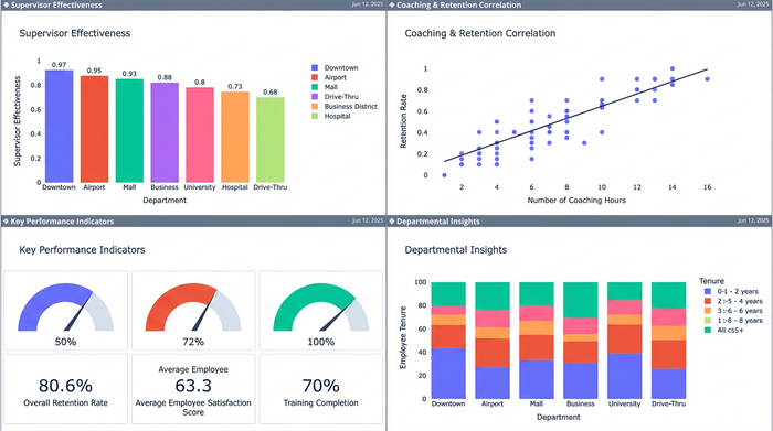
To determine if the trends you see are real or just random noise, you need statistical analysis of survey data. Descriptive analysis summarizes the basic features of the data to understand what happened. In an employee survey, this includes calculating the mean, median, and mode of responses (e.g., "The average Supervisor Effectiveness score is 4.2 out of 5"). While necessary for high-level overviews, descriptive analysis alone rarely explains why a score is high or low.
Inferential and statistical analysis
To determine if the trends you see are real or just random noise, you need statistical analysis of survey data. This involves using statistical tests to make inferences about the larger employee population based on your sample. For instance, is the difference in satisfaction between the Sales and Engineering departments statistically significant, or is it a result of a small sample size?
Segmentation
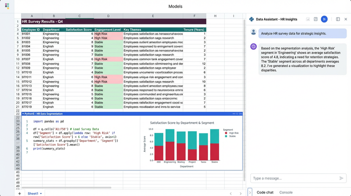
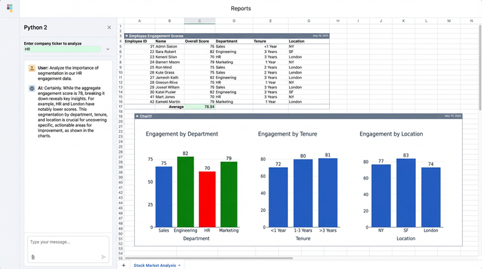
Segmentation is perhaps the most critical step for actionable HR insights. This involves breaking down data by specific variables such as tenure, department, gender, or location. Survey data analysis techniques that rely on segmentation allow you to pinpoint exactly where problems exist. A company-wide engagement score of 80% looks great, but if your high-performers with less than one year of tenure are rating their experience at 40%, you have a retention crisis brewing that an aggregate score would hide.
Step-by-step: How to do analysis of survey data for supervisor performance
The traditional method of analyzing this data involves a precarious chain of VLOOKUPs and pivot tables that break the moment the data structure changes. Here is a look at the modern workflow using Quadratic, where you can combine the familiarity of a spreadsheet with the power of Python to handle complex, multi-sheet data effortlessly.
1. Consolidating multi-sheet data
The first pain point in how to do analysis of survey data is consolidation. You typically start with a "Survey Responses" sheet (anonymized IDs and scores) and an "Employee Roster" sheet (IDs, tenure, department, manager).
In a standard spreadsheet, merging these requires memory-heavy lookup formulas that slow down your file. In Quadratic, you can use Python to merge these datasets instantly. By writing a simple script using the Pandas library, you can join the sheets on a common key, such as "Employee ID." This creates a new, consolidated dataset in your spreadsheet that updates automatically if the source data changes, ensuring your demographics are always perfectly aligned with your survey responses.
2. Cleaning and preparing the data
Using Quadratic, you can automate this cleaning process, leveraging AI for spreadsheet analysis. You might encounter inconsistent capitalization in department names, missing values, or incomplete responses. Manually filtering and correcting these rows is tedious and prone to human error.
Using Quadratic, you can automate this cleaning process. You can write a script to standardize headers, fill missing values with appropriate placeholders, or filter out respondents who didn't complete the survey. Because this logic is written in code, it is reproducible. Next quarter, when you paste in the new raw data, the cleaning script runs automatically, preparing your data for analysis in seconds rather than hours.
3. Advanced segmentation & metrics
Once the data is clean, the real work begins. Suppose you need to calculate a "Coaching Effectiveness" score, but it needs to be segmented specifically for employees with less than two years of tenure, grouped by their direct supervisor.
In Quadratic, you can use Python pivot tables or even SQL queries directly within the sheet to group your data. In Quadratic, you can use Python pivot tables or even SQL queries directly within the sheet to group your data. You can ask complex questions like, "Show me the average eNPS for employees under Supervisor A versus Supervisor B, but only for the Engineering department." This allows you to drill down into the micro-cultures within your organization to see which supervisors are driving retention and which are driving churn.
4. Visualizing executive insights
The final step is presenting your findings. Traditionally, this means copying charts from a spreadsheet and pasting them into a presentation deck—a static snapshot that becomes obsolete the moment the data updates.
Quadratic offers an infinite canvas that changes this dynamic. You don't need to export your data to visualize it. You can build professional-grade charts using libraries like Plotly or Matplotlib right next to your data tables. You might visualize the correlation between "Low Coaching Scores" and "High Turnover Risk" on a scatter plot that sits directly beside the analysis. This creates a living dashboard where the data, the analysis, and the visual storytelling exist in a single, interactive workspace.
Top survey data analysis software & tools
Choosing the right tool is essential for efficiency. Here is how the landscape looks for HR professionals.
Spreadsheets (Excel and Google Sheets)
These are the default tools for most HR teams. They are excellent for data entry and simple calculations. However, they are often insufficient as comprehensive survey data analysis software because they lack advanced data modeling capabilities. Managing complex segmentation across multiple sheets often results in slow, crash-prone files.
BI Tools (Tableau and PowerBI)
Business Intelligence tools are powerful for visualization and handling large datasets. However, they often have a steep learning curve and disconnect the analyst from the raw data. If you spot an error in a Tableau dashboard, you usually have to go back to the source file to fix it, disrupting the workflow.
The middle ground: Quadratic
Quadratic positions itself as the ideal solution for analysts who want the flexibility of a spreadsheet combined with the power of a data science platform. It allows for data analysis techniques for surveys that are usually reserved for data engineers. The key differentiator is reproducibility. By scripting your analysis in Python within the spreadsheet, you build a model that lasts. You do the hard work once, and for every subsequent survey, you simply update the dataset, and your entire analysis pipeline—from cleaning to visualization—updates instantly.
Turning analysis into action: Improving retention
The goal of this analysis is not just to produce a report, but to drive change. In our supervisor performance use case, the deep segmentation enabled by Quadratic might reveal that "Department X" has significantly lower supervisor engagement scores compared to the company average.
Because the analysis linked this sentiment data with tenure metrics, you might discover that new hires in this department are resigning at double the rate of other departments. With this clear, data-backed insight, HR leadership can intervene immediately. Instead of vague discussions about culture, you can implement targeted management training for supervisors in Department X. This moves HR from a reactive support function to a proactive strategic partner.
Conclusion
Effective survey data analysis bridges the gap between employee feedback and organizational health. It transforms a chaotic collection of spreadsheets into a clear narrative about what is happening inside your company.
Don't let your critical insights get buried in messy formulas or disjointed tools. By adopting a modern workflow that handles multi-sheet data with the power of Python and the familiarity of a spreadsheet, you can focus on strategy rather than data wrangling. Start analyzing your HR data with the speed and precision it deserves. Try Quadratic today.
Use Quadratic to do survey data analysis for HR
- Merge disparate survey responses with employee demographics and organizational data instantly using Python, replacing fragile lookup formulas.
- Automate data cleaning and preparation with reproducible Python scripts, ensuring consistency and accuracy across all survey cycles.
- Perform deep segmentation and calculate complex metrics (e.g., supervisor effectiveness by tenure) using Python or SQL directly in your sheet.
- Create dynamic, professional-grade visualizations and living dashboards alongside your data, eliminating static exports.
- Build repeatable analysis workflows that update automatically with new survey data, saving hours of manual work each quarter.
Ready to transform your HR insights? Try Quadratic.