Track user retention, identify high-performing segments, and optimize your product strategy with this comprehensive cohort analysis template. Designed for data-driven teams, this cohort analysis dashboard transforms raw event data into actionable insights through visual heatmaps, retention curves, and automated calculations—no coding required.
What this template does
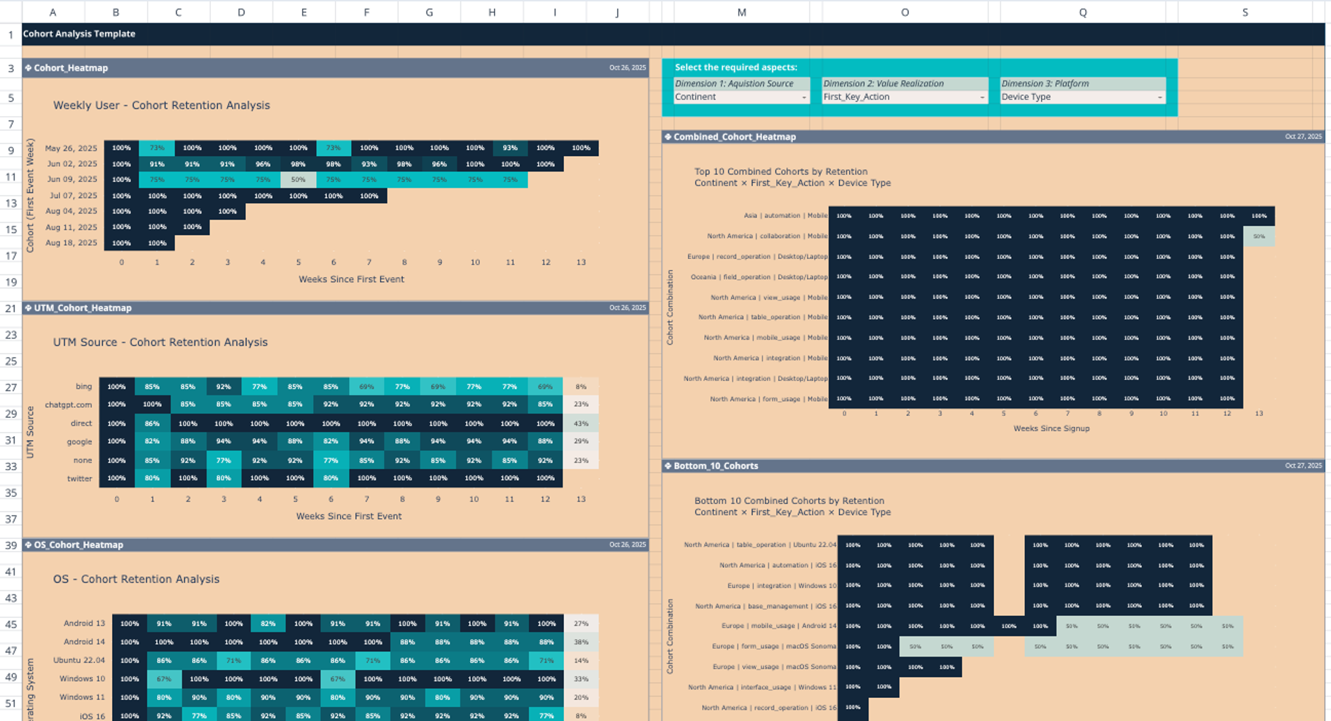
This SaaS cohort analysis template helps you analyze how different user groups retain over time across multiple dimensions. Monitor weekly retention rates for up to 14 weeks and compare performance across acquisition channels, platforms, geographic locations, and user behaviors. The template automatically calculates retention percentages and visualizes patterns through intuitive heatmaps, making it easy to spot trends and anomalies at a glance.
Key benefits include identifying your most valuable user segments, detecting early churn signals, understanding which acquisition sources drive lasting engagement, and measuring the impact of key user actions on long-term retention.
How to use this template
Getting Started:
- Import your user event data into the 'data' sheet (the template works with event-based analytics data)
- Map your events to relevant categories using the Event_Category_Mapping table
- Navigate to the Dashboard sheet to view your cohort analyses
Interactive Exploration: The dashboard features dimension selectors that let you analyze retention by:
- Acquisition Source: Compare performance across UTM sources, direct traffic, and referral channels
- Platform: Break down retention by operating system and device type
- User Behavior: Analyze cohorts based on first key actions taken
Each selection generates updated heatmaps showing retention percentages across weekly cohorts. Warmer colors indicate higher retention, making it easy to identify successful segments. The Combined Cohort Heatmap offers an at-a-glance view of overall performance, while specialized views let you drill into specific dimensions.
Best Practices:
- Start with broad analyses (acquisition source) before diving into granular segments
- Review the Bottom 10 Cohorts chart to identify at-risk user groups
- Use the Retention Curve Comparison to benchmark different segments
- Regularly update your data to track trends over time
Who should use this template
This cohort analysis template is ideal for:
- Product managers seeking to understand feature adoption and user engagement patterns
- Growth teams optimizing acquisition strategies and onboarding flows
- Data analysts in SaaS companies needing quick, visual retention reporting
- Marketing teams measuring campaign effectiveness beyond initial conversions
- Startup founders making data-informed product decisions on limited resources
Real-world applications include identifying which marketing channels attract loyal users, determining optimal onboarding experiences, predicting revenue from cohorts, and validating product-market fit through retention metrics.
Why this template stands out
Unlike static spreadsheets, this template leverages Python for automated calculations and Plotly for interactive visualizations—all within a familiar spreadsheet interface. Update your data and watch dashboards refresh automatically. No manual formulas to maintain, no complex pivot tables to rebuild.
Ready to understand what keeps your users coming back? Duplicate this cohort analysis dashboard template and start uncovering retention insights today.
Related templates
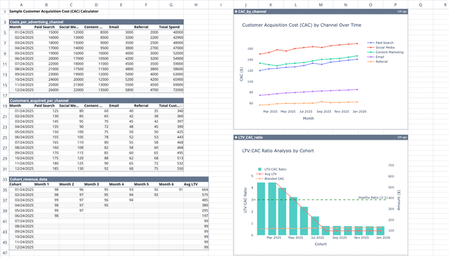
Customer Acquisition Cost (CAC) Calculator
Streamline your ROI analysis and compare LTV to CAC for smarter decisions.
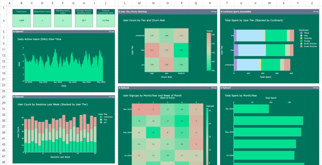
Product User Metrics Dashboard Template
Visualize and analyze user behavior with a comprehensive app usage dashboard.
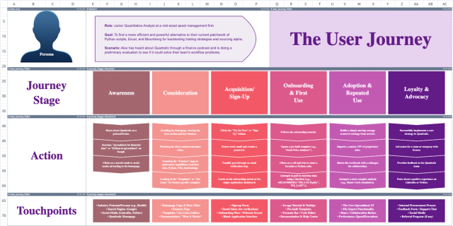
User Journey Map Template
Analyze emotions, pain points, and opportunities across each touchpoint in your customer's journey.