
Table of contents
Sustainability reporting has shifted from a voluntary marketing exercise to a rigorous requirement for modern enterprise. As regulatory pressure mounts and stakeholders demand transparency, the ability to produce accurate co2 emission reporting is no longer just about compliance, but also about adhering to established global sustainability reporting standards. It is about communication.
The problem facing many sustainability analysts is that environmental data is inherently messy. It involves thousands of rows of logistics logs, fuel consumption records, and distance metrics. When this raw data is presented to non-technical stakeholders—like board members or the C-suite—it often fails to land. Traditional spreadsheets bury the insights in hidden tabs, while enterprise dashboards often strip away the necessary narrative context.
To bridge this gap, analysts need a workflow that combines rigorous statistical analysis with clear, simply worded explanations. By using Quadratic, you can create a workspace where data cleaning, visualization, and written narrative happen side-by-side. This ensures that decision-makers do not just see the numbers; they understand the story behind them.
The challenge with standard CO2 emission reporting
Environmental data is rarely clean upon arrival. A typical dataset might include inputs from various organizational units, third-party logistics providers, and different transport modes ranging from air freight to rail.
The standard workflow for handling this data usually involves a "black box" approach. An analyst might perform complex calculations in a script or a separate spreadsheet, generate a chart, and then paste that static image into a presentation deck. This separation creates a disconnect. When a stakeholder asks why emissions are high in a specific sector, the answer is often buried in a file they cannot access or understand.
Quadratic solves this by unifying the workflow. Because it allows code, data, and formatted text to live on the same infinite canvas, the analysis and the report become the same document. This transparency builds trust and allows for immediate auditing of the logic behind the carbon calculations.
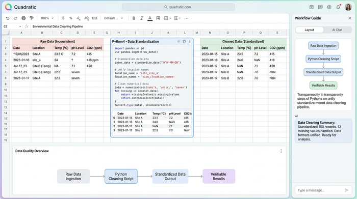
Step 1: Structuring the environmental data
The first step in any effective sustainability analysis is ingestion and cleaning. In a real-world scenario, an analyst might import a raw dataset containing organizational units, such as specific warehouses or office locations, alongside transport types and distances traveled.
This is often where the first roadblocks appear. One logistics provider might report distance in miles, while another uses kilometers. In a traditional tool, fixing this requires complex formula chains that are easy to break and hard to debug.
In Quadratic, you can use Python or SQL directly in the spreadsheet to clean this data. You can write a short Python script to standardize all distance units and categorize transport types (Air, Freight, Rail, Road) into a consistent format. Crucially, this code sits right next to the data visualization. It is not hidden in a macro; it is visible and verifiable, ensuring that the foundation of your reporting is solid before you begin visualizing.
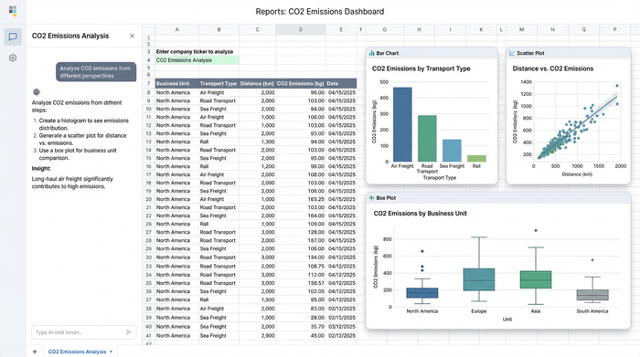
Step 2: Statistical analysis & visualization
Once the data is structured, the goal shifts from organization to insight. A standard sum of total emissions is useful for a high-level summary, but it rarely helps a company understand where to cut costs or carbon. To create a truly actionable co2 emissions report, you need to move beyond averages and explore the distribution of the data.
Using the built-in charting capabilities or Python libraries like Matplotlib or Seaborn directly within Quadratic, you can generate specific visualizations that reveal patterns:
- Univariate analysis: Histograms and bar charts are excellent for showing the frequency of shipments by transport type. This quickly highlights if a company is over-relying on high-carbon transport modes like air freight.
- Bivariate analysis: Scatter plots allow you to correlate distance against emissions. This helps identify inefficiencies, such as short-distance routes that are disproportionately carbon-intensive due to the vehicle type used.
- Deep dive with box plots: Perhaps the most valuable tool for this use case is the box plot. By plotting emission intensity across different organizational units, you can instantly spot outliers.
These visualizations do more than look professional. They reveal the operational reality that averages tend to hide, showing exactly which organizational units are performing well and which ones are skewing the company's carbon footprint.
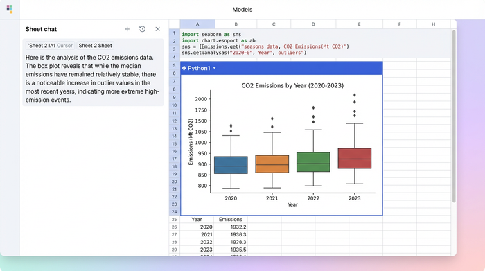
Step 3: Adding context for the non-expert
The most critical differentiator in this workflow is the narrative layer. A box plot is a powerful statistical tool, but it can be confusing to a non-expert stakeholder who may not understand quartiles or whiskers, highlighting the need for effective environmental data visualization for non-scientific contexts.
In a standard workflow, you might email the chart with a long explanation that gets lost in an inbox. In Quadratic, you place formatted text boxes directly beside the visualizations on the infinite canvas.
This allows you to guide the reader through the data. Next to a box plot showing emission variations, an analyst can write a plain-text summary: "While our average emissions are stable, the outliers in the top quartile suggest our North American road freight creates 40% of our carbon footprint."
This turns a static dataset into a guided reading experience. The stakeholder does not have to guess what the chart means because the insight is written clearly right next to it. This combination of hard data and soft narrative is what drives decision-making.
Best practices for accessible sustainability reporting
Creating reports that actually change business behavior requires a balance of transparency and simplicity. Here are a few best practices for improving your co2 emission reporting workflow:
- Do not hide the math: Keep your Python or SQL code visible on the canvas. It establishes credibility and allows auditors to verify your methodology without digging through hidden menus.
- Group by accountability: Organize your data and visuals by organizational unit. This helps specific departments understand their own impact rather than getting lost in global company figures.
- Pair visuals with text: Never leave a complex chart, such as a scatter plot or box plot, without a companion text box explaining the key takeaway.
Conclusion
Effective sustainability reporting requires more than just gathering data; it requires translating that data into a story that stakeholders can understand and act upon. When raw numbers are presented without context, opportunities for improvement are missed.
By combining Python-powered analysis with document-style text in a single workspace, analysts can create reports that do not just tick a compliance box but actually drive strategy. This approach ensures that the "why" behind the emissions is just as clear as the numbers themselves.
If you are looking to modernize your sustainability analysis, try Quadratic. It offers the flexibility to clean, analyze, and narrate your data in one cohesive environment.
Use Quadratic to do CO2 emission reporting
- Unify your entire CO2 reporting workflow: Combine raw environmental data, Python/SQL cleaning scripts, advanced visualizations, and clear narrative explanations on one canvas for complete transparency.
- Clean and standardize messy emissions data directly in the spreadsheet: Use Python or SQL to easily standardize units (e.g., miles to kilometers) and categorize transport types, making your data verifiable and audit-ready.
- Generate actionable insights beyond simple sums: Utilize built-in charting or Python libraries for advanced statistical analysis (histograms, scatter plots, box plots) to pinpoint specific high-emission sources and organizational outliers.
- Bridge the gap between data and decision-makers: Place plain-language explanations directly next to your CO2 emission visualizations, ensuring non-technical stakeholders immediately grasp the "why" behind the numbers.
- Build trust with transparent calculations: Keep all Python or SQL logic visible alongside your data and results, allowing for immediate auditing and verification of your carbon footprint methodology.
Ready to simplify your environmental reporting? Try Quadratic.