
Table of contents
- What is comparable company analysis?
- Step 1: Selecting the peer group
- Step 2: Gathering financial data (The "scrubbing" phase)
- Step 3: Calculating key valuation metrics
- Step 4: The investment scorecard
- Building a reusable comparable company analysis template
- Conclusion: Moving beyond static spreadsheets
- Use Quadratic to do comparable company analysis
Investment analysis is often bogged down by manual data entry, version control issues, and static spreadsheets that break the moment a new quarter begins. For years, analysts have spent more time copying and pasting from financial statements than actually analyzing the business. A modern workflow changes this dynamic. By moving your financial valuation work into a dynamic environment like Quadratic, you can automate the tedious parts of the process and focus on the strategy.
At its core, comparable company analysis (CCA) is a relative valuation method that compares a firm’s value to similar public companies. The logic is simple: similar assets should sell at similar prices. While the fundamental steps of the process—selection, financial data analysis, and ratio calculation—remain the same, the execution has evolved. Instead of manual grid-work, modern investors use dynamic data scripting to build analyses that update themselves.
What is comparable company analysis?
Before diving into the workflow, it is important to understand why investors rely on this method over others, such as Discounted Cash Flow models (DCF). While a DCF attempts to determine the intrinsic value of a company based on projected future cash flows, a company comparative analysis looks at the market as it exists today. It answers the question: "What is the market currently paying for a dollar of earnings in this specific industry?"
The primary advantages of comparable company analysis lie in its reliance on current market data and its relative ease of calculation. It provides a reality check against intrinsic valuation models, which can be heavily influenced by assumptions about terminal growth rates or discount factors. By observing real-time trading multiples, you get a snapshot of market sentiment. However, because market sentiment shifts rapidly, the ability to perform financial time series analysis and refresh your data instantly is crucial for accuracy.
Step 1: Selecting the peer group
The foundation of any relative valuation is the peer group selection best practices. If your list of comparable companies is flawed, your valuation will be meaningless. The traditional method involves manually searching for competitors based on industry, revenue size, and geography, often resulting in a list that is too broad or misses niche players.
In a modern workflow using Quadratic, you can use data filtering to narrow down peers with greater precision. You aren't just looking for companies in the same sector; you are looking for companies with similar business models and risk profiles.
For example, if you are analyzing public building products distributors for comparable companies analysis, you need to filter for specific metrics relevant to that industry, such as inventory turnover and exposure to housing cycles. A general "construction" category would be too broad. Conversely, if you are asking how do AI solutions companies compare in market positioning analysis, your peer selection must focus on high-growth SaaS metrics, R&D spend, and recurring revenue models, likely ignoring traditional profitability ratios in the early stages.
Using Python or SQL within your spreadsheet allows you to filter large datasets of tickers programmatically, ensuring your peer group is based on strict quantitative criteria rather than just intuition.
Step 2: Gathering financial data (The "scrubbing" phase)
This is traditionally the most painful part of the process. In a standard workflow, an analyst downloads 10-Ks and 10-Qs, locates the relevant tables, and types the numbers into Excel. This is slow, prone to human error, and creates "stale financial analysis" the moment it is finished.
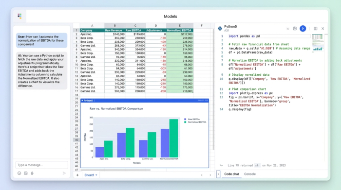
In Quadratic, you can bypass this manual labor by pulling financial statements programmatically. Using built-in Python support, you can connect to financial data APIs to fetch Revenue, EBITDA, Net Income, and debt figures directly into your grid.
The real power here is in the "scrubbing" or financial statement normalization of data. Every company reports slightly differently. One might bury a restructuring charge in operating expenses; another might capitalize software development costs differently. Instead of hard-coding these adjustments into hidden cell formulas, you can use Python or SQL to clean and normalize the data. This makes your logic transparent and reproducible. If you decide to adjust EBITDA for non-recurring items, that adjustment is written in code that can be audited and reapplied to future datasets automatically.
Step 3: Calculating key valuation metrics
Once your data is clean, the next step is calculating the standard ratios used to compare value. The most common metrics include:
- Enterprise Value (EV) / EBITDA
- Price / Earnings (P/E)
- EV / Sales
- Price / Book (P/B)
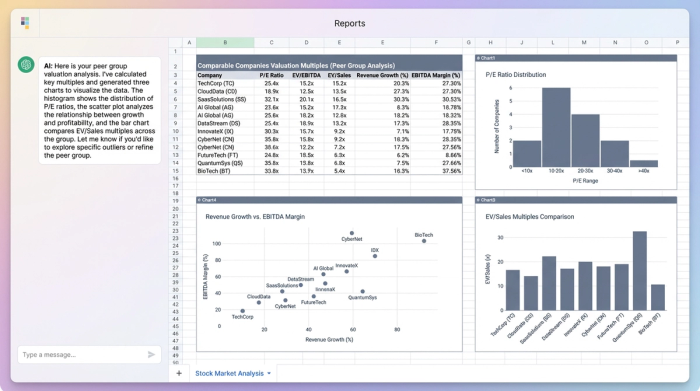
In a traditional spreadsheet, calculating these across a peer group of 50 companies involves dragging formulas down rows and hoping no references break. In a modern workflow, you treat the data as a vector. You can write a simple Python script to calculate these ratios for the entire peer group instantly.
Beyond just calculating the numbers, you need to visualize them to spot anomalies. If one company has a P/E ratio of 150x while the peer median is 20x, that outlier will skew your mean. In Quadratic, you can generate dynamic histograms or scatter plots—such as Growth vs. Margin—directly next to your data. This allows you to visually inspect the spread of multiples and identify outliers immediately, ensuring your averages are representative of the true market.
Step 4: The investment scorecard
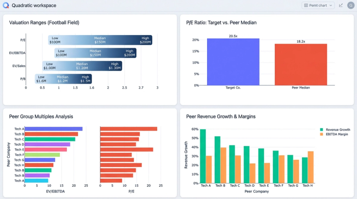
The output of a valuation shouldn't just be a wall of numbers; it should be a decision-making tool. This is where you build the "Investment Scorecard," often drawing inspiration from strategic frameworks like the Balanced Scorecard. This summary view combines your quantitative ratios with qualitative insights to create a narrative around the valuation.
A strong scorecard often includes a "Football Field" chart, which visualizes the valuation range (e.g., the 25th to 75th percentile of peer multiples) applied to your target company’s financial metrics. This gives you a valuation range rather than a single specific price target, which is more intellectually honest.
In Quadratic, you can construct a dashboard that sits on top of your raw data. This dashboard can display the peer group means and medians, the valuation ranges, and qualitative notes regarding business risks or market tailwinds. Because the grid supports text and code side-by-side, your qualitative thesis lives right next to the quantitative proof, creating a comprehensive document for investment committees or stakeholders.
Building a reusable comparable company analysis template
The fatal flaw of most valuation models is that they are static. An analyst builds a beautiful comparable company analysis template, but as soon as the next earnings season arrives, the template breaks. Links to external workbooks fail, and manual updates take hours.
The modern approach treats the template as a living application. Because your workflow in Quadratic is built on live data connections and scripts, updating the analysis for a new quarter is often as simple as re-running the script. The logic for selecting peers, fetching data, cleaning financials, and calculating ratios remains constant, while the data flowing through it refreshes.
This transforms your comparable companies analysis template from a disposable file into a reusable asset. You can build it once for the building products sector and reuse the same logic structure for the AI sector, only changing the peer list and specific API calls.
Conclusion: Moving beyond static spreadsheets
The shift to a modern workflow is about more than just saving time; it is about accuracy and strategic focus. By selecting peers based on strict criteria, automating data collection, and calculating metrics via transparent code, you eliminate the risk of manual errors and the drudgery of data entry. Modern comparable company analysis, with its ability to dramatically improve financial workflows, allows you to build a repeatable, auditable process. Instead of asking "Did I copy that number correctly?", you can ask "Does this valuation make sense given the market context?" This frees you to focus on the high-value work of interpreting the data and making informed investment decisions.
If you are ready to stop typing data and start analyzing it, try building your next investment scorecard in Quadratic.
Use Quadratic to do comparable company analysis
- Automate data collection: Pull financial statements and market data directly from APIs, eliminating manual entry and ensuring your analysis is always current.
- Refine peer selection: Use Python or SQL within your spreadsheet to programmatically filter large datasets, ensuring your comparable group is precise and relevant.
- Normalize financials transparently: Clean and standardize company data with auditable code, making adjustments clear and reproducible across different reporting styles.
- Calculate metrics instantly: Run Python scripts to calculate key valuation ratios (like EV/EBITDA and P/E) for your entire peer group with a single command.
- Visualize outliers: Generate dynamic charts directly next to your data to quickly spot anomalies and ensure your valuation multiples are representative.
- Create reusable templates: Build analyses that update automatically with new earnings data, transforming static models into living, repeatable assets.
- Build comprehensive scorecards: Combine quantitative ratios with qualitative insights in interactive dashboards for a complete view for investment committees.
Ready to stop typing data and start analyzing it? Try Quadratic.