
Table of contents
- The technical challenge of compensation analysis
- Step 1: Integrating internal data and market benchmarks
- Step 2: Calculating compa-ratios with precision
- Step 3: Visualizing salary discrepancies
- Turning analysis into a competitive compensation strategy
- Ensuring reproducibility for next year
- Conclusion
- Use Quadratic to build a competitive compensation strategy
A robust competitive compensation strategy is more than just a commitment to paying well; it is a precise alignment of internal equity, performance metrics, and external market data designed to retain top talent without bloating the budget. In today's volatile talent market, relying on gut feelings or outdated salary bands leads to two dangerous outcomes: losing your best people to competitors or overspending on new hires.
However, most strategies fail not because the philosophy is wrong, but because the execution is flawed. HR professionals and compensation analysts often find themselves trapped in "spreadsheet hell," trying to merge internal HRIS exports with external market benchmarks using fragile VLOOKUPs and manual data entry. This manual process is slow, error-prone, and difficult to audit.
To build a truly resilient strategy, you need a workflow that handles data complexity with the same sophistication as the strategy itself. Quadratic offers a modern canvas for this work, allowing analysts to combine the familiarity of a spreadsheet with the power of Python and SQL. This approach transforms compensation analysis from a chaotic administrative task into a repeatable, data-driven science.
The technical challenge of compensation analysis
The primary obstacle to a dynamic compensation model is the limitation of traditional spreadsheet tools. A typical workflow involves exporting employee data from an HRIS (like Workday or BambooHR), downloading CSV files from benchmark providers (like Radford, Pave, or Option Impact), and attempting to stitch them together.
In standard spreadsheets, this usually results in a fragile web of cross-sheet formulas. If a row is added or a column shifts, the links break. Furthermore, this method often leads to "static analysis." By the time you have cleaned the data, resolved the formula errors, and built the charts, the data is already weeks old. If executive leadership asks for a revised scenario, you often have to start over.
A competitive compensation strategy requires a repeatable, auditable workflow. You need to be able to ingest raw data, process it through a consistent logic model, and visualize the results instantly. This is where moving beyond standard cells to a code-enabled grid changes the game.
Step 1: Integrating internal data and market benchmarks
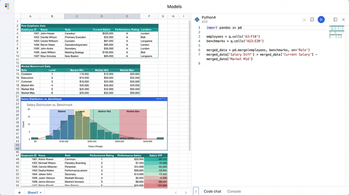
The first step in modernizing your workflow is data ingestion. In a standard tool, this is a copy-paste exercise. In Quadratic, you can pull data directly or import datasets and treat them as structured sources.
This is particularly critical when dealing with international compensation and competitive strategies. If your organization has employees in London, New York, and Bangalore, you are not just matching roles; you are dealing with currency conversions, cost-of-labor adjustments, and distinct regional benchmarks.
Instead of dragging a complex formula down 1,000 rows to match an internal "Senior Engineer" to a benchmark "Software Engineer IV," you can use SQL or Python directly within the sheet to join these datasets. You can write a script that maps internal job codes to external survey codes and applies the necessary currency conversion logic in a single step. This ensures that your data foundation is clean and that your global benchmarks are applied consistently across all regions.
Step 2: Calculating compa-ratios with precision
Once your internal data is mapped to market benchmarks, the core metric you need to evaluate is the compa-ratio. This metric divides an employee's current salary by the midpoint of the market range for their role. It acts as the "health check" for your compensation strategy.
While you can calculate a compa-ratio calculation using standard spreadsheet formulas, logic often gets messy when you introduce variables like variable pay, bonuses, or different salary bands for different departments.
In Quadratic, you can replace nested IF statements with clear, readable Python code. For example, you can write a short function in a cell that calculates the ratio and automatically flags the status:
if ratio < 0.8: return "Underpaid"
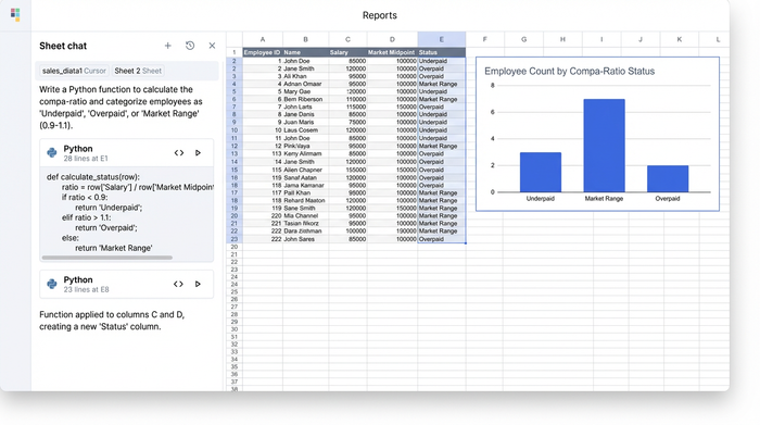
elif ratio > 1.2: return "Overpaid"
else: return "Market Range"
This approach creates a dynamic column that updates instantly if the underlying benchmark data changes. It eliminates the risk of "broken formula" errors and makes the logic transparent to anyone reviewing the file.
Step 3: Visualizing salary discrepancies
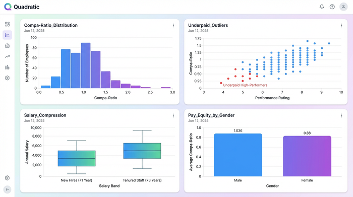
Rows and columns are excellent for storage, but they are poor tools for insight. A list of 500 salaries is difficult to scan for patterns. To truly understand your position, you need to move from raw numbers to visual analysis.
Using the integrated plotting libraries in Quadratic, such as Matplotlib or Plotly, you can generate scatter plots or distribution graphs directly next to your data tables. This allows you to spot salary benchmarking anomalies immediately.
There are three specific patterns to look for:
- Outliers: Employees who are significantly below the 0.8 compa-ratio. These are your highest retention risks.
- Compression: Situations where new hires are being paid the same as—or more than—tenured staff in the same role.
- Equity: Visualizations that break down pay bands by gender, department, or ethnicity to ensure your strategy is equitable as well as competitive.
Turning analysis into a competitive compensation strategy
With the data cleaned, calculated, and visualized, the focus shifts from administration to strategy. The goal is to provide data-driven compensation insights that guide executive decision-making.
If your analysis reveals an average compa-ratio of 0.85 across the engineering department, you are lagging the market. Your strategy must shift toward aggressive salary adjustments or the introduction of stronger non-monetary benefits to prevent attrition. Conversely, if the ratio is 1.15, you are leading the market. In this scenario, the strategy might shift toward performance-based bonuses rather than base salary increases to manage long-term fixed costs.
Because Quadratic allows you to present these graphs and data tables side-by-side in an infinite canvas, you can present a live dashboard to the C-Suite rather than a static PDF. This allows you to answer "what-if" questions in real-time during strategy meetings.
Ensuring reproducibility for next year
Compensation analysis is cyclical. The work you do today will need to be repeated next quarter or next year. The hidden cost of traditional spreadsheets is that they often need to be rebuilt from scratch every cycle.
By building your workflow in a code-enabled environment, you ensure reproducibility. When new benchmark data arrives next year, you simply replace the dataset. The Python logic, the SQL joins, and the visualization code run automatically against the new numbers. You don't need to rebuild the spreadsheet; you just need to review the insights.
Conclusion
A successful competitive compensation strategy relies entirely on data integrity. If you cannot trust the numbers, you cannot trust the strategy. By moving away from fragile, manual spreadsheets and adopting a tool like Quadratic, you bridge the gap between high-level theory and tactical execution.
You gain the ability to handle complex international data, calculate precise metrics without formula errors, and visualize the results instantly. It is time to stop wrestling with broken links and start building a compensation model that truly supports your workforce. Load your anonymized salary data into Quadratic today to build your first Compa-Ratio Dashboard and see the difference a modern tool can make.
Use Quadratic to build a competitive compensation strategy
- Integrate all compensation data: Combine internal HRIS exports and external market benchmarks using native Python and SQL for reliable, error-free data foundations.
- Automate compa-ratio calculations: Replace complex, nested formulas with clear Python code to instantly calculate and flag pay discrepancies, ensuring accuracy and dynamic updates.
- Visualize pay equity and market position: Generate interactive charts directly in your grid to quickly identify underpaid talent, pay compression, and overall market alignment.
- Run "what-if" scenarios in real-time: Present live, interactive dashboards to leadership and answer strategic questions on the fly, moving beyond static reports.
- Ensure repeatable, auditable analysis: Build a compensation model that automatically updates with new data, eliminating manual rebuilds and ensuring consistency year after year.
Ready to transform your compensation analysis? Try Quadratic today.