
Table of contents
- The challenge: Why corporate travel data analytics is hard
- Step 1: Consolidating unstructured data (The PDF problem)
- Step 2: Building the dynamic financial tracker
- Step 3: Visualizing the spend (Dashboards & insights)
- Strategic impact: Better data, better decisions
- Conclusion
- Use Quadratic to do corporate travel data analytics
Managing corporate travel expenses often feels like a battle against entropy. For many finance managers and operations leads, the reality of tracking travel spend isn't a sleek, automated dashboard. Instead, it is a fragmented mess of PDF flight confirmations, emailed hotel invoices, and crumpled taxi receipts. The disconnect between this messy, unstructured reality and the need for clean, structured financial reporting creates a massive bottleneck.
Corporate travel data analytics is the process of turning this raw, often chaotic spending data into actionable financial decisions. It is not simply about generating charts; it is about establishing a reliable pipeline that cleans, categorizes, and visualizes expenses so you can see where money is going in real-time.
Unfortunately, most teams are stuck in the middle. They are either manually typing data from PDFs into static spreadsheets—a process prone to human error—or they are paying significant enterprise fees for rigid SaaS platforms that don't quite fit their specific workflows. There is a better way. By using a tool like Quadratic, which integrates Python directly into the spreadsheet grid, you can build a "self-healing" financial tracker. This allows you to automate the flow from raw PDF to visual dashboard, giving you enterprise-grade insights without the enterprise price tag.
The challenge: Why corporate travel data analytics is hard
Effective corporate travel data analytics is difficult because travel data is naturally siloed. A single business trip generates data across multiple formats: a flight confirmation in an email, a hotel folio as a PDF attachment, and incidental expenses on a credit card statement.
The "static trap" of traditional spreadsheets makes this problem worse. In a standard spreadsheet, data entry is manual. If a manager wants to compare "Paid vs. Outstanding" reimbursements, they usually have to manually update rows and check formulas every single month. This manual maintenance creates a lag between when money is spent and when it is analyzed.
To solve this, we need to shift our thinking, embracing the 7 principles of dynamic finance. We need a tool that acts less like a calculator and more like a flexible data application. The goal is to build a system where the data ingestion is automated, and the insights update themselves.
Step 1: Consolidating unstructured data (The PDF problem)
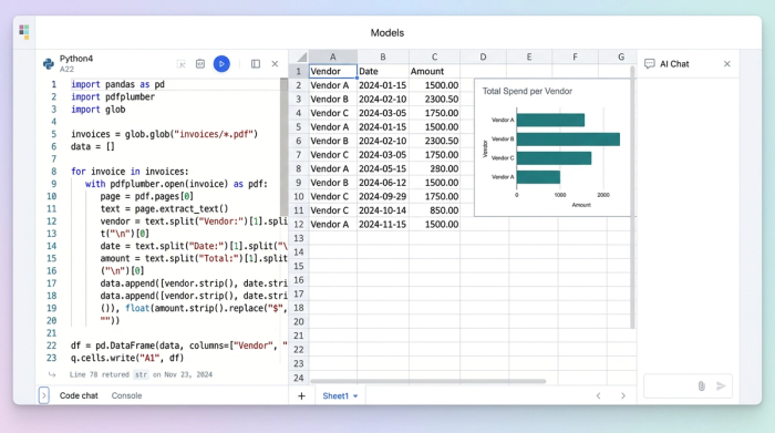
The first hurdle in this workflow is the format of the data. In a traditional workflow, a finance analyst might open a PDF invoice on one screen and a spreadsheet on the other, manually typing the date, vendor, and total amount into cells. This is tedious and scales poorly.
In Quadratic, the user takes a different approach by leveraging Python directly within the spreadsheet. Instead of manual entry, you can import the raw data from PDF documents directly into the grid. Using Python libraries available within the Quadratic environment, you can write a script that parses the text from these documents automatically.
The script identifies key fields—such as the invoice date, the total amount, and the vendor name—and pulls them into the spreadsheet cells. The beauty of this approach is that you write the script once. When a new batch of invoices arrives the following month, the script processes them automatically. This transforms unstructured documents into a clean dataset, creating the foundation for accurate analytics.
Step 2: Building the dynamic financial tracker
Once the raw data is ingested, the next step is standardization. Raw travel data is rarely clean. Dates might be formatted differently depending on the vendor (DD/MM/YYYY vs. MM/DD/YYYY), and currency symbols may vary.
In this phase, the manager uses Python logic directly in the sheet to clean the data. You can normalize date formats and convert currencies to a single standard, ensuring that all subsequent calculations are accurate. Following this, the data is categorized. You can set up logic to group expenses into buckets such as "Meals," "Transport," and "Lodging."
Crucially, this tracker is not static. Because the cleaning and categorization are handled by code and formulas, the spreadsheet becomes dynamic. When new invoice data is added, the tracker updates immediately. Formulas do not break, and the manager does not need to manually re-sort or re-calculate columns. The data is always ready for analysis.
Step 3: Visualizing the spend (Dashboards & insights)
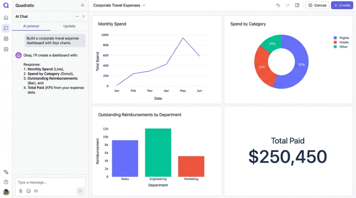
A wall of numbers, no matter how clean, rarely tells a compelling story. To make the data useful for decision-making, it must be visualized. In Quadratic, the user moves beyond the grid to create an interactive dashboard that sits alongside the data.
For this travel tracker, the manager creates a donut chart to visualize the distribution of spend. At a glance, they can see that 40% of the budget went to flights, while 30% went to hotels. This provides immediate context on where the bulk of the budget is being consumed.
Additionally, the dashboard tracks the status of payments. Visual indicators show "Paid Amounts" versus "Outstanding Reimbursements." This gives the finance team an instant health check of the travel budget, highlighting pending liabilities without requiring a deep dive into the rows of data. Because this is built in Quadratic, the dashboard remains interactive. Managers can filter views to see specific trips or departments, allowing them to answer ad-hoc questions during meetings instantly.
Strategic impact: Better data, better decisions
Building the tracker is only the means to an end. The ultimate goal is to leverage these insights to optimize operations, understanding the strategic benefits of spend visibility. This is exactly how travel data analytics improves corporate travel policies.
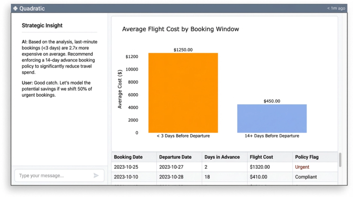
When you can see the data clearly, you can identify behaviors that drive up costs. For example, if the donut chart reveals that 50% of flight spend is occurring on bookings made less than three days before departure, the finance team can update the travel policy to require a 14-day advance booking window.
Similarly, if the "Outstanding Reimbursements" metric is consistently high, it may indicate a bottleneck in the approval workflow. The finance team can then adjust their processes to ensure employees are reimbursed faster, improving morale. You cannot improve what you cannot measure. By moving from static PDFs to a dynamic analytical tool, you gain the visibility required to make these strategic adjustments.
Conclusion
The journey from messy, unstructured PDF receipts to a clean, Python-powered dashboard transforms how a company manages its travel spend. It proves that you do not need expensive enterprise software to achieve enterprise-grade results. You simply need a spreadsheet that handles data intelligently.
By automating the ingestion of unstructured data and visualizing the results dynamically, finance teams can stop acting as data entry clerks and start acting as strategic analysts. If you are ready to turn your corporate travel data into genuine insights and leverage the best practices for expense management automation, start building your own dynamic financial tracker in Quadratic today.
Use Quadratic to do corporate travel data analytics
- Automatically extract key travel expense data from unstructured PDFs and email attachments directly into your spreadsheet using embedded Python.
- Build dynamic financial trackers that clean, standardize, and categorize travel data in real-time, eliminating manual updates and formula breaks.
- Create interactive dashboards to visualize spend distribution and track payment statuses (paid vs. outstanding) instantly for a clear financial overview.
- Identify cost-saving opportunities and process bottlenecks by easily analyzing consolidated travel data, enabling smarter policy adjustments.
- Achieve enterprise-grade visibility and control over corporate travel spend without the cost or rigidity of traditional enterprise software.
Ready to transform your travel expense data into actionable insights? Try Quadratic.