
James Amoo, Community Partner
Aug 13, 2025

Whether you're just a beginner in data analysis or you're an expert, facing a blank screen when confronted with raw data can be overwhelming. Regardless of your experience level, large and unstructured datasets often present a first look that can be intimidating.
To overcome this, data analysts need to be equipped with solid Exploratory Data Analysis (EDA) techniques. EDA helps to uncover patterns, trends, and relationships between variables, as well as potential issues such as missing values or outliers, all of which are crucial for making data-driven decisions.
Python Exploratory Data Analysis is not just about data exploration; it’s about asking the right questions and using the answers to guide deeper analysis. Python provides a powerful toolkit to support this process. Libraries like NumPy (for scientific computing), Pandas (for data manipulation), and Matplotlib (for data visualization) make it easier to explore and understand your data.
In this blog post, we'll walk through how to perform EDA using these data analysis Python libraries. We'll also see how Quadratic, an AI tool for data analysis, simplifies and accelerates data exploration. With Quadratic, you can ask questions about your data and instantly get actionable insights without writing code.
Importing required libraries and loading data
We mentioned that Python provides several libraries that help with exploratory data analysis, so the first step is to import these libraries for use in the project. Here:
import pandas as pd
import numpy as np
import matplotlib.pyplot as plt
import seaborn as sns
This line imports Pandas, Numpy, Matplotlib, and Seaborn. We can then load the dataset using the Pandas read_csv function, which converts our data into a dataframe:
df = pd.read_csv("sales.csv")
print(df.head())
Here’s the output:
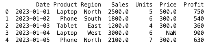
In this tutorial, we’ll be working with a sample sales dataset to demonstrate how to perform Python Exploratory Data Analysis. Now that the dataset is successfully loaded, let’s dive in and start uncovering insights from the data.
Python for data analysis: exploring Pandas functions
Python (using Pandas) provides several functions that help data analysts explore their data and gain key insights quickly. These functions basically help you know more about your data. Let’s discuss them briefly:
df.info()
The df.info() function provides a quick overview of the dataset, including column data types, the number of non-null entries, missing values, and memory usage. Data analysts can immediately get key information on their data without manually sifting through many rows of data.
df.info()
Here’s the output:
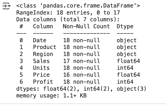
At a glance, this function provides a summary of key details in our dataset. It shows the total number of columns, identifies the distinct data types, and counts how many times each type appears. It also provides the number of non-null values per column, making it easy for data analysts to spot columns with missing data. For example, we can see that the Sales and Price columns contain missing values, as they have fewer entries than expected.
df.shape()
This Python function is used to get the number of rows (observations) and columns (features) in a dataset. It provides insights into the size and structure of the dataset.
df.shape()
This gives the output “(18, 7)”, indicating that our dataset has 18 columns and 7 rows.
df.describe()
This function provides a quick statistical summary of each numeric column in your DataFrame. It is one of the most commonly used functions in Python Exploratory Data Analysis, as it gives insights into statistics like the mean, count, standard deviation, etc.
df.describe()
Output:
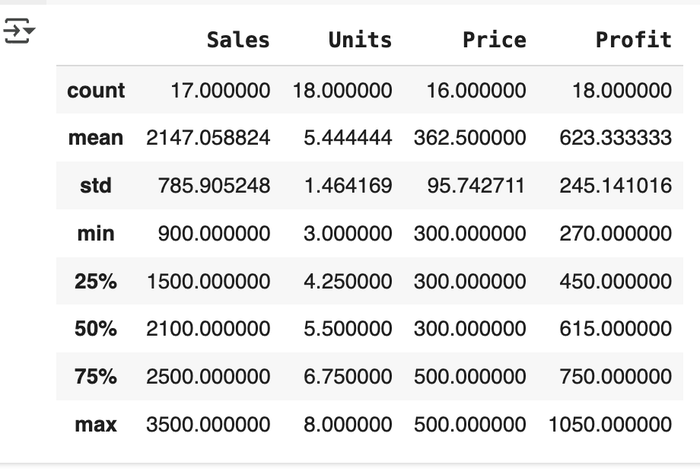
The df.describe() function automatically scans your data for columns with only numeric values, then performs mathematical calculations for each column. This saves users a lot of time in data exploration as they get deep insights into the statistical summary of their data with just a single line of code.
Checking for duplicate values
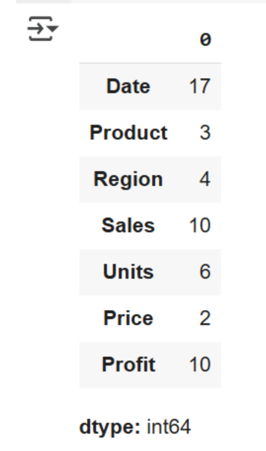
The df.nunique() function gives insight into how many unique values exist in each column. With this process, data analysts have information on the variety of data that exists and can quickly identify instances of duplicate data.
df.nunique()
Output:
Checking for missing values
The df.isnull() function identifies all null (missing) values using boolean notation. It returns True for all cases of null values and False for non-null values. df.isnull().sum is a more efficient method as it returns the total number of missing values in each column, helping users to quickly identify them. Users can either manually handle missing values or leverage data cleaning tools to automatically detect and correct dirty or stale data, making the process faster and more efficient
df.isnull().sumOutput:
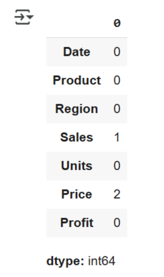
This provides the total number of missing values in our dataset. We can see that missing values exist in the Sales and Price columns.
Univariate analysis
As the name implies, Univariate analysis deals with analyzing data in a single column or using just one variable for analysis. This helps analysts to understand the distribution, central tendency, and dispersion of their dataset.
It is suitable for both categorical and numerical variables. Univariate analysis is also useful in data modeling. Let’s see how we can perform a univariate analysis on the “Region” column in our dataset:
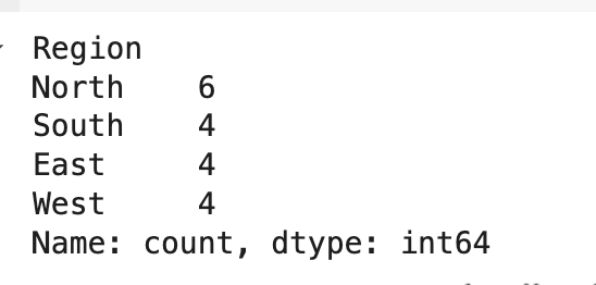
print(df['Region'].value_counts())
df['Region'].value_counts().plot(kind='bar')
plt.title('Distribution across regions')
plt.xlabel('Region')
plt.ylabel('Count')
plt.show()
This code block counts how many times each unique value appears in a single column. It then creates a bar chart based on the frequency counts of each region.
Here’s the output:
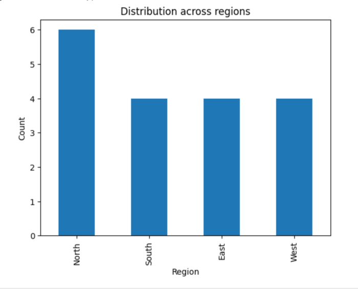
A glance at the chart reveals that the North region recorded the highest number of sales, while the other regions are represented more evenly. Gaining such insights manually would be time-consuming and inefficient.
Data visualization plays a crucial role in Exploratory Data Analysis by making patterns and trends easier to identify and interpret. Note that univariate analysis doesn’t necessarily have to include visualizations; you can also get a numerical count of unique values in a specific column.
Here’s an example:
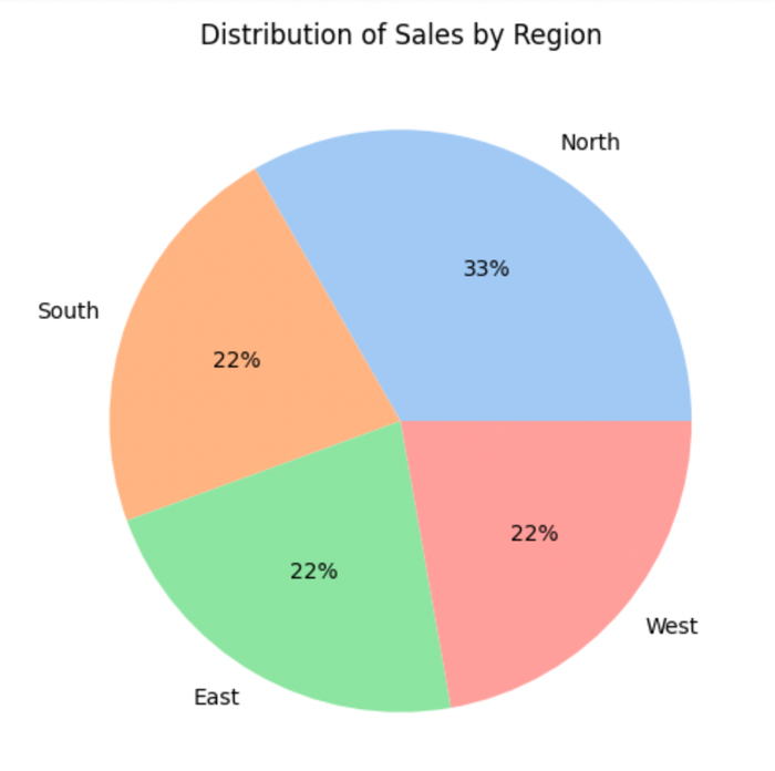
Categorical variables can also be represented using a pie chart:
plt.figure(figsize=[6,6])
data = df["Region"].value_counts(normalize=True)
labels = ["North","South","East","West"]
colors = sns.color_palette('pastel')
plt.pie(data,labels=labels,colors=colors, autopct='%.0f%%')
plt.title("Distribution of Sales by Region")
plt.show()
This code block calculates the percentages of each region and represents them using a pie chart. Here’s the output:
Bivariate analysis
Bivariate analysis involves analyzing two variables together and understanding how they are related. It helps to indicate correlations, dependencies, and interactions between two variables. Scatter plots and pair plots are often used to represent numerical variables, while a grouped bar plot or stacked bar chart can be used for categorical data. Let’s see how we can represent the relationship between Sales vs Profit in our dataset:
sns.scatterplot(data=df, x='Sales', y='Profit')
plt.title('Sales vs Profit')
plt.show()

print(df[['Sales', 'Profit']].corr())
This code block creates a scatter plot that represents the correlation matrix between Sales and Profit. We should expect a perfect positive correlation (+1), since profit increases as sales increase. Here’s the output:
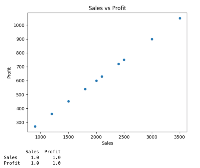
This chart shows a positive linear relationship. As sales increase on the x-axis, profit increases on the y-axis.
We can also use Bivariate analysis to understand the relationship between categorical data and numerical data. A bar plot can be used to get the mean sales per region, which gives insights into the best-performing regions in sales. Here:
sns.barplot(data=df, x='Region', y='Sales', estimator='mean')
plt.title('Average Sales by Region')
plt.show()
Output:
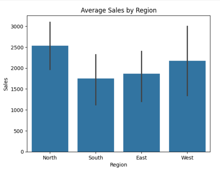
This chart shows the regions with the highest sales. Note that this is different from the value count, which deals with the unique counts of each region. This operation gives insights into the best-performing regions using sales as a metric.
Multivariate analysis
Multivariate analysis deals with understanding the relationship between three or more variables simultaneously. It is used to uncover complex patterns and interactions within a dataset. It is a crucial operation in Python Exploratory Data Analysis as it helps data analysts to accurately draw correlations and make inferences when multiple variables are involved. Heat maps are often used in multivariate analysis.
plt.figure(figsize=(9, 5))
sns.heatmap(data.drop(['Date', 'Region', 'Product'], axis=1).corr(), annot=True, vmin=-1, vmax=1)
plt.show()
Output:
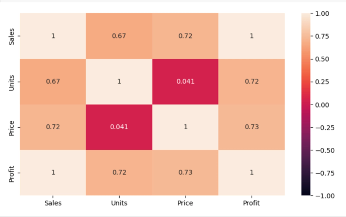
In a correlation matrix, values close to +1 indicate a strong positive correlation, while values near -1 suggest a strong negative correlation. A value of 0 implies no linear relationship between variables.
From the heatmap, we observe that Sales has a perfect positive correlation with Profit, which makes sense, as higher sales typically lead to higher profits. The Sales column also shows a strong positive correlation with both Price and Units, indicating that increases in price and quantity sold are generally associated with higher sales.
The correlation between Units and Price is very weak, suggesting that price changes do not significantly influence the quantity sold.
Streamlining Python Exploratory Data Analysis with Quadratic
Manual methods of Exploratory Data Analysis with Python can become slow and prone to errors, especially when dealing with large datasets. Data analysts would have to leverage Python or SQL for data analysis and visualization. Quadratic automates the entire data exploration workflow, enabling users to uncover insights from their data even faster.
Quadratic provides a centralized environment where users can access, analyze, and visualize data without having to juggle between multiple tools to achieve their desired results. Its intuitive environment allows non-technical users, technical users, and citizen developers to fully gain insights from their data. The best part? You don’t need to know how to use Python for data analysis; Quadratic does all the technical work for you.
Easily access your data
Quadratic is a browser-based software, which means no installation or additional setup is required. All you have to do is import your data into the Quadratic spreadsheet interface and start your analysis. Quadratic supports several data file formats and connects directly to multiple databases, APIs, and raw data, providing analysts with a wide range of file options for exploration.
Faster data exploration in Python with AI assistance
Thanks to AI spreadsheet analysis capabilities, the journey from raw data to actionable insights is significantly shorter. This promotes data accessibility and democratization by empowering users to self-serve analytics and generate insights without relying heavily on external support
This tool allows users to use LLM for data analysis, while enabling them to apply the results directly to their data. Once data is imported into Quadratic, it’s immediately ready for analysis. No additional setup, coding, or complex logic required.
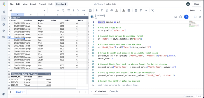
Quadratic’s AI assistance is especially valuable when working with complex data or with large datasets, where manual preparation and scripting would typically slow down the analysis process. Instead of writing Python scripts or building formulas, users can simply ask questions like, “What's the total monthly sales for each of the products?” and Quadratic will deliver the insight within seconds. Here’s an example:
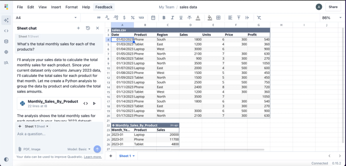
Quadratic provides insights into the total monthly sales for each product in a tabular format. While users can perform this analysis without any coding knowledge, Quadratic also includes an integrated code editor, giving technical users the flexibility to write and run custom code. This flexibility makes Quadratic one of the best IDEs for data analysis.
Here’s the code for this analysis:
What sets Quadratic apart as one of the best coding spreadsheets is that it doesn’t just deliver black-box answers; it provides transparent, reusable methods that users can inspect, modify, and build upon. This also makes it an excellent AI education tool for users who want to get into analytics, because they can see the code the AI generates and how it’s adopted in implementation. Quadratic natively supports modern programming languages like Python, SQL, and JavaScript.
Visualize your data using simple text prompts
By using natural language queries, data analysts can instantly transform raw data into interactive visualizations. No deep expertise in charting libraries or visualization tools required. Simply describe how you'd like your data presented, and Quadratic automatically generates the appropriate Python code to bring your charts to life. This makes it one of the best visualization software tools to use.
It offers different chart types to help in visualization. Unlike other tools that require integration with third-party tools for visualization, Quadratic’s all-in-one solution allows users to visualize their data directly within their spreadsheet. Let’s see how we can create visualizations using our sales data:
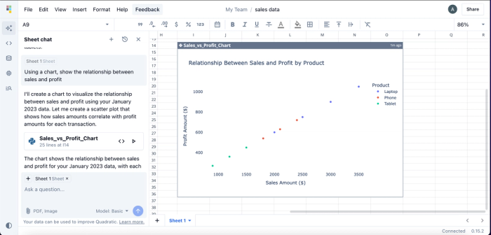
In this example, we simply prompted the AI with: “Using a chart, show the relationship between sales and profit.” Quadratic responded by generating a scatter plot, which is the most appropriate chart type for visualizing the relationship between two continuous variables.
Notably, we didn’t specify which chart to use. That’s because Quadratic intelligently selects the best chart type based on your data. Unlike traditional methods, this approach requires no coding or manual import of Python visualization libraries. The entire process happens in seconds through natural language prompts. Visualizations generated in Quadratic are highly customizable, as users can modify colors, labels, and other visual elements.
Conclusion
Data exploration is a crucial step in turning raw data into meaningful insights. After all, users can only make informed business decisions when they truly understand their data. Python Exploratory Data Analysis simplifies this process through powerful libraries and functions that help uncover patterns, trends, and relationships within a dataset.
In this blog post, we explored Exploratory Data Analysis (EDA) in Python, covering steps such as detecting duplicates, handling missing values, and visualizing data using popular Python libraries. We also walked through key techniques, including Univariate, Bivariate, and Multivariate analysis.
We also saw how Quadratic, an AI-powered spreadsheet tool, transforms how EDA is done. With Quadratic, users can ask simple text-based questions and receive instant insights and visualizations.
Give Quadratic a try for free and experience a faster and smarter way to explore your data.