
Google Analytics 4 (GA4) is an incredibly powerful data collection engine, capable of capturing millions of events, user properties, and granular interactions. However, for many marketing analysts and data strategists, extracting a clear, cohesive narrative from that massive dataset remains a daily struggle. The native reporting tools often feel like they force you into a binary choice: generic, high-level overviews that lack detail, or manual "Explorations" that are difficult to share and tedious to recreate. These limitations of standard analytics reporting tools highlight the need for more flexible solutions.
To truly track specific team KPIs and present a compelling story to stakeholders, you need a custom dashboard in Google Analytics context that lives outside the rigid constraints of the platform. While GA4 handles the collection, the analysis often requires a more flexible environment. This guide explores the limitations of native reporting and demonstrates a workflow to build a fully tailored, automated dashboard using Quadratic—bridging the gap between raw data collection and executive-level insights.
Why you need a custom Google Analytics dashboard
The transition from Universal Analytics to GA4 represented a fundamental shift in how data is modeled. Because GA4 is an event-based data model rather than session-based, the data requires more interpretation to be useful. This shift has created a significant gap between the data available and the insights stakeholders expect.
Executives and clients rarely want to see a raw "Exploration" view or a list of event counts. They need "Executive Dashboards" that tell a specific story about return on investment (ROI), acquisition costs, and long-term trends, emphasizing the importance of creating effective Executive Dashboards. A standard Google Analytics custom dashboard built within the native interface often struggles to provide this context because it lacks the ability to blend data easily. True insight often comes from integrating GA4 traffic data with CRM data or internal budget spreadsheets, a task that native GA4 reporting cannot handle effectively.
The standard way: how to create a custom dashboard in GA4
If you are searching for how to create a custom dashboard in Google Analytics using only the native tools, the platform offers two primary methods. It is important to understand these workflows to recognize where they fall short for advanced use cases.
The first method is editing the "Reports Snapshot." This is the default dashboard you see when you log in. You can customize this by clicking the pencil icon in the top right corner to add or remove "cards." While this allows for some layout changes, you are restricted to pre-defined visualizations and metrics.
The second, more advanced method is using the "Explore" tab to create a Google Analytics 4 custom dashboard. Here, you can build "Free Form" tables or "Funnel Explorations" by dragging and dropping dimensions and metrics onto a canvas. This mimics a pivot table experience and offers more granularity than standard reports.
However, relying solely on these native tools introduces friction. Explorations are often temporary and difficult to share with non-technical users without granting them full access to the analytics property. Furthermore, heavy users frequently hit API quota limits when building complex views. The most critical limitation, however, is the inability to perform complex post-processing. If you need to apply advanced data analytics techniques like calculating a weighted average based on custom attribution logic or combine metrics in a way GA4 doesn’t natively support, you are stuck. This is where a programmable approach becomes necessary.
A better approach: the programmable dashboard
There is a "Flexibility Gap" in the modern data stack. Historically, you had to choose between a rigid Business Intelligence (BI) tool, which is powerful but hard to edit, or a spreadsheet, which is flexible but struggles with large datasets and automation. Quadratic offers a middle ground: a coding spreadsheet that combines the familiarity of a spreadsheet with the power of native Python and SQL.
Consider a common scenario for a marketing analyst. You need to build a custom GA4 dashboard that combines traffic sources, landing page performance, conversion data, and geography into a single, unified view. You also need to apply custom logic to define "high-quality" traffic that goes beyond standard GA4 definitions. Here is how you can achieve that workflow in Quadratic.
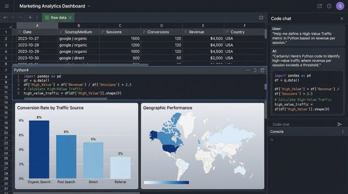
Step 1: Ingesting raw GA4 data
The first step in building your dashboard is establishing a live connection. Instead of relying on static CSV exports that become outdated the moment they are downloaded, you can connect GA4 directly to Quadratic.
Because Quadratic allows you to bring in data via APIs or connectors, you get a live feed of your analytics events. Unlike standard browser-based spreadsheets that might crash when trying to load tens of thousands of rows of event data, Quadratic is built to handle larger datasets smoothly. This ensures that your foundation—the raw data—is always accurate and ready for manipulation.
Step 2: Defining custom calculated fields with Python
This is where the programmable dashboard differentiates itself from the native "how to create a custom dashboard in GA4" tutorials. Native tools restrict you to standard metrics or very basic calculated fields.
In Quadratic, you can use Python directly in the cells to define complex logic. For example, a marketing analyst might want to create a "High-Value Traffic" score that isn't just based on revenue. You could write a Python script that looks at session duration, scroll depth, and conversion value to assign a weighted score to every session.
By using code cells right next to your data, you can iterate on this logic instantly. If the definition of "High-Value" changes, you simply update the Python code, and the entire column recalculates. This level of granular control allows you to align your reporting exactly with your team’s internal KPIs.
Step 3: Filtering and segmenting with SQL
Navigating through nested menus in GA4 to filter for a specific campaign or business unit is time-consuming and prone to clicks errors. In a programmable dashboard, you can use SQL to segment your data instantly.
Once your raw data is ingested, you can treat it like a database. If a stakeholder asks for performance metrics specifically for the "North America" region during the "Summer Sale" campaign, you can write a quick SQL query directly in the sheet to filter the dataset. This allows you to create clean, segmented tables ready for visualization without destroying the original raw data or navigating away from your dashboard view.
Step 4: Visualizing trends and comparisons
The final step is producing the "Executive-Ready" output. One of the most notoriously difficult views to create in native GA4 is a clean "Current vs. Prior Period" comparison that visualizes the percentage change clearly across multiple custom metrics.
With your data processed via Python and filtered via SQL, you can easily structure your dataset to show this comparison. You can then generate charts that map traffic sources alongside conversion rates, or visualize geographic performance on a map. Because the data is already cleaned and calculated according to your specific logic, the visualizations represent the actual business reality, not just generic web traffic stats.
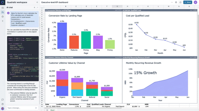
Best practices for strategic GA4 dashboards
Building the technical implementation is only half the battle. To ensure your custom dashboard Google Analytics solution drives decision-making, follow these strategic best practices.
Focus on KPIs, not just metrics.
Avoid filling your dashboard with vanity metrics like "Total Pageviews." Instead, focus on calculated KPIs that reflect business health, such as "Conversion Rate by Landing Page Category" or "Cost per Qualified Lead," aligning with best practices for selecting meaningful marketing KPIs. The programmable nature of Quadratic makes it easy to construct these compound metrics.
Automate the mundane.
Marketing analysts often lose hours every Monday morning rebuilding the same reports. By leveraging spreadsheet automation with a connected spreadsheet, you can ensure your dashboard updates automatically. This shifts your time from data assembly to data analysis.
Use storytelling and context.
A chart without context is just a picture. Use the infinite canvas in Quadratic to add text annotations next to your visualizations. If there is a spike in traffic on Tuesday, add a note explaining that a specific email campaign went out that morning. This context turns a dashboard into a narrative that stakeholders can understand without needing you in the room to explain it.
Conclusion
Google Analytics 4 is an exceptional tool for data collection, but its native reporting features are often too rigid for the complex needs of modern marketing teams. When you need to manipulate data, calculate custom logic, and present flexible reports, sticking strictly to the native interface can hold you back.
A programmable spreadsheet like Quadratic bridges the gap between raw data and executive insights. By combining live data ingestion with the power of Python and SQL, you can build Google Analytics custom dashboards that are automated, deeply insightful, and tailored exactly to your organization's KPIs. Instead of fighting against the limitations of "Explorations," you can start building your custom analytics workflow in Quadratic today.
Use Quadratic to build custom Google Analytics dashboards
- Connect directly to live GA4 data and blend it with other sources like CRM or internal spreadsheets for a unified view of your KPIs.
- Define complex, custom metrics and attribution logic using native Python, going beyond GA4's standard calculations.
- Filter and segment your data instantly with SQL queries, creating precise views tailored to specific campaigns or business units.
- Automate your dashboard updates, freeing you from manual reporting and allowing you to focus on analysis.
- Create executive-ready visualizations, including custom period-over-period comparisons, with full control over data presentation.
- Add context and narrative directly on the canvas, transforming raw data into understandable, actionable stories for stakeholders.
Ready to build more insightful, automated GA4 reports? Try Quadratic.