
Every reporting analyst knows the sinking feeling of receiving a recurring operational export. The data arrives, but it is never ready for immediate insight. Dates are formatted inconsistently, currency symbols are mixed with integers, and duplicate rows threaten to inflate your metrics.
You likely spend hours manually finding and replacing errors, filtering out blanks, and formatting cells just to get the dataset ready for a chart. The frustration compounds when you realize you will have to repeat this entire manual process when the updated dataset arrives next week.
The most effective data cleaning tips before visualization aren't about learning faster keyboard shortcuts for finding and replacing text; they are about shifting your workflow from manual repair to automated repeatability.
By treating data cleaning as a pipeline rather than a chore, you can ensure accuracy and save countless hours. In Quadratic, this is achieved by building a "Staging Sheet"—an intermediate layer where Python or SQL scripts standardize your raw data automatically. This approach ensures that your cleaning logic is defined once and applied instantly every time your data updates.
Why “staging” is the ultimate data cleaning best practice
When you search for cleaning advice, most results treat the process as a destructive task performed directly on a static file. You are often told to delete rows or overwrite cells. However, in a professional analytics workflow, cleaning should be a pipeline that preserves the integrity of the source data while preparing a specific view for reporting.
In a traditional spreadsheet, you might be tempted to clean data directly in the tab where it was pasted. This is fragile; if you paste new data over the old range, your manual formatting breaks. The Quadratic workflow introduces a more robust architecture:
1. Raw Data Tab: This is where your messy CSV or database export lands. You never touch this data manually.
2. Staging Tab: This is the engine room. Here, you use Python or SQL to reference the raw data, apply cleaning rules, and output a pristine dataset.
3. Visualization Tab: Your charts and dashboards connect exclusively to the Staging Tab.
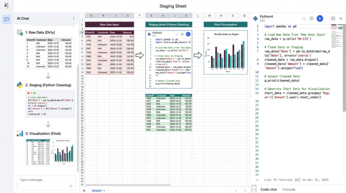
This separation of concerns allows you to build a system that is resilient to change. If the raw data changes, your Python or SQL logic runs automatically, cleaning the new inputs and updating your visualizations without you lifting a finger.
4 essential data cleaning tips before visualization
While the architecture of a staging sheet provides the foundation, you still need specific tactics to handle common data errors. Below are four essential strategies for preparing data, moved from manual spreadsheet actions to automated code-based rules.
1. Standardizing units and formats programmatically
Inconsistent formatting is the enemy of clean visualization. One system might export dates as MM/DD/YYYY, while another uses DD/MM/YYYY. Similarly, financial data might arrive with a mix of currency symbols and plain text that prevents a chart axis from recognizing the values as numbers.
The manual solution usually involves highlighting columns and wrestling with custom cell formatting. The Quadratic way is to handle this in your Staging Sheet using Python. By writing a script that parses dates and strips non-numeric characters, you enforce consistency at the code level. For example, you can convert an entire column to a unified datetime object or cast text strings to floats. This ensures that no matter how the source system formats the export, the data feeding your chart is mathematically consistent.
2. Handling missing values: imputation vs. deletion
Missing values, often appearing as nulls or blanks, create unsightly gaps in line charts and cause errors in aggregation formulas. The decision of how to handle these gaps—whether to delete the row entirely or fill it with a default value—is a critical analytical choice.
In a standard spreadsheet, analysts often filter for blanks and manually delete rows. This is risky because it leaves no record of what was removed. In Quadratic, you can automate this decision. You might write a rule to fill all missing sales values with zero, or drop rows where a critical ID is missing. Because this logic is written in code (such as df.fillna(0)), your decision-making process is documented. Anyone reviewing your work can see exactly how you handled missing values, ensuring the integrity of your analysis.
3. Removing duplicates without losing data context
Duplicate rows are a silent killer of accurate reporting. They inflate revenue numbers and skew averages, leading to incorrect business decisions. The traditional "Remove Duplicates" button in Excel is a destructive action; once you click it, the context of those duplicates is lost, and you cannot easily audit what was removed.
A better approach is to use SQL within your Staging Sheet to create a unique view of the dataset. You can write a query to select distinct records from your raw data tab. This leaves the raw data intact for verification purposes while feeding only the unique, clean records to your visualization. This method creates a non-destructive pipeline where you can always trace back to the source to understand why duplicates occurred in the first place.
4. Identifying and flagging outliers
A single massive outlier can distort a Y-axis, making the rest of your trend lines look flat and unreadable. While it is tempting to simply delete the anomaly, doing so obscures reality. A more sophisticated strategy is to flag these outliers programmatically.
In your Staging Sheet, you can create a calculated column that tags rows based on a threshold, such as values that are more than three standard deviations from the mean. Once flagged, you can filter these out of your specific visualization without deleting the underlying data. This allows you to present a clean trend to stakeholders while retaining the ability to drill down into the anomalies if questions arise.
Automating trust: building a live data quality checklist
The final step in a robust data pipeline is verifying that your cleaning rules are working. Instead of relying on a manual mental checklist before you take a screenshot of your dashboard, you can build a live quality check directly into your spreadsheet.
In Quadratic, you can create a summary table at the top of your Staging Sheet that calculates pass/fail rates for your data health. This table can count total rows, identify how many null values were found and filled, track the number of duplicates removed, and list the number of outliers flagged.
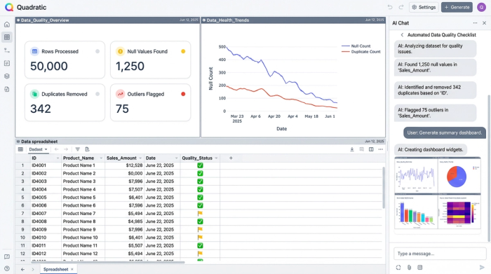
This acts as an automated data quality checklist. Before you share your analysis, you simply glance at this summary. If the "Null Values" count spikes unexpectedly, you know immediately that the upstream data source has a quality issue, allowing you to investigate before a stakeholder spots the error. This turns data cleaning from a hidden task into a visible, trustworthy metric.
Conclusion: from manual fixes to repeatable pipelines
The shift from manual data preparation to automated pipelines fundamentally changes how you interact with data. You stop treating data cleaning as a repetitive weekly chore and start treating it as a system you build once. By utilizing a Staging Sheet and automated data quality checks, you protect your time and ensure that your visualizations are always built on a solid foundation.
Quadratic empowers you to bridge the gap between messy operational exports and polished insights. By combining the familiarity of a spreadsheet with the power of Python and SQL, you can create repeatable workflows that handle standardizing data formats, removing duplicates, and handling missing values automatically. This allows you to focus less on fixing the data and more on the story it tells.
Use Quadratic to do data cleaning before visualization
- Automate repetitive cleaning tasks by building "Staging Sheets" with Python or SQL, eliminating manual find-and-replace for recurring data exports.
- Standardize inconsistent data formats like dates and currencies programmatically, ensuring your visualizations always receive clean, uniform inputs.
- Handle missing values with documented logic, choosing to fill or drop rows automatically, maintaining data integrity and transparency.
- Remove duplicate records non-destructively using SQL queries, keeping your raw data intact while feeding unique, clean datasets to your charts.
- Identify and flag outliers automatically, allowing you to filter them for clearer visualizations without deleting the underlying data.
- Build live data quality checklists directly in your sheet to monitor cleaning effectiveness and catch upstream data issues immediately.
Stop spending hours on manual data prep and start building repeatable, trustworthy pipelines. Ready to transform your workflow? Try Quadratic.