
The concept of a "Life OS" is incredibly appealing to data-savvy individuals. Ideally, you want a single, comprehensive health and wellness tracker that monitors your gym progress, habit streaks, and bank accounts in one unified view. The goal is a quantified self-dashboard where you can see the correlation between your physical health and your financial stability.
However, the reality of maintaining such a complex system in traditional spreadsheets is often frustrating. As you add new months of data, cell references get disconnected, formulas return errors, and formatting becomes inconsistent across different tabs. What starts as a clean template often degrades into a fragile workbook where you spend more time fixing broken links than analyzing your progress.
This article explores a real-world workflow of a user who transitioned a broken, multi-sheet system into Quadratic. By moving beyond the limitations of standard grids, they were able to repair the logic behind their personal data management and turn a messy spreadsheet into a reliable engine for their life.
Diagnosing the data: repairing broken formulas
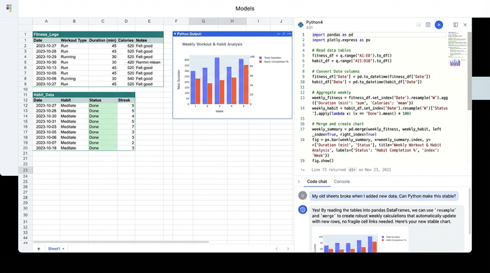
The user began with a common scenario: a workbook containing distinct sheets for financial transactions, fitness logs, and daily habits. While the raw data entry was consistent, the summary sheets—designed to provide a high-level overview—were riddled with errors.
The primary friction point was cross-sheet referencing. In traditional tools, linking a cell in a "Summary" tab to a moving target in a "Daily Log" tab is prone to breaking. When the user sorted their data or added new rows for a new month, the summary formulas often lost their targets, resulting in #REF errors or, worse, silent calculation errors where the wrong range was summed.
To fix this, the user utilized Quadratic to stabilize their data logic. Instead of relying on fragile relative cell links, they established clear data structures. By updating the incorrect references, they ensured that calculations for fitness activities—such as total miles run or weight lifted—were accurate. Similarly, they repaired the logic tracking habit adherence, effectively creating a robust daily habit tracker where a "streak" was calculated based on actual dates rather than just adjacent cells. This shift from fragile cell-linking to structured referencing ensures that the logic holds up even as the dataset grows over time.
Measuring success: implementing progress percentages
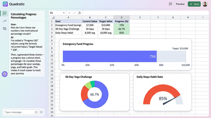
Raw numbers often lack the context necessary for motivation. Seeing that you saved $5,000 or completed 15 workouts is useful, but it doesn't tell you how close you are to your actual objective. To keep your goals on track, wellness data needs to be visualized clearly against a target. The user’s next step was to implement percentage formulas to gauge progress in two distinct areas: financial health and physical wellness.
For the financial component, the user created specific formulas to track savings goals. This logic mirrors the utility of a personal loan tracker, where the focus is on the percentage of the principal paid off rather than just the remaining balance. By calculating the percentage of the savings goal achieved, the user transformed a static bank balance into a dynamic progress bar.
Simultaneously, they applied this same logic to their physical health. They set up formulas to track completion rates for specific fitness challenges, such as a 30-day yoga streak or a marathon training block. This addition of percentage-based metrics introduces a layer of gamification. Psychologically, seeing a "75% Complete" metric is far more motivating than seeing a raw count. It bridges the gap between simple data entry and actionable insight.
Standardizing visuals: from messy sheets to a clean dashboard
Data integrity is the foundation, but readability is what makes a tracker usable day-to-day. The user’s original spreadsheet suffered from visual clutter: inconsistent fonts, misaligned columns, and a lack of visual hierarchy made it difficult to review data quickly. Once the formulas were repaired, the focus shifted to the makeover.
The user started by applying strict formatting rules to different data types. Financial rows were standardized with specific currency symbols to differentiate them instantly from other metrics. Progress metrics were formatted as percentages with consistent decimal places, eliminating the visual noise of unrounded numbers.
To create a true dashboard feel, the user implemented bold colored headers. They used distinct color coding—such as blue for finance sections and green for health metrics—to visually separate the different domains of their life. Finally, they utilized auto-fit column widths across all tracking and planning sheets. This simple adjustment removed the need for manual resizing and ensured that every data point was fully visible. In Quadratic, standardizing these visuals across a large canvas is significantly faster than manually formatting individual ranges in disjointed tabs, resulting in a professional, clean interface.
The result: a unified view of health and wealth
After repairing the broken references and standardizing the visuals, the user no longer had a fragile spreadsheet; they had a robust wellness tracker. The system now functions as a reliable dashboard where financial health and physical well-being are viewed side-by-side.
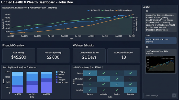
True wellness is holistic. Just as a DBSA wellness tracker might monitor mood trends over time, a health and wellness dashboard should monitor the stability of your finances and the consistency of your habits. By fixing the underlying math and cleaning up the presentation, the user created a tool that supports decision-making rather than requiring constant maintenance.
If you are tired of fighting with broken formulas or staring at messy, disconnected spreadsheets, it is time to upgrade your approach. Building your system in Quadratic allows you to focus on the insights your data provides, ensuring your tracker works as hard as you do.
Use Quadratic to Enhance Your Wellness Tracker
- Repair broken formulas and cross-sheet references to ensure your tracker remains accurate as data evolves.
- Stabilize data logic for reliable calculations of fitness metrics, habit streaks, and financial progress.
- Implement percentage-based progress tracking for financial goals and fitness challenges, turning raw data into motivating insights.
- Standardize visuals with consistent formatting, clear headers, and auto-fit columns for a professional, easy-to-read dashboard.
- Build a robust, unified view of your financial health and physical well-being, eliminating constant manual maintenance.
Ready to build a reliable wellness tracker that works as hard as you do? Try Quadratic.