
Table of contents
There is a distinct tension in healthcare analytics between the tools used to build models and the tools used to consume them. As a biostatistician or data scientist, you likely develop sophisticated survival analysis models using R or Python, leveraging the best data science tools available. These environments offer the statistical rigor required for handling complex life-tables, hazard ratios, and disease progression curves. However, your stakeholders—clinicians, business executives, and operational teams—almost exclusively live in Excel 365.
This creates a difficult gap. You are often forced to choose between two suboptimal paths: distributing a static PDF report that stakeholders cannot interact with, or attempting to rebuild a complex deconvolution model using native Excel formulas. The latter is particularly risky. Attempting to port advanced statistical logic into standard spreadsheet cells often leads to broken formulas, circular reference errors, or illogical outputs, such as negative survival probabilities.
Quadratic offers a third path. As a Python spreadsheet, it allows you to embed Python code directly into a spreadsheet interface, operationalizing your models without sacrificing mathematical integrity. This approach enables you to run rigorous survival analysis in R or Python logic while delivering the familiar, interactive grid that your stakeholders expect.
Why native Excel struggles with deconvolution
Porting a deconvolution model to a standard spreadsheet is rarely a one-to-one translation. The mathematical requirements of these models often exceed the capabilities of standard cell formulas. Deconvolution frequently requires iterative solving, complex matrix algebra, or integral equations to estimate the underlying distribution of events. While Excel has solver add-ins, they are often manual, fragile, and difficult to automate for a general business user.
A specific pain point in this workflow is the "guardrails" problem. In a robust statistical environment, you can easily program constraints to ensure data integrity. For example, a survival probability can never logically drop below zero. In a programming environment, preventing this is a trivial task. In vanilla Excel, however, ensuring that a deconvolution curve does not dip into negative territory requires a litany for survival analysis constraints—often taking the form of massive, nested IF statements.
These formula chains are notoriously brittle. If a user inputs a parameter that the nested logic didn't anticipate, the model breaks or returns impossible values. Furthermore, auditing these models becomes a nightmare. When the logic for censored data survival analysis is fragmented across hundreds of hidden calculation cells, verifying the accuracy of the model is nearly impossible.
The hybrid approach: Python-grade logic in an Excel grid
The solution lies in shifting the workflow from translation to embedding. Instead of trying to approximate statistical functions with spreadsheet formulas, Quadratic allows you to paste your original programmatic logic directly into the sheet, functioning as a true coding spreadsheet.
This means you no longer have to compromise. Many analysts prefer survival analysis in R for its robustness and vast library ecosystem. With Quadratic, you do not have to abandon that logic to satisfy Excel users. You can write the heavy analytical lifting in code cells—using the exact libraries and syntax you trust—and pipe the results directly into the grid for visualization and interaction.
Step-by-step: building the deconvolution model
To illustrate how this works in practice, we can look at the workflow for building a deconvolution survival model that handles patient risk groups and time horizons.
1. Handling censored data
The first challenge in any longitudinal study is data preparation, specifically regarding censoring. In the context of clinical trials, censoring in survival analysis refers to data points where the event of interest (such as death or disease progression) has not occurred by the end of the study period. These "right-censored" subjects provide partial information that must be included to avoid bias.
In a standard spreadsheet, managing censoring data in survival analysis typically involves manual filtering or complex helper columns to flag patients who dropped out or outlived the study window. This manual manipulation is a common source of user error.
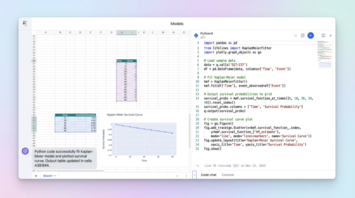
In Quadratic, you can pull the raw clinical data directly into a dataframe. Because you have access to standard Python libraries like pandas and lifelines, you can handle the data structure programmatically, allowing you to learn Python for data analysis directly within the workflow. You can write a script that automatically identifies and flags censored subjects based on start and end dates, ensuring the dataset is clean before any calculations begin. This reduces the risk of human error associated with manual row deletion or filtering.
2. Implementing the deconvolution logic
Once the data is prepped, the core deconvolution calculation takes place in a code cell. This is where the hybrid nature of the tool shines. You can paste your deconvolution function—whether it uses maximum likelihood estimation or other numerical methods—directly into the cell.
Crucially, this is where you implement the "guardrails" that native Excel lacks. In the use case of a deconvolution model, it is vital to ensure that the resulting probability curve never produces negative values. In Python, this is handled with a simple clamp function or a normalization step within the array calculation.
By scripting this logic, you explicitly prevent negative values. If a calculation dips below zero due to noise or data sparsity, the code logically corrects it (e.g., clamping it to zero) before the value is ever returned to the grid. The business user never sees a "broken" model; they only see mathematically valid results.
3. Creating the business interface
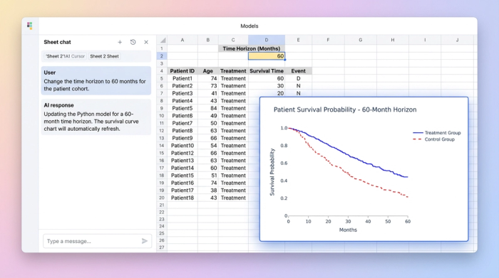
The final step is connecting this logic to the business user. In Quadratic, code cells can reference standard spreadsheet cells as inputs. You can designate specific cells for parameters like "Time Horizon," "Patient Cohort," or "Risk Group."
When a stakeholder changes one of these inputs, the Python model recalculates instantly. This creates an "app-like" experience, akin to an interactive dashboard in Python. Unlike doing a Kaplan Meier survival analysis in standard Excel, which often requires static copy-pasting of data to update a chart, the curves in Quadratic are dynamic. The user adjusts a timeline, and the deconvolution updates immediately, respecting all the programmed constraints and censoring rules.
Advantages of this workflow for healthcare analytics
Moving this workflow into a Python-integrated spreadsheet offers several distinct advantages for life sciences teams, particularly in health analytics.
The primary benefit is accuracy and trust. By using R survival analysis libraries or their Python equivalents, you are leveraging validated, peer-reviewed code rather than approximate Excel math. You eliminate the risk of formula typos or order-of-operations errors that plague complex spreadsheet models.
There is also a significant improvement in user safety. In a standard spreadsheet, a business user might accidentally delete a critical formula or overwrite a hard-coded value, breaking the model. In this workflow, the logic is locked inside code cells. The user interacts only with the defined parameters, ensuring they cannot accidentally dismantle the mathematical engine driving the analysis.
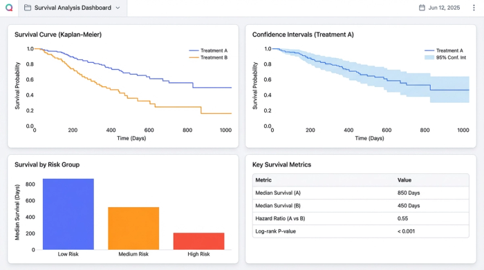
Finally, this approach improves how risk is communicated. You can use Python graphing libraries like Matplotlib or Plotly to render the survival curves directly in the sheet. These visualizations are far more customizable and capable than standard Excel charts, allowing you to plot confidence intervals and risk tables alongside the main curve.
Conclusion: from "spreadsheet" to "application"
Survival analysis is too critical to rely on fragile spreadsheet formulas. The decisions made from these models affect clinical trial designs, resource allocation, and patient outcomes. Yet, the reality of business operations demands that these insights be delivered in a format stakeholders understand.
You no longer need to choose between the power of code and the familiarity of the grid. By using Quadratic, you can deploy production-ready clinical models that bridge the gap. It transforms your work from a static spreadsheet into a robust application, ensuring that your stakeholders get the answers they need without compromising the integrity of the analysis.
Why "Censoring" Matters in Excel
Handling censored data survival analysis in native Excel is notoriously difficult. It usually involves creating complex helper columns to mathematically account for patients who left the study early or haven't experienced the event yet. If a user sorts the data incorrectly or deletes a row, these dependencies often break. In Quadratic, censoring is handled by a single line of code within a dataframe, completely removing the risk of manual data entry errors and ensuring the statistics remain valid regardless of how the spreadsheet is viewed.
Use Quadratic to do survival analysis
- Bridge the gap between sophisticated Python models and Excel-based stakeholders by embedding your code directly into an interactive spreadsheet.
- Implement complex deconvolution logic, iterative solving, and matrix algebra with the full power of Python libraries, avoiding fragile native Excel formulas.
- Programmatically ensure data integrity with "guardrails," preventing illogical outputs like negative survival probabilities that plague traditional spreadsheets.
- Streamline data preparation and accurately handle censored data using pandas or lifelines, eliminating manual errors and complex helper columns.
- Create dynamic, app-like interfaces where stakeholders can interact with model parameters, instantly updating survival curves while maintaining mathematical rigor.
- Leverage validated, peer-reviewed statistical libraries for accurate and trustworthy results, eliminating the risk of formula typos or order-of-operations errors.
- Enhance user safety by locking analytical logic in code cells, allowing business users to interact with parameters without accidentally breaking the model.
Ready to build robust, interactive survival analysis models? Try Quadratic.