Template purpose
This template provides a programmable system for automated data processing, evaluating internal pay structures against external market data. By leveraging the Python spreadsheet and Plotly within the grid, it transforms raw payroll logs into interactive visualizations and automated textual analysis.
- Compares internal employee salary data against external market benchmarks to establish competitiveness.
- Visualizes compa ratios across departments, teams, and locations to highlight distribution patterns.
- Identifies pay equity gaps using interactive Plotly charts that allow for dynamic grouping.
- Generates automated textual insights using Python and AI to summarize key findings without manual writing.
Data structure and inputs
Employee data sheet
The foundation of the analysis is the Employee_Data table located on the employee_data sheet. This table is pre-populated with 30 sample records to demonstrate the template's functionality.
- Demographic details: Includes fields for Employee ID, Name, Department, Team, Role, Job Level, Location, and Gender.
- Financial metrics: Tracks Salary, Bonus Target %, Bonus Actual, and Equity Value.
- Function: Serves as the primary internal dataset for the compensation analysis template, allowing Python scripts to pull individual records for aggregation.
Market data sheet
The market_data sheet houses the Market_Salary_Data table. This dataset acts as the external anchor for all compa ratio calculations.
- Benchmarks: Lists 26 role-based market salary medians.
- Usage: Python scripts reference this table to determine the denominator in compa ratio formulas (Employee Salary / Market Median).
Dashboard visualization and analytics
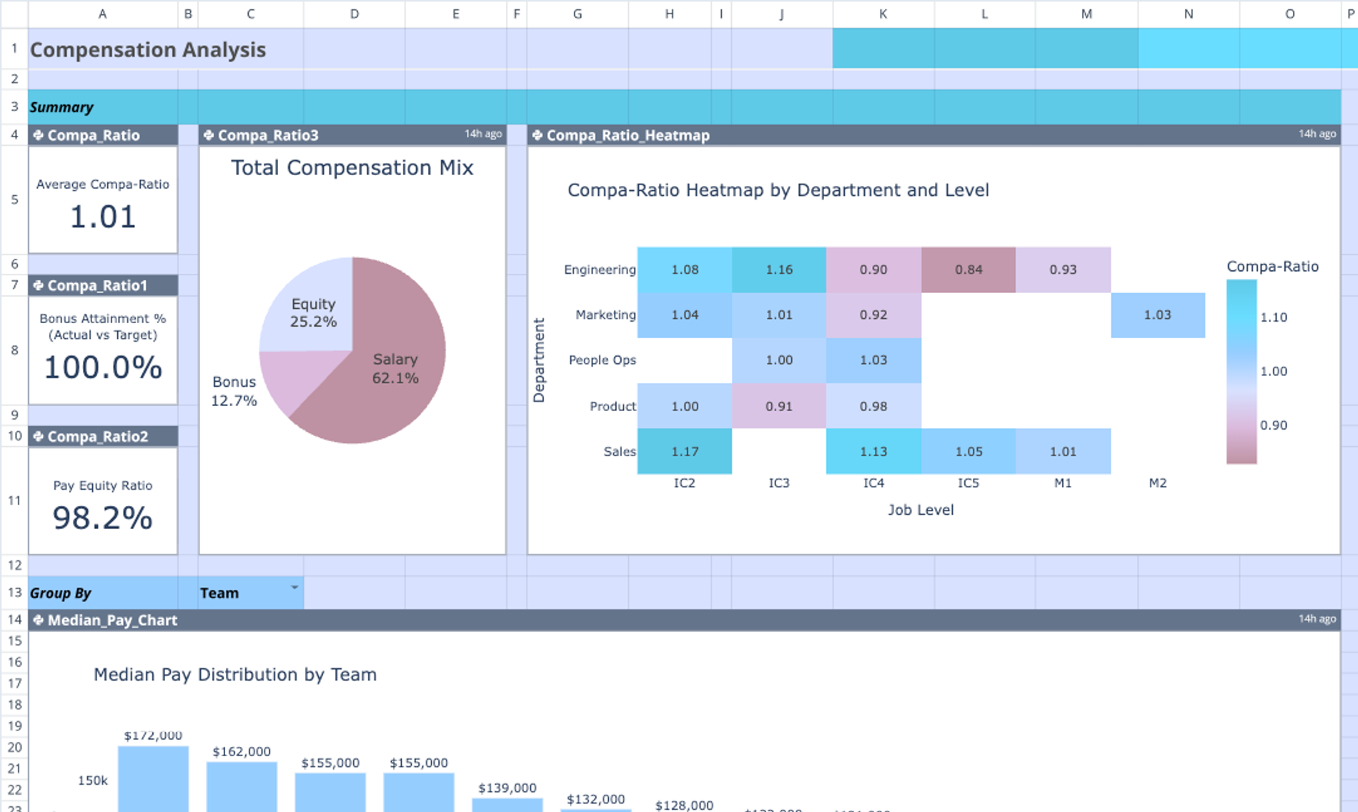
Compa ratio metrics
The dashboard uses Python to calculate compa ratios dynamically for every employee record. These metrics are aggregated to provide a high-level view of market competitiveness.
- Calculation: The script divides individual employee salaries by the corresponding market median for their specific role.
- Indicators: Three small summary charts in Column A (rows 4-11) provide immediate visual cues regarding overall market alignment.
- Heatmap: The Compa Ratio Heatmap (spanning columns G-O) visualizes aggregate data, allowing analysts to spot outliers or departments that are significantly over or under market rates.
Pay distribution charts
The template includes three major visualizations designed to break down compensation components by specific dimensions.
- Median Pay Chart: Located in the main dashboard view, this chart groups analysis by Team (or a user-selected dimension) to show salary distribution ranges.
- Total Comp Breakdown: This visualization stacks salary, bonus, and equity components, grouped by Department, to show the full financial weight of each business unit.
- Pay Equity Analysis: Occupying columns Q-AA, this chart provides a detailed view of compensation across locations to assist in identifying regional disparities.
AI-driven insights
To supplement the visual data, the template utilizes an integrated LLM flow, among the top AI tools for finance, to produce written analysis.
- Python integration: A Python script analyzes the Employee_Data and Market_Salary_Data tables simultaneously.
- Prompt engineering: The script references a customizable prompt template located in cells A63:A70, which guides the AI on what specific anomalies or patterns to look for.
- Output: Bullet-point observations are rendered directly onto the Comp Insights chart (Columns J-O), providing an automated narrative of the data.
How to use this compensation analysis template
1. Import internal data: Replace the sample records in the Employee_Data table with actual internal payroll template data and demographic information.
2. Set benchmarks: Update the Market_Salary_Data table with relevant industry benchmarks or salary band midpoints for your organization's roles.
3. Customize views: Adjust the "Group By" labels (e.g., changing "Team" to "Department" in cell A13) to dynamically update how the charts aggregate data.
4. Refresh analytics: Run the Python cells to refresh the Plotly visualizations and regenerate the AI-driven insights based on the new dataset.
Who this compensation analysis template is for
- Compensation analysts: Professionals requiring flexible, code-based benchmarking tools, which are among the best data science tools, that go beyond standard spreadsheet limitations.
- HR managers: Leaders responsible for monitoring pay equity, market competitiveness, and retention risks.
- Finance teams: Analysts performing financial data analytics, including budget allocation, salary planning, and departmental cost analysis.
- Advanced spreadsheet users: Individuals seeking a more powerful, programmable alternative, such as a coding spreadsheet, to a static compensation analysis template excel free download.
Use Quadratic to do compensation analysis
- Automate data processing and analysis using native Python within the grid.
- Compare internal employee salaries against external market benchmarks to calculate compa ratios.
- Visualize pay distribution and identify equity gaps with interactive Plotly charts.
- Generate automated textual insights and summaries using integrated AI flows.
- Dynamically customize analysis views by grouping data across dimensions like team or department.
- Consolidate employee data, market data, code, and visualizations in a single browser-based workspace.