Template overview
This template consolidates compensation data and geographic employment statistics on a single sheet. It functions as a static reference dashboard with no external data connections, allowing users to view industry baselines immediately.
- Combines tabular benchmarks with a Python-generated choropleth map.
- Provides immediate visibility into 2025 industry standards and regional job density.
Analyzing the supply chain salary table
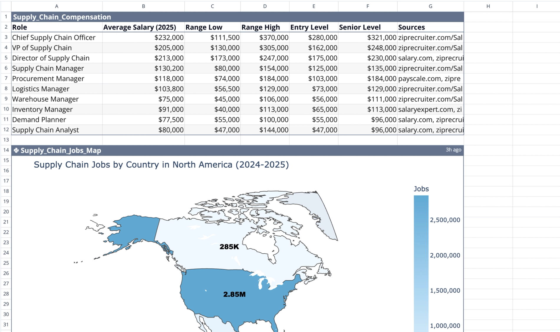
Data structure
The primary dataset is located in the range A1:G12 under the name "Supply_Chain_Compensation." It lists ten distinct roles ranging from executive leadership to individual contributors. The table includes specific benchmarks for roles such as supply chain analyst salary and supply chain coordinator salary.
Compensation metrics
The table displays average 2025 base salary figures to establish a market baseline. It provides low and high range bounds for comprehensive market analysis. Additionally, the data breaks down pay scales by experience, contrasting entry-level against senior-level compensation.
Sourcing
The table cites aggregate data from platforms like ZipRecruiter, Salary.com, and Payscale. It acts as a fixed dataset without dynamic formulas or calculations, serving as a stable reference point.
Visualizing North American job distribution
Python implementation
This visualization utilizes a Python code cell at A14 named "Supply_Chain_Jobs_Map," effectively functioning as a python chart generator, leveraging the Plotly library to render a static geographic visualization.
Map features
The Python code projects a choropleth map scoped specifically to North America. It visualizes job volume intensity using a light blue color gradient. To provide immediate context, the map overlays text annotations directly on countries to display abbreviated job counts.
Underlying data
The script defines internal variables for estimated job counts in the US, Canada, and Mexico. This allows the map to visualize approximate market size, such as the 2.85 million roles in the United States, without requiring an external dataset.
Reviewing textual context
Description placement
Explanatory text is located in cells A38:A40 immediately following the map visualization. These cells contain static text descriptions of the employment figures found in the Python map.
Functionality
This section provides a written summary of the data visualized in the chart above. It offers quick reference numbers for regional supply chain workforce sizes, ensuring the data is accessible in both visual and text formats. This data can be crucial for resource capacity planning.
Who this supply chain salary template is for
- HR professionals benchmarking supply chain management salary packages for new hires.
- Department heads reviewing competitive rates for a supply chain director salary.
- Job seekers researching logistics and supply chain management salary expectations can also benefit from a resume keyword analyzer to optimize their applications.
- Students evaluating potential supply chain management degree salary outcomes.
Use Quadratic to do supply chain salary benchmarking and job mapping
- Consolidate compensation data and geographic employment statistics on a single sheet.
- Visualize North American supply chain job distribution with a Python-generated choropleth map.
- Access 2025 average base salaries and experience-based pay scales for various roles.
- Reference industry baselines for roles like supply chain analyst and director salaries.
- Review estimated job counts for the US, Canada, and Mexico directly on the map.
Related templates
Professional Payroll Template
Automate payment calculations and spot trends with a dynamic dashboard.
Job Description to Resume Keyword Analyzer
Automatically match your resume to job descriptions based on key skills.
Fill Rate Calculator
Analyze performance, reduce backorders, and optimize your supply chain in one dashboard.