Table of contents
You check your bank balance at the end of the month and feel that familiar sinking sensation. The money is gone, but you aren't exactly sure where it went. You didn't make any massive purchases, yet your savings goals feel further away than they did thirty days ago. This is the phenomenon of "money leaking", where small, unmonitored transactions drain your liquidity. The solution isn't just "trying harder" to save; it is implementing a better system for data visibility.
This is where category spend analysis comes into play. In technical terms, this is the process of grouping transactions into buckets to identify patterns, spot inefficiencies, and optimize cash flow. It is the difference between seeing a list of 500 random transactions and seeing a clear chart that says, "Your dining expenses have increased by 15% month-over-month."
Most financial advice suggests solving this problem by saving receipts or manually entering every coffee purchase into a spreadsheet. That approach is unsustainable and leads to burnout. A better solution is to adopt a modern workflow for spreadsheet automation—using a tool like Quadratic to sync your financial data, apply AI rules for cleaning, and analyze trends like a data engineer rather than just a consumer.
The building blocks: understanding spend analysis categories
Before you can automate your analysis, you must define the structure of your data. If you dump thousands of transactions into a grid without a plan, you will only get noise, not signal.
At a high level, your spend analysis categories should be divided into two primary groups: fixed costs and discretionary spending. Fixed costs include the "must-haves" like your mortgage, rent, insurance premiums, and utilities. These are generally static and predictable. Discretionary spending covers the "wants," such as dining out, entertainment, shopping, and travel. This is usually where the leaks happen.
To take this a step further, you can borrow a concept from the corporate world: spend analysis and category management. In a business context, this refers to how procurement teams organize purchasing data to negotiate better contracts. For your personal finances, leveraging personal finance templates can mean treating your household budget like a business strategy. You aren't just "tracking" expenses; you are managing categories to optimize your bottom line. By defining these buckets clearly at the start, you set the stage for meaningful automation.
Why manual tracking fails (and how to fix it)
The reason most people fail at budgeting is not a lack of discipline; it is a friction problem, which can often be overcome with an automated budget. Traditional methods require too much manual intervention. Maintaining a manual spreadsheet requires you to download CSV files from multiple banks, format them, and copy-paste them into a master sheet. By the time you finish data entry, you are too tired to actually analyze the numbers.
Conversely, a standard family budget app often feels too rigid. They might miscategorize a transaction, and fixing it requires navigating through endless menus. Furthermore, they rarely give you the raw data access needed to build custom views or forecasts.
True financial insight requires a blend of automation and customization. You need a system that handles the boring work—ingestion and cleaning—automatically, while giving you the flexibility to query your data however you see fit. This is where the Quadratic use case shines. By using a canvas that supports live data connections, Python, and AI, you can build a workflow that cleans and visualizes your finances in real-time.
The modern workflow: automating your category spend analysis
Moving from a passive consumer to an active analyst involves setting up a pipeline. In Quadratic, this process mirrors a professional data engineering workflow: ingestion, cleaning, and reporting.
1. Syncing transactions (ingestion)
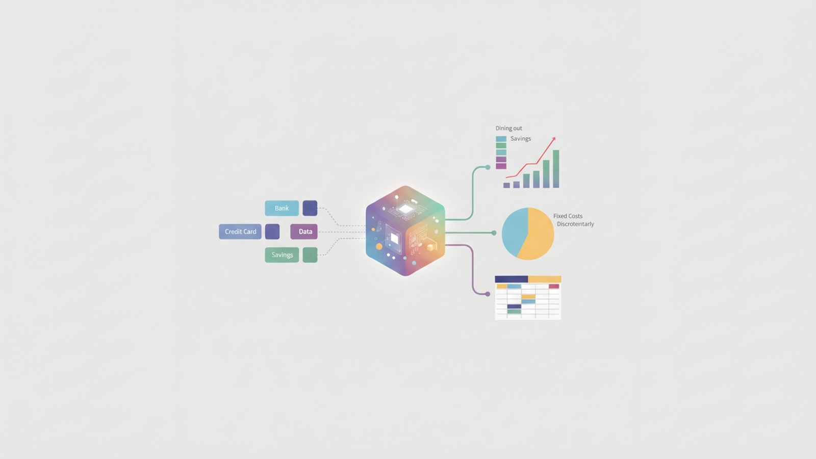
The first step is aggregating your data without manual entry. In a modern environment, you should be able to connect your checking accounts, credit cards, and savings accounts directly to your workspace. Instead of downloading static files that are obsolete the moment you save them, you establish a live link to your financial institutions.
This ensures your dataset is always current. When you open your spreadsheet to perform a category spend analysis, the raw transaction data is already there, waiting for you. This eliminates the friction of data gathering, allowing you to focus entirely on the analysis itself.
2. AI-assisted categorization (cleaning)
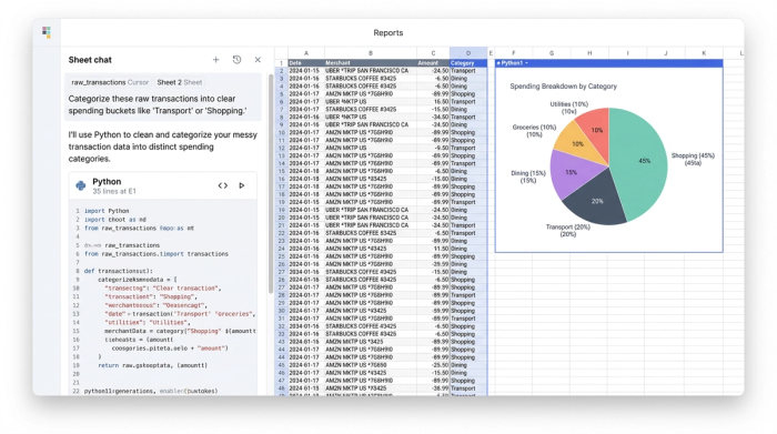
Raw bank data is notoriously messy. A transaction might appear as "AMZN MKTPLACE WA" one day and "AMZN PRIME" the next. Manually tagging these as "Shopping" every single time is tedious.
In Quadratic, you can automate this phase using AI-powered transaction categorization or Python logic. You can set up rules or use an AI prompt to scan the merchant descriptions and assign categories automatically. For example, you can create a logic flow that says, "If the merchant is Uber, tag as Transport," or use an embedded Large Language Model (LLM) to interpret obscure vendor names and categorize them intelligently.
Because Quadratic supports Python and SQL directly in the grid, you can handle edge cases that rigid apps miss. If you want to split a transaction from "Costco" into 50% "Groceries" and 50% "Home Goods," you can write a simple script to handle that logic automatically whenever a Costco charge appears.
3. Summarizing and visualizing (reporting)
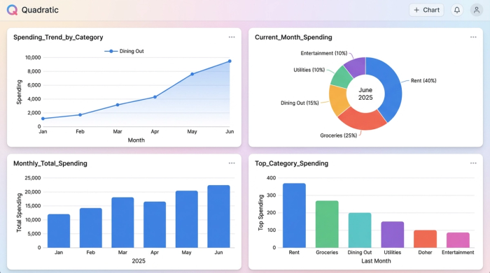
Once your data is clean, the final step is aggregation. A weekly spending tracker can help provide a high-level view, grouping your spending by Merchant, Category, and Month.
Visuals are critical here. A list of numbers might not show you the severity of a trend, but a line chart will. You can generate a visualization that maps your top five variable categories over the last six months. Seeing a red line for "Dining Out" trending sharply upward provides an instant visual cue that action is required.
Analyzing the data: how to spot overspending
With your automated dashboard built, you can now put on your analyst hat and apply financial tracking best practices. The goal is to look for anomalies and patterns that standard banking apps might miss.
Start by looking for "lifestyle creep." This is rarely a sudden spike; it is usually a slow, steady increase in a specific category. Perhaps your grocery spend has drifted up 10% because you’ve started buying premium brands, or your subscription services have multiplied unnoticed.
Next, analyze your Fixed vs. Discretionary ratio. If 80% of your income is tied up in fixed costs, you have very little liquidity to handle emergencies. Finally, perform a merchant deep dive. sometimes a whole category is skewed by a single vendor. You might find that your "Shopping" category is inflated entirely by Amazon purchases, signaling exactly where you need to cut back. This level of granularity is the core benefit of a robust category spend analysis.
Turning insights into action
Data without action is just trivia. The purpose of this analysis is to inform behavioral change. If your dashboard reveals that entertainment spending is up 20% compared to last year, the solution isn't necessarily to stop having fun. The solution is to set a data-backed cap for the coming month.
You can also use the spreadsheet environment for scenario planning. Since you have the raw data and the calculation power, you can forecast outcomes. Ask questions like, "If I cut my dining budget by 15% and cancel two subscriptions, how much faster will I reach my savings goal?"
This creates a positive feedback loop. You aren't just auditing your finances once a year; you are operating a continuous system that alerts you to changes in your financial health, allowing you to pivot quickly.
Conclusion
Financial clarity is not about having more willpower; it is about having better data. Category spend analysis provides the visibility required to stop money from leaking out of your accounts, but the method you use to track it matters.
Relying on manual logs or restrictive apps often leads to frustration and abandonment. By utilizing a tool like Quadratic, you can build a professional-grade workflow that syncs, categorizes, and visualizes your money automatically. This transition from manual entry to automated insight allows you to stop worrying about where your money went and start directing where it should go.
Use Quadratic to do category spend analysis
- Automate data ingestion: Connect bank accounts, credit cards, and savings directly to maintain live, always-current transaction data, eliminating manual entry and outdated files.
- Categorize transactions with AI and Python: Apply AI rules or custom Python logic to automatically clean messy merchant data and assign categories, including handling complex rules like splitting transactions.
- Visualize spending trends instantly: Generate dynamic charts and dashboards within the grid to quickly spot overspending, identify lifestyle creep, and track anomalies across categories.
- Gain flexible, deep insights: Access raw financial data and leverage Python/SQL for custom queries, enabling detailed merchant deep dives and robust scenario planning for savings goals.
- Build a continuous analysis system: Establish an automated pipeline for ongoing ingestion, cleaning, and reporting, keeping your category spend analysis current without constant manual effort.
Ready to get a clearer picture of your finances? Try Quadratic.