
For any subscription-based business, the relationship between the churn rate vs retention rate is symbiotic. These two metrics are effectively two sides of the same coin—one measures the leak in your bucket, while the other measures how well you hold onto what you have. When analyzed together, they provide the baseline health check for a company’s recurring revenue.
However, for the analysts tasked with reporting on these numbers, the challenge is rarely about understanding the definitions. The real problem lies in the workflow. Tracking these metrics effectively across different business units, locations, and time periods usually involves a fragmented process: writing SQL queries to pull raw data, exporting that data to CSV, and then rebuilding charts in Excel every single month.
This manual friction slows down decision-making. By the time a report is polished, the data is often stale, underscoring the benefits of real-time data dashboards. This article explores how to streamline this process using a connected spreadsheet like Quadratic, allowing you to bridge the gap between customer retention rate vs churn rate analysis and live operational data.
Defining the metrics: churn rate vs retention rate formulas
Before diving into the workflow, it is important to establish the standard definitions and formulas. While simple on the surface, consistency in how these are calculated is vital for accurate historical comparison.
Churn Rate
This metric represents the percentage of subscribers who cancel or fail to renew their subscriptions within a given time period. It is the primary indicator of customer dissatisfaction or competitive pressure.
- Formula: (Lost Customers / Total Customers at the Start of Period) × 100
Retention Rate
Conversely, the retention rate measures the percentage of customers a business retains over a specific period. It excludes new customer acquisition to focus solely on the existing base.
- Formula: ((Total Customers at End of Period - New Customers) / Total Customers at Start of Period) × 100, a key aspect of the overall retention rate formula.
The Relationship
Understanding the churn rate vs retention rate formula dynamics helps in calculating broader metrics like Net Revenue Retention (NRR). If your churn is high, your acquisition team has to work double-time just to keep revenue flat. By analyzing churn vs retention rate together, analysts can pinpoint whether a revenue plateau is a sales problem or a product stickiness problem, often requiring specialized product analytics tools for deeper insight.
The analyst’s dilemma: static reports vs. live data
Consider the role of a Business Analyst managing data for a multi-location, subscription-based office rental service. Their job is to track membership health and recurring revenue performance across dozens of properties.
The analyst faces a common dilemma. They have the SQL skills to query the company’s MySQL database, where the source of truth lives. However, their stakeholders—operations managers and finance leads—live in spreadsheets.
To bridge this gap, the analyst typically runs a static SQL query, exports the results, and pastes them into a spreadsheet to build visualizations. This method is fragile. If a manager asks, "What did retention vs churn rate look like for the Downtown location last November?" the analyst has to go back to the code, re-run the query, re-export the CSV, and update the charts.
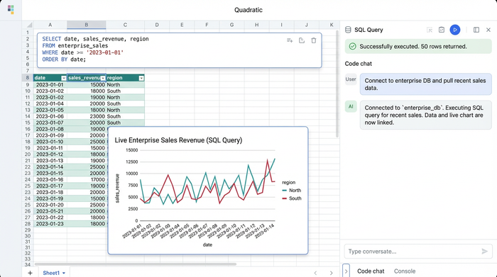
This is where the "connected spreadsheet" approach changes the game. By using a tool like Quadratic, the analyst can connect directly to the MySQL database within the spreadsheet interface. This eliminates the export step entirely, allowing for reports that are both powered by SQL and as flexible as a standard spreadsheet.
Tutorial in Quadratic
Let’s look at how this office rental use case translates into a live dashboard. The goal is to create a view that tracks monthly revenue by product and location, specifically isolating churn (lost revenue) and acquisition (new revenue), perhaps leveraging a product metrics template for efficiency.
1. Connecting directly to MySQL
The first step involves establishing a direct connection to the database. Instead of working with a static snapshot, the analyst connects Quadratic to the MySQL server containing the subscription logs. This ensures that every time the dashboard is opened, the metrics reflect the most current state of the business. There is no version control nightmare because the data is never manually moved; it is simply queried.
2. Querying churn and acquisition
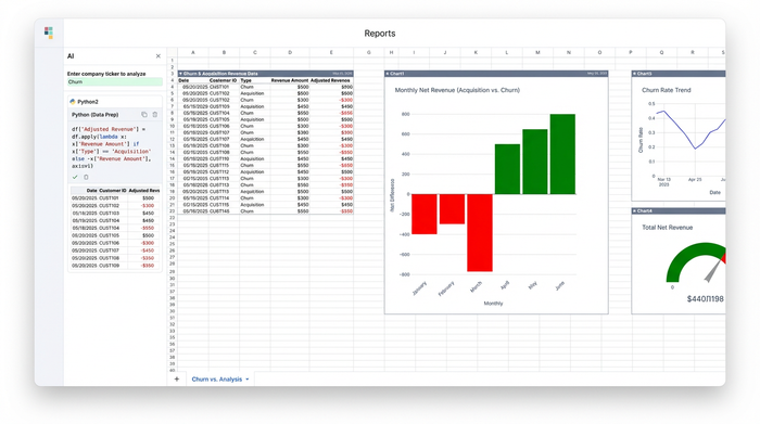
To visualize the health of the business, the analyst needs to separate positive momentum from negative drag. The strategy here involves writing a SQL query that categorizes revenue based on the subscription status.
The analyst writes a query that sums revenue for new sign-ups and assigns them a positive value. In the same query, they sum the revenue value of terminated subscriptions but multiply the result by negative one.
This data preparation is crucial for the visualization strategy. By mapping churn as negative values and acquisition as positive values on the same axis, the analyst prepares the data for a diverging bar chart. This visualization style offers an immediate visual cue: bars extending upward or to the right represent growth (acquisition), while bars extending downward or to the left represent contraction (churn).
3. Making it interactive with parameters
The most powerful aspect of this workflow is the ability to parameterize the SQL query using spreadsheet cells. In a traditional BI tool, creating dynamic filters often requires complex setup or proprietary coding languages. In Quadratic, the analyst can use standard cells as input fields.
For example, the analyst can designate cell A1 as the "Location" filter. They can then reference this cell directly inside their SQL query.
SELECT * FROM subscriptions WHERE location = cell_A1
Now, when the analyst or a stakeholder types "Uptown Branch" into cell A1, the SQL query automatically re-runs, and the diverging bar charts instantly update to reflect the churn rate vs retention rate data for that specific location. This allows for rapid ad-hoc analysis without rewriting code.
Visualizing the story: interpreting the diverging bar chart
Once the data is live and the visualization is built, the story becomes clear. The diverging bar chart provides a net impact view that is often lost in standard line graphs.
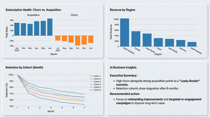
In the office rental use case, the analyst might spot a trend where a specific business unit shows strong green bars (acquisition) but equally long red bars (churn). This indicates a "leaky bucket" scenario, highlighting the need for a robust churn prediction model: the sales team is bringing people in, but the product isn't keeping them.
Alternatively, they might see a location with very low acquisition but almost zero churn. This suggests a highly loyal customer base where an increase in marketing spend could yield high long-term value. By visualizing the retention rate vs churn rate in this format, perhaps even integrating a cohort analysis template, the analyst moves from simply reporting numbers to identifying actionable strategic interventions.
Conclusion
The quality of your churn rate vs retention rate analysis is heavily dependent on the workflow behind it. If you are stuck in a cycle of manual exports and static spreadsheets, you are spending more time wrangling data than interpreting it.
By adopting a tool that combines the power of SQL with the flexibility of a spreadsheet, you can build dashboards that are live, interactive, and deeply insightful. It is time to stop rebuilding the same charts every month and start analyzing the story your data is trying to tell.
Try Quadratic for your own KPI dashboards and experience the difference of a truly connected workflow.
Use Quadratic to analyze churn rate vs retention rate
- Connect directly to live subscription databases: Eliminate manual data exports and ensure your churn and retention metrics are always current by linking Quadratic to sources like MySQL.
- Create dynamic, interactive dashboards: Build real-time reports where stakeholders can filter churn vs retention data by location, product, or time using simple spreadsheet cells.
- Automate monthly reporting workflows: Ditch the repetitive cycle of querying, exporting, and rebuilding charts, freeing up time for deeper analysis and strategic insights.
- Visually identify "leaky bucket" scenarios: Use diverging bar charts to clearly see the net impact of customer acquisition versus churn, making it easy to spot areas needing intervention.
- Drive actionable subscription strategies: Quickly move from raw data to insights that pinpoint whether revenue plateaus are a sales problem or a product stickiness problem.
Stop rebuilding the same charts every month and start analyzing the story your data is trying to tell. Try Quadratic to build your own live subscription dashboards.