
Hospitality loyalty programs are massive investments. Hotel chains pour millions into rewards, tier benefits, and marketing with the assumption that these efforts drive retention and increase share of wallet; indeed, some studies show that loyalty programs can significantly increase revenue. But determining the actual return on investment is notoriously difficult. A simple look at the average transaction value might show that loyalty members spend $50 more per stay than non-members, but without statistical validation, that number could be nothing more than random noise.
To truly understand if a program is working, analysts need to move beyond basic dashboards and averages. They need a comprehensive quantitative data analysis that employs rigorous statistical testing. In the past, this meant exporting data from a spreadsheet into a complex environment like R or Python, creating a disjointed workflow.
In this article, we will walk through a complete workflow using Quadratic. We will take synthesized hospitality data and apply statistical tests—specifically T-tests, Chi-square tests, and ANOVA—to prove exactly what drives loyalty and spend. This approach allows us to validate business intuition with mathematical certainty, all within a browser-based spreadsheet interface, by understanding the applications of these statistical tests.
What is customer loyalty analysis?
Customer loyalty analysis is the process of evaluating customer data to understand the underlying drivers of retention, spending behaviors, and the overall effectiveness of loyalty initiatives. While many organizations track high-level metrics like churn rate or net promoter score, a deep-dive analysis goes further by testing relationships between variables.
There is a distinct shift here from descriptive analysis to inferential analysis. Descriptive analysis tells you what happened, such as observing that "Gold Tier members had a higher satisfaction score last month." Inferential analysis tells you why it happened and if the difference is statistically significant, or if it was just a fluke.
For this walkthrough, we are adopting the persona of a Hospitality Analyst. We are not just looking at rows of data; we are looking for the story behind transactional spend and guest satisfaction to give management a recommendation they can trust.
Step 1: structuring the data for analysis
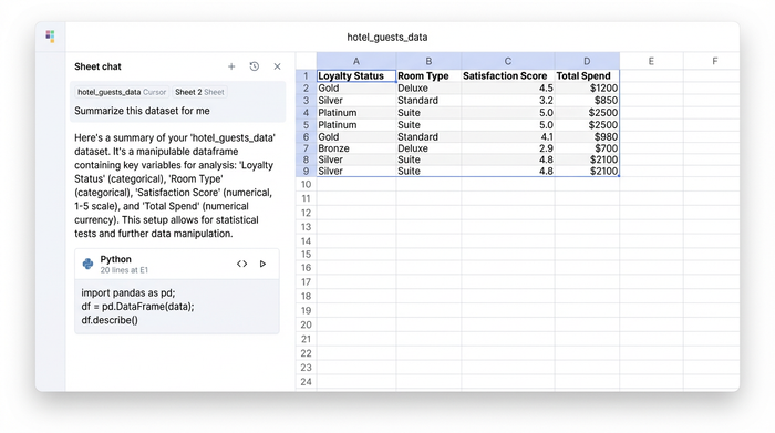
Before running any tests, we need to establish our dataset. In this use case, we are working with synthesized data that mimics a real-world hotel environment. The dataset includes a mix of continuous variables, like total spend, and categorical variables, such as room type and loyalty status.
The key variables we are tracking include:
- Loyalty Status: A binary category distinguishing between Members and Non-members.
- Room Type: A categorical variable representing options like Standard, Deluxe, and Suite.
- Satisfaction Score: A numerical rating provided by the guest post-stay.
- Total Spend: The total dollar amount associated with the booking and ancillary services.
In a traditional spreadsheet, this data would simply sit in static rows. If you wanted to analyze it, you would likely create a pivot table. In Quadratic, we import this data into the grid, but we have the added advantage of treating it as a dataframe. This allows us to view the data familiarly while simultaneously preparing it for Python-powered manipulation in the same workspace.
Step 2: running statistical tests
Once the data is structured, we move to the core of the workflow. This is where we transition from guessing to knowing. By using Python directly within the Quadratic grid, we can run standard statistical tests to answer specific business questions.
Is the program working? (the t-test)
The first question management will ask is simple: Do loyalty members actually spend more than non-members? A simple average might show that members spend $500 while non-members spend $450. However, if the standard deviation is high, that $50 difference might not mean anything.
To validate this, we use a T-test. This statistical test compares the means of two groups to determine if there is a significant difference between them. In Quadratic, the analyst clicks a cell and writes a short Python script using the scipy library to compare the "Total Spend" column for members versus non-members.
The output provides a p-value. If the p-value is below a standard threshold (usually 0.05), we can confidently say the difference in spend is statistically significant, underscoring the importance of statistical significance in business decisions. We are no longer guessing; we have mathematical proof that the loyalty program correlates with higher spending.
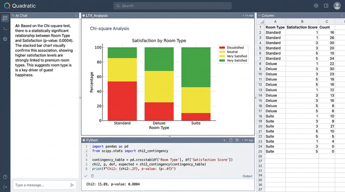
What drives satisfaction? (the chi-square test)
Next, we want to understand guest happiness. Is high satisfaction associated with being a loyalty member, or is it perhaps just associated with the type of room a guest booked?
To figure this out, we use a Chi-square test for independence. This test helps us see if there is a relationship between two categorical variables. For example, we might hypothesize that satisfaction scores are dependent on loyalty status.
By running this test in a Quadratic code cell, we can generate a test statistic and a p-value. If the test shows no significant association between loyalty status and satisfaction, but a strong association between room type and satisfaction, the insight changes. It would suggest that upgrading guests to better rooms is a more effective driver of happiness than simply giving them points.
Analyzing spend across categories (ANOVA)
Finally, we need to look at spending across multiple categories. A T-test works for two groups, but what if we want to compare spend across Standard, Deluxe, Suite, and Penthouse rooms simultaneously?
For this, we use ANOVA (Analysis of Variance). This method compares the means across three or more groups to see if at least one differs significantly from the others. Running an ANOVA test in Quadratic allows the analyst to pinpoint exactly which room categories drive the highest value.
The output helps us move beyond a simple "top 10" list. It helps us understand the variance between groups, identifying if the "Suite" category truly outperforms the "Deluxe" category in a way that justifies the price difference, or if the spending habits are largely the same.
Step 3: visual reporting and data storytelling
Statistical outputs like p-values and F-statistics are vital for the analyst, but they are often difficult for stakeholders to interpret. A successful customer loyalty analysis must translate these hard numbers into a visual narrative, leveraging data storytelling best practices to effectively communicate insights.
In this stage, we visualize the findings to support our statistical conclusions:
- Box Plots: These are excellent for visualizing the results of the ANOVA test. They show the spread of spend across different room types, highlighting outliers and the median spend for each category.
- Bar Charts: We use these to visualize the distribution of satisfaction scores across loyalty tiers, making the results of the Chi-square test immediately apparent.
This is where the Quadratic interface differentiates itself from standard tools. Instead of having a chart floating over a grid of numbers, Quadratic offers an infinite canvas. The analyst can place the raw data on the left, the Python code generating the statistics in the middle, and the resulting visualizations and text conclusions on the right.
This layout creates a transparent, reproducible report. A stakeholder can look at the graph, read the conclusion, and if they are technical, inspect the code that generated the p-value, all in one view.
Conclusion: moving from intuition to proof
True customer loyalty analysis requires more than just observing trends; it requires proving significance. By moving from simple averages to hypothesis testing, analysts can provide recommendations that are mathematically sound.
Using data science tools like Quadratic bridges the gap between the ease of a spreadsheet and the power of data science. It allows analysts to perform T-tests, Chi-square tests, and ANOVA without leaving their browser, turning raw hospitality data into actionable insights.
If you are ready to stop relying on static dashboards and start performing your own statistical deep dives, try Quadratic. It is the AI spreadsheet that empowers you to validate your business intuition with data.
Use Quadratic to perform customer loyalty analysis
- Validate loyalty program effectiveness: Use T-tests to statistically prove if loyalty members spend significantly more than non-members, moving beyond simple averages to mathematically sound conclusions.
- Uncover drivers of satisfaction and spend: Apply Chi-square tests to identify relationships between loyalty status, room types, and satisfaction, and use ANOVA to compare spending across multiple categories like different room types.
- Streamline your analytical workflow: Conduct rigorous statistical tests (T-tests, Chi-square, ANOVA) with native Python directly within a familiar spreadsheet interface, eliminating disjointed tools and data exports.
- Create transparent, shareable reports: Combine raw data, Python code, and interactive visualizations on an infinite canvas to easily communicate statistically-backed insights to stakeholders.
- Turn intuition into data-backed recommendations: Provide management with mathematically certain conclusions about what truly drives customer loyalty and spending, moving from observation to proof.
Ready to stop guessing and start proving the impact of your loyalty programs? Try Quadratic.