For many data analysts and technical marketers, the migration from Universal Analytics to Google Analytics 4 (GA4) felt like trading a finished house for a pile of lumber. While the Google Analytics 4 event-based data model is objectively more flexible and scalable than its predecessor, it often requires significant assembly before it yields actionable insights, highlighting some common challenges in data analytics when dealing with raw, event-level data. The familiar session-based reports are gone, replaced by a raw stream of events that can feel messy and disconnected.
Currently, most professionals face a difficult binary choice when trying to tame this data. You can either struggle within the limitations of the native GA4 interface and Looker Studio—where blending data sources is fragile—or you can commit to a full data engineering stack involving BigQuery, SQL, and dbt. The latter is powerful but comes with a high technical barrier and maintenance cost.
There is, however, a middle ground. By using a google analytics spreadsheet like Quadratic, you can build a robust Google Analytics data model directly in a familiar grid interface. This approach gives you the relational power of a database and the flexibility of Python and SQL, allowing you to turn raw GA4 exports into a clean, queryable structure without needing a data engineering team.
Why native GA4 reporting isn't enough
To understand why you need to model your data, you first need to understand the limitations of the raw Google Analytics 4 data model when viewed through standard reporting tools. In GA4, everything is an event. A page view is an event; a click is an event; a purchase is an event.
This flatness creates several pain points for deep analysis. First, valuable context is often buried inside nested event parameters. For example, to understand which specific link color drove a click, you have to extract that parameter from the event payload, which is difficult to do in standard flat reports.
Second, the "sessionization" logic that analysts relied on in Universal Analytics is not inherent to the raw data export. If you want to analyze user behavior over a specific 30-minute window, you have to calculate that logic yourself. Finally, native reports tend to isolate metrics. You might have a report for user acquisition and a separate report for engagement, but joining them to see how a specific campaign influenced a specific downstream interaction often results in sampling errors or "thresholding" limitations. Modeling is the strategic process of organizing this chaos into clarity.
The anatomy of a clean data model
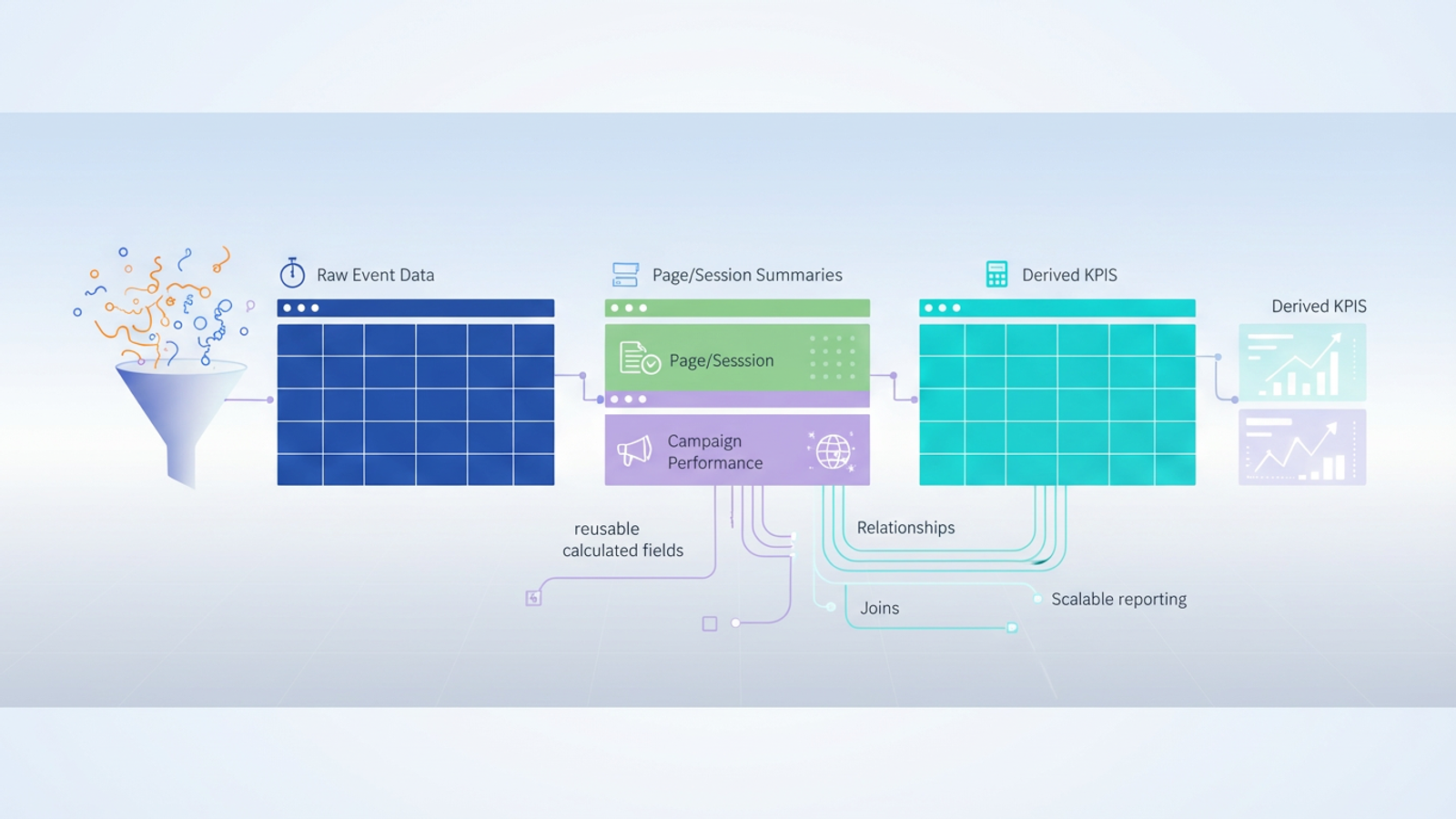
Building a data model Google Analytics relies on is not about creating one massive, color-coded tab. It is about separating your data into logical entities that relate to one another. A clean model generally consists of three types of tables, a concept central to dimensional modeling:
- Fact tables: These contain your raw, immutable event logs. This is the "what happened" stream—every page view, scroll, and conversion, stamped with a time and a user ID.
- Dimension tables: These are clean, unique lists of entities, such as a "Pages" table (containing URL, title, and category) or a "Campaigns" table (containing source, medium, and campaign ID).
- Derived tables: These are your calculated outputs. They aggregate data from the fact and dimension tables to produce KPIs like "Conversion Rate per Channel" or "Average Time on Page."
Step-by-step: building your GA4 data model in Quadratic
Quadratic allows you to implement this database-style architecture within a spreadsheet interface. Because Quadratic supports native SQL and Python directly in the cells, you can query data from one sheet to another, creating a live, updating model.
1. Ingest and isolate raw data
The first step is syncing your GA4 dimensions and metrics into Quadratic. Whether you are pulling a CSV export or connecting to a data warehouse where your GA4 data lives, this initial sheet serves as your raw ingestion layer.
A critical best practice in data modeling is to treat this sheet as a "Source of Truth." You should never manually edit cells in this raw feed. If you find an error or an anomaly, you fix it in the transformation layer (the subsequent tables), not the source. This ensures that when new data flows in next month, your manual changes aren't overwritten or lost.
2. Normalizing data into structured tables
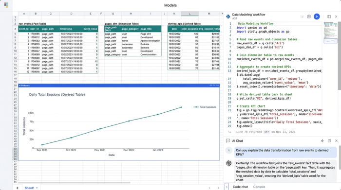
Once the raw data is present, you need to break it apart into manageable dimension tables. In a standard spreadsheet, you might use pivot tables or copy-paste distinct values. In Quadratic, you can use SQL cells to automate this.
For example, to create a "Page Summary Table," you can write a SQL query against your raw data sheet to select distinct page paths. This creates a live table that automatically updates if a new page URL appears in your analytics. You can do the same for your "Campaign Table," grouping data by source and medium to create a clean list of acquisition channels, which is crucial for defining your own GA4 default channel grouping. This process, known as data normalization, reduces redundancy and makes analysis much faster.
3. Defining relationships and joins
The real power of a GA4 data model emerges when you define relationships between these tables. You might want to answer a question like, "Which campaigns drove the most views to our pricing page?"
In traditional spreadsheets, this would require fragile VLOOKUP or INDEX/MATCH formulas that break easily when row counts change. In Quadratic, you perform a SQL join. You can join your "Campaign Data" table with your "Conversion Events" table based on a common identifier (like a user ID or session ID). This relational approach allows you to perform ga4 funnel exploration in complex ways—such as filtering for users who came from LinkedIn (Source) and viewed the Blog (Page) before converting—without building a new report from scratch every time.
4. Creating reusable calculated fields
The final layer of your model involves defining your metrics. Because your data is now structured, you can build calculations that apply across the entire dataset.
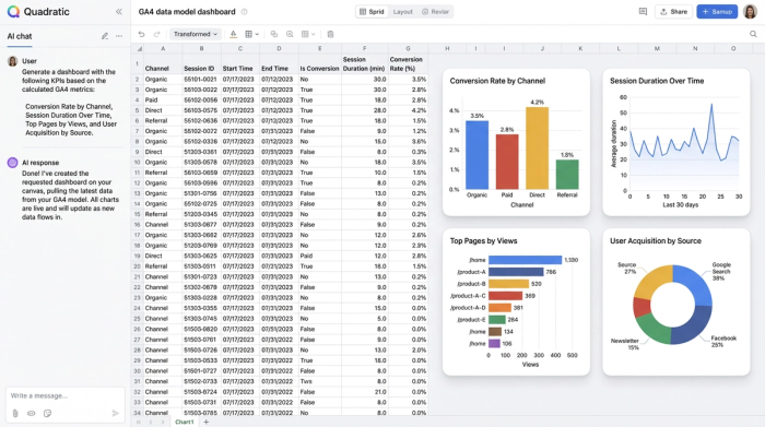
For instance, you can calculate Session Duration by writing a query that subtracts the timestamp of a user's first event from their last event. You can calculate Conversion Rate per Channel by dividing total conversions by total sessions for each source. The benefit of doing this in a model rather than a one-off report is scalability. When next week's data arrives in the raw sheet, it flows through your dimension tables and joins, and your calculated fields update automatically. You build the logic once and use it forever.
Advanced modeling: solving the "event-based" headache
One of the most common search queries regarding analytics today is for Google Analytics 4 event-based data model documentation, largely because users are trying to figure out how to make events look like sessions again. The native GA4 session logic is often a "black box," making it hard to audit why a session broke or why a user was attributed to "Direct" instead of "Organic."
By building your own model, you can define your own session logic. Using Python in Quadratic, you can iterate through your raw event stream. You can write a script that looks at a User ID and their event timestamps. If two events from the same user occur within 30 minutes of each other, you assign them the same session_id. If the gap is longer, you generate a new ID. This effectively recreates the session view analysts miss from Universal Analytics, but with the added benefit that you can tweak the logic (e.g., changing the timeout to 60 minutes) to fit your specific business needs.
The benefits of a spreadsheet-based data model
Adopting this modeling workflow in Quadratic offers distinct advantages over the alternatives. First, it provides agility. You do not need to wait for a data engineering ticket to create a new dimension or fix a metric definition. You can write the SQL or Python yourself immediately.
Second, it offers transparency. In many dashboarding tools, the logic is hidden behind drag-and-drop interfaces. In a code-enabled spreadsheet, the SQL query or Python script defining your "Churn Rate" is visible right next to the data. Anyone on the team can read it and understand exactly how the number was derived.
Finally, it provides scalability. Standard spreadsheets often crash when loaded with raw GA4 exports. Because Quadratic runs code and connects to data sources efficiently, it handles the volume required for a robust model while keeping the analysis layer clean and responsive.
Conclusion
A well-structured Google Analytics data model is essential for accurate, deep analysis in the post-Universal Analytics world. However, achieving this structure does not require you to become a data engineer or manage a complex warehouse stack.
By moving your workflow into a computational spreadsheet, you can organize your raw GA4 events into clean, relational tables. You can define your own logic for sessions and attribution, and you can build google analytics custom dashboards that update automatically. It is time to stop wrestling with the limitations of the native interface and start modeling your data in an environment where you have full control over the logic. Turn your disconnected reports into a cohesive data engine.
Use Quadratic to design a Google Analytics data model
- Transform messy GA4 event data into a clean, queryable structure without a full data engineering stack.
- Build robust fact, dimension, and derived tables directly in a familiar spreadsheet interface using native SQL and Python.
- Define custom session logic and attribution rules to overcome GA4's "black box" reporting limitations.
- Perform complex joins and create reusable calculated fields for accurate KPIs like conversion rate per channel.
- Gain agility and transparency in your analytics, making deep GA4 analysis faster and more reliable.
Ready to take control of your GA4 data? Try Quadratic.