
For product marketers and data analysts, the GA4 Funnel Exploration is often the first port of call when trying to understand user journeys. It serves as the standard starting point for visualizing how users move from acquisition to conversion, highlighting where they drop off and where they stick. However, as organizations scale and their questions become more complex, the native "Explore" tab in Google Analytics 4 often hits a ceiling.
The standard workflow usually involves building a visualization in the native UI, applying a few segments, and hoping the data hasn't been heavily sampled. But when you need to answer why a drop-off occurred or verify the underlying data, the interface becomes a "black box." You can see the trend, but you cannot easily audit the specific rows of data behind it. This article explores a more robust workflow: moving from a closed analytics UI to an open data canvas using Quadratic. By syncing raw event data directly into a spreadsheet environment that supports Python and SQL, analysts can overcome sampling issues, apply custom logic, and build auditable, reusable reports.
Understanding the native funnel exploration in GA4
Before diving into advanced custom analysis, it is helpful to understand what the standard Funnel Exploration Report in GA4 provides. At its core, this report allows you to visualize the steps users take to complete a specific task, such as purchasing a product or signing up for a newsletter. You define a series of events—such as session_start, view_item, and purchase—and the tool calculates how many users proceed from one step to the next.
GA4 offers two primary types of funnels: "closed funnels," where users must enter at the first step, and "open funnels," where users can enter the funnel at any stage. While the Funnel Exploration Google Analytics provides is excellent for quick, directional insights, it functions primarily as a visualization tool rather than a deep analysis engine. When product teams need to ask nuanced questions that fall outside standard event parameters, the native interface begins to show its limitations.
Why native tools limit deep analysis
The frustration many analysts feel with limitations of native reporting usually stems from three specific constraints: data sampling, rigidity, and a lack of transparency.
First, data sampling is a persistent challenge in the Explore view. When your date range is long or your event count is high, GA4 samples the data to return results quickly. While this is efficient for loading charts, it means your conversion rates are estimates rather than exact figures. For precise financial reporting or critical product decisions, "directional" accuracy is often insufficient.
Second, the native UI is rigid regarding custom logic. You are generally limited to standard inclusion or exclusion criteria. If your business question requires complex conditional logic—for example, "Users who did X and then Y within 5 minutes, but only if they came from Z source"—the drag-and-drop interface struggles to accommodate it.
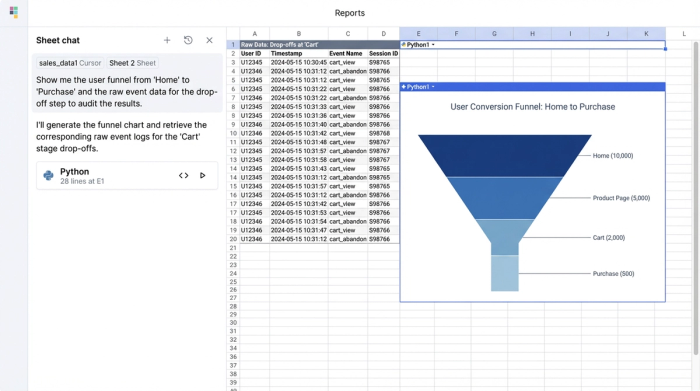
Finally, the lack of auditability is a major strategic weakness. If you are looking for GA4 Funnel Exploration Analytics Help because a drop-off rate looks suspicious, the native tool rarely lets you investigate the root cause. You cannot click on a bar in the chart and immediately see the raw list of User IDs and timestamps to verify if the data is accurate or if there is a tagging error. This opacity forces analysts to trust the chart blindly, which is a risky proposition in data-driven organizations.
A better workflow: syncing funnel data to Quadratic
To bypass these limitations, sophisticated teams are shifting their workflow. Instead of relying solely on the pre-built charts in GA4, they are syncing event-level data directly into Quadratic. This moves the analysis from a "click-and-view" interface to an "own-and-analyze" environment.
The setup involves connecting your GA4 data source (or the BigQuery database where your GA4 data resides) directly to Quadratic. Because Quadratic is an AI-powered spreadsheet that supports native SQL and Python, you aren't just importing a static CSV. You are establishing a live connection to your raw data.
The immediate benefit is transparency. Once the data is synced, you can see the actual rows—User IDs, event names, timestamps, and parameters. You are no longer looking at an aggregated abstraction; you are looking at the behavior itself. This granular access forms the foundation for building custom funnels that are accurate, unsampled, and fully transparent.
Step 1: Defining custom funnel steps
In a standard analytics tool, you select events from a dropdown menu. In Quadratic, you define funnel steps using SQL queries or Python scripts applied to your raw data. This offers unparalleled flexibility.
For example, you can write a query to filter your dataset for specific sequences. Step 1 might be defined as any user with a session_start event. Step 2 could be a view_item event, but with a custom filter applied via Python to exclude specific low-value inventory categories. Step 3 might be a purchase event where the value exceeds a certain threshold.
You are not limited by the standard paths found in general Funnel Exploration Documentation; you can define steps based on complex business logic. If you need to define a step as "User visited the pricing page three times in one week," you can script that logic directly in the spreadsheet cells, creating a funnel that maps to your actual user journey, not just the default events GA4 tracks.
Step 2: Calculating conversion and drop-off rates
Once your steps are defined and the data is filtered into the spreadsheet, calculating conversion rates becomes a matter of simple arithmetic or Python formulas. You can calculate the percentage of users moving from Step 1 to Step 2, and then from Step 2 to Step 3, with complete control over the numerator and denominator.
A key differentiator in this workflow is the ability to blend data. In the native GA4 Funnels Exploration, you cannot easily pull in cost data from Facebook Ads or integrate CRM data from Salesforce to contextualize the funnel. In Quadratic, you can import these external datasets into adjacent tables. This allows you to calculate not just the conversion rate, but the Cost Per Acquisition (CPA) at each stage of the funnel, giving you a financial view of user behavior that native analytics tools cannot provide.
Step 3: Segmentation and analysis
Native reporting allows for segmentation, but it often forces you into nested views that are difficult to read or compare. By bringing the data into Quadratic, you can structure your analysis to suit your reporting needs.
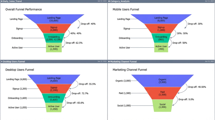
You can break down your funnel by critical segments—such as device category, acquisition channel, or landing page—and visualize them side-by-side. Because you are working in a spreadsheet grid, you can create a custom layout where the "Mobile" funnel sits directly next to the "Desktop" funnel, allowing for instant visual comparison of drop-off rates. This flexibility helps product marketers quickly identify if a specific browser or campaign is responsible for a bottleneck, without navigating back and forth between different filter settings.
The strategic advantage: auditing and refreshing
The most significant advantage of building your funnel analysis in Quadratic is the ability to audit and refresh your work.
In a static report or a screenshot, a sudden drop in conversion is a mystery. In Quadratic, it is an investigation waiting to happen. If the drop-off rate between "Add to Cart" and "Checkout" spikes, you can immediately query the underlying rows for that specific segment. You might discover that a specific error code is firing for those users, or that the drop-off is isolated to a specific browser version. This workflow provides the GA4 Funnel Exploration Help analysts need to validate their data and fix product issues faster.
Furthermore, this is not a one-time export. Because Quadratic connects to live data sources, your custom funnel report is reusable. You define the SQL logic and Python formulas once. Next week, or next month, you simply refresh the data connection, and your custom funnel, segmentation, and blended metrics update automatically.
Conclusion: moving beyond standard reporting
While the Funnel Exploration in GA4 remains a useful tool for quick checks and high-level visualization, true product insight requires more granular control. By moving your analysis into Quadratic, you eliminate the risks of data sampling, gain the ability to apply complex custom logic, and ensure every metric is fully auditable.
This workflow empowers product marketers and analysts to stop guessing at the "why" behind their data. Instead of accepting the limitations of a closed tool, you can build a reporting ecosystem where the data is transparent, the logic is yours, and the insights are actionable. For your next deep dive into user behavior, try syncing your data to Quadratic and building a funnel that tells the whole story.
Use Quadratic to do GA4 funnel exploration
- Eliminate GA4 data sampling and define precise funnel steps using native SQL or Python for complex user journeys.
- Audit every metric with full transparency by inspecting raw event data, user IDs, and timestamps directly within the spreadsheet.
- Blend GA4 funnel data with external sources like CRM or ad platforms to enrich analysis with comprehensive context, such as Cost Per Acquisition (CPA) at each stage.
- Build reusable, self-refreshing funnel reports that update automatically with live data, enabling flexible side-by-side comparisons of key segments.
Ready to get deeper insights into your user journeys? Try Quadratic.