
For financial analysts and FP&A professionals, employee productivity metrics are rarely just about performance reviews or individual output. They are the primary drivers of gross margin and operating profit. When headcount accounts for the majority of operating expenses, understanding the correlation between workforce output and financial health is critical for strategic planning.
The challenge, however, lies in the data structure. Operational data, such as headcount fluctuations, hours worked, and unit output, is typically tracked on a granular monthly basis. Financial outcomes, conversely, are often aggregated into quarterly or annual reports. Trying to correlate these two timescales in standard spreadsheets often results in disconnected tabs, fragile references, and version control issues.
To get a true picture of efficiency, analysts need a unified analysis workflow for financial data analytics. By utilizing Quadratic’s infinite canvas, you can model monthly operational data alongside quarterly financial summaries in a single view. This approach eliminates the need for constant tab-switching and ensures that your analysis of employee productivity metrics is both dynamic and directly tied to profitability.
Defining key financial vs. operational metrics
Before building the model, it is necessary to select the specific data points that bridge the gap between HR and Finance. While there are dozens of metrics to measure employee productivity in a general sense, financial analysts should focus on the ratios that impact the bottom line.
Effective employee productivity metrics examples for financial modeling typically fall into two categories that must be analyzed together:
- Operational inputs: These include average headcount, total hours worked, and units produced. These are the raw drivers of activity.
- Financial outputs: These include operating profit, gross margin, and total revenue. These are the results of that activity.
The insight comes from the intersection of these two categories. Instead of tracking them in isolation, you should model the ratios, such as Revenue per Employee, Operating Profit per Headcount, or Labor Cost as a Percentage of Revenue. Defining these metrics is straightforward, but the difficulty lies in modeling them accurately over time. In Quadratic, you can define these variables using Python or standard formulas, allowing you to create complex ratios that update automatically as the underlying monthly data changes.
Structuring data for multi-year analysis
The most common failure point in productivity analysis is the separation of data inputs from calculation logic. In a traditional spreadsheet, you might have a "Raw Data" tab for monthly headcount and a separate "QBR" tab for financial reporting. This separation makes it difficult to spot errors or trace the lineage of a specific metric.
A better approach is to leverage an infinite canvas to structure data for multi-year analysis without artificial boundaries. You can lay out your raw monthly operational data directly adjacent to your financial calculation blocks.
Imagine a grid where columns A through L represent your monthly inputs (January through December). Immediately to the right, in column M, you can build your Quarterly aggregation block. Because Quadratic supports an unbound grid, you are not limited by standard column counts or rigid table structures. You can place your monthly headcount data, your financial ledger data, and your resulting productivity ratios side-by-side. This layout allows you to visually verify that the spike in February hires is correctly flowing into the Q1 labor cost aggregate without clicking through multiple sheets.
Calculating average quarterly productivity from monthly data
One of the specific technical pain points in this workflow is data referencing. Financial reporting periods (Quarterly) do not always align neatly with operational realities (Monthly). For example, if a department hires heavily in late March, a simple sum of headcount for Q1 might skew the productivity data, making the team look less efficient than they are.
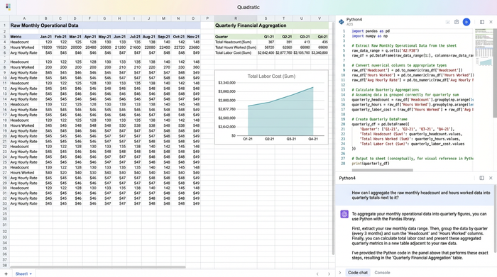
To solve this, analysts need to calculate a weighted average or a "smoothed" quarterly figure. This requires precise referencing of the monthly cells. In Quadratic, you can write formulas that target specific ranges of monthly data to calculate these averages with high precision.
For instance, rather than just summing total output, you can create a formula that divides Total Quarterly Revenue by the Average Monthly Headcount for that same quarter. This ensures that your metrics to measure employee productivity account for the timing of hires and exits. If the Q2 margin dips, this granular transparency allows you to immediately see if the cause was a drop in actual productivity or a temporary increase in training costs due to new headcount.
Building an employee productivity metrics template
Once the data structure is in place, the next step is to standardize the output. Instead of creating a static report that needs to be recreated every quarter, you can build a dynamic employee productivity metrics template directly on the canvas.
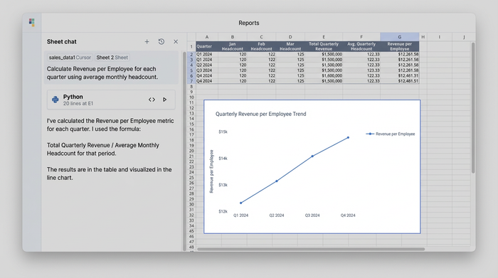
In this context, a template is not a separate file but a dedicated "view" or set of columns that automates the comparison logic. Your template area should include columns that automatically calculate Quarter-over-Quarter (QoQ) and Year-over-Year (YoY) percentage changes for both your financial margins and your productivity ratios.
Because you are working in a unified environment, this template is live. If you adjust a revenue assumption in the monthly block for November, the Q4 productivity ratio in your template updates instantly. There is no need for VLOOKUP or INDEX/MATCH functions across different file paths. The template acts as a logical layer on top of your raw data, giving you a consistent, error-free structure for every reporting cycle.
Visualizing trends for strategic decision making
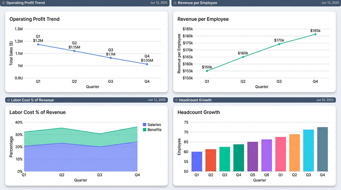
The ultimate goal of this analysis is to support strategic decisions. A dense grid of numbers is useful for the analyst, but stakeholders need clear visualization of the trends. The final step in the workflow is to format your summary table to highlight the "why" behind the numbers.
By stripping away the noise of the raw monthly data, you can present a clean dashboard that focuses strictly on the KPIs relevant to the Quarterly Business Review. This is where the ratios tell the story.
Consider a scenario where Operating Profit is down 5%, but Revenue per Employee is up 2%. A standard P&L might suggest a performance problem. However, your unified model would reveal that productivity actually improved, suggesting the profit decline is likely due to external factors like increased overhead or material costs, not workforce inefficiency. Quadratic allows you to isolate these specific trends and present them clearly, ensuring that leadership focuses on the right problems.
Conclusion
Accurate employee productivity metrics are essential for understanding the relationship between workforce investment and financial return. However, treating these metrics as a static list of HR figures limits their utility. To drive decision-making, analysts must correlate monthly operational details with quarterly financial goals in a unified model.
By using Quadratic to place multi-timescale data on a single canvas, you eliminate the friction of disconnected spreadsheets and ensure your data referencing is precise. This workflow allows for faster trend identification and more reliable reporting. For analysts looking to elevate their reporting, building this multi-timescale model offers a clearer path to actionable insights.
Use Quadratic to analyze employee productivity metrics
- Unify monthly operational data and quarterly financial summaries on an infinite canvas for a single, comprehensive view.
- Build dynamic models that automatically update employee productivity ratios (e.g., revenue per employee) as underlying operational data changes.
- Structure raw data and calculation logic side-by-side to easily trace data lineage and ensure accuracy across different timeframes.
- Precisely calculate weighted averages for quarterly productivity by referencing specific monthly data ranges, accounting for hiring and exit timing.
- Create live, reusable templates for quarter-over-quarter and year-over-year analysis, eliminating manual report recreation.
- Isolate and visualize key productivity trends for strategic decision-making, clearly showing the "why" behind financial outcomes.
Ready to connect your operational and financial data for clearer insights? Try Quadratic.