
Table of contents
- The challenge: moving beyond static handicapping sheets
- Step 1: structuring your event performance data
- Step 2: building the interactive pivot table
- Step 3: creating visual UI controls for filtering
- Step 4: integrating dynamic cost calculation models
- Step 5: visualizing the results
- Conclusion
- Use Quadratic to perform horse racing data analytics
In the high-stakes world of horse racing data analytics, the difference between a profitable season and a break-even year often comes down to how quickly you can manipulate variables. Handicappers and analysts spend hours staring at spreadsheets, trying to determine if a specific betting strategy holds up against historical track conditions or odds ranges. The problem is that traditional spreadsheets are excellent for storing data but often clumsy for dynamic, "what-if" analysis, presenting several perils of spreadsheet models when used for complex tasks.
If you want to filter a standard pivot table by complex criteria or switch between different cost models to see how they impact your ROI, you are usually forced to rewrite messy formulas or manually rebuild tables. This friction slows down decision-making.
The solution lies in moving toward a "living pivot table" environment. By using Quadratic, you can build a handicapping tool that functions more like an interactive app than a static sheet. This approach allows you to combine the familiarity of a spreadsheet with the power of Python and distinct UI controls. The result is a python dashboard where you can analyze finish positions and costs instantly, giving you a competitive edge in your handicapping workflow.
The challenge: moving beyond static handicapping sheets
Most sports data analysts start their journey by downloading CSV files of historical race results and opening them in standard spreadsheet software. They build a few pivot tables to look at win percentages by trainer or jockey. While this works for basic reporting, it falls short when you need to model complex scenarios.
The primary pain point is the lack of dynamic inputs. In a standard setup, if you want to switch your analysis from a "Conservative Cost Model" (flat betting) to an "Aggressive Cost Model" (like a variation of the Kelly Criterion), you generally have to go back into your raw data, add a new column with a new formula, and refresh your pivot table. This process is slow and prone to errors.
The Quadratic advantage is the ability to treat the spreadsheet like a dashboard where data flows through Python scripts. Instead of static cells, your logic lives in code that updates instantly when you interact with the sheet. This allows for complex logic that standard formulas struggle to handle.
Step 1: structuring your event performance data
The foundation of accurate horse racing data analytics is clean, structured data. To begin, you will import your tabular data into Quadratic. You can do this by dragging and dropping a CSV file or by connecting directly to an external database or API if you have a live data feed.
For this specific use case, your dataset needs a few essential columns to drive the analysis. First, you need competitor details, such as the horse name and jockey. Second, you require event identifiers, including the date, track name, and event number. Third, you need performance metrics, specifically pre-event ranks and closing odds. Finally, you must have the outcome positions, which is usually the official finish position of the horse.
Once this data is loaded into the grid, it acts as the raw material for the Python scripts you will write next. Unlike standard sheets where you might hide this data on a back tab, in Quadratic, this data remains easily accessible for SQL queries or Python manipulation without fear of breaking cell references.
Step 2: building the interactive pivot table
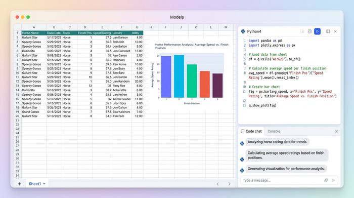
The goal of this step is to create a view that aggregates competitor finish position counts by unique event identifiers. In a traditional tool, you would insert a pivot table and drag fields into rows and columns. In Quadratic, you will use Python—specifically the Pandas library—to create this structure programmatically.
By writing a short Python script directly in a cell, you can aggregate the data to show how many times a horse finished in specific positions under certain conditions. The massive advantage here is differentiation. Unlike a standard Excel pivot, this table is the output of a script. This means the table is not a static artifact; it is a dynamic object that listens for instructions. We can feed variables into this script in the next steps, allowing the table to reshape itself entirely based on user input.
Step 3: creating visual UI controls for filtering
This is where the tool begins to feel less like a spreadsheet and more like custom handicapping software. Instead of using standard dropdown filters hidden in column headers, you can build custom UI elements directly on the sheet.
You can set up visually distinct controls for your specific filters. For event characteristics, you might create a slider that filters the "Event Number" or a dropdown menu to select the "Event Type" (e.g., turf vs. dirt). For performance metrics, you can add a control to filter by pre-event ranks, such as a toggle that says "Show only Top 3 ranked horses."
These controls are connected to your Python script. When you move a slider or change a dropdown, the script re-runs instantly, and the pivot table updates. The user benefit is significant. Clickable controls make the analysis faster and reduce the cognitive load during high-pressure handicapping sessions. You are no longer fighting the tool; you are simply asking questions and getting answers.
Step 4: integrating dynamic cost calculation models
The most powerful feature of this workflow is the ability to handle scenario analysis regarding money.
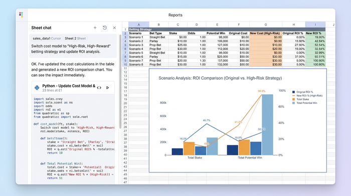
To implement this, you create a selector mechanism—such as a dropdown list or a set of buttons—that toggles between different betting strategies. You might include options like "Flat Stake," "Proportional," or "Kelly Criterion."
In your Python script, you add logic that reads the state of this selector. If the user selects "Flat Stake," the script calculates the cost per event based on a fixed amount. If they switch to "Proportional," the script recalculates the cost based on the implied probability of the odds. This calculation happens instantly and updates the "Cost per Event" column in your pivot table.
This allows for deep ROI analysis. You can immediately see how a specific betting strategy would have performed against historical finish positions without ever leaving the main dashboard view.
Step 5: visualizing the results
The final output is a cohesive dashboard that displays finish position distributions and dynamically updating competitor counts, often built using python data visualization libraries, such as the Plotly Python graphing library. As you adjust the filters and toggle your cost models, the numbers on the screen shift to reflect the new reality.
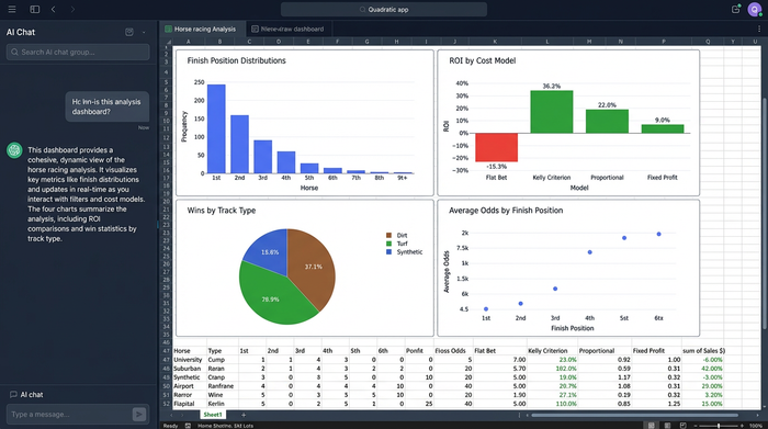
To interpret the data, you look for skews in the distribution. For example, if you filter for "Turf Races" and apply a "Top 3 Rank" filter, you might see that the distribution of finish positions skews heavily toward the top ranks. If you then apply a "Flat Stake" cost model and see a negative ROI, but switch to a "Kelly Criterion" model and see a positive ROI, you have found a valuable insight.
This type of analyzing race finishes and betting cost analysis is difficult to achieve with static tools but becomes second nature in a programmable environment.
Why Python-powered sheets win at sports analytics
There are three main reasons why this approach is superior for sports data analysts. First is flexibility. You are not limited by built-in spreadsheet formulas or the rigid structure of standard pivot tables. If you can describe the logic in code, you can build it.
Second is interactivity. The ability to build a UI makes the tool usable by non-coders once it is built. A technical analyst can build the model, and a less technical bettor can use the sliders and buttons to find winners.
Third is speed. Processing large datasets of historical race results happens instantly with Python. You do not have to wait for a heavy workbook to recalculate thousands of VLOOKUP or SUMIF formulas every time you change a variable.
Conclusion
Effective horse racing data analytics requires tools that adapt to your questions rather than forcing you to adapt to their limitations. By using Quadratic, you have moved from a static spreadsheet to an interactive cost-analysis tool that behaves like a custom application.
You now have a system that allows for flexible data exploration, where cost models and event filters can be manipulated in real-time. This empowers you to make smarter betting decisions based on data, not just intuition. We encourage you to load your own race data into Quadratic today and try building your own cost model selector to experience the difference firsthand.
Use Quadratic to perform horse racing data analytics
- Transform static handicapping spreadsheets into interactive dashboards with Python and custom UI controls.
- Dynamically switch between different betting strategies (e.g., flat stake, Kelly Criterion) to instantly recalculate ROI and cost per event.
- Filter historical race data with custom on-sheet UI elements like sliders and dropdowns for event types, horse ranks, and other performance metrics.
- Aggregate competitor finish positions and costs instantly, allowing for rapid "what-if" scenario analysis without rebuilding tables.
- Process large datasets of historical race results quickly, avoiding the slow recalculations common in traditional spreadsheet models.
Ready to make smarter betting decisions based on dynamic data? Try Quadratic today.