Table of contents
- What are the key indicators of economic growth?
- Step 1: The macro view – integrating live data
- From macro to micro: analyzing sector dynamics
- Step 2: Evaluating competitive dynamics
- Step 3: Valuing the target company
- Synthesizing the thesis: risk and opportunity
- Conclusion
- Use Quadratic to Analyze Key Economic Growth Indicators for Equity Valuation
Modern investment research is often a fragmented experience. An analyst might have a news terminal open in one browser tab, a PDF of a sector report in another, and a static spreadsheet open on a second monitor. While this setup is common, it introduces a significant amount of friction and latency into the valuation process.
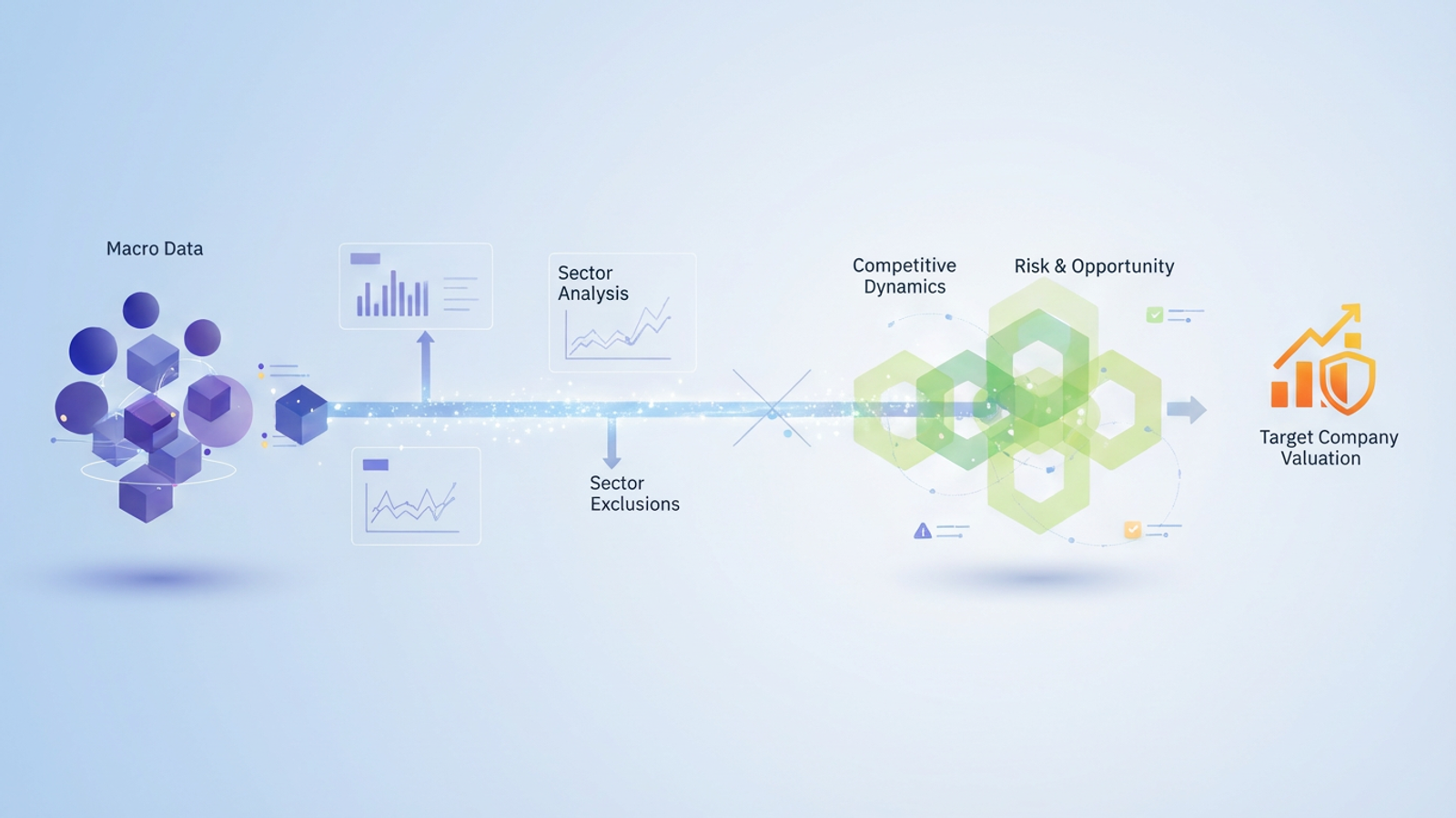
The "Top-Down" approach—analyzing the global economy, then the sector, and finally the specific company—remains the gold standard for MBA-level research and professional equity analysis. However, this method breaks down when the data fueling it is static. By the time an analyst finishes building a complex Discounted Cash Flow (DCF) model, the macroeconomic assumptions at the top of the funnel may already be outdated.
To solve this, forward-thinking analysts are moving toward a "Dynamic Research Lab" environment using tools like Quadratic. To accurately value equity, you must not only identify key economic growth indicators but integrate them into a live, connected workflow that traces impact from the global economy down to the specific share price.
What are the key indicators of economic growth?
Before building a dynamic model, it is essential to understand the inputs. Investors and students often ask, what are the key indicators of economic growth that actually move markets? While economists track dozens of metrics, equity researchers focus on the "Big Four" that directly impact corporate earnings and valuation multiples.
- GDP (Gross Domestic Product): This is the baseline for corporate revenue growth potential. If the overall economy is shrinking, assuming aggressive revenue growth for a cyclical company becomes a high-risk proposition.
- CPI & Inflation: These metrics reveal how purchasing power changes, impacting both a company's cost structure (input costs) and its pricing power (ability to pass costs to consumers).
- Interest Rates (The Fed): Perhaps the most critical variable for valuation, the risk-free rate directly drives the discount rate. Small changes here can drastically alter the present value of future cash flows.
- Employment Data: A strong proxy for consumer spending power. High employment usually correlates with robust consumer discretionary spending.
Knowing these definitions is step one. The real challenge is tracking them in real-time to inform your sector analysis without manually updating cells every morning, a crucial component of financial time series analysis.
Step 1: The macro view – integrating live data
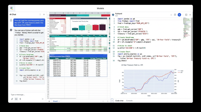
In a traditional workflow, an analyst visits the Bureau of Economic Analysis or the St. Louis Fed (FRED) website, downloads a CSV file, and pastes the data into a spreadsheet. This data is dead on arrival; it does not update, and it requires manual formatting.
In Quadratic, the workflow changes entirely. Because Quadratic integrates native Python directly into the spreadsheet grid, analysts can pull live data via APIs. Instead of manual entry, a user can write a simple Python script using libraries like pandas_datareader to fetch the latest GDP, CPI, and Treasury yield figures directly from FRED.
The result is a data table that serves as a live foundation for the entire investment thesis. If the Federal Reserve hikes interest rates or if GDP numbers are revised, the data in the Quadratic canvas updates automatically. This ensures that the starting point of the analysis always reflects the current economic reality.
From macro to micro: analyzing sector dynamics
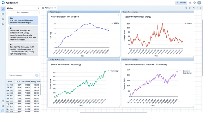
Once the live macro data is established, the next step is connecting those key indicators of economic growth to specific industries. This is known as business cycle analysis. For example, an environment characterized by high inflation and rising interest rates often triggers a rotation out of growth sectors, like technology, and into value-oriented sectors, like energy or financials.
This is where the advantage of an infinite canvas becomes apparent. In traditional spreadsheets, macro data is often hidden on a back tab, separated from the qualitative analysis. In Quadratic, an analyst can place their live Macro Data table directly adjacent to their sector analysis notes.
This visual proximity supports a more rigorous MBA-level workflow, specifically regarding sector exclusions. An analyst might note, "Based on the GDP slowdown identified in Step 1, we are excluding cyclical consumer discretionary stocks and focusing on defensive healthcare." By having the live data and the strategic logic side-by-side, the rationale remains clear and grounded in evidence.
Step 2: Evaluating competitive dynamics
After narrowing down the sector, the analysis moves to the competitive landscape. This stage requires blending qualitative frameworks, such as Porter’s 5 Forces, with quantitative metrics.
On the Quadratic canvas, users can document the threat of new entrants or supplier power in text cells right next to live tables showing sector-specific growth rates. This creates a holistic view of the industry. Additionally, analysts can factor in emerging trends, such as how artificial intelligence or new technologies might shift the sector's capital requirements. By keeping this analysis connected to the macro view, the user ensures that their competitive assessment acknowledges the broader economic environment.
Step 3: Valuing the target company
The culmination of this research is the valuation model, typically a DCF or comparable companies analysis. In a static spreadsheet, the inputs for the "Growth Rate" and "Discount Rate" are often hard-coded numbers that the analyst types in based on memory or old research, making robust financial forecasts difficult.
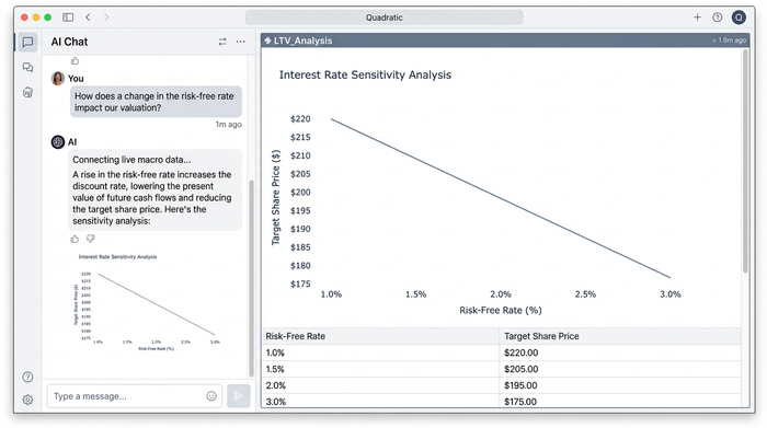
In a dynamic Quadratic workflow, the valuation model is directly linked to the live data established in Step 1. This is the moment where the connectivity pays off. For instance, the Weighted Average Cost of Capital (WACC) calculation—which determines the discount rate—can reference the live "Risk-Free Rate" cell pulled from the FRED API.
If the 10-year Treasury yield rises, the WACC in the company valuation updates instantly. This automatically lowers the present value of future cash flows and adjusts the target share price. This direct lineage ensures that the key economic growth indicators are not just abstract concepts but active drivers of the final valuation.
Synthesizing the thesis: risk and opportunity
The final step in the research process is presenting the findings. A robust investment thesis includes a risk assessment that weighs the probability of macro shocks, such as a recession, often performed through financial stress tests.
In Quadratic, this can be visualized as a risk matrix that sits alongside the valuation output. Instead of exporting this complex web of data and logic into a static PDF, the user can simply share a link to the Quadratic canvas. This allows a professor, portfolio manager, or investment committee to walk through the logic flow: seeing how the live Macro Data informed the Sector Logic, which in turn drove the Company Value.
Conclusion
Investment research is not about capturing static snapshots of the market; it is about understanding the evolving relationships between variables. By moving analysis from disconnected browser tabs and static files into a unified, code-enabled workspace, analysts can turn key economic growth indicators from abstract numbers into actionable valuation drivers.
Stop manually updating your macro assumptions. Start building live investment theses in Quadratic.
Use Quadratic to Analyze Key Economic Growth Indicators for Equity Valuation
- Integrate live economic data: Fetch real-time GDP, CPI, interest rates, and employment figures directly from sources like FRED using Python APIs, ensuring your macroeconomic assumptions are always current.
- Build dynamic valuation models: Link your Discounted Cash Flow (DCF) and Weighted Average Cost of Capital (WACC) calculations directly to live economic indicators, automatically updating discount rates and target share prices as market conditions change.
- Unify research on an infinite canvas: Consolidate live macro data, sector analysis, competitive assessments, and company valuation models in a single, connected workspace, eliminating fragmented workflows.
- Automate impact tracing: See how changes in global economic indicators flow directly through your sector analysis to influence specific company valuations and financial forecasts without manual updates.
- Share transparent, interactive analyses: Present your investment thesis with a shareable link that allows stakeholders to walk through the live data, logic, and valuation outputs in one clear, connected environment.
Start building live investment theses with Quadratic today. Try Quadratic.