For many analysts working in a Network Operations Center (NOC), the weekly reporting cycle is a source of recurring stress. You are tasked with ingesting metrics like occupation rates, session counts, and system health status from various disparate sources. The goal is to turn these raw numbers into actionable insights before the Monday morning briefing. While the broader industry buzzes about AI and predictive maintenance at scale, the day-to-day reality of telecom data analysis is often far less glamorous. It usually involves wrestling with fragile spreadsheets, manual copy-pasting, and the constant fear that a broken formula reference might hide a critical network risk.
Quadratic offers a different approach to this operational reality. By bridging the gap between traditional spreadsheets and code-based workflows, it allows analysts to automate the heavy lifting of data ingestion and risk assessment. This article explores how moving your network health checks to an infinite canvas can transform a rigid, error-prone process into a transparent and automated workflow.
The challenge of data analysis in the telecom industry
Network analysts deal with high-stakes metrics. Monitoring occupation rates tells you if your hardware is reaching capacity, while session rates indicate user demand and connectivity stability. When these numbers fluctuate, you need to know immediately if the deviation is within a standard margin or if it signals a looming outage.
The problem with conducting data analytics techniques in the telecom industry using traditional spreadsheets is the lack of robust data propagation. To build a weekly report, an analyst often has to export a CSV from a database, paste it into a spreadsheet, and hope that the lookup formulas on the summary tab catch the new rows. This manual handling introduces a high risk of human error, with human error rates from manual data entry can reach as high as 40% in some cases. Furthermore, traditional grids hide the data lineage. It is difficult to see the flow from raw input to the final risk assessment, making troubleshooting the report itself as difficult as troubleshooting the network.
Why static reports fail network operations
Standard spreadsheets are excellent for static snapshots but struggle with period-over-period trends. If you need to compare this week’s session rates against last week’s to identify a percentage drop, you often have to create complex, brittle chains of formulas. As the dataset grows over weeks and months, the spreadsheet becomes slower and harder to audit. This friction discourages the deep historical analysis required to spot subtle degradation trends before they become critical failures.
Streamlining the workflow: a Quadratic use case
Quadratic changes this dynamic by combining the familiarity of a spreadsheet with the power of Python and an infinite canvas. We observed a real-world use case where a telecommunications professional successfully migrated their weekly network performance reporting into Quadratic to solve these exact friction points. Here is how that workflow looks in practice.
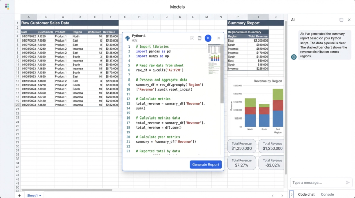
Step 1: Ingesting the data
Instead of manually opening a CSV and copying cells, the analyst brings the raw weekly data directly onto the Quadratic canvas. Because Quadratic supports connections to live data sources and handles formats like JSON and CSV natively, the data ingestion process is seamless. The raw data sits in its own dedicated zone on the infinite canvas, clearly separated from the reporting logic. This ensures that the source of truth remains untouched and visible.
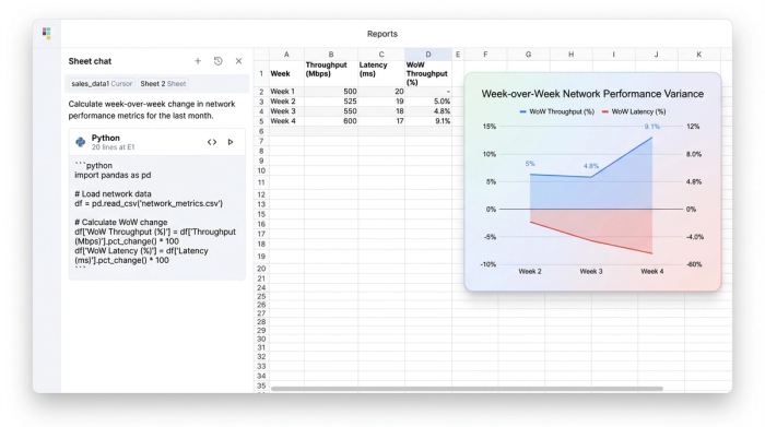
Step 2: Automating period-over-period calculations
The most time-consuming part of the previous workflow was calculating the "diffs"—the difference between the current week's metrics and the previous week's. In a standard spreadsheet, this requires VLOOKUPs or INDEX/MATCH formulas that are prone to breaking if data is not sorted perfectly.
In this use case, the analyst utilized Python directly within the cell. By querying the dataset with a few lines of Python code, they could automatically calculate the variance for every network component instantly. The code effectively says, "Take this week's session rate, subtract last week's session rate, and display the change." This automation means that as soon as new data arrives, the period-over-period trends are populated without dragging formulas down a thousand rows.
Step 3: Risk assessment logic
Once the variances are calculated, the next step is assigning a risk level. The analyst established thresholds for network health. For example, if the occupation rate exceeds 85%, the system should flag it as "High Risk." In Quadratic, this logic is transparent. Rather than burying a nested IF statement inside a cell, the logic is written in clear, readable code. This allows anyone reviewing the file to understand exactly how "Risk" is defined and ensures the logic is applied consistently across the entire dataset.
Enhancing telecom business data analysis with an infinite canvas
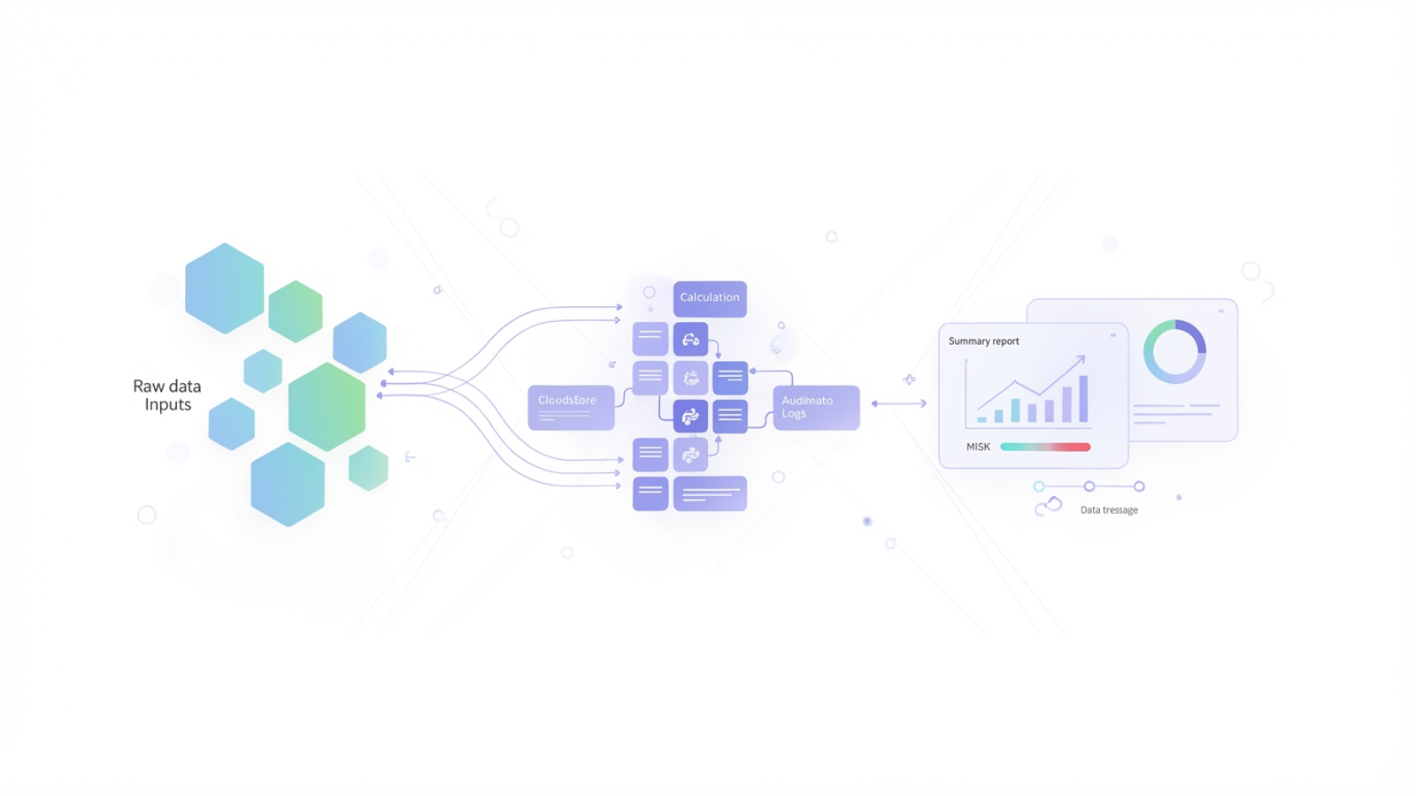
The structure of the workspace is just as important as the calculations. Quadratic’s infinite canvas allows analysts to break free from the constraints of tabbed sheets. In this workflow, the user arranged their workspace logically from left to right: raw data inputs on the left, the calculation zone (Python scripts) in the middle, and the final summary report on the right.
This layout is critical for telecom business data analysis because it visualizes the flow of information. When stakeholders ask how a specific risk conclusion was reached, the analyst can simply pan across the canvas to show the lineage.
Data propagation becomes reliable and visual. When the analyst updates the raw data for the new week, the change ripples through the Python cells and updates the risk assessment immediately. Because the links are established through code variables rather than rigid cell references, the report does not break when the dataset size changes. This reliability gives the operations team the confidence to make faster decisions based on the data.
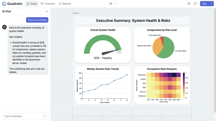
From raw metrics to executive summary
The ultimate output of this workflow is a clean, executive-level summary. While the backend relies on Python and raw data, the final view presented to management is a polished table summarizing system health, highlighting critical variances, and flagging components that require immediate attention. By keeping the "scratchpad" work and the final presentation on the same infinite canvas, the analyst ensures that the report is always live, accurate, and fully auditable.
Benefits of modernizing your network analysis
Moving your weekly reporting from static spreadsheets to a code-enabled environment offers three distinct advantages for network operations:
1. Speed: The reporting cycle is reduced from hours of manual manipulation to minutes of data refreshment. This returns time to the analyst to focus on investigating the problems found, rather than just finding them.
2. Accuracy: By removing manual copy-pasting and formula dragging, the risk of human error in data propagation is significantly reduced.
3. Auditability: Python code is easier to read and debug than complex spreadsheet formulas. If a metric looks wrong, checking the logic takes seconds, ensuring that the team trusts the numbers they are seeing.
Conclusion
Effective telecom data analysis is not just about having access to massive amounts of data; it is about having a workflow that can process that data accurately and efficiently. For network analysts and NOC engineers, the ability to automate routine calculations and visualize the lineage of their data is essential for maintaining system health.
By adopting no code database tools that merge the flexibility of spreadsheets with the power of code, you can transform your weekly reporting from a manual chore into a strategic asset. Try Quadratic to automate your network performance reporting and visualize your system health data in a single, infinite workspace.
Use Quadratic to streamline telecom data analysis
- Automate weekly network performance reporting, reducing manual effort from hours to minutes.
- Seamlessly ingest raw telecom metrics from disparate sources, eliminating manual copy-pasting and associated errors.
- Accurately calculate period-over-period trends and assign risk levels using transparent Python code, replacing brittle spreadsheet formulas.
- Visualize your entire data lineage on an infinite canvas, making it easy to audit calculations and explain network health conclusions.
- Ensure reliable and consistent data propagation, so your reports update instantly without breaking as datasets change.
Ready to transform your network performance reporting? Try Quadratic.