
James Amoo, Community Partner
Feb 23, 2026

It’s no surprise that data is abundant in modern business, but clear and actionable insights remain scarce. Many teams struggle not because they lack access to information, but because the high cost of poor data quality prevents them from interpreting it effectively. The gap between raw numbers and a strategic decision is bridged by effective measures for data analysis and visualization.
One of the biggest challenges in building a comprehensive data analysis and visualization workflow is the lack of tools that effectively address both needs within a single platform. Even teams with strong data analysis frameworks often struggle to find data visualization tools that enable clear communication of insights without forcing them to switch between multiple applications.
Effective analysis entails answering specific business questions through a rigorous loop of validation, computation, and presentation. This blog post outlines a practical framework to help you move from a vague business problem to a clear and visual answer that can be easily communicated.
What is data analysis and data visualization?
To build a repeatable workflow for data analysis and visualization, it is helpful to first distinguish between the two core components and understand how they work together.
Data analysis is the process of inspecting, cleansing, transforming, and modeling data to discover useful information. It provides the "what" and the "why" behind business performance. This often involves calculating metrics, identifying trends, or isolating anomalies using data analytics techniques or programming languages like Python and SQL.
Data visualization is the graphic representation of that data to communicate discoveries and better tell data stories. It provides the "so what" that stakeholders can digest immediately. A well-crafted visualization turns abstract rows and columns into a narrative that the human brain can process instantly.
When combined, data analysis and data visualization form a complete system for decision support. Visualization and data analysis are not separate phases that happen in isolation; they are interconnected steps. Analysis ensures the numbers are accurate, while visualization ensures the findings are understood and acted upon.
Understanding the question-driven workflow
A common pitfall in analytics is starting with the dataset rather than the problem. This often leads to analysis paralysis, where analysts generate dozens of charts that are technically accurate but are barely useful strategically. A question-driven approach balances this dynamic.
Step 1: Metric definition
Every analysis must start with a specific question. A question that entails what you actually want to achieve with your dataset. Instead of a broad request like "Show me cohort data," aim for a specific inquiry such as "How does user retention differ between customers acquired through paid ads and organic channels over their first three months?"
Once the question is defined, translate it into a calculable metric. For cohort analysis, this could be retention rate, repeat purchase frequency, customer lifetime value (LTV), or activation rate within a defined time window. Defining this upfront ensures that your subsequent data visualization and analysis focus only on what matters.
Step 2: Data validation
You cannot effectively visualize what you have not validated. In data analysis and visualization techniques, data validation best practices are the safety net.
Before building charts or dashboards, analysts should confirm that the underlying dataset is accurate, consistent, and complete. This includes data cleaning processes like checking for missing values, inconsistent date formats, and unexpected outliers that may distort results. Validating joins between tables, confirming aggregation logic, and reconciling totals against trusted sources are equally important steps.
Step 3: Iterative data exploration
Analysis is rarely a linear path. It is a loop of querying data, viewing a preliminary result, and refining the query. You might calculate a metric, notice a spike, and then drill down to see if a specific region caused it. Iterative data exploration ensures the actual insight is generated.
Each iteration adds context that sharpens your understanding of the dataset. Comparing different time ranges, segmenting users by behavior or acquisition source, and testing alternative assumptions often reveal patterns that a single query would miss. This process also helps analysts challenge initial hypotheses and separate coincidence from causation.
Mapping questions to visualization techniques
Once you have a validated answer, you need to choose the right visual format. Different business questions require different data analysis and visualization techniques, and a guide to choosing the right chart type can help ensure you don't obscure the insight you worked hard to uncover.
Comparison questions
If your question is "How does X compare to Y?", you are looking for a comparison.
- Bar charts: Ideal for comparing categorical data, such as revenue by product line or sales by region.
- Line charts: The standard for comparing values over time, such as website traffic over the last 30 days.
- Grouped (clustered) bar charts: Useful when comparing multiple categories across segments, such as product performance across different markets.
- Slope charts: Effective for showing change between two points in time, especially when highlighting increases or decreases between categories.
Distribution questions
If your question is "What is the spread of the data?", you need to understand distribution.
- Histograms: Useful for seeing where most values fall, such as the distribution of customer ages or order values.
- Box plots: Excellent for spotting outliers and understanding the range and median of a dataset.
- Density plots: Helpful for comparing how distributions differ between groups without relying on bins.
Relationship questions
If your question is "Does X affect Y?", you are investigating a relationship.
- Scatter plots: These are powerful data visualization and analysis tools for showing correlations, such as the relationship between marketing spend and lead volume.
- Correlation matrices: Useful when checking relationships across multiple variables simultaneously.
- Bubble charts: Extend scatter plots by adding a third variable through size, such as revenue, engagement, or deal size.
Composition questions
If your question is "What makes up the whole?", you are looking at composition.
- Stacked bar charts: Good for showing how parts of a whole change over time.
- Treemaps: Effective for hierarchical data, allowing you to see the relative size of categories at a glance.
- Pie charts: Use these sparingly. They are often difficult to read accurately compared to bar charts or treemaps. but a pie chart maker can still be useful when you need to visualize simple part-to-whole relationships.
The role of software in the analysis loop
In traditional workflows, there is often a validation-visualization gap. Analysts frequently perform data transformation and querying in one tool (tools that support SQL or Python) and then export the results to a separate tool for visualization (like Tableau or Excel).
This separation creates friction. If you spot an error in the final chart, you often have to go back to the code, fix the query, re-export the CSV, and rebuild the visualization. This overhead slows down the iteration loop significantly.
Modern data analysis and visualization software aims to close this gap. We are seeing a rise in AI tools for data analysis and visualization that assist in generating code or suggesting chart types based on the dataset. However, the most effective tools are those that integrate the data connection, cleaning, and visualization into a single environment, reducing the need for context switching.
How Quadratic streamlines data analysis and visualization
Quadratic addresses the friction of fragmented workflows by providing a unified workspace. It brings Python, SQL, and spreadsheet formulas into a single browser-based grid, allowing you to manage the entire analysis loop in one place.
Unified workspace for data analysis and visualization
In Quadratic, you can connect directly to your database or API and query live data using SQL, enabling seamless charting with SQL within the same environment. You can then use Python to clean that data directly within the spreadsheet cells.
Because the analysis and visualization happen in the same view, the feedback loop is immediate. You can tweak a Python script to exclude an anomaly and watch the associated chart update instantly. There is no need to export files or switch between data analysis and visualization tools.
Native support for modern programming languages
For technical users who want more control over their dataset, Quadratic also functions as a coding spreadsheet that natively supports programming languages like Python, SQL, and JavaScript.
You should also note that AI data analysis in Quadratic isn’t a black box approach; users can see the underlying logic and how insights are being generated.
AI for data analysis
Quadratic allows users to query their data using plain English. Its AI spreadsheet analysis technology then generates the Python code for that analysis, ensuring the logic can be checked, modified, and reused. Let’s see a practical example.
First, I import my data into Quadratic:
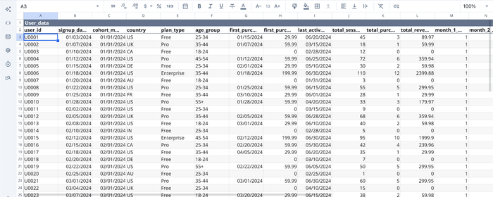
In the image above, we have some user product data in Quadratic’s interface. Suppose I want to add a column that shows the lifetime value for each user. I just ask:
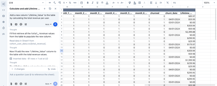
I prompt Quadratic AI to “Add a new column 'Lifetime_Value' to the table by calculating the total revenue per user”, and it instantly adds a new column after scanning through the dataset. This could take up to hours of manually writing formulas or code in Python.
AI for data visualization
Quadratic does not just provide a unified environment for data analysis and visualization; it also eliminates the barrier that comes with writing code to create interactive visualizations. With its built-in AI feature, users can generate charts by simply prompting it. Let’s see this in action:

Here, I ask Quadratic AI to “Visualize the most active users by age group”, and it generates a chart that displays the most active users by their age group.
With Quadratic, users can achieve a comprehensive data analysis and visualization workflow without juggling multiple tools.
Collaboration
Unlike static spreadsheets or isolated code notebooks, Quadratic allows for real-time multiplayer collaboration. You can share your analysis via a simple URL, enabling stakeholders to view the visual insights and, if necessary, inspect the underlying logic.
Conclusion
Effective data analysis and visualization require a disciplined approach to managing your datasets. By starting with a clear business question, validating your data rigorously, and choosing the appropriate visualization technique, transforming raw numbers into actionable insights becomes less difficult.
The goal of this framework is to move beyond simple observation and toward decision support. When you unify your validation and visualization steps, you reduce errors and speed up the time to insight.
With Quadratic, all you have to do is connect your data and turn analysis into shareable visuals faster. Try Quadratic for free today.
Frequently asked questions (FAQs)
What is the primary goal of effective data analysis and visualization?
The primary goal is to transform abundant raw data into clear, actionable insights that answer specific business questions. This process bridges the gap between raw numbers and strategic decisions by making complex information understandable and usable.
How does Quadratic enhance the data analysis and visualization workflow?
Quadratic unifies the entire analysis loop by integrating Python, SQL, and spreadsheet formulas in a single browser-based grid. This eliminates the traditional validation-visualization gap, allowing for immediate feedback and dynamic updates as you perform data analysis and visualization, streamlining the path from raw data to actionable insights.
Which data analysis and visualization techniques are best for different types of questions?
For comparison questions, bar and line charts are highly effective. Histograms and box plots are ideal for understanding data distribution, while scatter plots help reveal relationships between variables. Composition questions, showing parts of a whole, can be addressed using stacked bar charts or treemaps.