
The native Google Analytics 4 (GA4) interface is incredibly powerful, but extracting actionable narratives from it often feels like a battle against the UI. For many growth marketers and data analysts, the workflow involves endlessly toggling between screens, exporting CSVs, or wrestling with Looker Studio connectors that break unexpectedly. This friction leads to "dashboard rot"—reports are built with good intentions, but because they are difficult to update and interpret, stakeholders eventually stop looking at them.
The solution isn’t just another static visualization tool; it is an AI dashboard GA4 workflow. Modern analytics demands more than just seeing what happened; you need to know why it happened, and you need that insight immediately.
By moving your reporting into a flexible, AI-enabled environment like Quadratic, you can bypass the rigid "black box" limitations of standard SaaS dashboards. Instead of manually updating charts every week, you can pull live GA4 data directly into a spreadsheet canvas and use built-in AI to analyze trends, flag anomalies, and write plain-English summaries that update automatically.
Why move from reactive reporting to AI insights?
Traditional reporting methods are inherently reactive. Whether you are using Excel, Google Sheets, or Looker Studio, the dashboard usually serves as a rear-view mirror. You log in on Monday morning to see that traffic dipped last Friday, but the dashboard doesn't tell you the cause. You then have to spend hours digging through secondary dimensions and event logs to find the culprit.
Adopting an AI-driven approach transforms this workflow from reactive to proactive. When you build an AI dashboard GA4 solution, you are leveraging two distinct advantages:
1. Natural Language Generation (NLG): Instead of forcing stakeholders to interpret complex scatter plots, the AI can generate text summaries explaining exactly what the metrics mean.
2. Proactive Analysis: Rather than simply reporting "Traffic is down," the AI can parse the dataset to identify specific anomalies, such as a broken landing page or a sudden drop in a specific referral channel.
This shift allows analysts to spend less time on data janitorial work and more time on strategy.
Step-by-step: Building an automated AI dashboard for GA4
The following workflow illustrates how a growth marketer can turn raw analytics data into a live, self-updating performance dashboard using Quadratic. This approach replaces manual exports with direct connections and Python-based automation.
1. Syncing live data (the foundation)
The first step in this workflow is establishing a direct pipeline to the data. In a traditional spreadsheet, you might manually export a CSV from GA4 and paste it into a tab. This is brittle and immediately outdated.
In Quadratic, the user connects directly to the Google Analytics data source. Because Quadratic supports large datasets without the performance lag typical of browser-based spreadsheets, you can pull in granular event-level and page-level data. This ensures the dashboard is built on the full fidelity of your analytics, not just high-level aggregates. Once connected, the data resides in the sheet and remains live, ready to be queried.
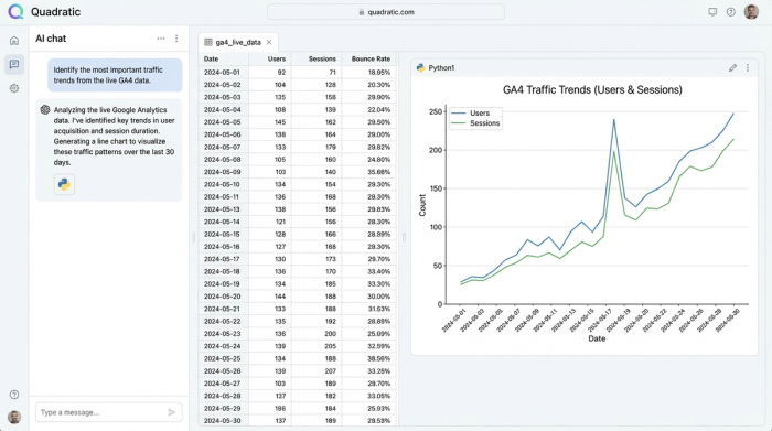
2. Asking the AI for "the why"
With the live data synced, the manual "grunt work" of analysis is offloaded to the AI. In a standard tool, you would need to build pivot tables or write complex formulas to find trends. Here, the user simply selects the data range and prompts the built-in AI.
Common prompts in this workflow include:
- "Identify the most important traffic and conversion trends from the last 30 days."
- "Flag any anomalies in landing page performance where bounce rate increased by more than 10%."
- "Compare channel performance week-over-week and highlight the top three drivers of growth."
The AI interprets these natural language requests and generates the necessary Python code to query the dataset. It runs the analysis instantly and returns the answers directly in the spreadsheet grid.
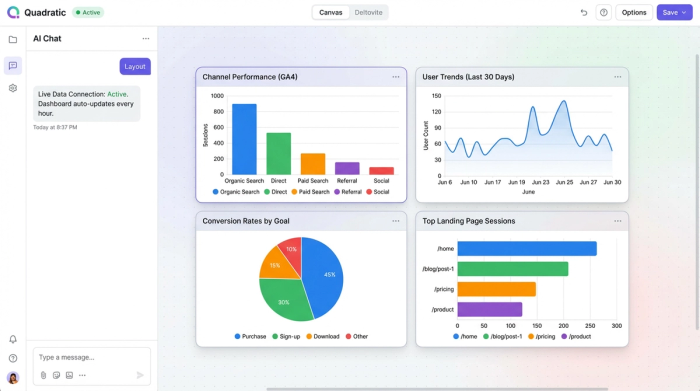
3. Visualizing channel performance & conversion rates
Visualizing data in GA4 or Looker Studio often requires tedious configuration—selecting dimensions, dragging metrics to axes, and fighting with filters.
In this workflow, the user asks the AI to visualize the findings derived in the previous step. For example, after identifying a trend in organic search traffic, the user can prompt the AI to "Create a line chart showing organic search sessions vs. conversions for the past month."
The AI generates the chart automatically. It handles the axis labeling, data grouping, and rendering. The user can request charts for channel performance, landing page effectiveness, or conversion rate changes, and the AI places them on the infinite canvas alongside the raw data and text summaries.
4. Automating the insights (the "live" aspect)
The true power of this setup is that it is not a one-time report. Because the underlying data connection is live, the dashboard effectively maintains itself.
When new analytics data syncs into the spreadsheet, the Python code generated by the AI re-runs. The charts update to reflect the latest numbers, and the AI-generated text summaries refresh to describe the new reality. If a new anomaly appears in the fresh data, the dashboard flags it automatically without the user needing to lift a finger.
Beyond the "black box": Why flexibility matters
A major frustration with many "AI analytics" tools is that they function as closed systems. You feed them data, and they spit out a chart, but you cannot see how they calculated the result. If the numbers look off, you have no way to audit the logic.
Quadratic differentiates itself through transparency. When the AI helps you build an AI dashboard GA4 report, it writes actual Python or SQL code that is visible in the cell. You can read the code, audit the logic, and tweak it manually if necessary, emphasizing the importance of auditable code for transparency.
Furthermore, the "infinite canvas" structure allows for a hybrid workflow. You are not limited to a rigid grid of charts. You can place your AI-generated insights next to manual notes, combine them with data from a different source (like a Postgres database or a CSV from your CRM), and perform ad-hoc calculations in standard spreadsheet cells right alongside the advanced analytics.
Top features to look for in an AI analytics tool
If you are evaluating tools to automate your reporting, ensure they offer the capabilities required for a robust workflow:
- Anomaly detection: The tool should be able to statistically identify outliers in your traffic or conversion data, not just sum up totals.
- NLG (Natural Language Generation): The ability to turn quantitative data into qualitative summaries is essential for communicating insights to non-technical stakeholders.
- Data ownership: You should be able to see the raw data and the code used to analyze it. Avoid tools that lock your insights behind proprietary, uneditable interfaces.
Conclusion
Building an automated AI dashboard GA4 workflow does not require a data science degree or a complex stack of enterprise software. It simply requires an environment that bridges the gap between raw data and actionable intelligence.
By using Quadratic to connect live analytics data with AI-driven analysis, growth marketers can eliminate hours of manual reporting time. Instead of pasting data into static spreadsheets, you can build a living dashboard that surfaces the "why" behind your trends, allowing you to focus on driving growth rather than managing reports.
To experience this workflow, you can start a free workspace in Quadratic and connect your own data to see how quickly automated insights can transform your reporting process.
Use Quadratic to build an AI dashboard for GA4
- Sync live GA4 data directly into a flexible spreadsheet canvas, eliminating manual exports and ensuring your reports are always up-to-date.
- Ask AI to identify trends, flag anomalies, and explain "why" data changes using natural language prompts, moving from reactive reporting to proactive insights.
- Generate charts and plain-English summaries that update automatically as new data flows in, preventing dashboard rot and simplifying communication to stakeholders.
- Audit AI-generated Python code and customize analyses directly within the spreadsheet, ensuring full transparency and control over your data logic.
- Combine GA4 insights with other data sources and ad-hoc analysis on an infinite canvas, consolidating your entire workflow in one place.
Ready to transform your GA4 reporting? Try Quadratic.