Template purpose
This template centralizes risk management data into a single, structured format, allowing teams to move away from scattered notes and static spreadsheets. It is designed to provide immediate visibility into potential disruptions affecting supply chain operations.
- Visualizes risk severity through calculated impact and probability scoring.
- Monitors mitigation progress and assigns ownership to specific stakeholders, effectively acting as a KPI calculator for risk management.
- Provides accessible supply chain risk management solutions through customizable dashboards and analytics.
How the supply chain risk dashboard works
The template utilizes a two-sheet architecture to separate raw data entry from visual analysis. This structure ensures that the underlying data remains clean while the dashboard provides dynamic insights.
- Data storage: The 'Data' sheet acts as the input layer, storing raw records in a structured table named
Supply_Chain_Risks. - Python integration: On the 'Analysis' sheet, Python code cells query the data using
q.cells()to pull information into pandas DataFrames. - Visualization: Plotly libraries generate dynamic charts based on live table data, ensuring the dashboard always reflects the most current inputs.
Data sheet structure
The 'Data' sheet serves as the source of truth for the dashboard. The primary table spans the range A1:J17 and includes specific columns required for the Python scripts to function correctly.
- Core identifiers: Columns for Risk_ID, Risk_Description, and Owner establish accountability and identity for each entry.
- Scoring metrics: The Impact and Probability fields utilize a 1-5 numerical scale to quantify the severity of each risk, which is a key part of any FMEA analysis template.
- Categorization: Risks are classified using fields for Category (e.g., Supplier, Logistics) and Status (e.g., Open, Mitigated).
- Tracking details: The table includes Mitigation_Plan, Date_Identified, and Last_Updated columns to maintain a historical record of actions taken.
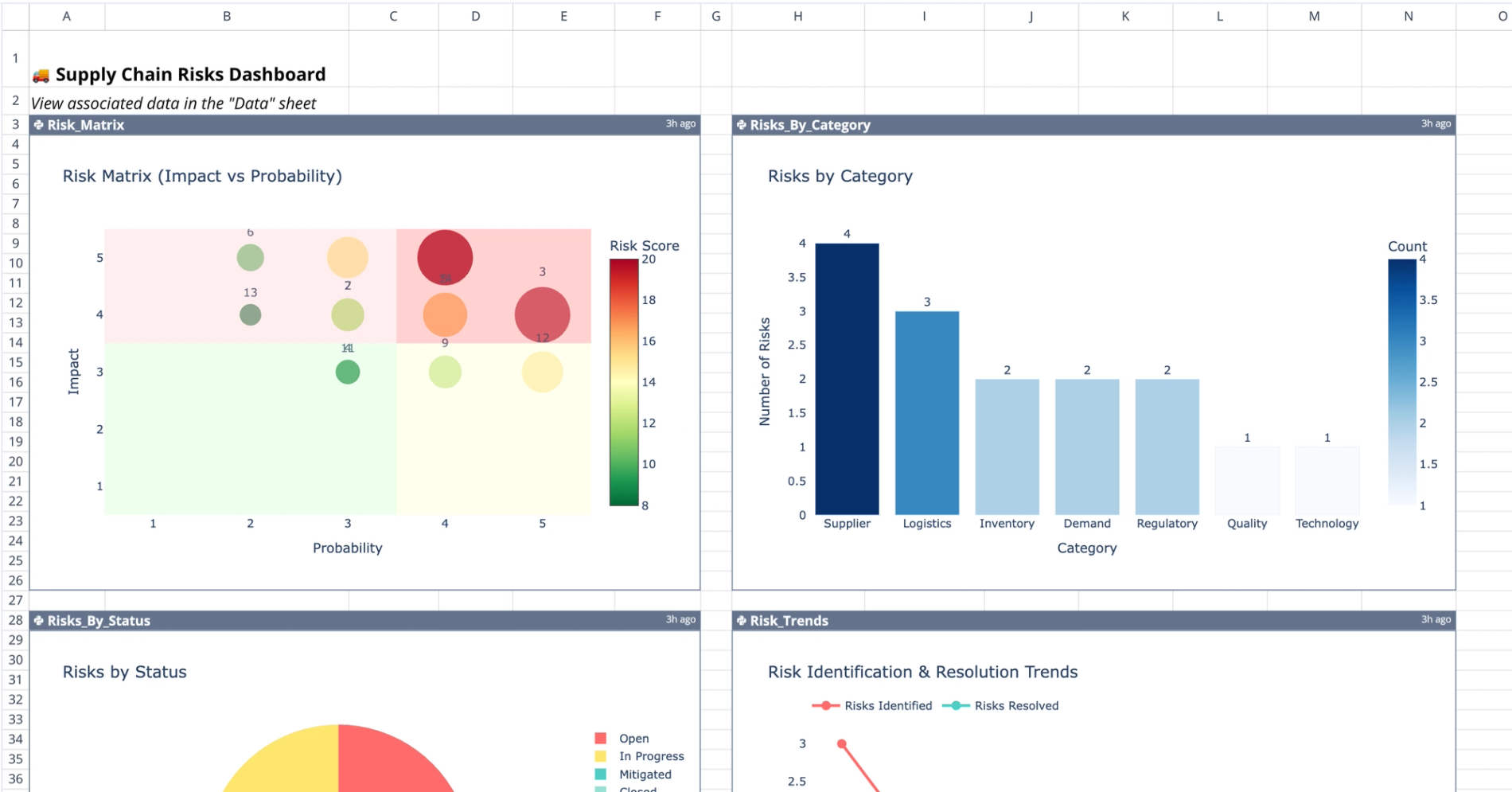
Analysis sheet visualizations
The 'Analysis' sheet features four distinct Python-generated visualizations that update automatically based on the data table, providing deep insights similar to those gained through telecom data analysis. These charts provide different perspectives on the risk register.
- Risk matrix: Located at A3:F26, this plot maps Impact against Probability to visually highlight high-priority items that require immediate attention.
- Category distribution: The chart at H3:N26 aggregates risks by types, such as Demand, Quality, or Regulatory, to identify systemic weaknesses.
- Status breakdown: A visualization at A28:F50 displays workflow progress by comparing Open versus Closed items.
- Trend analysis: The time-series chart at H28:N50 tracks risk identification over time to reveal emerging patterns or spikes in activity.
Interacting with the template
Users manage the dashboard primarily through the 'Data' sheet, while the 'Analysis' sheet reflects those changes programmatically.
- Adding records: Input new rows directly into the
Supply_Chain_Riskstable on the 'Data' sheet. - Updating status: Modify the Status or Score columns as risks evolve to ensure the dashboard displays current risk levels.
- Automatic updates: Dashboard charts recalculate immediately when source data changes, eliminating the need for manual refresh buttons.
- Code customization: Users comfortable with Python can modify the code cells to adjust plot types, axes, or color schemes to fit specific reporting needs, helping them create a dashboard in Python tailored to their requirements.
Who this supply chain risk dashboard template is for
This template is designed for professionals responsible for maintaining operational continuity and visibility across the supply chain.
- Supply chain directors monitoring high-level threats and strategic impact.
- Logistics managers tracking specific category risks and transport disruptions.
- Project managers requiring a clear, shared risk register for stakeholder updates often need tools to track subcontractor performance effectively.
- Analysts needing customizable visualization tools for detailed risk reporting, much like the advanced data analytics in insurance ensures financial integrity.
Use Quadratic to manage and visualize supply chain risks
- Centralize scattered risk data into one structured format.
- Score risk impact and probability to visualize severity and prioritize actions.
- Monitor mitigation progress and assign clear ownership to stakeholders.
- Generate dynamic charts with Python and Plotly that update automatically from live data.
- Customize visualizations and analysis with Python for tailored reporting.
- Provide immediate, accessible visibility into potential supply chain disruptions.