
James Amoo, Community Partner
Feb 23, 2026

Most business teams are drowning in data but starving for insights. They track total signups, daily active users, or page views. These metrics look good on a slide deck but fail to predict the actual health of the business. They tell you that customers are arriving, but they don't tell you if those customers are finding value, if they are likely to renew, or if they are ready to upgrade.
Customer data analysis is the strategic process of connecting user behaviors to business outcomes like retention, churn, and revenue. It moves beyond aggregate numbers to understand the specific actions that drive value.
The biggest barrier to this type of niche-specific analysis is the silo problem. For example, you have your financial data in billing tools like Stripe, engagement data lives in product analytics tools like Mixpanel or Amplitude, and customer context lives in CRMs like Salesforce or HubSpot.
To track growth and actual customer behavior, you must unify these disparate sources. You need to see the full picture: who the customer is, what they are doing in the product, and how that translates to revenue.
Understanding the lifecycle and unit of analysis
Before diving into specific metrics, you need a structural framework. Without it, you risk analyzing noise. A critical, yet often overlooked, component of a robust data strategy is defining the correct unit of analysis.
In B2B SaaS, there is a fundamental difference between analyzing data at the user level versus the account level. Let’s explore this in detail:
- User level: This focuses on individual usage, feature adoption, and workflow friction. It helps product teams to optimize the interface and user experience.
- Account level: This aggregates user data to understand the health of the paying entity. It helps customer success and sales teams predict renewals and identify expansion opportunities.
Mixing these units often leads to incorrect churn predictions. An account might have five highly active users, but if the decision-maker (who pays the bill) never logs in and sees no value, the account is at high risk of churning. Effective analysis requires aggregating user behaviors up to the account level to assess true business health.
Mapping the customer lifecycle
Once the unit of analysis is defined, the next step is to map your data to the three critical phases of the customer journey. The goal of analysis changes at each stage. Let’s see what this means:
- Acquisition: Focuses on funnel analysis and lead quality. Here, customer acquisition data analytics helps identify which channels bring in customers who actually convert to paid plans, rather than just generating traffic.
- Retention: Focuses on activation, habit formation, and value realization. The goal is to identify friction points that cause drop-offs after onboarding.
- Expansion: Focuses on identifying power users and accounts that are ripe for upsells or cross-sells.
By applying these strategies across specific stages, teams can stop treating all customers the same and start applying specific strategies based on where the customer is in their lifecycle.
Integrating the three pillars of customer data
A complete view of customer health requires joining three specific types of data. Analyzing any one of these in isolation results in a fragmented view of reality.
- Demographic data: This answers "Who they are." It includes industry, company size, role, and location. This data usually resides in your CRM and provides the necessary context for segmentation.
- Behavioral data: This answers "What they do." It tracks feature usage, login frequency, session time, and workflow completion. This is the core of customer analytics data, typically found in product analytics tools or raw database event logs.
- Attitudinal data: This answers "What they say." It includes NPS scores, qualitative feedback, and support ticket history. Customer service data analysis is vital here; a customer might be logging in every day (high behavioral score) but struggling with bugs (high support ticket volume), making them a churn risk despite high usage.
How to analyze customer data for retention and revenue
Once your data is organized and unified, the next stage is interpretation. The objective is to move from reactive reporting to predictive analysis.
Distinguishing leading and lagging indicators
Most executive dashboards rely on lagging indicators. Product management metrics like Churn Rate, Annual Recurring Revenue (ARR), and Net Revenue Retention (NRR) are the "rearview mirror." They tell you exactly what happened in the past, but by the time they change, it is often too late to influence the outcome.
To drive retention, you must identify leading indicators for churn prediction and cohort analysis. These are the headlights of your business. A leading indicator might be a 20% drop in weekly active users, a decline in key feature usage, or a spike in support tickets. The goal of customer data and analytics is to mathematically correlate these leading behaviors with lagging financial outcomes. If you know that a drop in "Feature X" usage correlates with churn 90 days later, you can intervene before the customer leaves.
Analyzing churn and retention patterns
Cohort analysis is one of the most powerful tools for understanding retention. By grouping customers based on their start date (e.g., the "January 2024 Cohort"), you can track how retention evolves. This reveals whether your product improvements are actually extending the customer lifetime or if newer cohorts are churning faster than older ones.
Beyond cohorts, teams should develop customer health scores. This involves creating a composite metric that weights different inputs to assign a single health value (e.g., Red, Yellow, Green) to every account. This simplifies complex behavioral data into a signal that Customer Success Managers (CSMs) can act on immediately.
Identifying expansion opportunities
If you think data analysis and customer success are only about defence, you’re wrong. It is also about offense. By analyzing product usage patterns, you can spot accounts that are ready to grow.
Look for accounts that are approaching usage limits (e.g., 90% of storage used) or utilizing premium features on a trial basis. High utilization rates among specific user roles can also indicate a need for more seats. By setting up alerts for these behaviors, sales teams can approach customers with a value-add conversation at the exact moment the customer needs it, rather than waiting for a renewal cycle.
Streamlining customer data analytics with Quadratic
The primary technical challenge in this process is that most tools are specialized. Google Analytics and Mixpanel are great at understanding data like acquisition and retention, Salesforce excels at CRM, and Stripe handles billing.
Standard customer data analytics tools often fail to communicate with one another, leaving teams to export CSVs and manually merge them in spreadsheets. This process is slow, error-prone, and becomes stale data the moment it is finished. This is where customer data analytics software like Quadratic offers a distinct advantage. It unifies these fragmented workflows by bringing the power of SQL, Python, and spreadsheets into a single interface. Let’s explore these features in detail.
Direct connection to multiple tools
Quadratic connects directly to databases, raw data, and APIs. This allows users to pull live data from CRMs and billing systems into one shared workspace. You can use SQL for data analysis and Python to perform complex joins, such as merging Stripe revenue data with Mixpanel event log. This allows you to flexibly build customer data analysis tools tailored specifically to your business logic, creating live dashboards that update automatically and serve as a single source of truth for all teams.
AI for customer data analysis
Customer datasets are often large, complex, and constantly evolving. Writing advanced Python and SQL code can slow down teams that need answers quickly, particularly when cross-functional stakeholders want to explore data independently.
Quadratic’s AI capabilities reduce this friction by allowing users to ask analytical questions in natural language. Instead of manually constructing queries, users can describe the insight they want, and Quadratic generates the Python or SQL code required to perform the analysis. Let’s see an example.
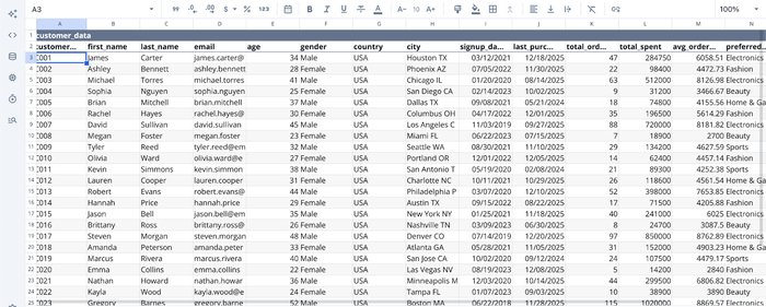
First, you’d have to import (or connect to) your dataset:
After successfully importing your data into Quadratic, you can then proceed to generate insights from your data. Here:
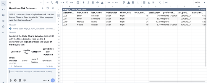
In the image, I ask Quadratic a very specific question (just like we explained earlier): “Which customers have a high churn risk but also have a Silver or Gold loyalty tier? How long ago was their last purchase?”
Quadratic evaluates this prompt and instantly generates a table (with the corresponding code for it) for this analysis. This approach significantly lowers the barrier to advanced customer analytics. Product managers, marketers, and operations teams can explore behavioral patterns without deep technical expertise, while experienced analysts benefit from faster iteration cycles.
AI for customer data visualization
Communicating customer insights effectively is just as important as discovering them. Many teams struggle with visualization because it requires switching into separate tools or manually configuring charts, which slows decision-making.
Quadratic integrates AI-powered visualization directly into the analysis workflow. Users can describe how they want to present their findings, and it automatically generates the most appropriate chart type based on the dataset. Here’s an example:
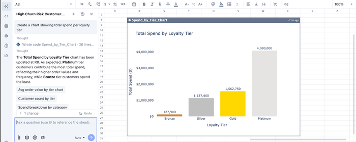
In the image above, I ask Quadratic to “Create a chart showing total spend per loyalty tier”, and it instantly generates an interactive visualization to present this insight.
Collaboration
Customer data analysis rarely belongs to a single department. Marketing, product, sales, customer success, and finance teams all contribute data and rely on shared insights to make decisions. Traditional workflows create bottlenecks because analysis happens in isolated files or individual analyst environments.
Quadratic provides a collaborative analytics platform where teams can query data, build models, and visualize results together. Multiple stakeholders can review datasets, refine calculations, and contribute context directly within the same document. Analysts no longer need to distribute updated spreadsheet versions or manually synchronize dashboards across teams.
Conclusion
When conducting customer data analysis, moving from vanity metrics to actionable insight is a journey. It requires shifting your focus from simple reporting to a deep understanding of the customer lifecycle, the unit of analysis, and the leading indicators that predict business health. By unifying your demographic, behavioral, and financial data, you can stop reacting to churn and start proactively driving growth.
A modern customer analytics workflow requires live data connectivity, flexible analysis capabilities, clear visualization, and seamless collaboration across departments. Every stage of the process depends on having the right environment to work in.
Quadratic addresses these challenges by bringing SQL, Python, spreadsheets, and AI into a unified workspace designed for iterative exploration. Direct integrations eliminate the need for constant exports and manual reconciliation, while AI-assisted analysis lowers technical barriers so both analysts and non-technical stakeholders can explore customer data confidently. Try Quadratic for free today.
Frequently asked questions (FAQs)
Why is traditional customer data analysis often ineffective for improving retention?
Many teams focus on vanity metrics like total signups or page views, which look good but fail to predict actual business health or retention. Effective customer data analysis requires connecting specific user behaviors to outcomes like churn and revenue, moving beyond simple reporting.
How does customer journey data analytics drive better acquisition and retention?
By mapping data to the acquisition, retention, and expansion phases, teams can apply specific strategies at each stage. This helps identify which channels bring valuable customers through customer acquisition data analytics and pinpoints friction points causing drop-offs after onboarding.
How do customer data analytics tools like Quadratic help unify fragmented customer data?
Quadratic addresses the silo problem by unifying fragmented workflows, bringing SQL, Python, and spreadsheets into a single interface. It connects directly to live data sources like product, CRM, and billing systems, allowing teams to perform complex customer data analysis.