
James Amoo, Community Partner
Feb 19, 2026

Shipping a new feature feels like the finish line, but for growth-focused teams, it is really just the starting point. The engineering work is done, but the business question remains: is anyone actually using it in a way that generates value?
Many product teams depend on conversion tracking tools to answer this question. They look at total clicks or page views and assume that high numbers equal success. However, basic activity rarely correlates with long-term retention or revenue expansion. To understand the true impact of product changes, you need to track specific feature adoption metrics that measure habit formation and value realization.
For early-to-mid-stage SaaS companies, the challenge isn't just knowing what to measure but establishing a repeatable process for measurement. Moving beyond ad-hoc SQL queries and building a consistent operating model is the only way to ensure feature launches actually drive growth.
In this blog post, we will outline the core feature adoption metrics you need, a playbook for staging your data, and how to set up a reporting ritual that turns numbers into action.
Usage vs adoption: defining the difference
Before diving into formulas to calculate these metrics, we have to distinguish between usage and adoption. Conflating these two concepts often leads to inflated confidence and poor product decisions.
Usage is a surface-level activity. It happens when a user clicks a button, views a page, or toggles a setting. Usage tells you that a user knows the feature exists, but it doesn't tell you if they derived any value from it. Marketers often engage in product usage analytics to get useful insights.
Adoption is value-driven behavior, referring to the process by which users integrate a product or feature into their workflow to achieve specific goals. It happens when a user completes a core workflow that solves a problem. Adoption implies that the feature has become part of the user's habit loop.
For example, in a project management tool, usage might be clicking the "Create Report" button. Adoption is successfully generating, downloading, and sharing the report with a team. If you only track clicks, you might miss the fact that 50% of users drop off before the report is generated.
The core feature adoption to track
To gain a complete picture of feature performance, you need a metrics stack that captures breadth, speed, depth, and real business impact. Let’s discuss some of the core feature adoption metrics to track:
Adoption rate
Adoption rate measures the breadth of your feature's appeal. It answers the simple question: "Of the people who could use this, how many did?"
The basic formula is:
(Number of users that used the feature / Total Active Users) x 100
The key distinction lies in the denominator. Ideally, feature adoption should be measured against active users rather than total registered users. Using total signups skews results downward by including inactive accounts. A more accurate approach is to use total active users within the same timeframe, or eligible users if the feature is limited to certain plans or roles.
Time to first action
Time to First Action (TTFA) measures the speed of discovery. It tracks the time elapsed between a user becoming eligible for a feature (e.g., signing up or upgrading) and their first meaningful interaction with it.
This metric is a strong proxy for time to value. If users take weeks to find a core feature, you likely have a discoverability or UX problem. Shorter times generally correlate with better onboarding and clearer UI design.
Stickiness & frequency
Once a user tries a feature, do they come back? Frequency measures the intensity of usage, often tracked as "uses per week" or "uses per session."
To measure habit formation, look at product stickiness. A common approach is calculating the ratio of Daily Active Users (DAU) to Monthly Active Users (MAU), specifically for that feature. High stickiness indicates that the feature is essential to the user's daily workflow, whereas low stickiness might suggest it is a utility used only occasionally.
Impact on retention
Feature adoption metrics are ultimately useless if they do not predict business health. The most effective way to measure this is by comparing cohort retention curves. Plot the retention rate of users who adopted the feature against those who did not.
If the "Adopters" cohort retains at a significantly higher rate, you have quantitative proof that the feature drives business value. If the curves are identical, the feature might merely be nice to have but not essential for preventing churn.
Drop off rate
Beyond tracking feature completion, monitoring user drop-off provides valuable insights into funnel analysis and usability gaps. It reveals where users exit a workflow and where improvements can increase retention.
To calculate the drop-off rate, divide the number of users who abandoned the workflow by those who started it, then multiply by 100.
How to turn feature metrics into actionable insights
Defining metrics is the easy part. The hard part is the messy middle, getting the data out of your database and into a format that stakeholders trust. Here is a three-step playbook to operationalize this process:
Step 1: Define success with custom logic
Avoid depending on the default "event clicks" provided by simple analytics tools that often lack actual context into user behavior. True product adoption often requires complex logic that maps to your specific product value.
For instance, instead of tracking simple button clicks, adoption should often be defined as a compound event. This could mean measuring when a user uploads a file and then clicks export within a 24-hour window. The goal is to create custom definitions that reflect successful workflows, not just UI interactions.
Step 2: The messy middle of data staging
Raw event data is rarely ready for analysis immediately. It is often messy or siloed in different systems. You might have clickstream data in a warehouse like Snowflake, but customer plan details in Salesforce or a production database.
To get an accurate picture, you must engage in data transformation tasks like data cleaning, data blending, and then also adhere to best practices for data staging. You need a workspace where you can filter out internal test accounts, join event logs with customer attributes (like plan type or industry), and audit the data for anomalies. Staging your data ensures that when you present different chart types, you aren't derailed by questions about data quality.
Step 3: The segmentation strategy
Aggregate numbers hide the truth. A 20% adoption rate might look mediocre, but it could mask the fact that 90% of your Enterprise users love the feature, while small to medium-sized businesses ignore it.
Use segmentation and cohort analysis to slice your metrics by:
- User Role: Admins vs. Members.
- Account Size: Enterprise vs. Mid-market.
- Lifecycle Stage: New users (first 30 days) vs. Power users.
This level of granularity helps you understand who is finding value, allowing you to target improvements where they matter most.
Why black box analytics tools often fail
Many teams try to solve this with out-of-the-box product analytics software. While these tools are great for basic trends, they often become black boxes when dealing with complex SaaS products.
A common failure point emerges when stakeholders ask a simple but critical question: “How exactly is this metric calculated?” In many black-box tools, the answer is buried inside proprietary filters, hidden event logic, or undocumented aggregation rules. When teams can’t inspect or validate the underlying calculations, confidence in the data erodes. Over time, metrics become something people reference but don’t fully trust.
Most analytics platforms rely on rigid event schemas such as button clicks, page views, and feature opens. While these signals are useful, they rarely represent meaningful product success. Real adoption typically involves multi-step workflows, time-based sequences, and use of automated spreadsheets, the kind of compound metrics that black-box tools struggle to model effectively.
Further, these tools are built primarily around behavioral event data, not broader business context like revenue, CRM records, billing systems, customer segmentation, or support interactions. As a result, connecting product usage to revenue impact, churn risk, or account tiers often involves messy exports and brittle integrations. Users need to adopt a tool that brings all data sources together in one environment, making complex cross-functional analysis seamless and scalable.
As products evolve, so do the metrics that define success. New features, pricing models, onboarding flows, and user journeys continuously reshape how adoption should be measured. Black-box tools often force teams to wait for vendor updates, rely on awkward workarounds, or abandon outdated dashboards altogether.
How Quadratic streamlines feature adoption analysis
In this section, we’ll see how Quadratic offers a better solution than black box analytics tools and how it ultimately helps to streamline managing feature adoption metrics. Let’s explore these features in detail:
Direct connections to databases
Quadratic provides the ideal workspace for operationalizing this metrics playbook. Instead of juggling rigid analytics tools and disconnected spreadsheets, Quadratic allows you to connect directly to multiple databases, APIs, and raw data, making complex joins across product, marketing, and business data straightforward and scalable.
Since connections in Quadratic remain live, feature usage and adoption reports update automatically as new events flow in. Teams can build continuously refreshed user metrics dashboards that replace static weekly reports and manual spreadsheet updates. This ensures everyone works from the same up-to-date source of truth without repetitive maintenance.
Support for modern programming languages
In addition to its support for formulas, Quadratic also functions as a coding spreadsheet that gives teams full analytical control. Unlike black-box tools that force simplified definitions, you can use Python, SQL, or JavaScript to define complex adoption logic, model compound workflows, run cohort analysis, and segment users dynamically. This allows metrics to reflect real product behavior, not the limitations of a predefined dashboard.
AI-powered insight generation
Quadratic also accelerates insight generation through its built-in AI spreadsheet analysis feature, allowing you to leverage LLMs for data analysis. Product managers and analysts can ask natural language questions and instantly generate tables, breakdowns, and deep insights without writing new queries from scratch. Let’s see how this works.
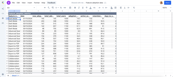
First, I import my dataset into Quadratic:
Then I prompt Quadratic AI to “Calculate churn rate per feature.” Here:
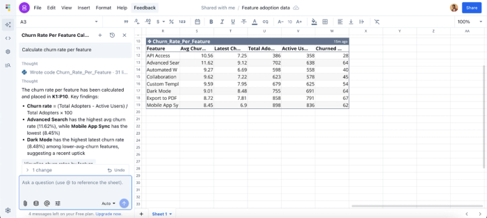
Quadratic instantly returned a table that shows a breakdown of the churn rate of all the features, giving additional insights into the average churn data, the latest churn data, and the total adoption rate. This allows marketers or product managers to get quick insights from their data and focus on driving strategies for improvement.
Data visualization
Quadratic makes feature usage and adoption data instantly interpretable with dynamic, AI-powered visualizations. Whether it’s adoption trends, retention curves, or marketing data visualizations, Quadratic automatically recommends the most effective chart type. It allows teams to slice and dice by user segment, timeframe, or feature variant.
All visualizations stay live with your database and CRM connections, automatically updating as new data arrives, providing a single source of truth for teams to monitor trends, identify friction points, and share insights seamlessly. Let’s see how this works:

By asking Quadratic to “Visualize adoption rate over time for all the features”, it automatically generates the most suitable chart type for this request. From the chart, we can see that the “Export to PDF” and “Mobile App Sync” are two of the most adopted features in the application. This helps marketing teams easily communicate their findings to non-technical stakeholders.
Collaboration
Quadratic also excels as a collaborative analytics platform built for real-time collaboration. Teams can review metric logic together, experiment with alternative definitions, and share dashboards across the organization. This democratizes access and enables employees to easily self-serve analytics.
Conclusion
Feature adoption metrics are the bridge between shipping code and driving business value. By measuring breadth, speed, depth, and impact on retention, you move beyond vanity metrics and start understanding true customer behavior.
However, the key to success isn't just a one-time analysis; it lies in building a repeatable operating model. By staging your data properly and defining success with precision, you turn data into a growth lever.
Connect your product usage and customer data to Quadratic and build a feature adoption dashboard that ties usage to retention and revenue, then share it with your team. Try Quadratic for free today.
Frequently asked questions (FAQ)
Why are feature adoption metrics important for SaaS products?
These metrics reveal which features are actually being used, identify friction points in workflows, and guide product decisions. Tracking adoption helps improve retention, optimize onboarding, and prioritize development efforts.
How does Quadratic streamline feature adoption tracking?
Quadratic unifies product, CRM, and revenue data into a single AI-powered spreadsheet platform. Teams can define custom adoption metrics, track conversions, and visualize workflows without juggling multiple tools or complex formulas.
How does Quadratic improve data visualization for feature metrics?
Quadratic automatically generates charts, dashboards, and interactive visualizations based on your data. Natural language queries allow users to create adoption reports, retention curves, and cohort visualizations instantly, making insights easy to understand and share.